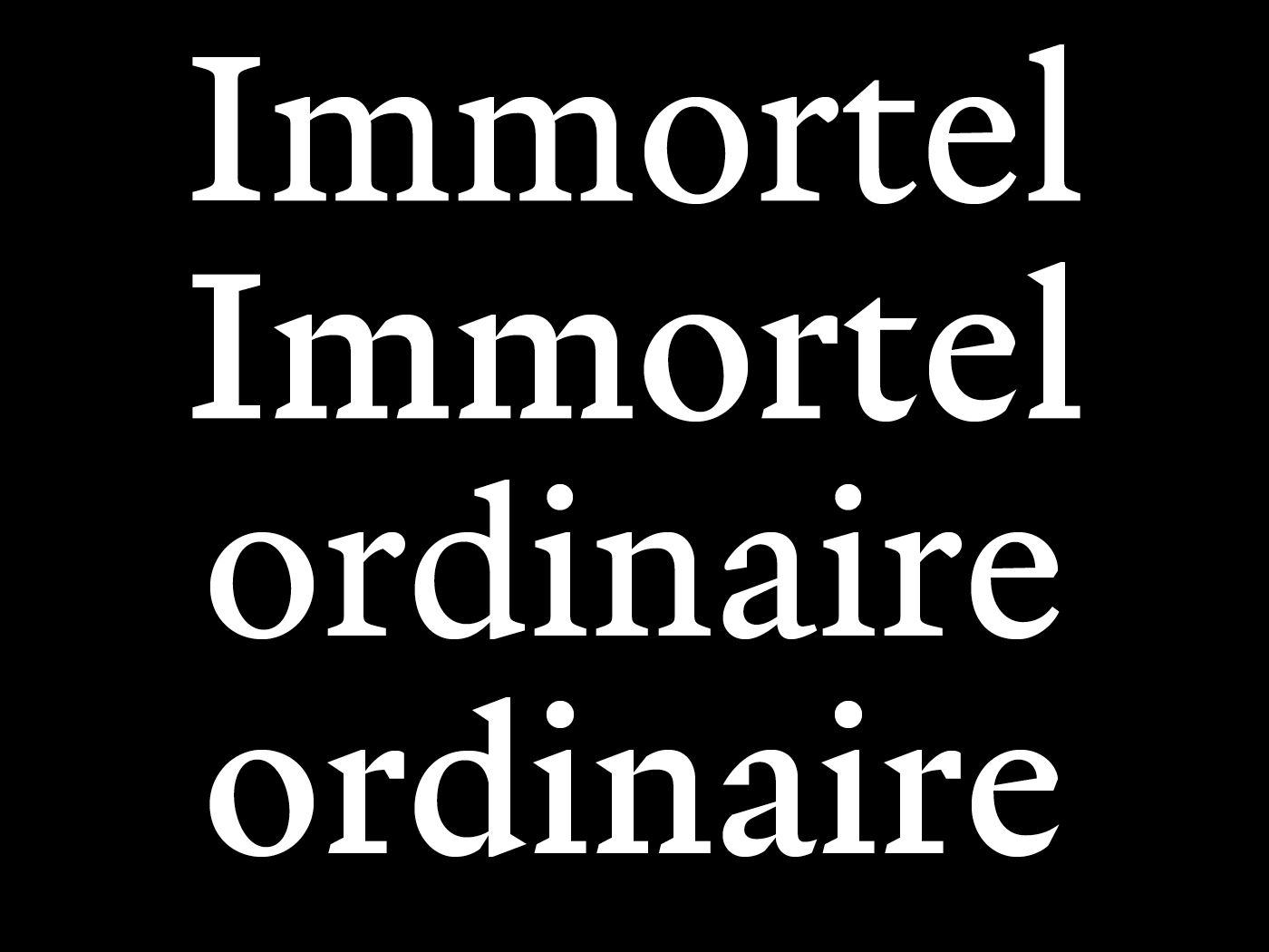
Immortel
Clément Le Tulle-Neyret zoomHow can a typeface transmit / say /show / embody texts / thoughts / concepts, beyond its layout?
In reaction to Beatrice Warde’s theory, supported by Stanley Morison, about the idea that typography and typefaces should be transparent and objective1, this research questions how text can be embodied by the typeface used to set it, letterforms being here considered as the smallest unit of communication. The transmission of a text is not simply the result of a purely physiological process, it also calls for for a degree of subjectivity and sensitivity in its perception – the text is seen as much as it is read2. Consequently, how and to which extent can a typeface embody the content it displays to the eyes of the reader? How may the subjectivity of the type designer manifest itself as part of an original typeface intended for continuous reading or for a specific text? How may these letters, these words, these sentences, this text be qualified? This research also investigates what makes the identity of a typeface family. As part of this process, a number of variations will be designed, using as a basis specific texts selected for this occasion. Which parameters will need to remain unchanged, and which ones will vary as part of the creation of the identity of the type family? Up to which point will these variations remain part of a coherent system, and when will they depart too much from it?
1. Beatrice Warde, «The Crystal Goblet, or Printing Should Be Invisible.», The Crystal Goblet: sixteen essays on typography, London, The Sylvan Press, 1955
2. Emmanuël Souchier, «L’image du texte pour une théorie de l’énonciation éditoriale», Les cahiers de médiologie, vol. 6, no. 2, 1998, p. 137–145.