Lost and Found: Carte Antique
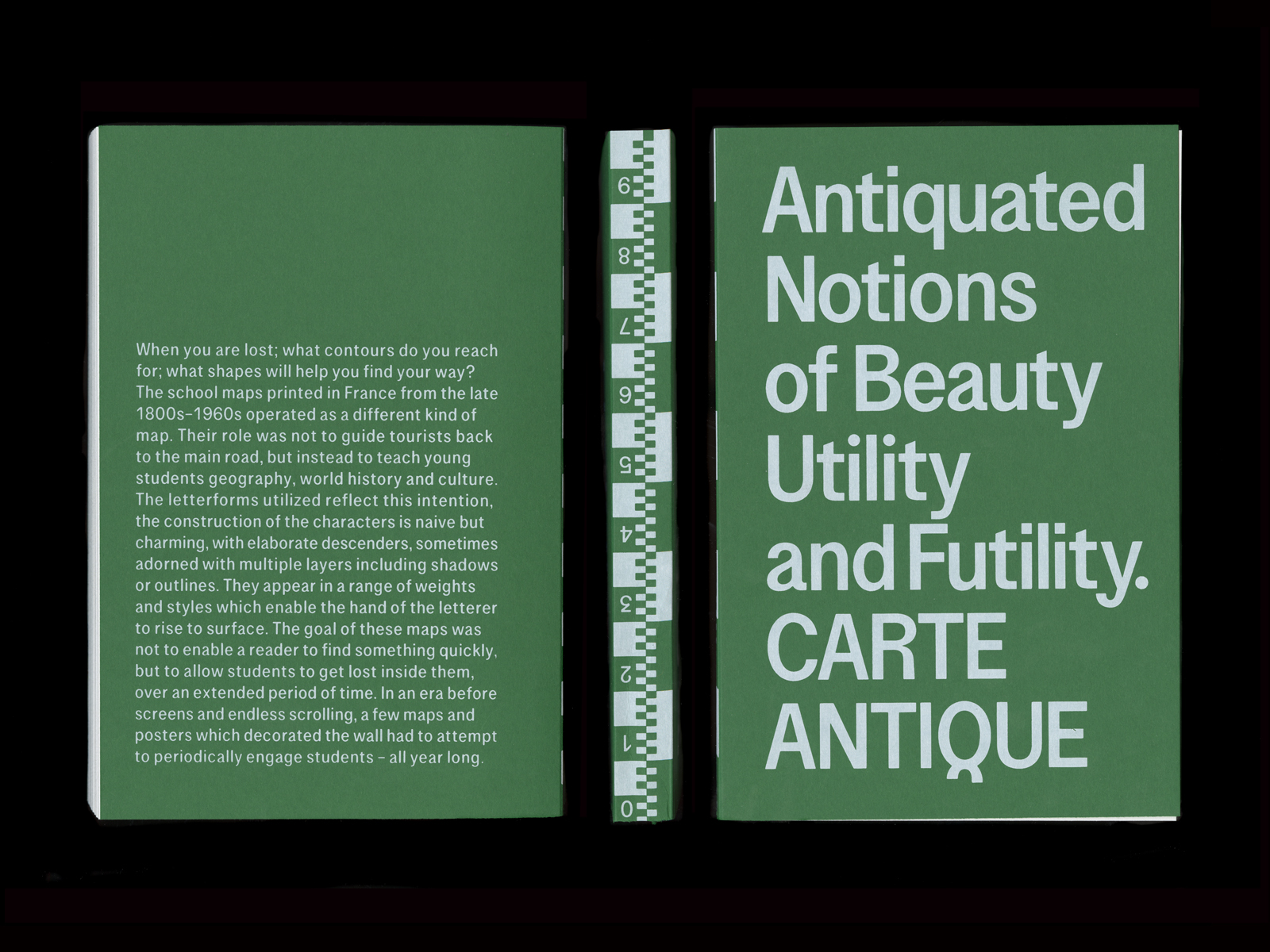
Sean Kuhnke zoomWhen you are lost; what contours do you reach for; what shapes will help you find your way? The school maps printed in France from the late 1800s–1960s operated as a different kind of map. Their role was not to guide tourists back to the main road, but instead to teach young students geography, history and culture. The letterforms utilized reflect this intention, the construction of the characters is naïve but charming, with elaborate descenders, sometimes adorned with multiple layers including shadows or outlines. They appear in a range of weights and styles which enable the hand of the letterer to rise to the surface. The goal of these maps was not to enable a reader to find something quickly, but to allow students to get lost inside them, over an extended period of time. In an era before screens and endless scrolling, a few maps and posters which decorated the wall had to attempt to periodically engage students – all year long.
The earliest reference to this lettering style, however, is in stark contrast to this use. The Service Géographique de l’Armée published a manual in 1934 entitled: Les écritures sur les cartes topographiques. Included in this manual is a model from 1905 which one can clearly connect the forms to the lettering used in the school maps, however the eccentrics of these forms no longer seem at home within a military operation – have you ever seen a ‘y’ so cute? It is likely that the people employed to create these manuals had a background in engineering, or topography – not specialists in typography or lettering – yet we can see a clear influence from this model in the Carte Michelin road maps produced as late as the 1970s. Even if the forms were eccentric, and developed for antiquated processes, they cemented themselves into this genre for nearly a century. The goal of my research is to trace the origin of these letterforms and to map out their genealogy, through a study of printed matter from this era, lettering manuals, and metal type.