Mapping composition, new topology
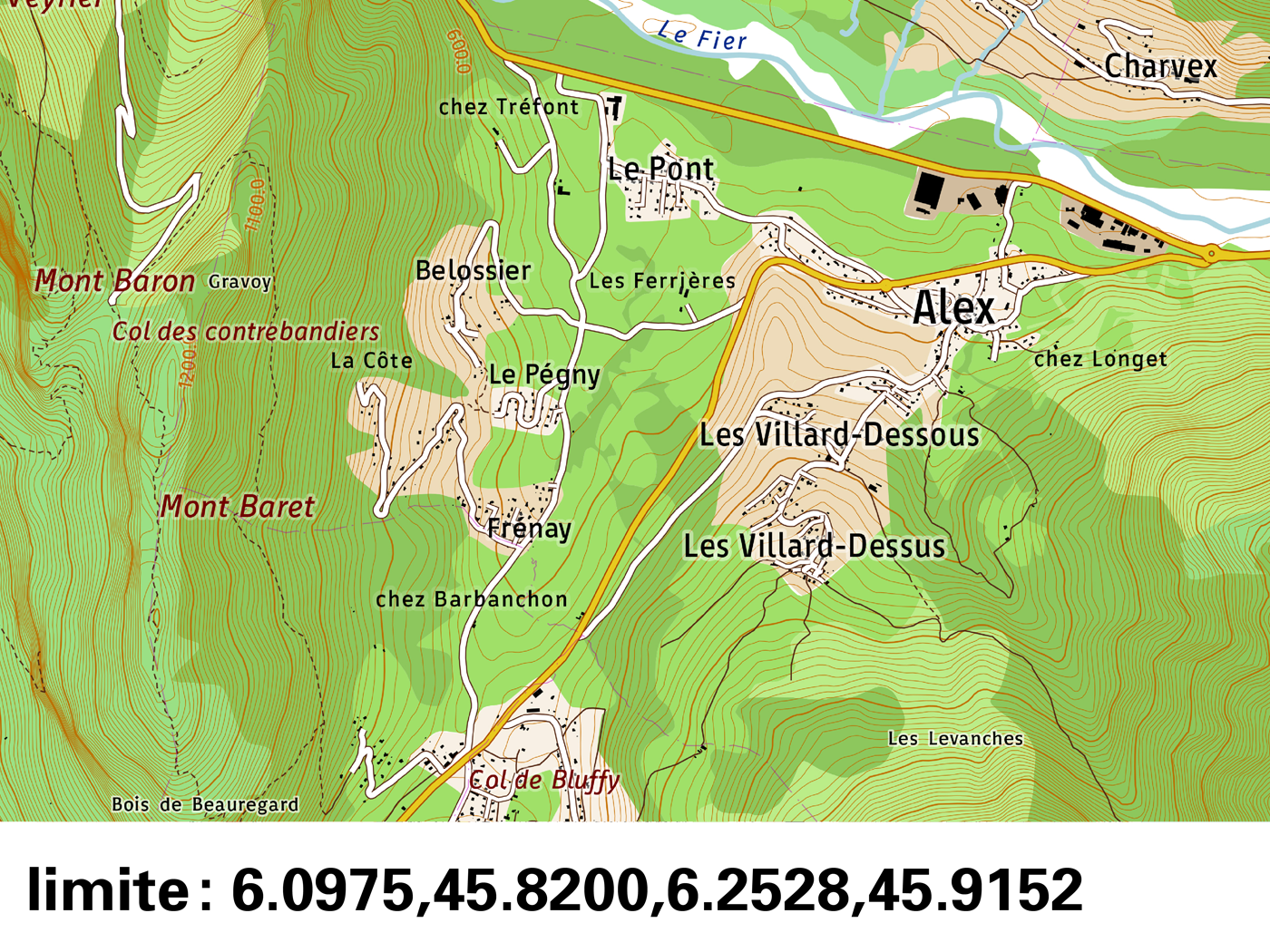
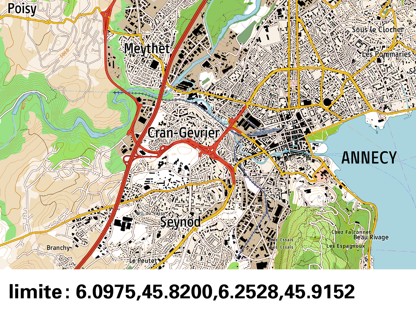
Sébastien Biniek zoomThe graphic and textual components of a map form a single image that is both seen and read. The map-reader is in a consultation process, which requires constantly juggling between the general and the particular. This working paper presents the research subject: MAP-MAKING, NEW TOPOLOGY. The different sections transpose the elements that were required to build a test protocol for several typefaces for digital topographic maps. It took isolated issues inherent to text in a topographic map. They were divided in three areas: 1. Specific situations of composition of the word; 2. map background; 3. toponymic hierarchies.
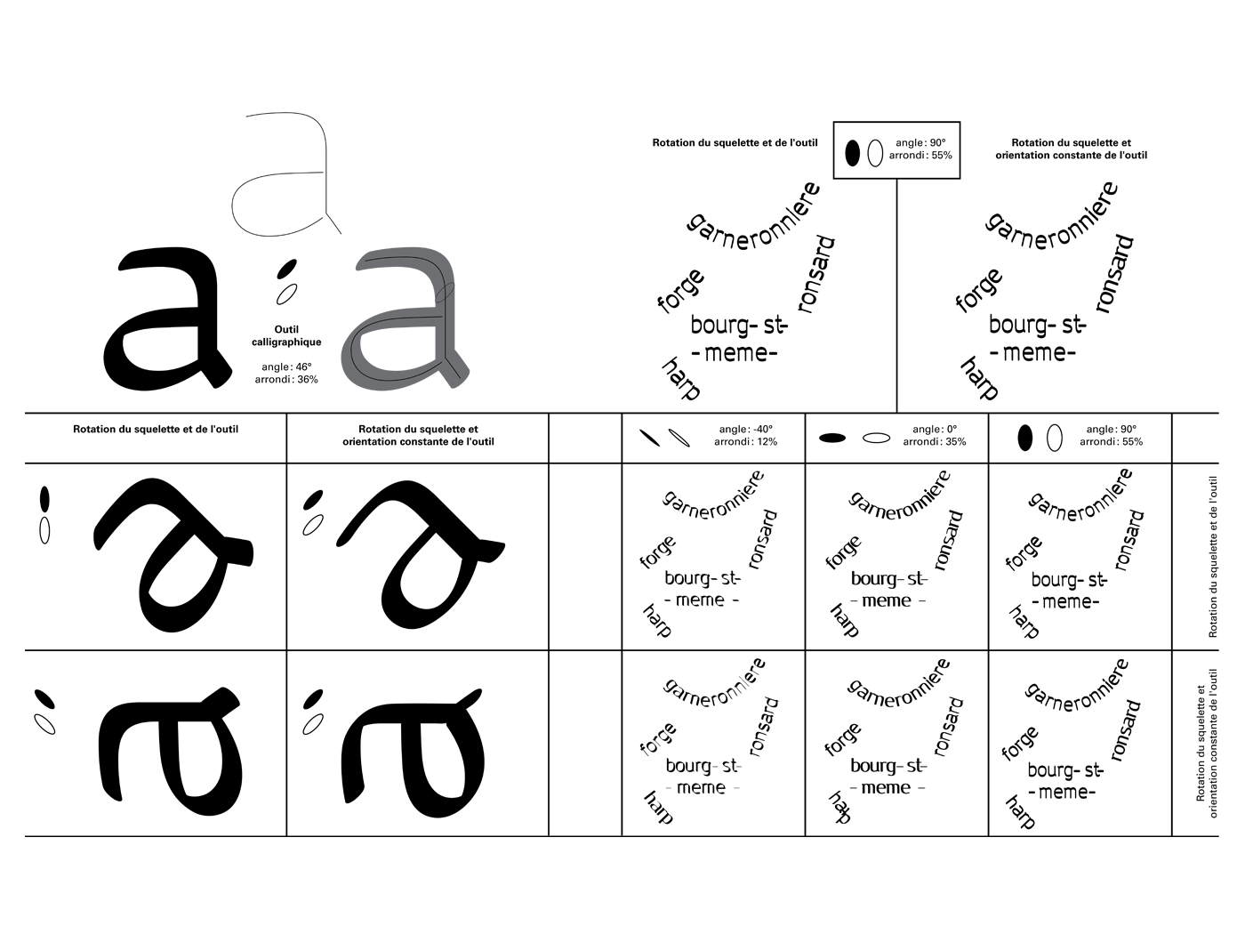
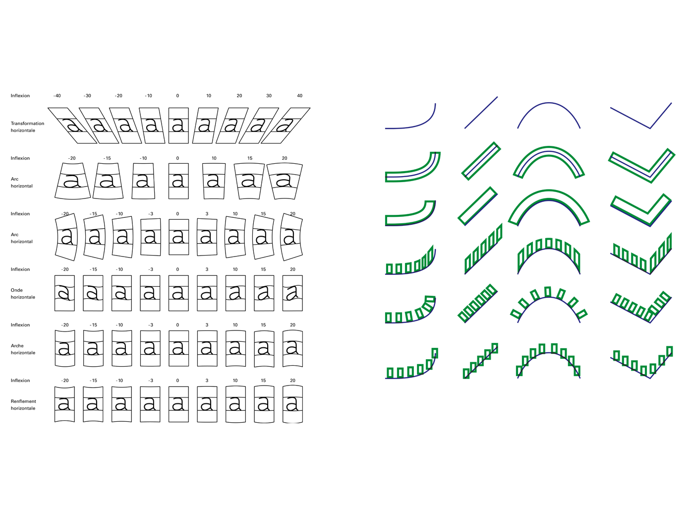
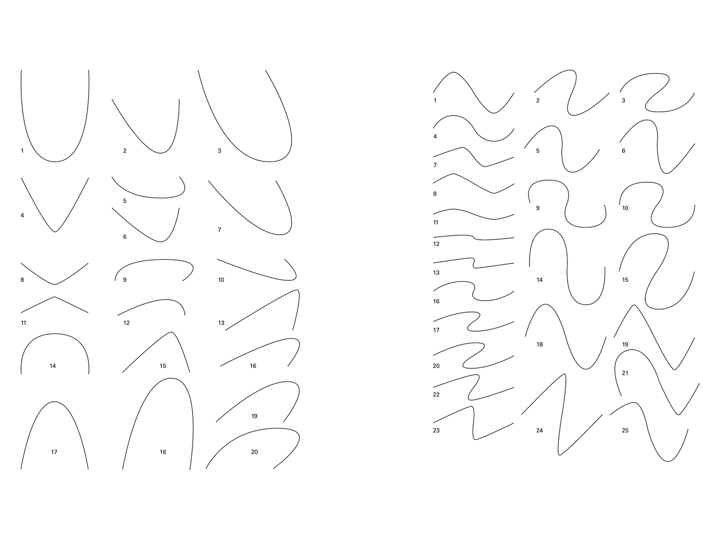
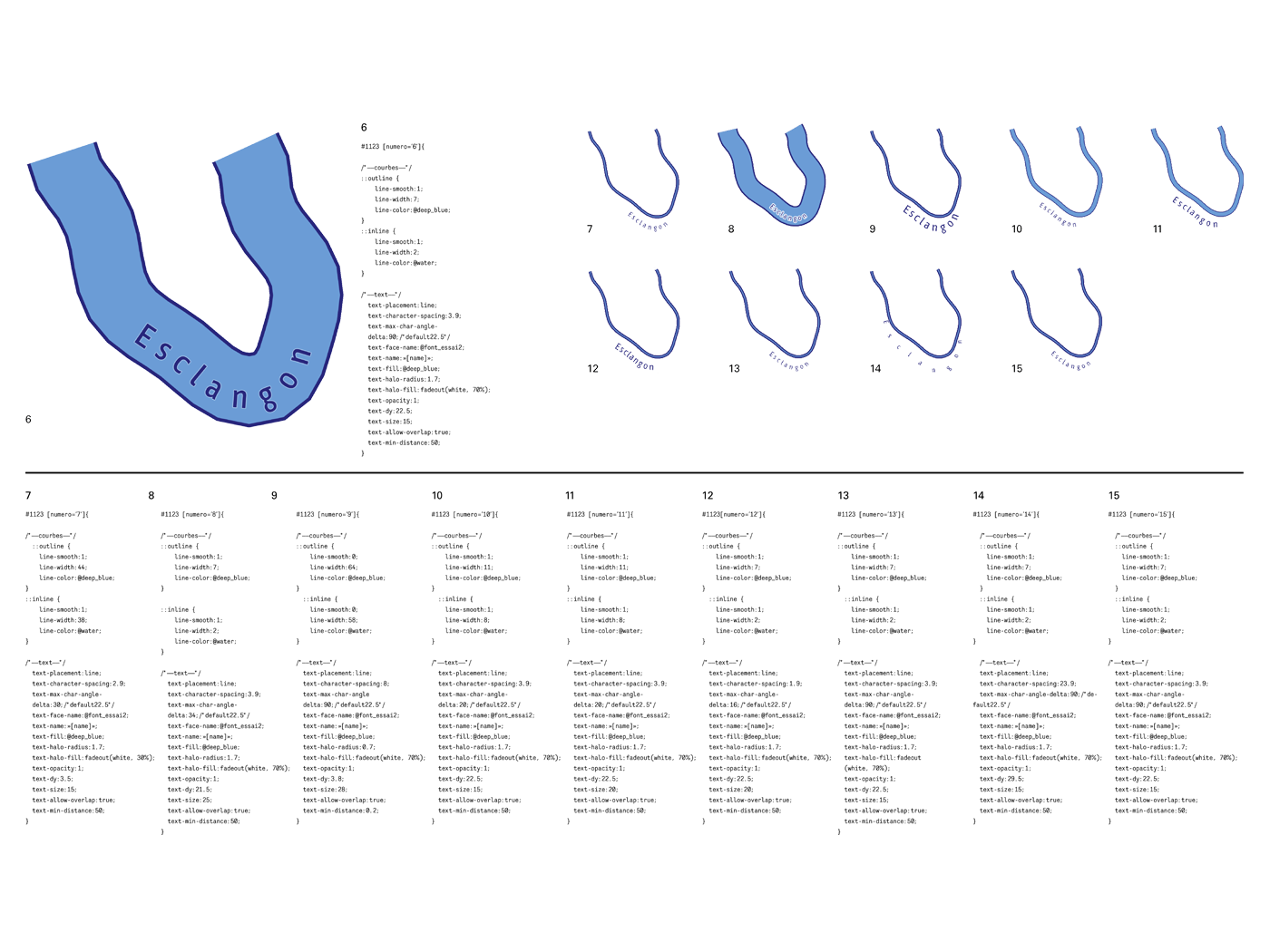
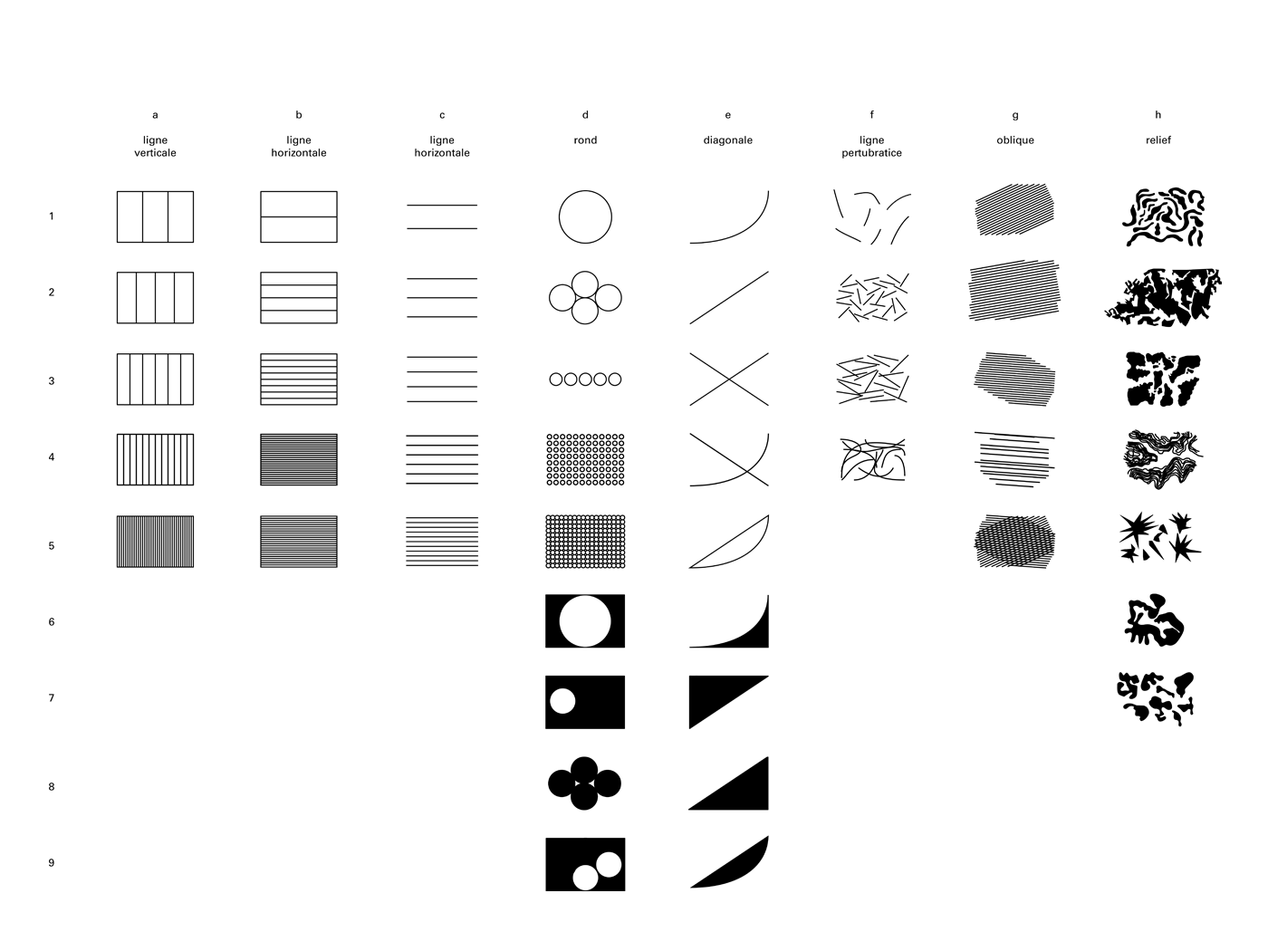
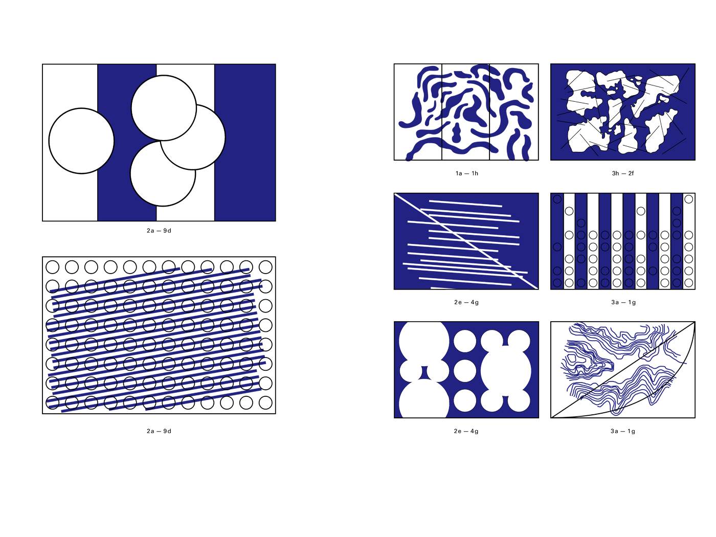
The first two points represent the phenomenon that disturbs reading conditions. Regarding toponyms, there are two broad categories: those composed horizontally (the localities) and those we can describe as “layout place names” which are typeset according to surfaces or lines (ex: forests, mountain ranges, geographical areas, roads and watercourses). How do letters and words behave, when their baseline is as winding and steep as the landforms? Another cartographic phenomenon: map background. Place names are rarely composed on white backgrounds. They can be superimposed to an area with a high-density contrast (ex: urban areas), moving from darkness to lights (from one mountain slope to the other), or pass through an area of great formal complexity (rocky mountains). To make this possible, it is necessary to anticipate saturation and the overlapping phenomena that may occur. The design of the typeface was fed by the development of this protocol, which itself was evolving.
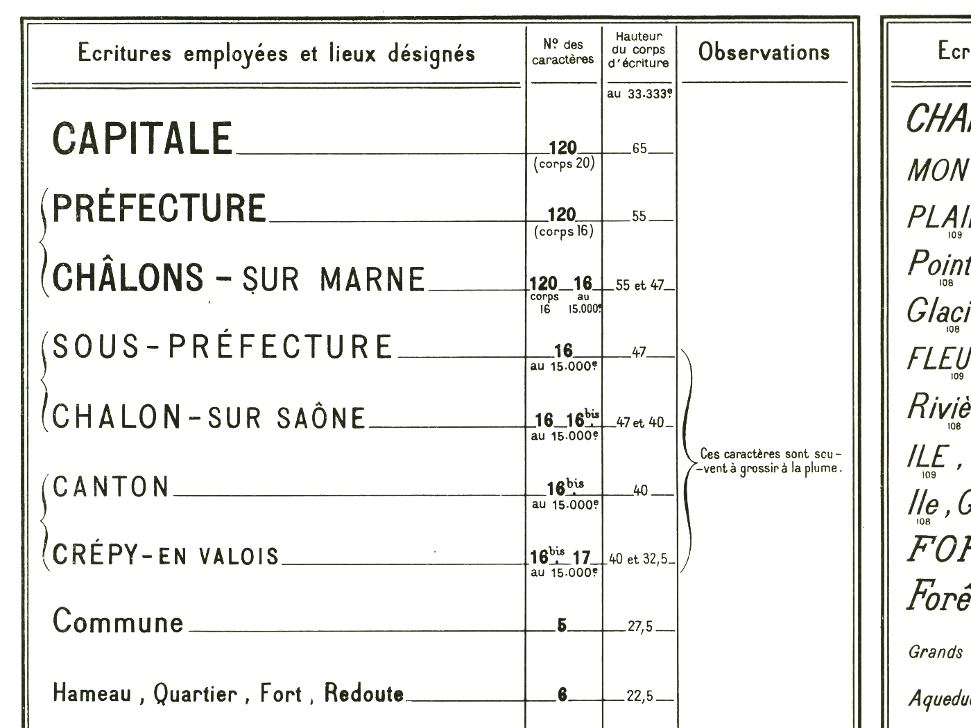
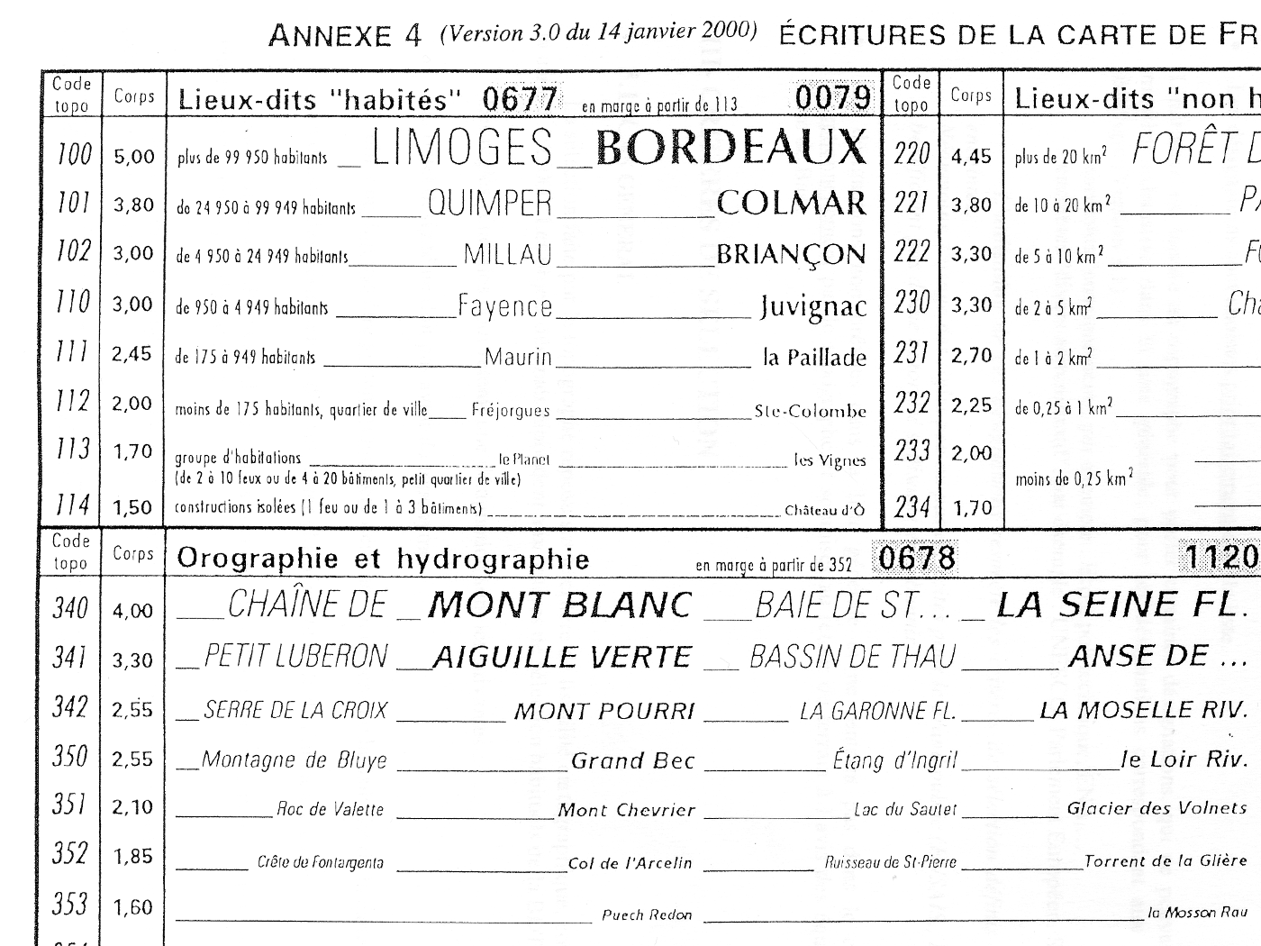
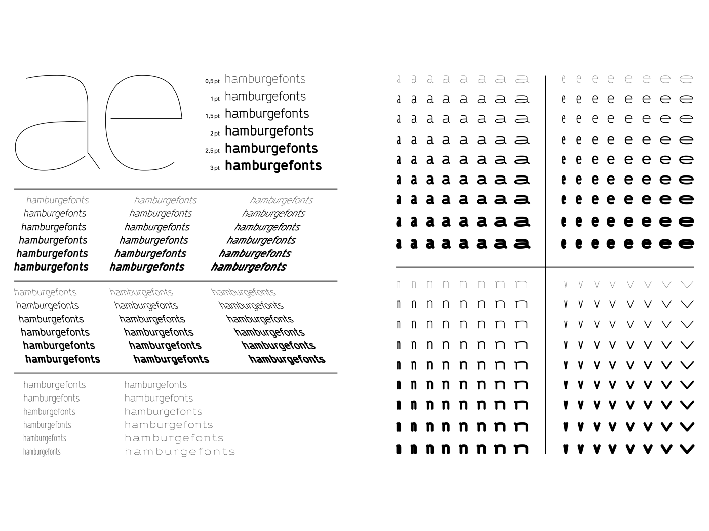
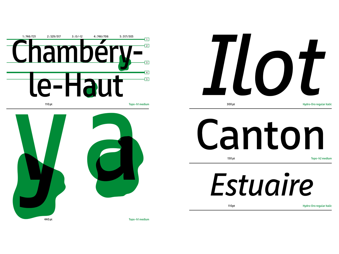
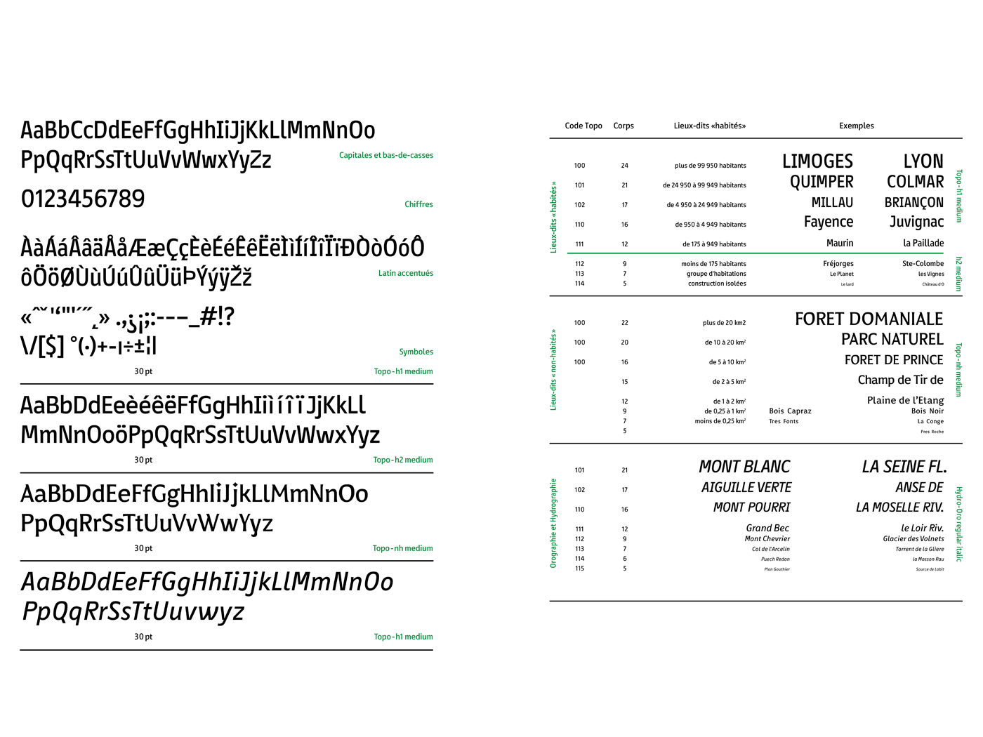
The fonts were designed for the screen through the use of geographical information systems (which use geo-referenced databases). The use of MSS language (map style sheet) of TileMill software and OpenStreetMap’s datasets helped organize and visualize this data according to the criteria of a topographical map. It was first envisaged to draw a skeleton for providing a structure that could anticipate deformations. This step was the starting point for the design of several versions. The resulting family, designed in four styles, is based on the textual standards that have been implemented by the French national mapping agency (IGN). Two typefaces were designed for populated places. The first one is rather narrow in order not to interfere with the background’s legibility; the second one is more legible at small sizes. The others were designed for natural places. The italic version suits for the oronyms & the hydronyms (mountains & watercourses). The serif version is used for uninhabited place names. At the end of the year, the result is a work environment that outlines a future research project.