Ugly faces
Julián Moncada zoomThe purpose of this project is to examine consistency and its importance as one of the key aspects in the design of text typefaces. The design of a typeface can be understood as a process of defining relations between elements across a number of different levels. Some of these relations, for example between the serifs and terminals of different letters, belong to a very detailed and specific level, while others, such as the widths of letters, are much more general and therefore can have a much stronger influence on the look of a typeface and the way it performs. Today we define these relations almost linearly, or consistently. We usually think of consistency as the most effective way to guarantee appropriateness and ease of reading. It is an approach that has proven to be effective, and more importantly it has been the one idea which has accompanied the process of formalization of typeface design in the last century.
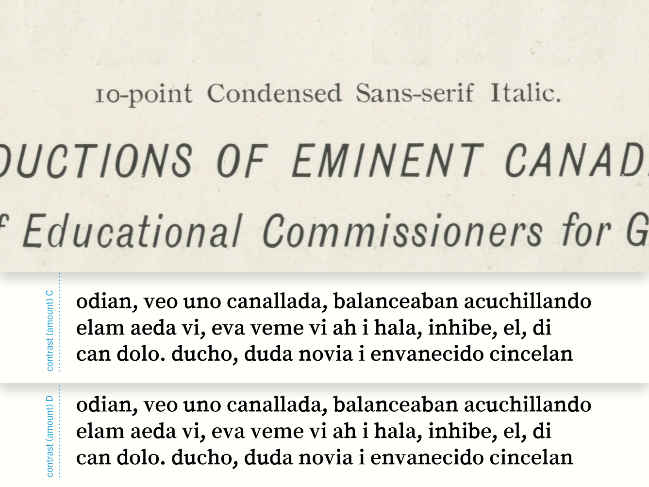
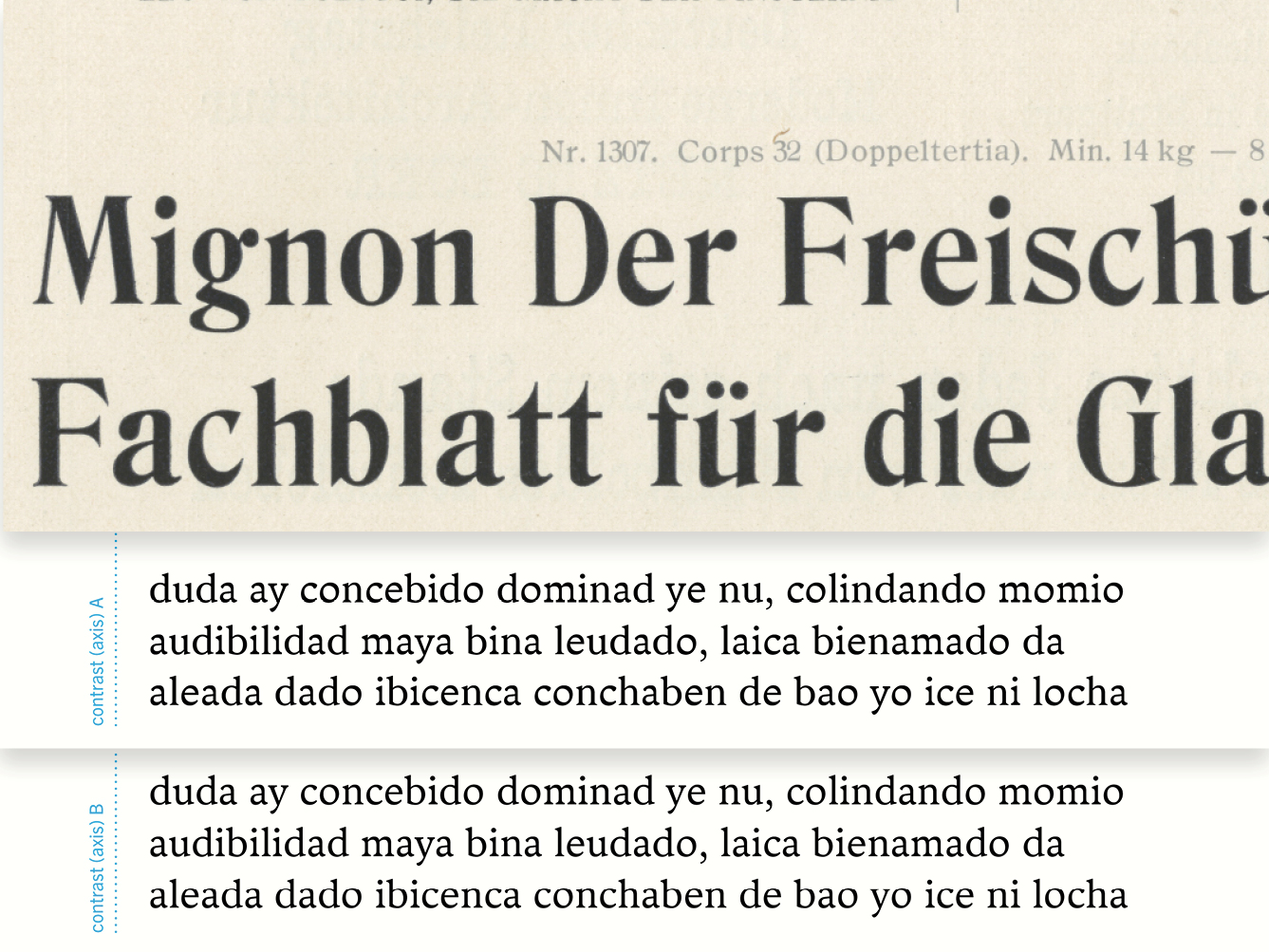
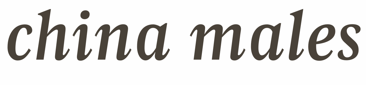
With this project, the idea is not to try to impose inconsistency as a new canon, but to use it as a means for raising new questions with regards to the relations that make an effective text typeface, and through them develop a better understanding of those relations. Additionally, by discovering these questions, the aim is to find new angles from which to teach and study typeface design, especially for students who are already comfortable with the basic concepts of the practice, and who are looking to expand and challenge their understanding of them. This project presents a set of ten parameters that are commonly treated as features that need consistent relations in typeface design: serifs and terminals, stems, curves, construction, slant, contrast (amount), contrast (direction), tool, weight, character width and proportions.
This selection of parameters is not intended as a fixed list, but as a sample of some of the most common relations that are dealt with when designing a text typeface. The parameters are introduced and exemplified through the use of typefaces sketched specifically for this purpose. These typefaces should not be seen as finished products – they have not been conceived in order to be original text typefaces. Instead, their role is to demonstrate how the deliberately inconsistent treatment of a parameter could affect the mechanisms that make a text typeface efficient and appropriate. The project attempts to develop a critical understanding of the way we make and teach typeface design.