Italicismes. From Aldine to oblique, italic forms in relation to the traditional family model
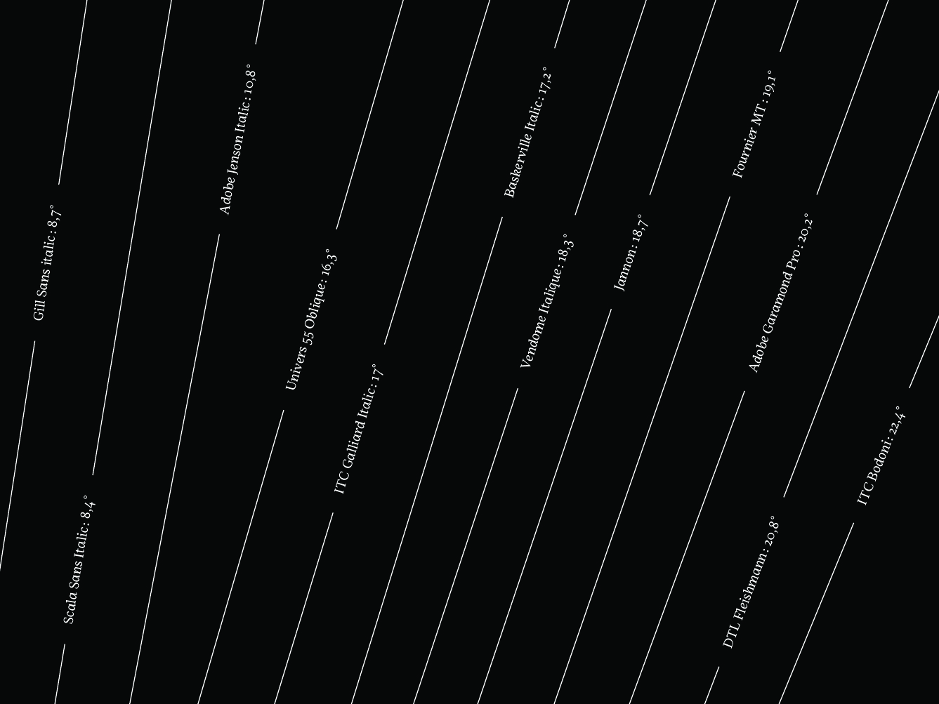
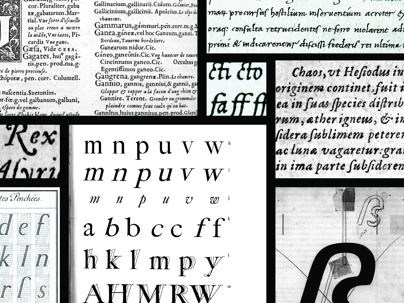
Lucas Descroix zoomIn the first few decades after the birth of printing in the Western world, several writing styles were developed, each of them inspired by one of the calligraphic models of the time. Amongst these, the fonts referred to as ‘italics’ first created in a Venetian printing shop, appear to be the first results of a proper type ‘design’, as a formal answer to a functional requirement – space saving, in that case. Nowadays, not a single text type family is released without the basic couple of a roman and its italic, the second one being designed according to the first and only sporadically used to distinguish some elements within the text. Between those two observations lie more than five centuries of evolution, refinement and questioning this side-kick’s appearance and status. Its characteristics are numerous and subtle, far from being as basic as a slant. The idea was to focus on the italic – or italics – in its relation to the roman and how the two of them became this strong family model, so strong it is now part of our habits and very rarely questioned. Why and when did the two models meet? And more than that, how did this strong relationship influence the look and structure of this typographic style born from humanistic calligraphy, sometimes to the point of removing all of its original cursivity?
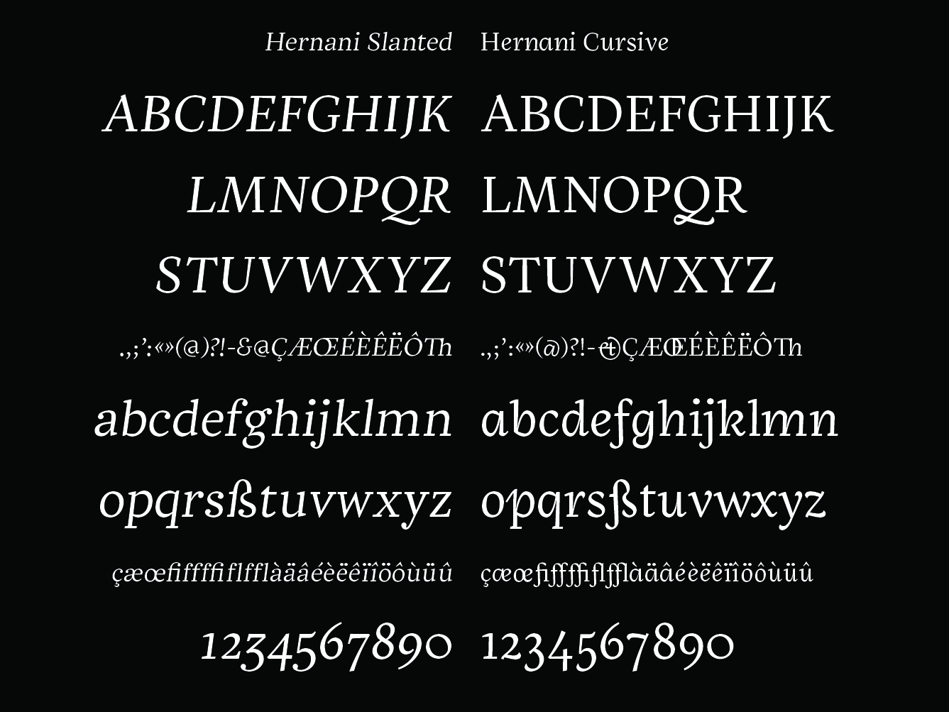
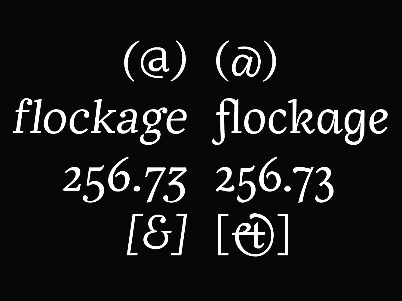
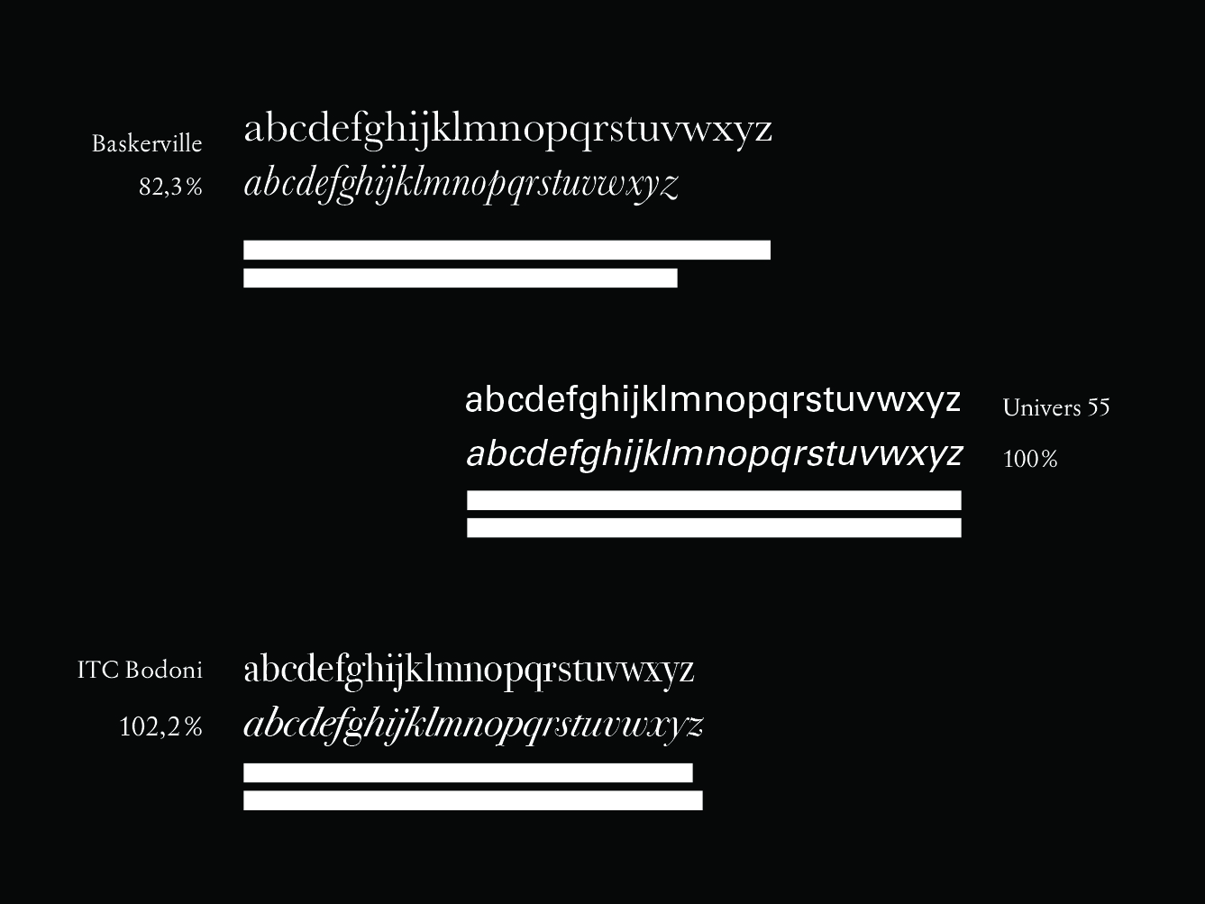
The Hernani type family was designed to question the coexistence of styles not only as a form of hierarchy but as a reading experience. Italic’s two main characteristics – slant and cusivity – are explored and confronted, creating a different layer of speech, drawing the outlines of our codes and habits to form unexpected links.