Paideuma
Mário Vinícius zoomModernity in Brazil in a typeface.
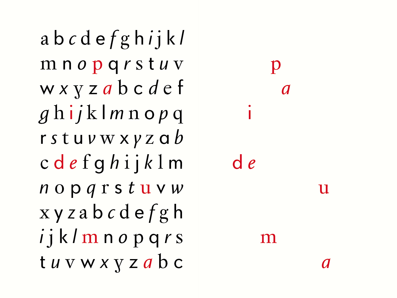
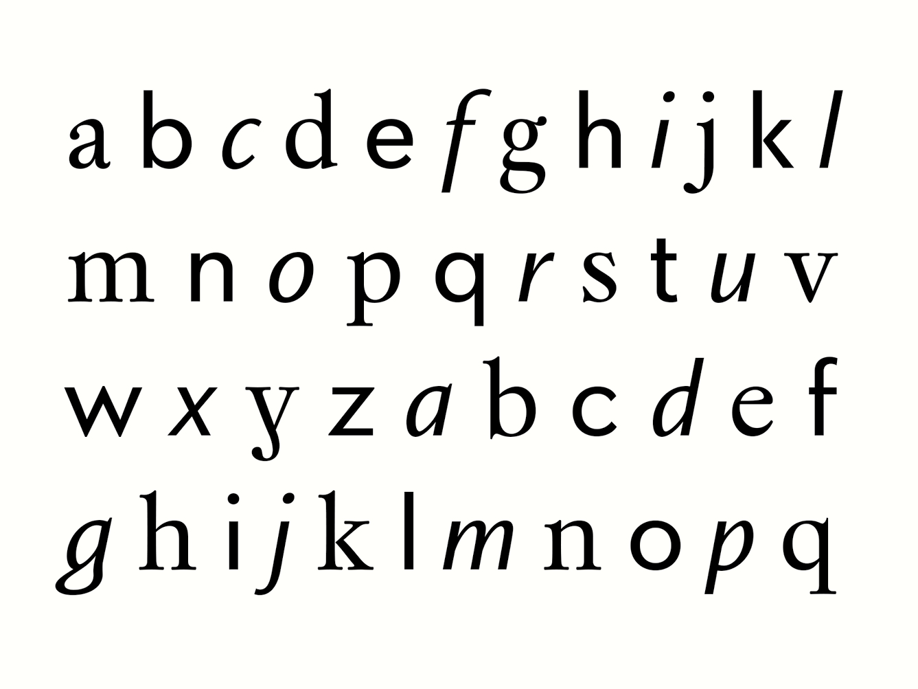
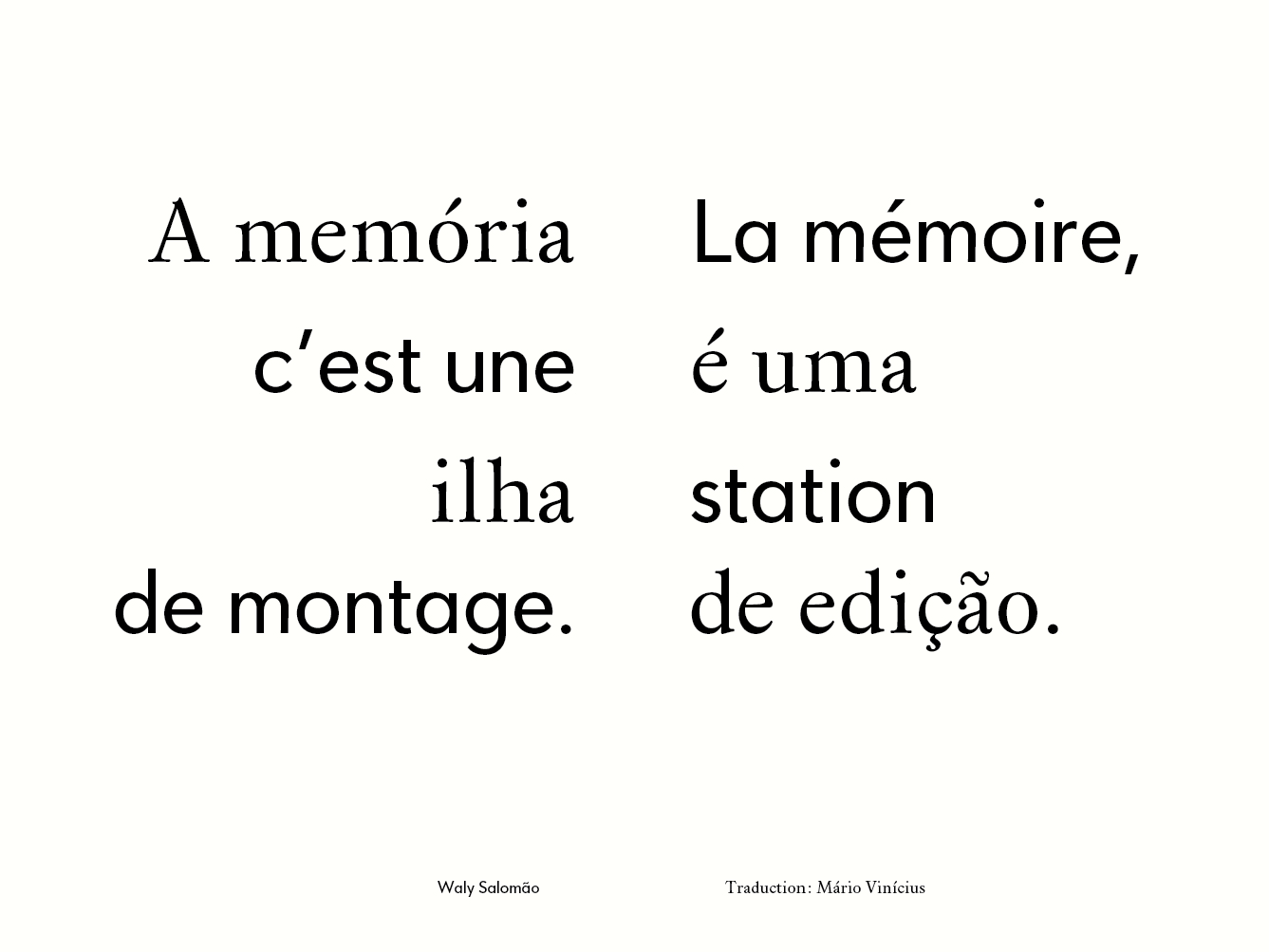
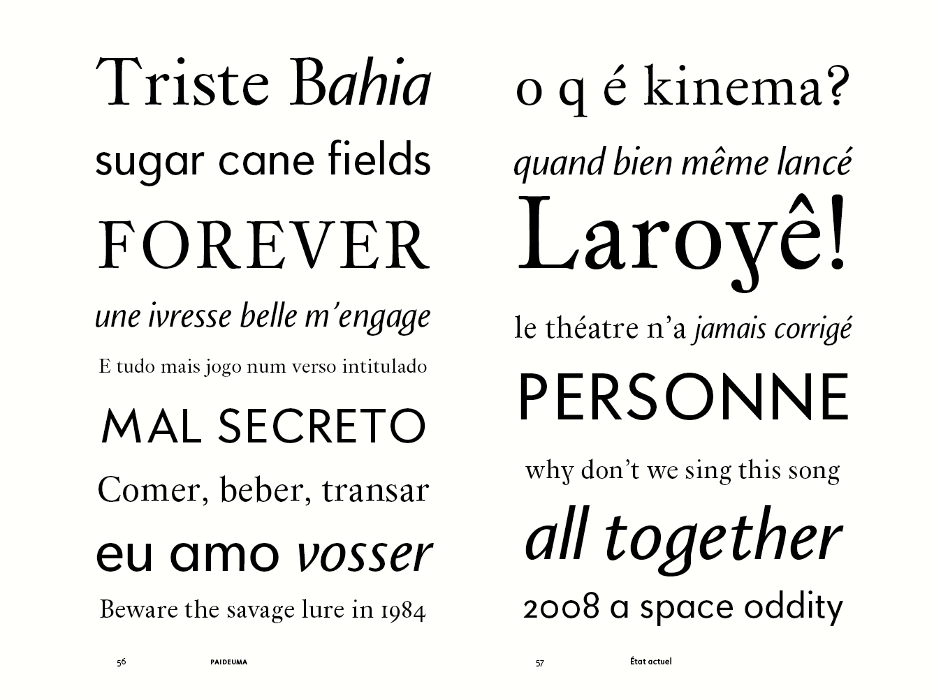
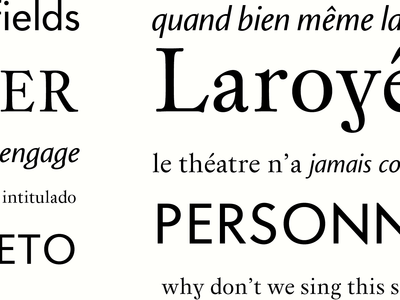
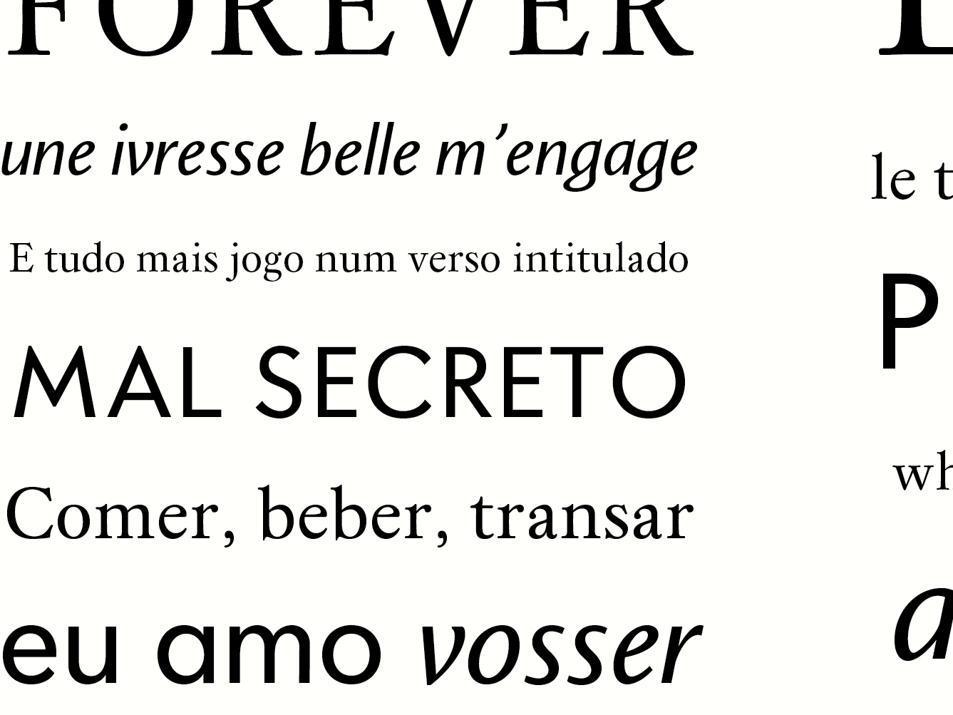
Paideuma is a typeface family that attempts to translate, through typeface design, the evolution of modernity in Brazil, from the colonial period to the second half of the twentieth century. Every person has its paideuma, that is to say, its original faculty and manner of being touched: of being seized. However, the artist – dancer, sculptor, poet – is not content to relive the Other; he recreates it in order to better live it and make it live. He recreates it through rhythm and, as doing so, creates a higher reality, more truthful, i.e. more real than the factual reality. Good typography demands not only the knowledge of type itself, but an understanding of the relationship between letterforms and the other things that humans make and do. Typographic history is just that: the study of relationships between type designs and the rest of human activity – politics, philosophy, the arts, and the history of ideas. Paideuma is declined in three formal and historical variants, related to different periods of Brazilian arts and literature: seventeenth century Baroque; Concretism, Brazil’s post-Second World War particular take on Constructivism; and Tropicalia, a syncretic multimedia movement that shook up Brazilian moral and aesthetic conventions in the late 1960s. The genre, which is becoming one, like the symphony, little by little, alongside personal poetry, leaves intact the older verse; for which I maintain my worship, and to which I attribute the empire of passion and dreams, though this may be the preferred means (as follows) of dealing with subjects of pure and complex imagination or intellect: which there is no remaining justification for excluding from Poetry – the unique source. The Baroque typeface is a serif design inspired by European types from the same period, while the Concretist typeface is a geometric sans. In keeping with Tropicalia’s syncretism, its associated typeface is a hybrid italic that can be used in combination with the two other designs. From the theoretical point of view, in addition to the evocation of the idea of paideuma, the design of each style of the typeface family was guided by a specific approach.
In his article “Call it what it is”, typeface designer John Downer defines some among the many manners of approaching typeface creation from existing models. Building on this typology, the approaches linked to each style from Paideuma are historical fiction, associated to the baroque typeface, and anthology, associated to the concretist typeface. The tropicalist typeface, on the other hand, does not find its niche in the range of Downer’s definitions. The corresponding approach to its creation is syncretism. Certainly, one must highlight that these approaches do not exclude each other. The syncretistic spirit itself that emanate from the idea of paideuma demands that the reliance on these definitions must be flexible, liable to entail interpenetration among the different approaches behind each typeface. Formally, even though each style should also work individually, the design of the whole family has to be coherent in spite of its internal diversity, so as the different styles may harmonize when used together. While each style consists in a coherent option to typeset content linked to the periods and movements that served as an inspiration, Paideuma is equally suitable to answer the needs and perspectives of contemporary literary typesetting. Its multiple forms and the combination of three styles, in which a single italic links two styles a priori distanced one from each other, offers a strong expressive potential.