The signs on the wall
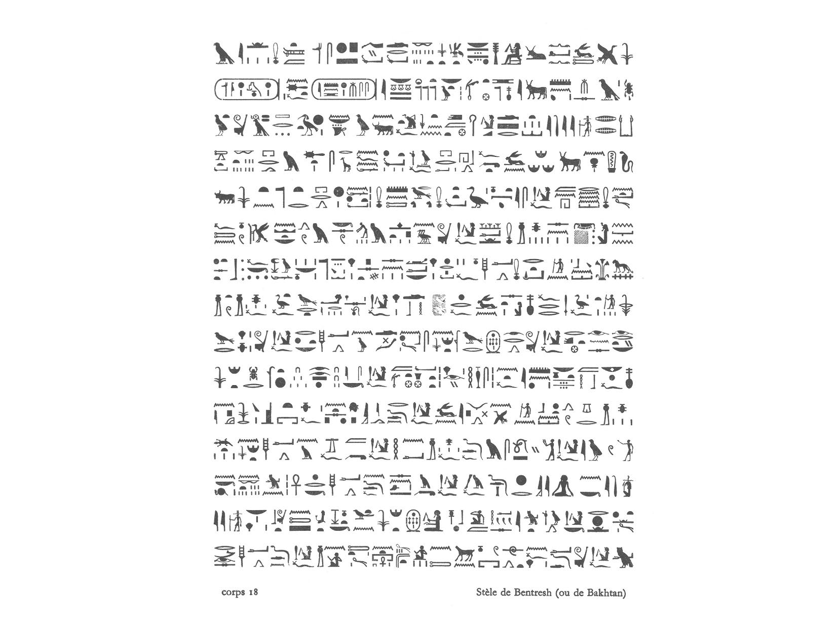
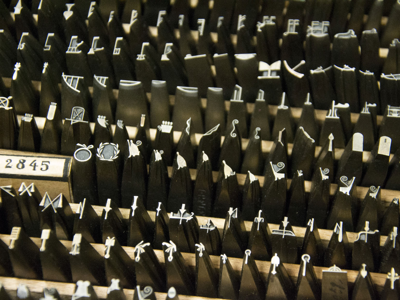
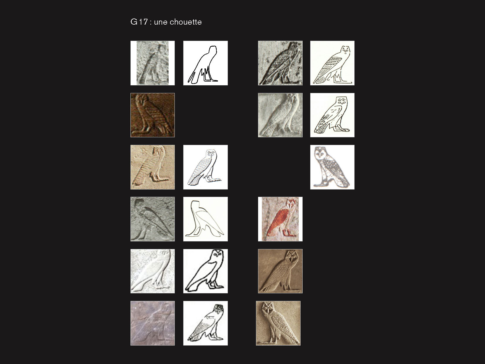
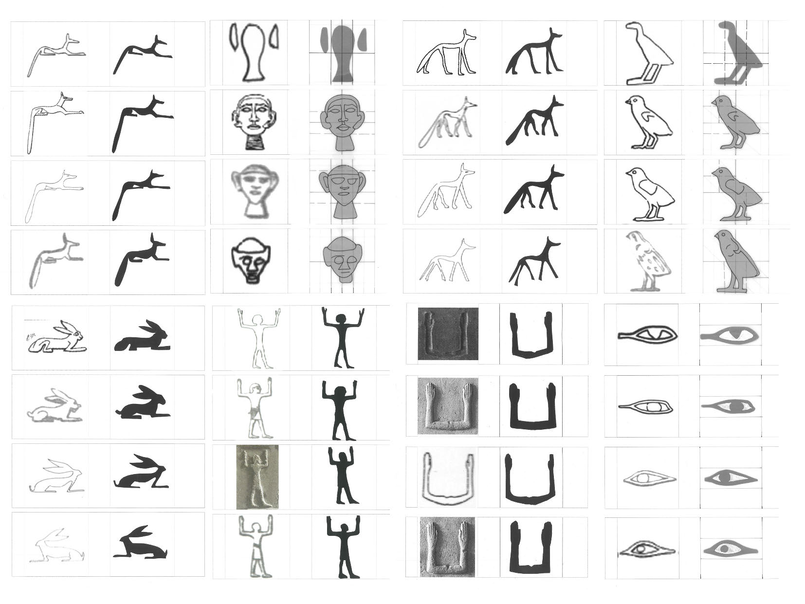
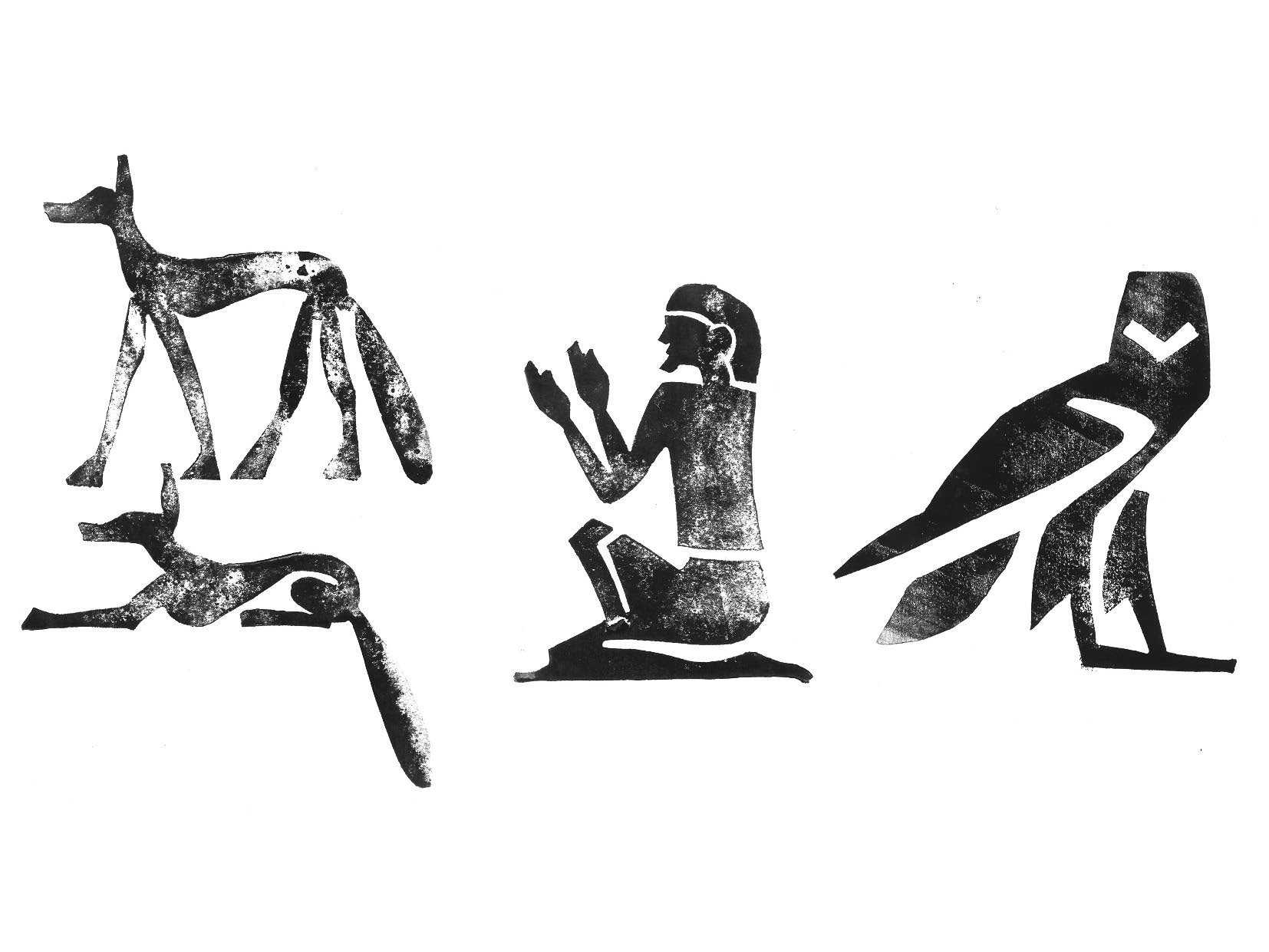
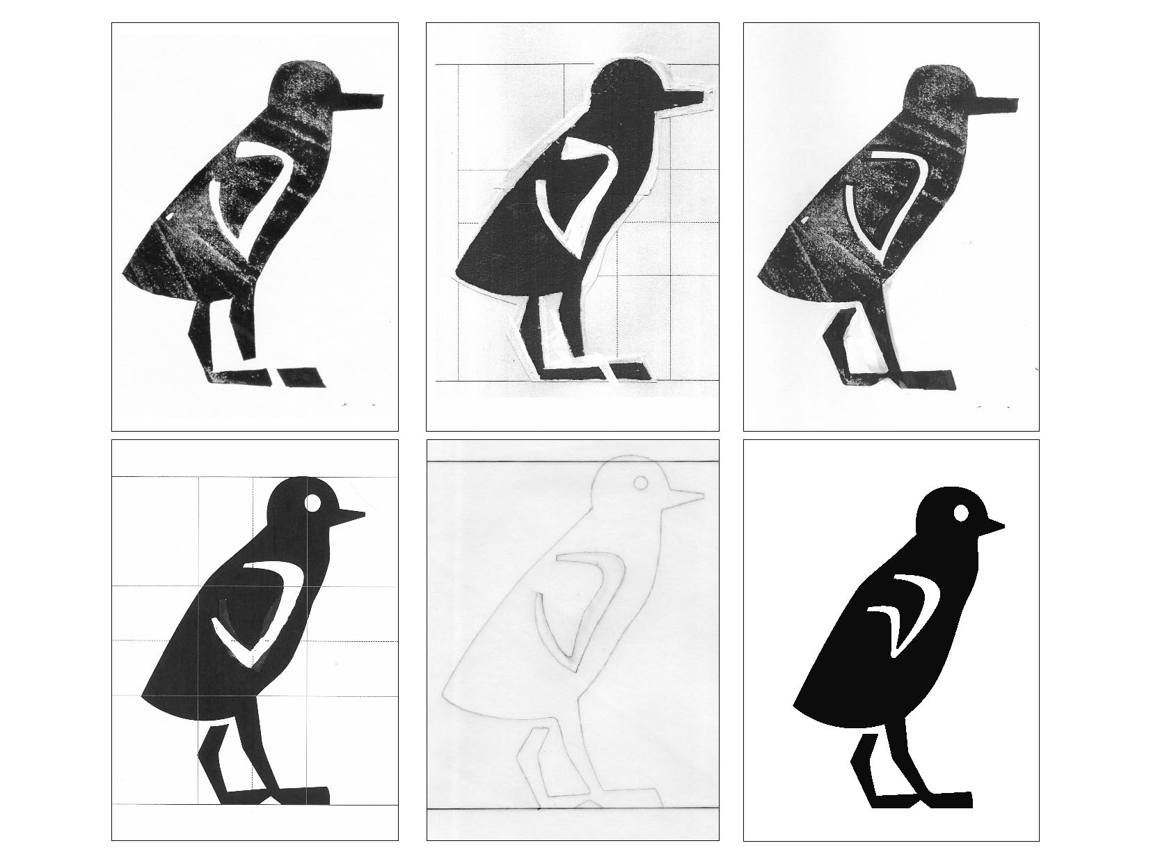
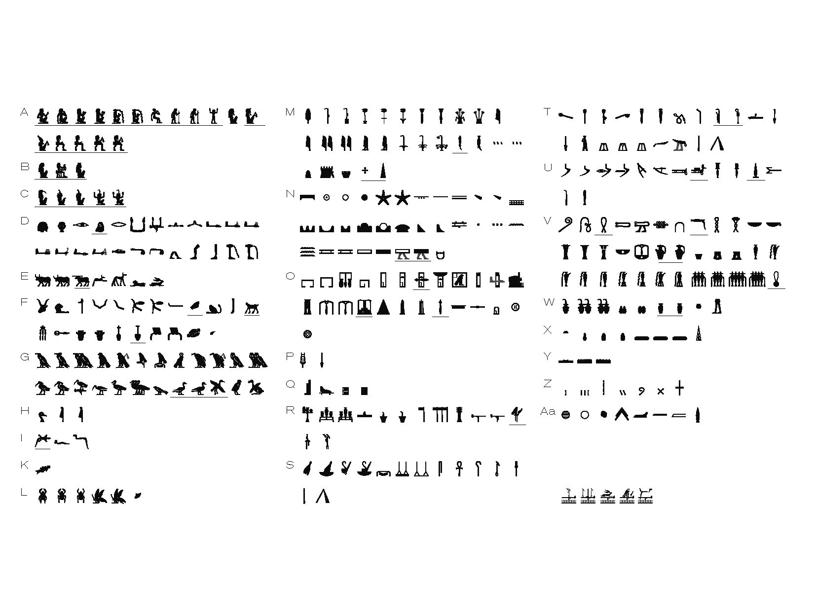
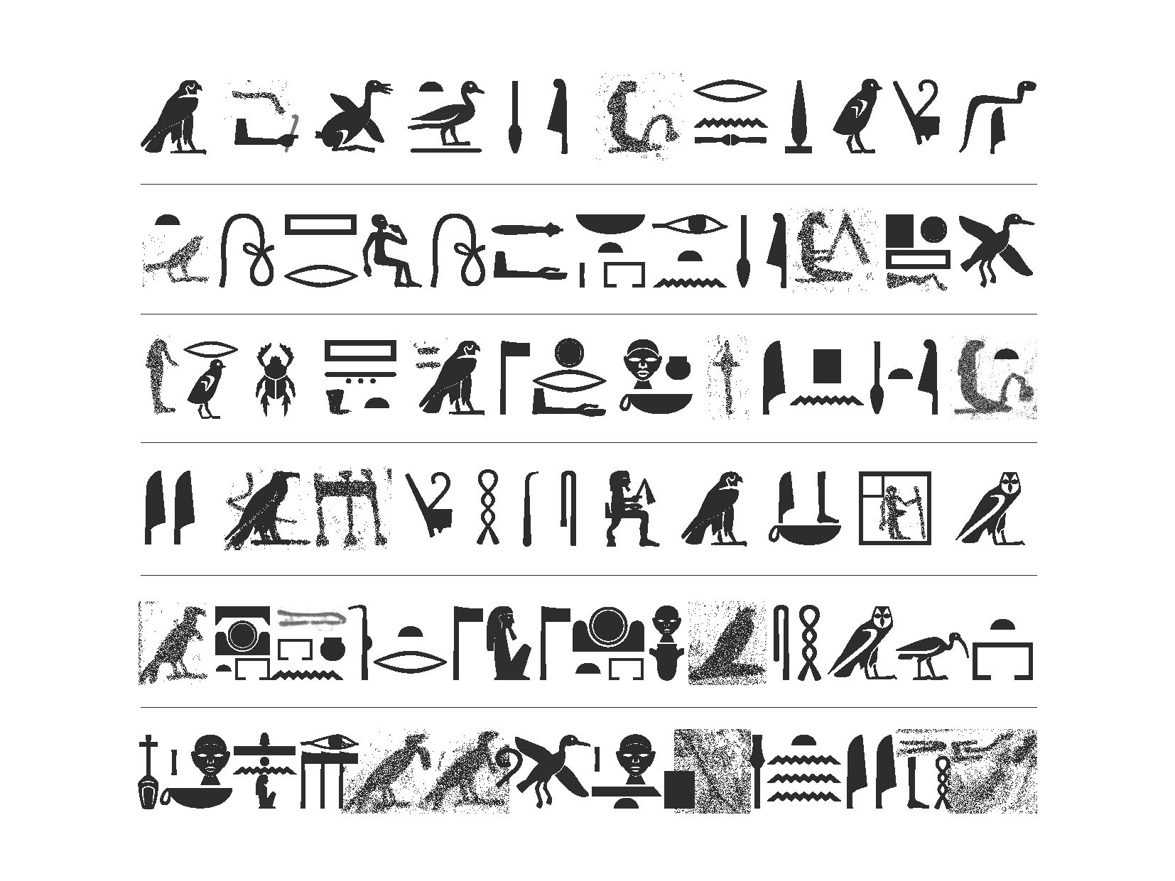
Pierre Fournier zoomThe hieroglyphic font I am currently designing is to be used for transcribing hieroglyphic texts, without distinction of period or geographic area. To give a shape to the hieroglyphs of the Vocabulaire de l’Égyptien Ancien (VÉgA) I had to set up a process to design glyphs that synthesise several epigraphic sources. A hieroglyphic font based on epigraphic sources may be used for the publication of scientific studies, communication between researchers or as a tool for learning the language.
Typography is a tool taking part in a succession of codes used to translate the hieroglyphic text in a form we can understand: photographs-facsimile / typographique transcription / transliteration / translation. By studying scientific publications, I observed that hieroglyphic fonts are used to refer to another state of the text (facsimile or photograph), and don’t have to support the semantic aspect of hieroglyphs, which is very important in the interpretation of hieroglyphic texts: the font is used to refer to another document, so the sign acts as a referral. This function involves that the shape of the glyph has to be different from the shape of the epigraphic sources the glyph is based on, in order to not be too close from a specific period of the script. Moreover, this function justifies that I had to determine the structure and the proportion of a glyph by the synthesis of several sources. There goes a triangulation between the original shape, the shape noted by academics, and the normalised typographic version I am working on, conferring a scientific veracity to the system I established. At the end of this process, the glyphs are submitted to the egyptologists for approval. For the creation of the font, I conceived a typographic template, a structure with its own logic within a coherent typographic system: the font doesn’t refer to any epigraphic source in particular. As a designer, my role involves to judge of the most appropriate way to translate a form that was produced several millenia ago.