Typeface for monetary inscriptions
Elvire Volk Leonovitch zoomEn collaboration avec le Département des monnaies, médailles et antiques de la Bibliothèque nationale de France (BnF), l’Institut de recherche sur les Archéomatériaux (IRAMAT) et le Centre d’Études Supérieures de Civilisation Médiévale (CESCM), dans le cadre du plan triennal de la recherche 2013–2015 de la BnF
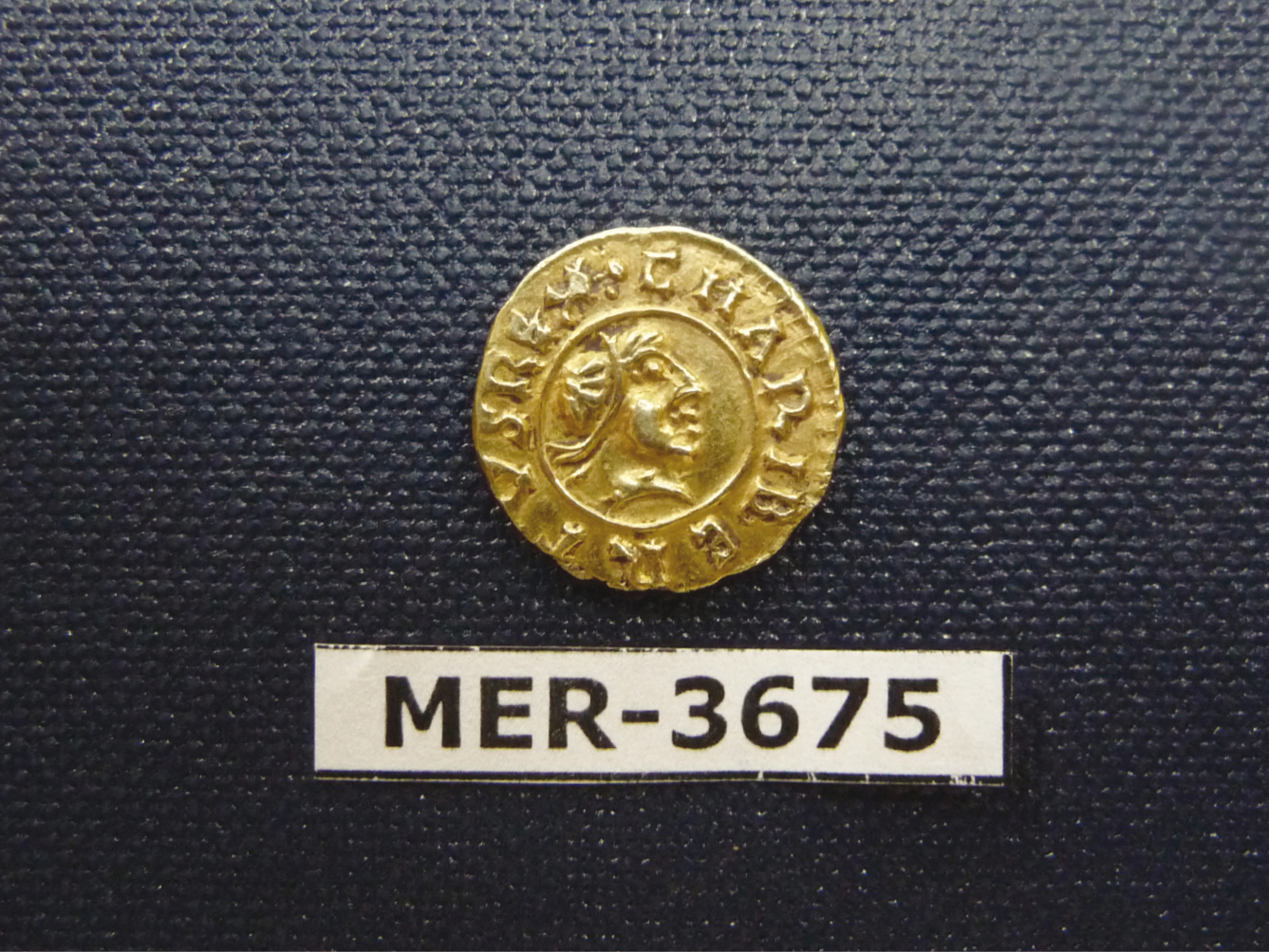
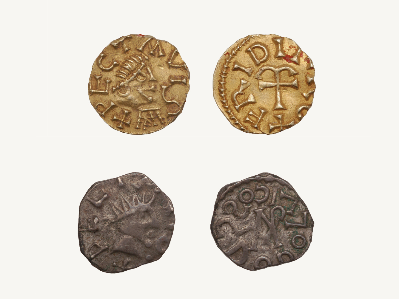
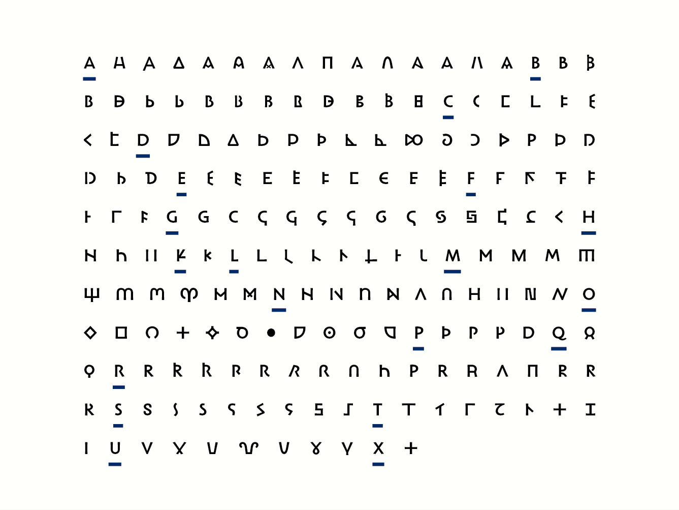
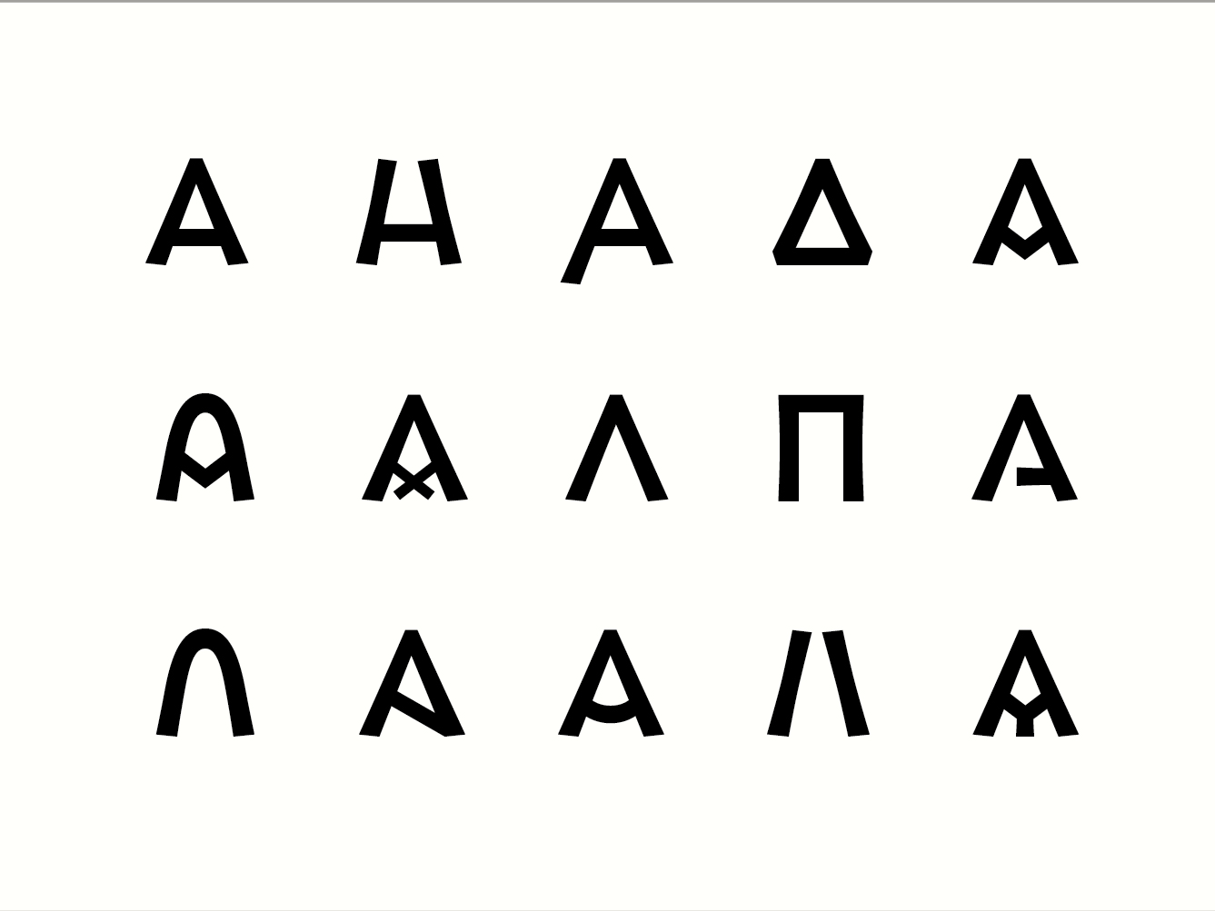
The PIM research project (Font for Monetary Inscriptions) initiated by Florence Codine, curator in charge of the Merovingian coins at the department of coins, medals and antiques from the National Library of France (BnF), aims at producing a tool suitable for transcribing the information contained on monetary inscriptions, beyond their semantic content. When studying a coin, the textual information it carries provide many clues regarding its origin. But the graphic features of the inscription (structure, weight, terminals, …) also provide valuable information. Unfortunately, there is currently no digital font capable of fully rendering these specificities.
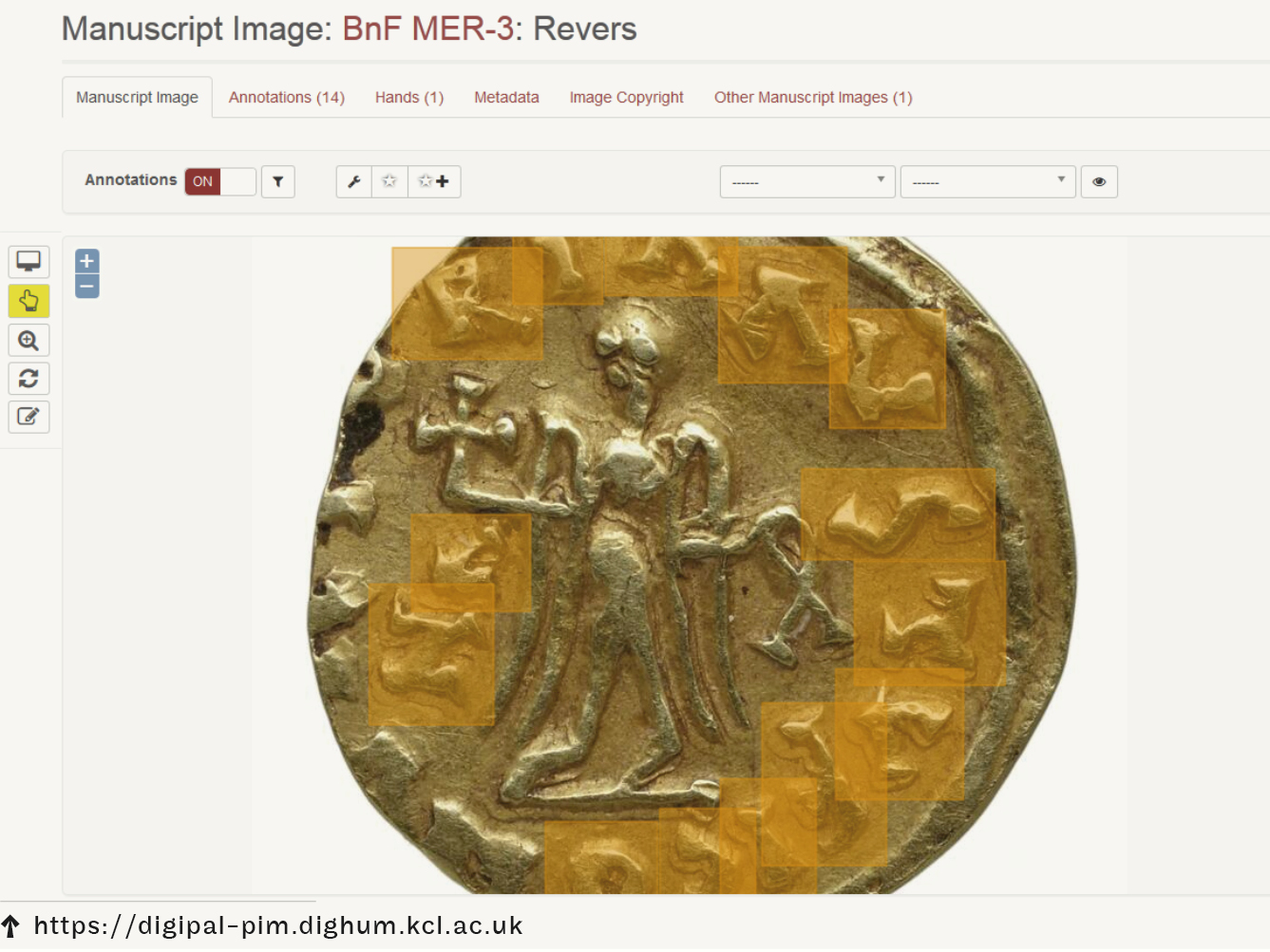
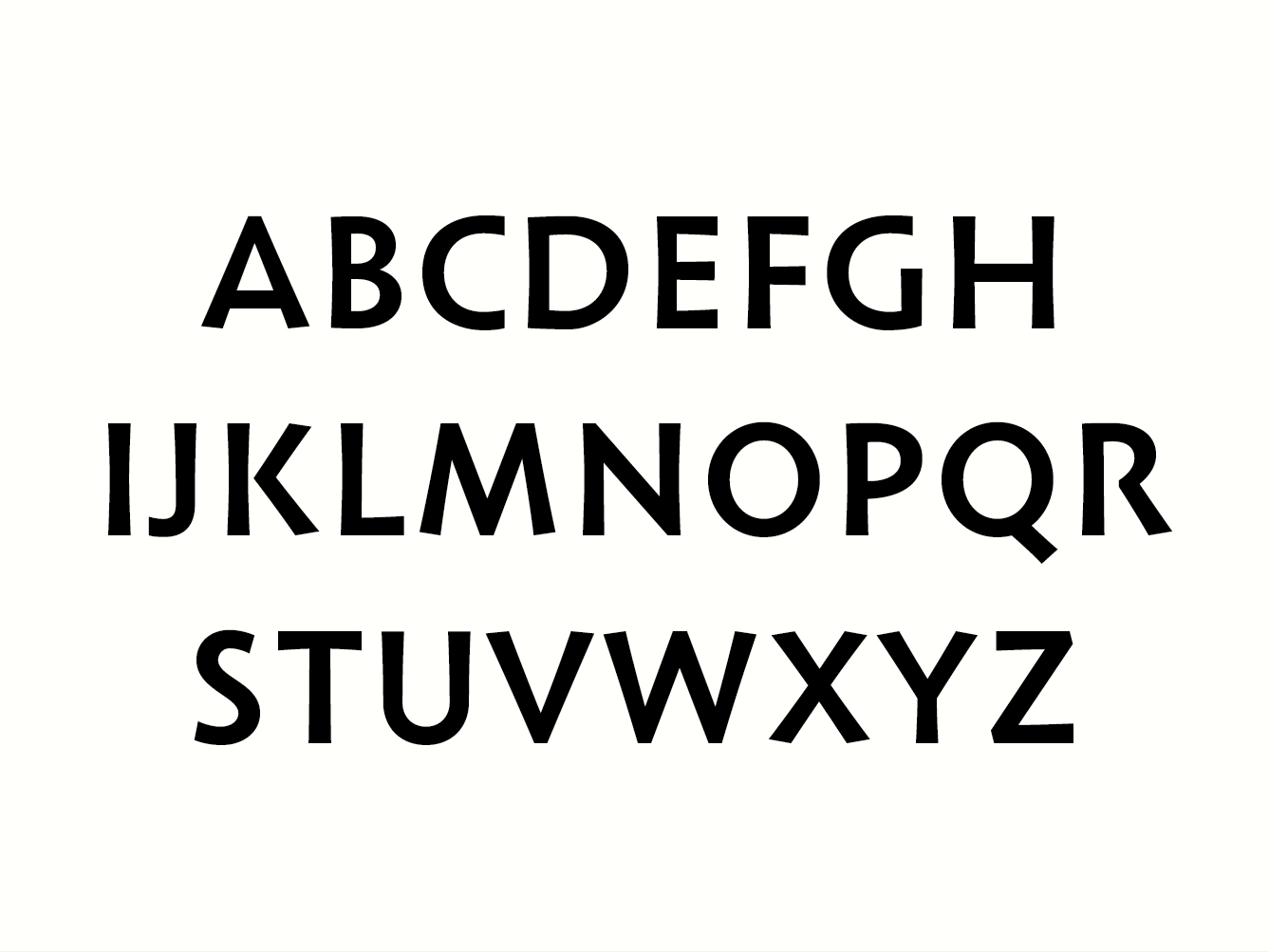
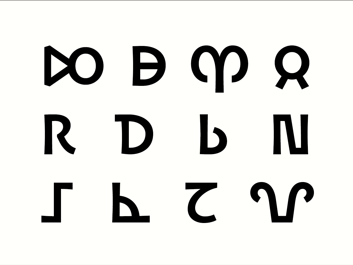
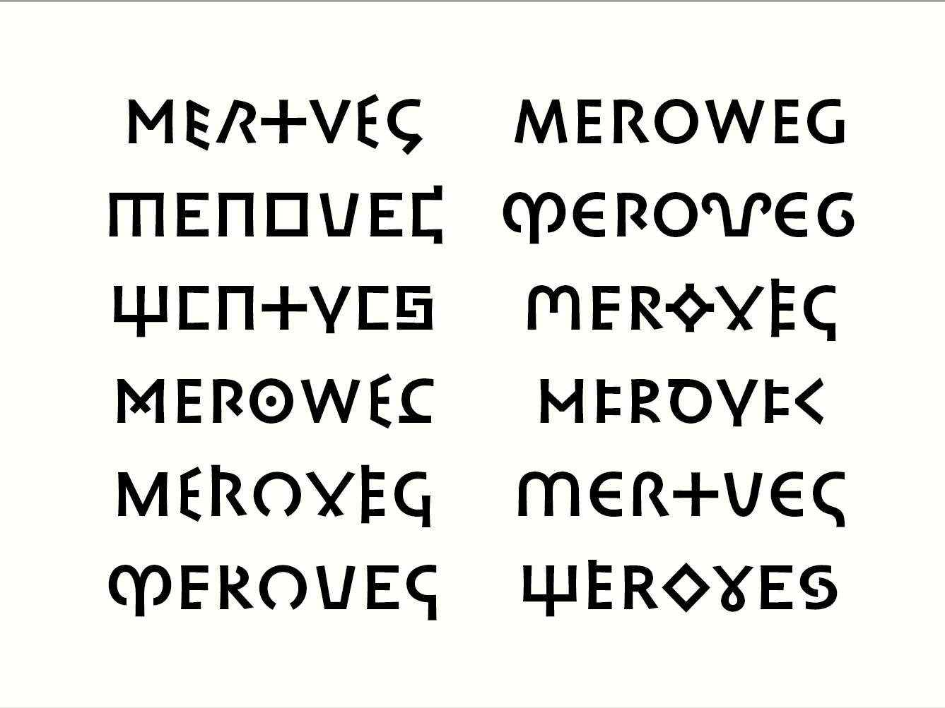
Therefore, a partnership between the BnF and ANRT has been set up with a view to develop a typeface that brings together, in a unified form, all identified stylistic variants. Based on the classification of the letters found on these coins, which was conducted by a team of researchers, it was possible to deduce an accurate and relevant interpretation of the various letterforms. This step questioned the level of information that should be represented by the glyph. Which details belong to the structure? How could endings or thickness of stroke appear, and should they appear? Where should the line be drawn between interpretation and transcription of the sign? Throughout this first stage of work, it was necessary to keep in mind the graphic unity of the typeface. This led to a reflection on the coherence of the letterforms within the font. How can glyphs, whose structure and appearance vary greatly, work together? Up to which point can the shapes be standardized, while remaining compatible with the project’s aim? Composed mainly of capital letters, the typeface, whose primary use would be for scientific publications, questions the readability and identification of each glyph independently of the others within a text.
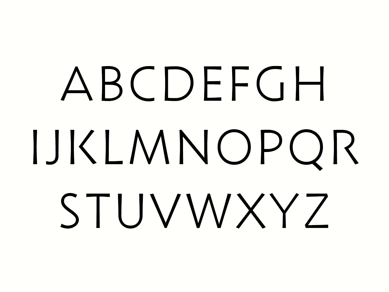
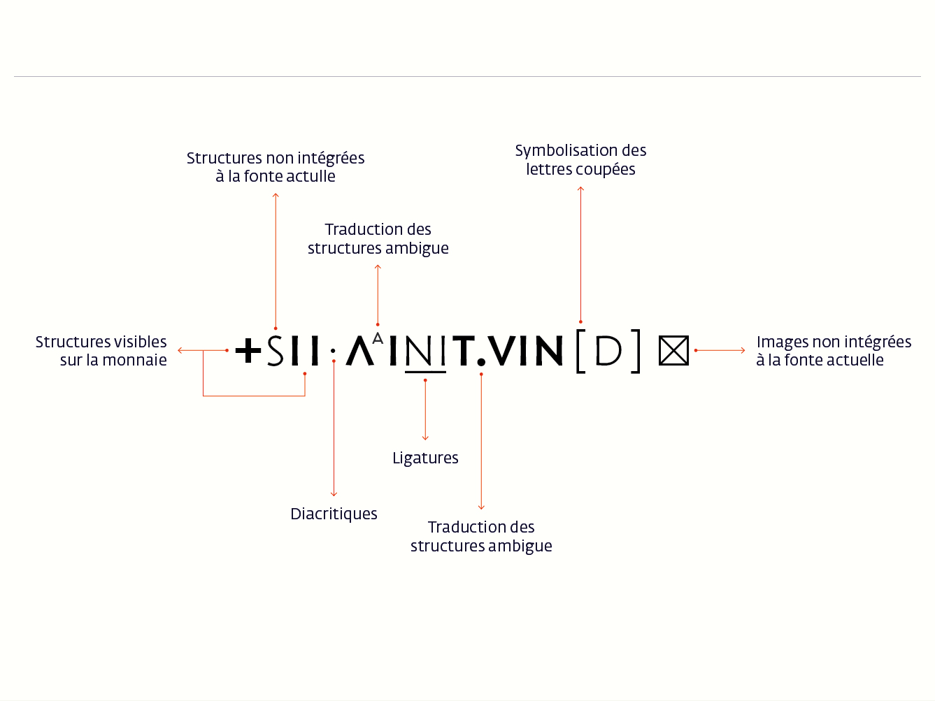
Currently, the Meroweg typeface is designed without serifs to emphasize the multiple letter structures. It is designed with a fairly heavy weight and a very low contrast, to distinguish it from other text typefaces that might be used to set the text around it. Lighter variants of the letters are also integrated to the font, to mark the missing structures, ligatures and damaged letters… The aim is to expand the character set further.
