Visiting the Text
Pierre Fave zoomThis project examines how a letter exists in space and how it transforms when it leaves the page to inhabit a physical environment.
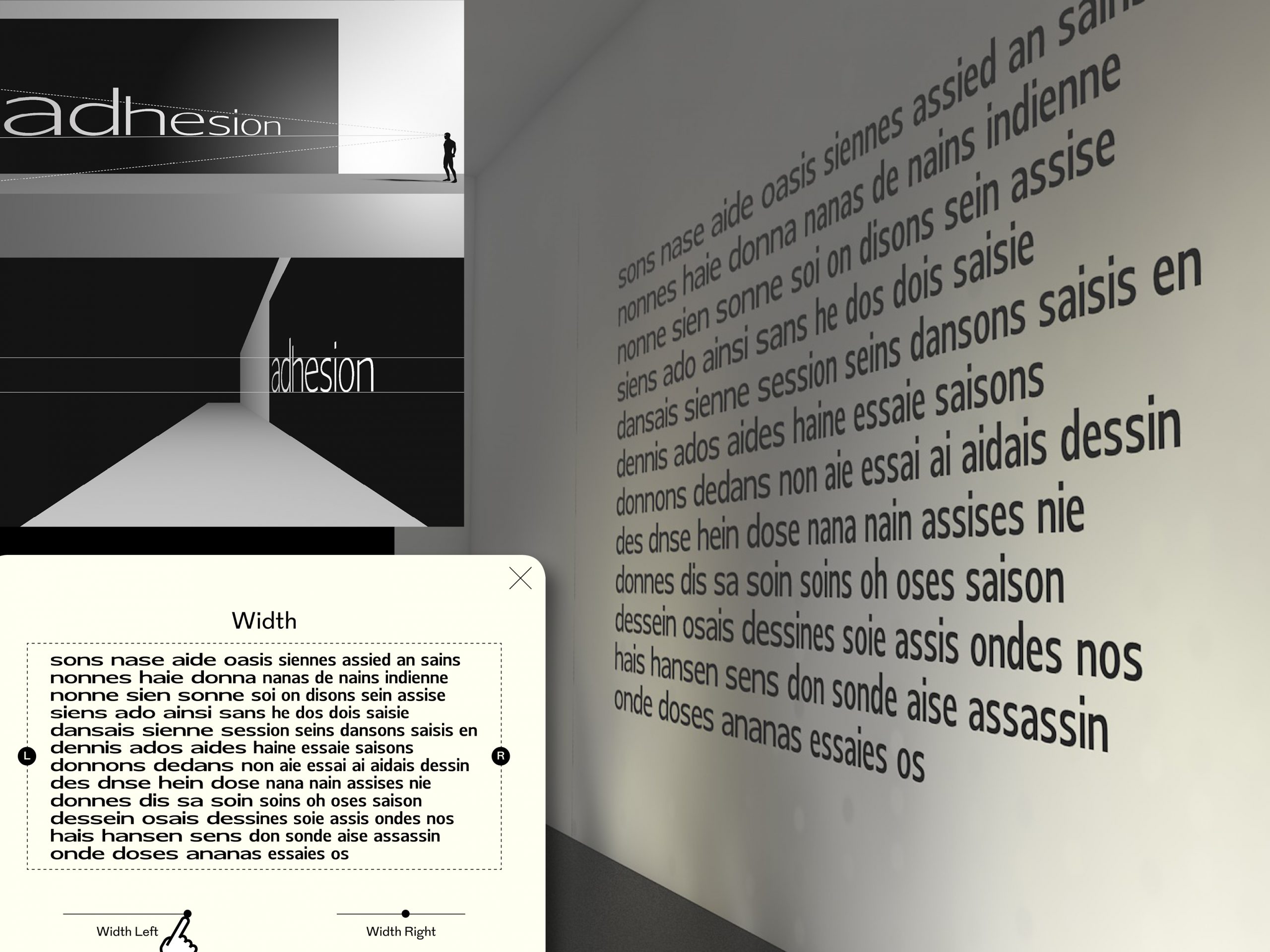
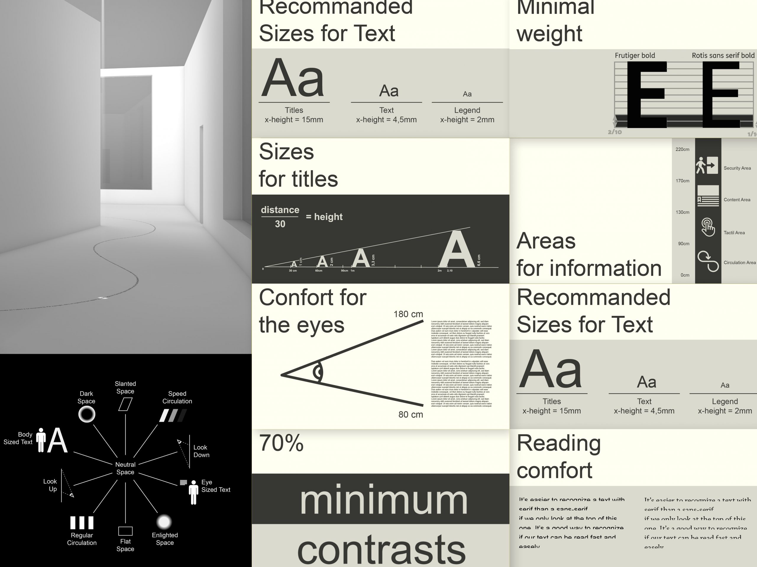
Initially focused on designing a variable typeface for augmented reality within a museum context, the research developed around a set of constraints related to reading in motion: viewing distance, angle, lighting variations, and text registers. This first phase helped define a typographic design space capable of automatically adjusting its form according to the visitor’s experience, making the text more accessible and more responsive.
The shift of the project toward the public realm then opened a more expressive field. The study moved away from strict legibility standards toward exposed lettering: nineteenth-century monumental posters, wood type, sign-painting, and New York graffiti. These practices—where a letter is conceived as a visual presence before being a linguistic sign—fed the creation of a typeface grounded in the iconic text-type forms of that period, particularly the principles of Benton Waldo’s self-spacing types and the shapes of nineteenth-century Ionic types. Both functional text faces and emblematic urban forms, these references guided the development toward heavy weights, compact monospaced versions, and distortions inspired by both Fat Faces and graffiti.
Through these back-and-forth movements between functional legibility and mural expressiveness, the project seeks to design a typeface capable of unfolding across scales, media, and contexts: a character that adapts, condenses, or stretches to inhabit space while making visible the optical mechanisms that condition its reading.
The project thus proposes a historical, technical, and expressive reflection on how the letter can become a fully spatial element, engaged in a continuous dialogue between architecture, perception, and movement.