Design and development of an extended phonetic typeface
Sarah Kremer zoomDesign and development of an extended phonetic typeface for the digitisation of the Französisches Etymologisches Wörterbuch by Walther von Wartburg. In collaboration with FEW/ATILF-CNRS (Analyse et traitement informatique de la langue française), Nancy.
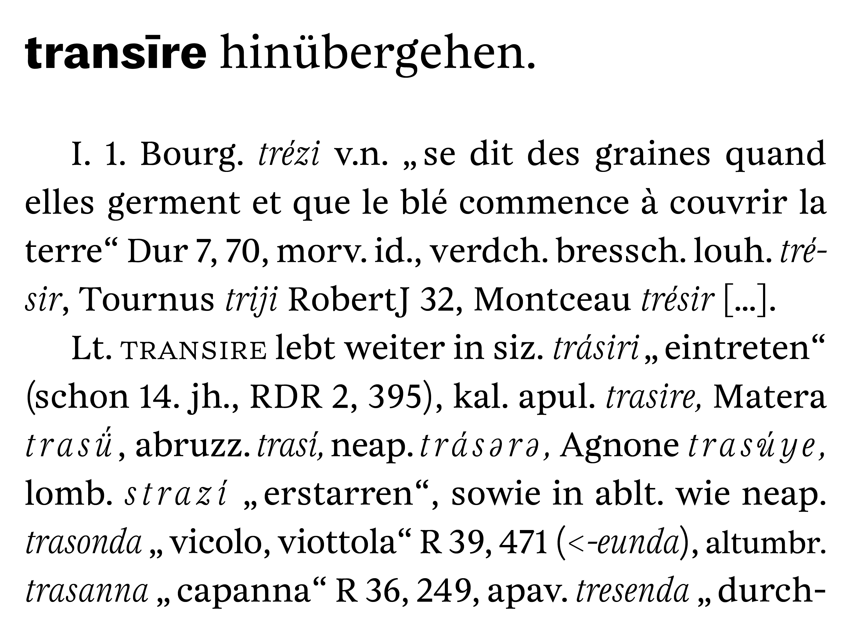
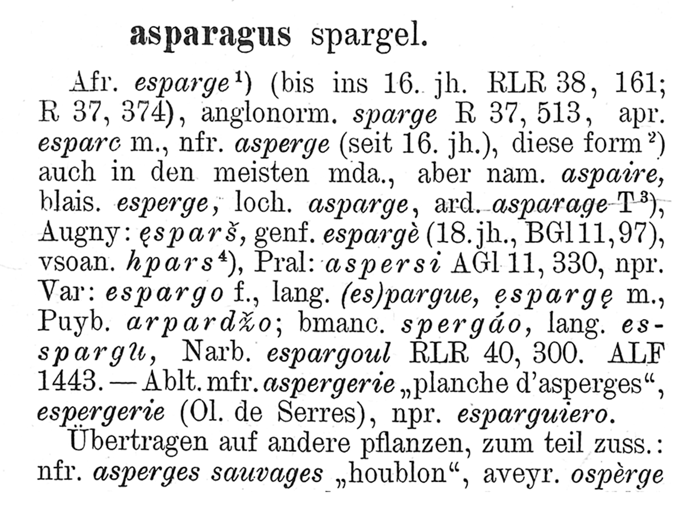
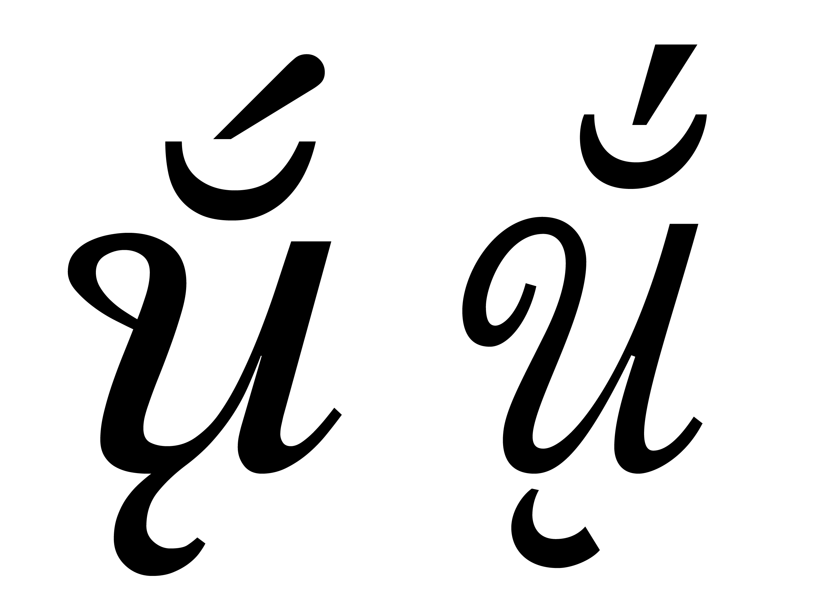
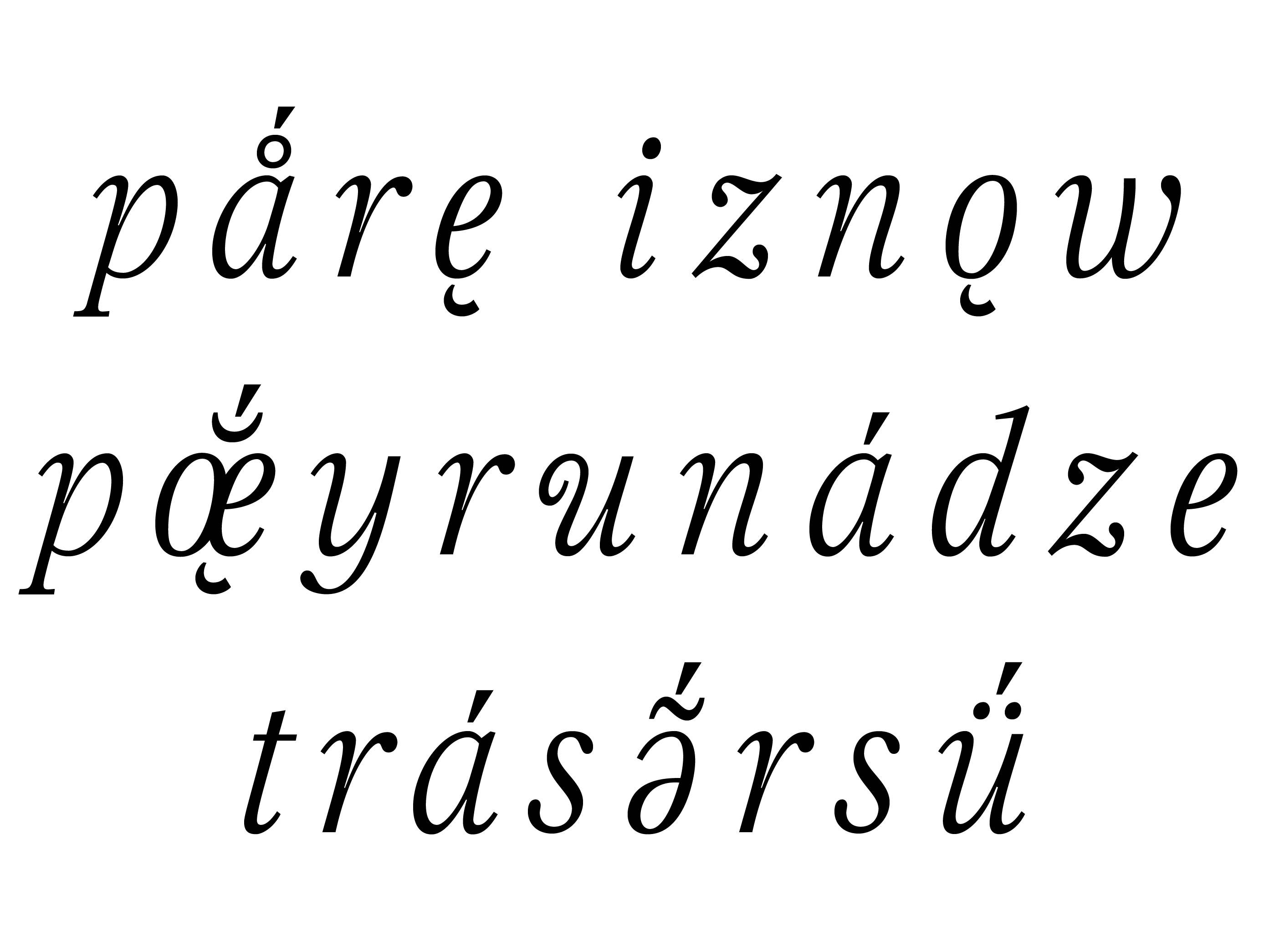
ATILF is a research laboratory based in Nancy that stores, operates and expands several historical dictionaries focused on French language. Among these dictionaries is the reference book for French linguistic: the Französisches Etymologisches Wörterbuch, also called the FEW. Initiated in the 1920s by the Swiss lexicographer and philologist Walther von Wartburg, it is subtitled A representation of the gallo-roman lexical treasure. In fact, it attempts to trace exhaustively the evolution of the genetic of Gallo-Romance languages through time and territories. Each article studies the history and evolution of an etymon. Its evolution is explained and all the words derived from it are listed. They are typeset in italicwith extra loose letter spacing if they are extracted from the oral language. To signify their pronunciation, Wartburg does not use the International Phonetic Alphabet but uses instead letters extracted from the Latin alphabet, completed with diacritical marks set above and below them. They are particularly suitable to the study of Romances languages and take their inspiration from Antiquity, Middle-Ages, or from notation systems conceived to transcribe living languages. Current fonts that include these specific notations do not respect the recommendations of the Unicode consortium. They make the typesetting and publishing process very complex and slow down the computerization of the dictionary.
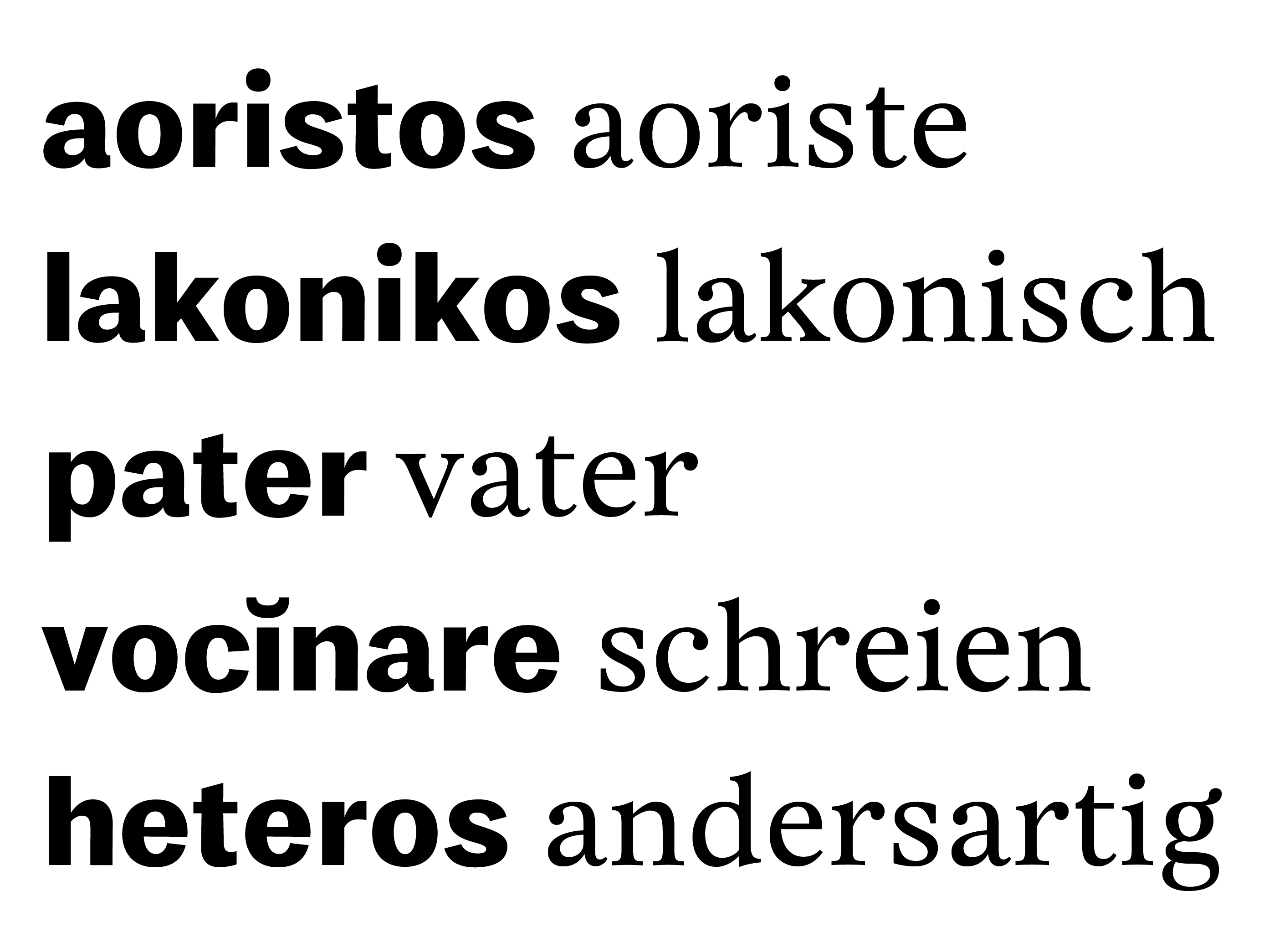
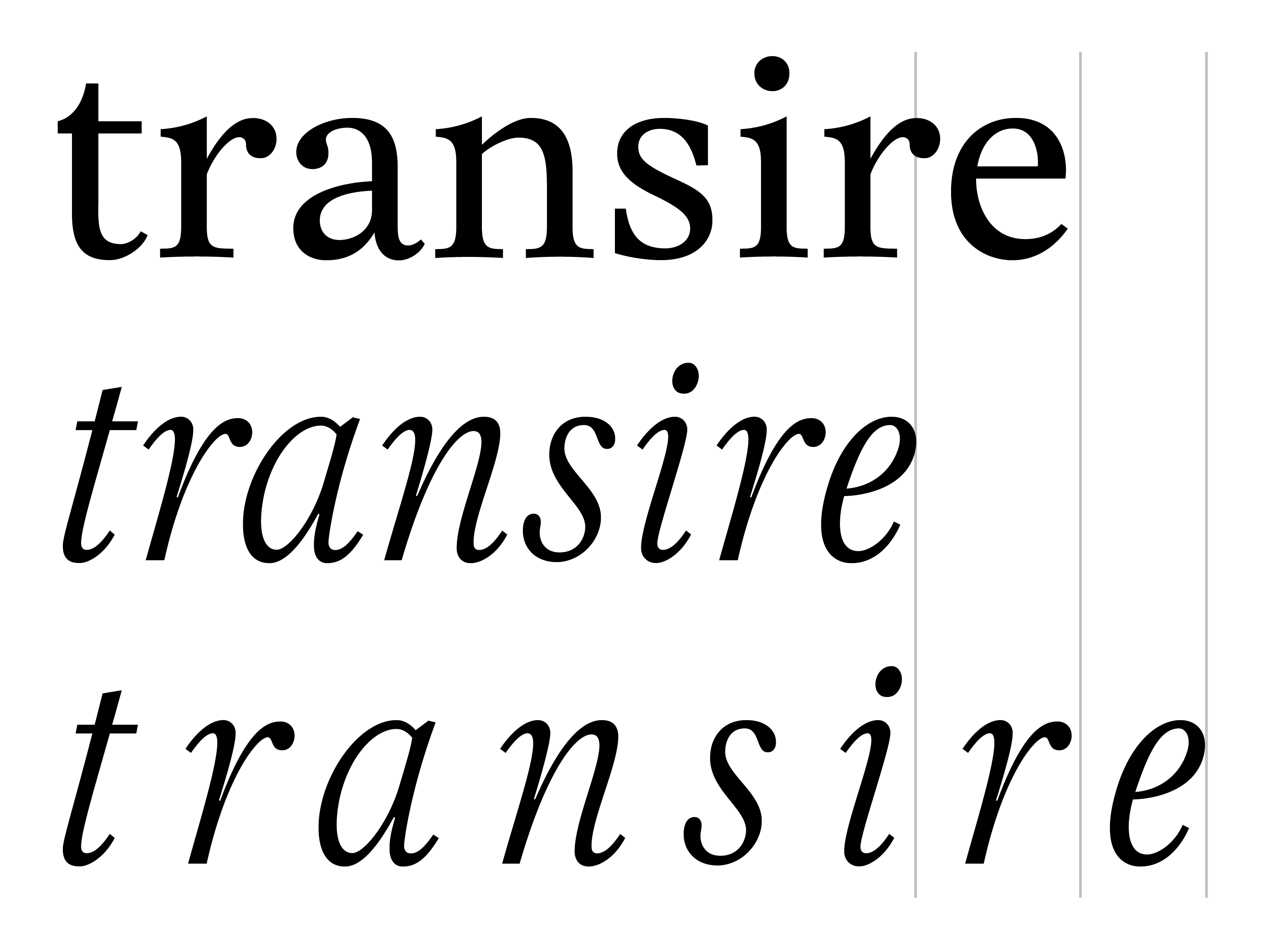
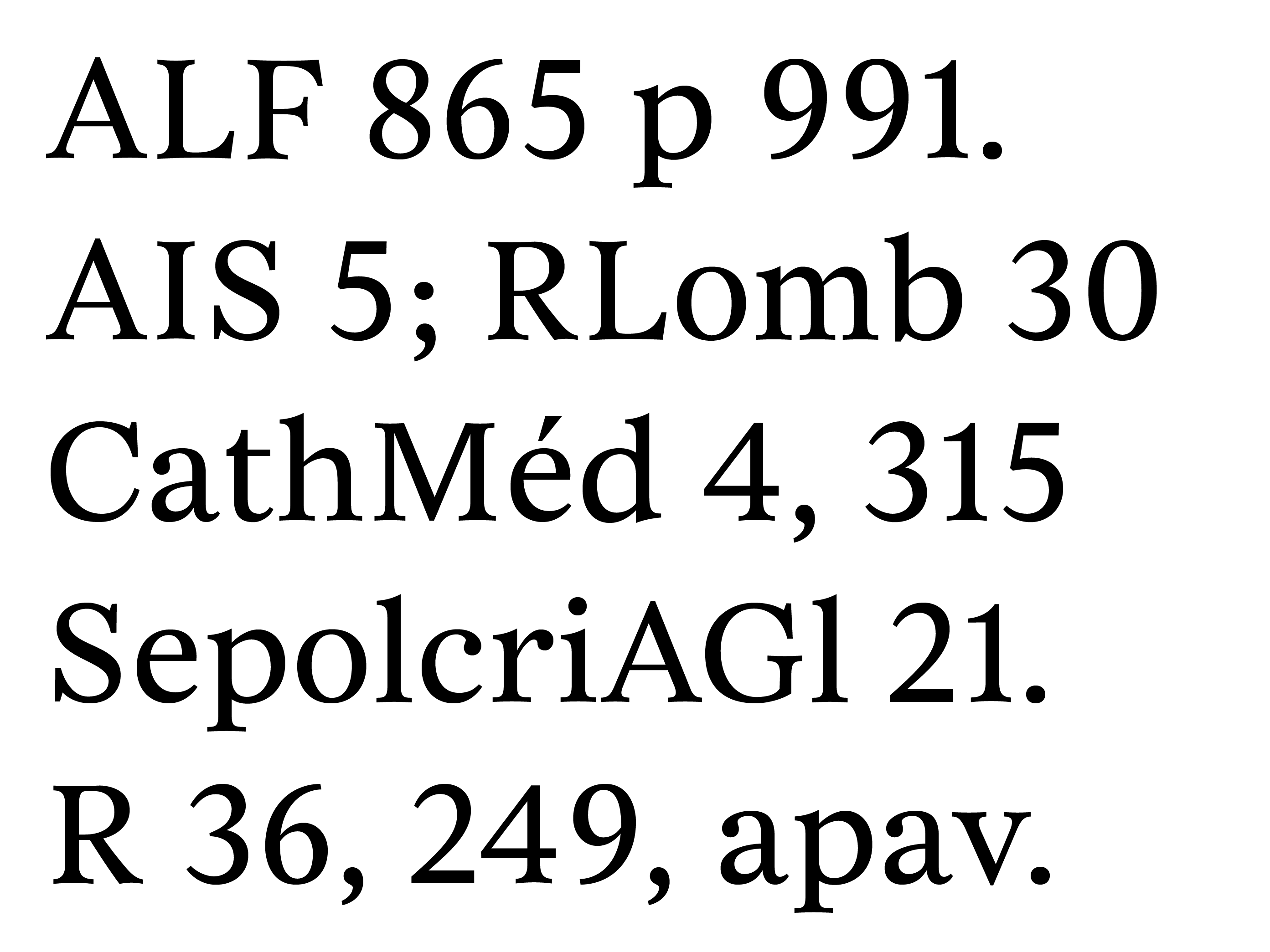
A partnership between the FEW Centre (which is part of ATILF) and ANRT was set up in order to conceive a series of new typefaces, as well as to redesign the printed version of the dictionary and to conceive its future electronic layout, all tailored to the FEW. The linearity of the articles is disrupted by the frequent use of capitals, figures and punctuation marks. The proportions of the roman typeface have been determined with the aim to minimize their impact. Increasing the horizontal proportions of the lowercase letters also enabled me to harmonize the rhythm of the text. I frequently wondered how much the silhouette of words set in italic should stand out, since their identification is really important. After several trials, it seemed interesting not to base my drawings on a strict skeleton that would have resulted in a uniform family, but to play instead on different kinds of structures and weights to help identifying the different parts of the article. The complex structure of the articles assigns to each typographic style a specific semantic function. Thus, the stylistic conventions have to be handled carefully. The stylistic autonomy of each typeface has been strengthened through regular communication with the team of linguists at ATILF. The beginning of each article is highlighted by a very bold typeface. The roman face used throughout the article sets in a much more discreet way the many bibliographical fields. The variants of the etymon, whether composed in italic or in roman small capitals, stand out from the rest of the text thanks to their light weight. The dictionary consultation schemes will be the next territories to invest.