From hand to hand.
The transmission of typeface design in France, 1979 – 2019
Published in Graphisme en France 2019: Typographie, transmission création variation. Publié par le Centre national des arts plastiques, april 2019.
“The same problem considered in terms of human generations; two dozen pairs of scrawny hands, some twenty five old men is enough to establish an uninterrupted contact between Hadrien and us.” Marguerite Yourcenar, Memoirs of Hadrian: And Reflections on the Composition of Memoirs of Hadrian, translated by Grace Frick, Penguin, 2000.
The remarkable vitality shown by typeface design in France today should be credited to the development and structuring of its teaching. This transmission, which was in the past assured by foundries, has progressively gained ground in art and design schools. This previously rare know-how, which had almost disappeared in France at the end of the 1970s, is today transmitted from hand to hand: without aiming for the far flung Antiquity evoked by Marguerite Yourcenar, this contribution looks back at the origins of this revival and at the role of a group of passers, students and teachers, who have allowed the thread to remain unbroken.
1979: French typography is moribund
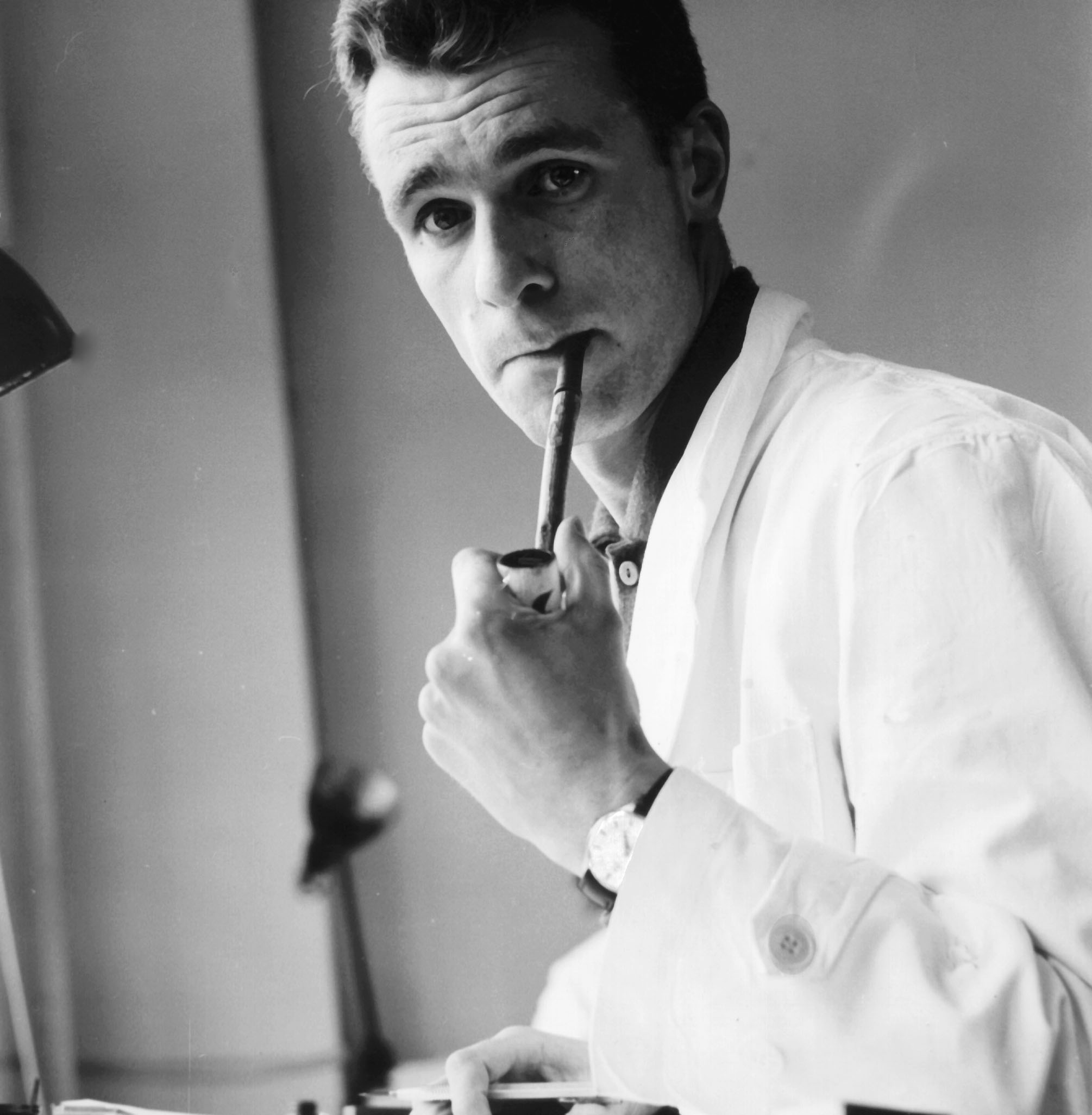
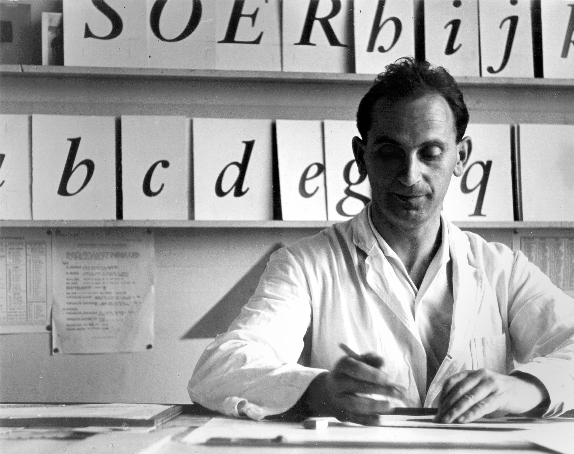
Albert Boton (left) and Ladislas Mandel (right) in the design studio of the Deberny & Peignot foundry, 1956. Personal collection.
French typography was on the point of disappearing at the end of the 1970s. This collapse was the result of a number of missed opportunities, the sources of which can be traced back to the beginning of the 20th century. Missed opportunities with mechanical typesetting, which gradually increased the gap between the French typographic industry and its foreign competitors, but also with Modernism, which would contribute to reinforcing the isolation (even isolationism) of French design with regard to the fresh impetus which blew across Europe between the two wars.
Paradoxically, the 1950s had been the scene of a spectacular upturn, with Charles Peignot’s ambitious commitment to phototypesetting, Adrian Frutiger’s emblematic designs for Deberny & Peignot, Roger Excoffon’s work for the Olive foundry, and even the arrival of new actors like Albert Hollenstein in the area of photo-lettering. An upturn that came as a kind of swan song: in the 1970s the main French type foundries would close their doors.
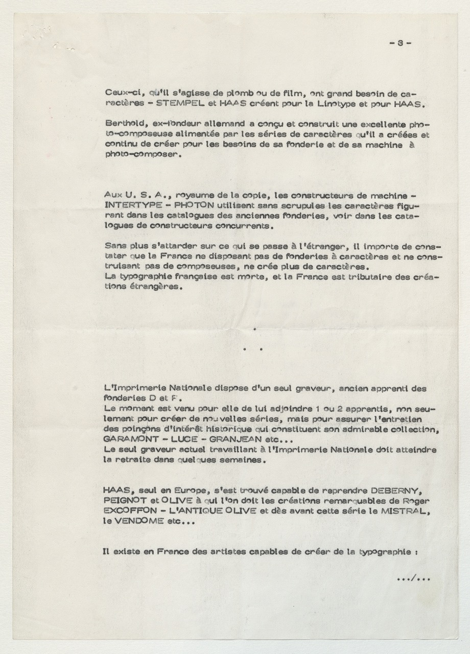
An alarming situation that Charles Peignot described in a note entitled “The state of typographic design in France”, transmitted in October 1979 to Georges Bonnin, Director of the Imprimerie nationale, the only place left at that time which continued to practice typeface design. Charles Peignot stated: “The Imprimerie nationale has a sole punch-cutter, a former apprentice of D&P foundries. The time has come for him to be joined by 1 or 2 apprentices, not only to create new series, but also to ensure the maintenance of historically important stamps which make up its admirable collection, Garamont — Luce — Grandjean etc… The only punch-cutter currently working at the Imprimerie nationale will be retiring in a few short weeks”.
And in conclusion: “To the American school of typography, has the time not come to oppose a French school, and is it not the responsibility of the Imprimerie nationale to take the initiative?”.
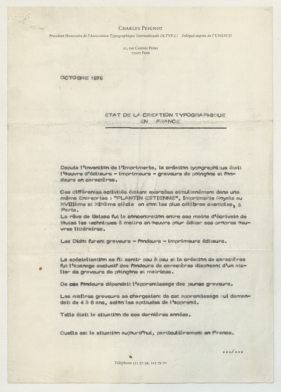
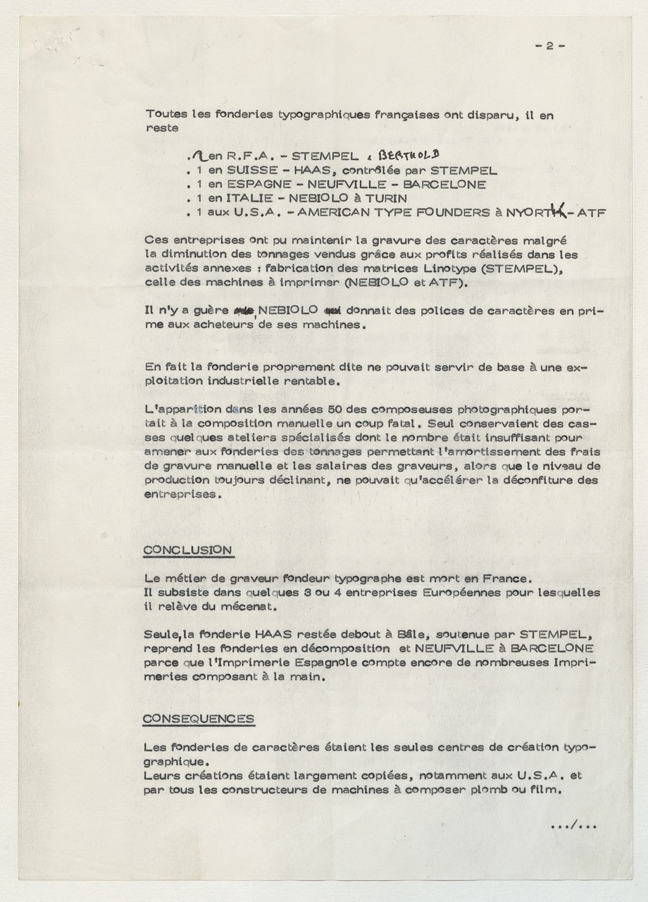
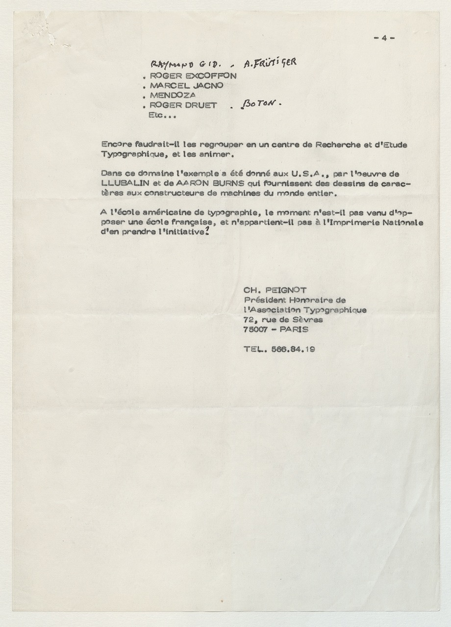
Charles Peignot, «État de la création typographique en France», note à l'attention de Georges Bonnin, directeur de l'Imprimerie nationale, octobre 1979. Archives ANRT.
French isolation
French typography, with its rich and prodigious history, gradually isolated itself from the rest of the world over the course of the 20th century. Firstly, ill considered industrial choices widened the gap with foreign foundries: failing to take advantage of mechanical typesetting, it would also fail to engage with the audacious adventure of the Lumitype, and the move to phototypesetting. Technological changes which would create a progressive concentration of actors, essentially of German and Anglo-Saxon origin.
This imbalance would evoke reactions of withdrawal and retreat. From the beginning of the 1900s a certain defiance with regard to German foundries can be felt in the writings of typographer and historian Francis Thibaudeau. A “French spirit” is raised up against them, valorizing the gesture, the arabesque: terms that can be found in the Paul Iribe’s text Choix in 1930: “The arabesque is movement, the cube is unmoving. The arabesque is freedom, the cube prison. The arabesque is gaiety, the cube sadness. The arabesque is fertile, the cube sterile, as the arabesque is a living line “which walks and leads to where one wants to go”. The time has come to choose between this Europe of the cube and this arabesque France”. This text with its nationalist overtones which is, if one is to be fully honest, xenophobic, would resonate 20 years later in a text by Maximilien Vox, “Pour une Graphie Latine”. These ideas would find a certain echo in the Franco-Hispanic scene of the time, and in the catalogues of the Fonderie typographique française (around Enric Crous-Vidal, Louis Ferrand, Joan Trochut-Blanchard…), of Deberny & Peignot (first with Scribe and Film by Jacno, then the first designs by Frutiger, Président, Phoebus and Ondine – of which he would later say: “To be frank, it always made me a little uneasy. I had the impression that I was betraying my professors”) and of the Olive foundry (with the Vendôme by François Ganeau, and the Chambord, Mistral, Banco, Choc by Roger Excoffon). The Graphie Latine movement accompanied the foundation of the école de Lure in 1952 by Maximilien Vox, Jean Garcia and Robert Ranc (both from the école Estienne).
This movement could be read as an artificial attempt by Vox to tackle the massive arrival of foreign typefaces and the hegemony of the Anglo-Saxon industry; it is also a questionable ideological position, in light of the political ideas that the latter would display during the German occupation. A position which was not devoid of paradoxes: it was Vox himself who convinced Charles Peignot to acquire the rights to Futura in 1930, published under the name Europe by D&P…, and the same Charles Peignot would create the Association typographique internationale (ATypi) in 1954, which has since then united global typeface design.
The CERT (1980 – 1984)
The call made by Charles Peignot in 1979 would not fall on deaf ears: a few months later the constitution of an informal group would emerge, the Centre d’Étude et de Recherche Typographique (Cert), would bring together the major figures of French typography. During a number of meetings organized between 1980 and 1982 one could encounter Fernand Baudin, Gérard Blanchard, Roger Druet, Roger Excoffon, Adrian Frutiger, Raymond Gid, Marcel Jacno, Ladislas Mandel, Claude Mediavilla, Jos. Mendoza y Almeida, Charles Peignot and his sons Rémy and Jérôme, and René Ponot.
In the postface of the book De Plomb, d’encre et de lumière, published by the Imprimerie nationale in September 1982 on the occasion of the ATypi congress in Beaune, Georges Bonnin looks back on the experience adventure of Cert: “Fifteen or so specialists with excellent reputations, recognized not only in France but the world over, naturally found themselves in the nations print-works, in a group which was in no way institutional in nature, and that was essentially formed by the personal adhesion of its participants, for the purposes of a constructive thinking around a new “defense and illustration” of French typography. […] Next, it was important to relaunch typeface design in our country, this was at the time a monopoly of almost exclusively Anglo-Saxon manufacturers of foreign equipment. […] This is where the idea came from, supported by certain people, to open a workshop for typeface design which could use the experience acquired by the Imprimerie nationale as much in the domain of centuries old tradition as in the activity of composition dating from the last fifteen years or so and which, having recorded the patrimony of French typography onto magnetic media, could then endeavor to study new typefaces, advising and assisting public and private users and carrying out a promotional information campaign to a wider public”.
This book, set using lead characters, in Grandjean, outlines a contrasted, if not outright paradoxical, state of affairs, of typeface design on the cusp of its digitization. Certain authors were particularly reticent, while others showed themselves to be more optimistic.
In 1982, encouraged by Jack Lang, then Minister of Culture, the Graphisme et Typographie inter-ministerial group was set up, consolidating state support for this initiative which originated in the profession. The participation of different Ministers displayed among other things a concern for a combined renewal of the industry and a new approach to the teaching of French typography.
The first project for the creation of a Photo-typesetter, envisaged as a reaction to French dependance on foreign technology, would never see the light of day. It was in reality the final hours of this technology, soon to be replaced by desktop publishing.
In 1984, as Cert had ceased to meet, more details were provided about the setting up of the Atelier national de cr.ation typographique (ANCT): the project was moving in the direction of a teaching space which would be part of the Imprimerie nationale, under the pedagogical supervision of The École nationale supérieure des arts décoratifs (Ensad) in Paris. The Ensad was at the time, one of those rare spaces in France which taught graphic design and typography, and also one of the most prestigious. In Autumn of 1985, the definitive team was formed: Raoul Sautai was named General Co-ordinator, Robert Michel was dispatched from the Ensad in order to ensure the administrative co-ordination, along with Peter Keller for pedagogical co-ordination, while Mandel and Mendoza were entrusted with the teaching of type design.
The Scriptorium in Toulouse (1967-2005)
However, a training course did exist in France at the time, provided by the Scriptorium in Toulouse. Created by Andr. Vernette in 1967 in the city’s art school, its first two classes included Bernard Arin, Claude Mediavilla and François Boltana. After closing down in 1973, the Scriptorium was reopened in the École des beaux-arts in Toulouse from 1982 to 1985 under the direction of Bernard Arin. François Boltana and Rodolphe Giuglardo also intervened on a regular basis. The teaching was based on calligraphy, stonecutting and the design of alphabets, essentially for the purposes of titling. It was the golden age of letter transfer: businesses such as Letraset and Mecanorma enabled young creators to publish new alphabets.
Taking the opposite tack to this effort to relaunch French typeface design, and in the context of the redefinition of the teaching of visual communication in art schools, the Scriptorium, judged to be too focused on “professionalization”, was once again forced to close its doors in 1986. The repeated calls by a number of figures from Cert, like Blanchard and Mendoza, would amount to nothing. Nevertheless the Scriptorium would reopen its doors in 1988, in the form of a private class, taught by Arin in his home, which would continue through to 2005. All throughout its tumultuous history, the Scriptorium trained a large number of typeface designers and calligraphers including Claude Mediavilla, François Boltana, Thierry Puyfoulhoux, Rodolphe Giuglardo, Franck Jalleau, Kitty Sabatier (who, along with David Théry, had participated in a work-study program, Axe Sud, in Toulouse, from 2011 to 2013), and closer to home, Xavier Dupré and Jérémie Hornus.
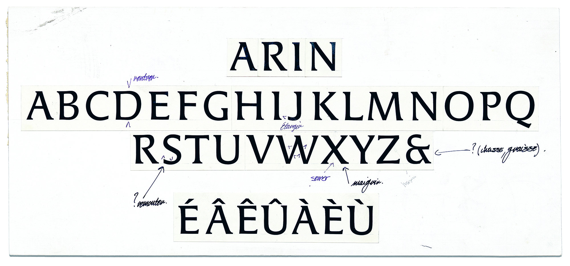
Franck Jalleau, jeu de caractères ARIN, bromure, 1985—1986. Archives ANRT
The creation of the Atelier national de création typographique (1985)
The Atelier national de cr.ation typographique (ANCT) opened in December 1985, with its first interns, Franck Jalleau, former student of the Scriptorium in Toulouse, and Tung Lâm Ngô. The first would work on adapting Gauthier for phototypesetting, it was the last design by the Imprimerie nationale (to date), engraved by Louis Gauthier between 1948 and 1979.
Between 1985 and 1988, the typefaces created at the ANCT were designed under the direction of Mandel and Mendoza. In parallel to the adaptation of Gauthier (by Jean-Renaud Cuaz, Franck Jalleau and Tung Lâm Ngô), work began on designs like the Anisson, an ambitious project of “large scale French design” proposed by Ladislas Mandel, inspired by a tight Cicero by Pierre-Simon Fournier, or the Perrin, based on the work of Lyonnais publisher Louis Perrin.
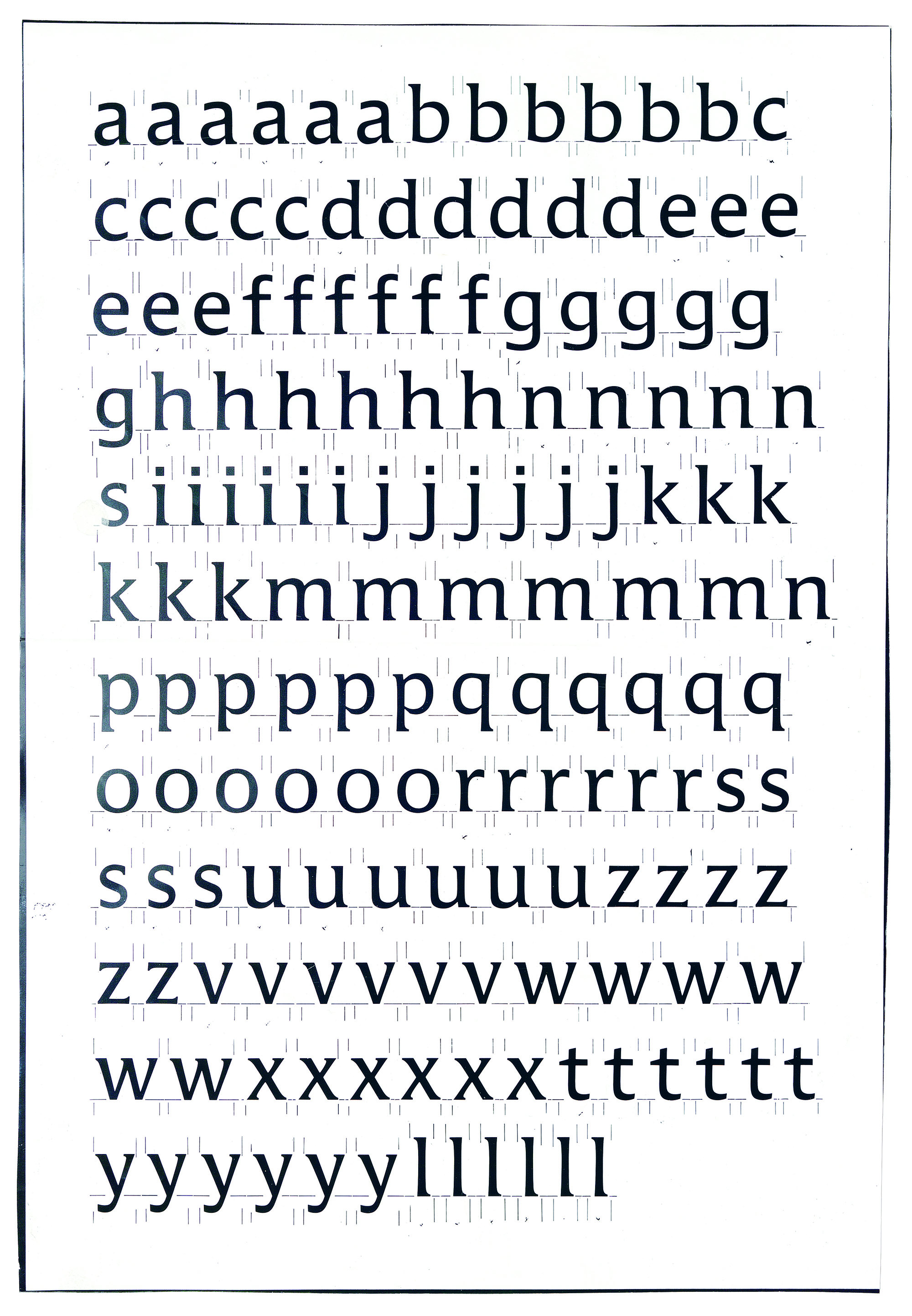
The design of typefaces was done for the most part by hand. It was Ladislas Mandel and José Mendoza who provided their know-how. The drawings were done on tracing paper, with hard lead pencils, using constant heights (the height of capitals was 11 centimeters). It was often necessary to make a number of series before inking them. Inked drawings, first on white card and then directly on tracing paper or polyester film, also indicated the spacing of the typefaces. These clear and clean drawings were then passed to the repro stand and printed at a reduced size using bromide paper for the purposes of setting texts. These were then patiently assembled by hand, and once again photographically reduced in order to judge the text in a smaller size.
At that time, Mandel and Mendoza were internationally recognized creators. A review of their practices will allow us to understand their approaches and methods.

Jean-Renaud Cuaz, Franck Jalleau, Tung Lâm Ngô, under the direction of Ladislas Mandel and José Mendoza, an adaptation of the typeface Gauthier for phototypesetting, ink on white card, 1985-1987. Ink traps allow clogging to be kept to a minimum in the sharp angles. ANRT archives.
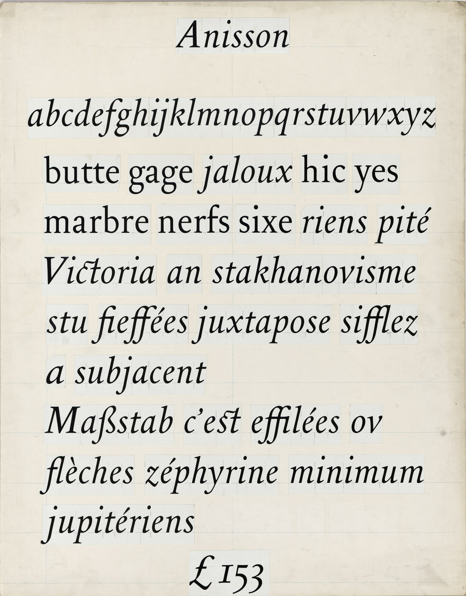
Isabelle Durand, Franck Jalleau, Tung Lâm Ngô, under the direction of Ladislas Mandel and José Mendoza, Anisson, a typeface design from the ANCT inspired by a tight cicero by Pierre-Simon Fournier. Bromide paper mounted on card, 1987. ANRT archives.
José Mendoza (1926-2018)
Jos. Mendoza became interested in type design very early on thanks to his father, Guillermo de Mendoza (1895 – 1944), a Spanish type designer considered by Vox to be a forerunner to Graphie Latine. He collaborated with Maximilien Vox after the war, and went on to assist Roger Excoffon at the Olive foundry from 1954 to 1959. In 1960, he perfected Pascal, a subtle humanist sans serif published by the Amsterdam foundry to compete with the Optima by Herman Zapf. In 1991, ITC published the ITC Mendoza Roman, which remains his greatest success. For a foundry at the time, publishing a typeface represented a considerable financial investment. This economic factor, difficult for us to imagine today, along with a context marked by a number of technological upheavals, explains why the vast majority of Mendoza’s typefaces did not see the light of day: only five are available at the time of writing (Pascal, Fidelio, Sully Jonquières, Photina, ITC Mendoza Roman). His style, marked by humanistic forms, composed of tense curves and rounded corners, would nevertheless have a considerable influence on a whole generation of designers, as we will see.
Adrian Frutiger (1928-2015)
and Ladislas Mandel (1921-2006)
The young Frutiger, having just graduated from the Kunst Gewerbeschule in Zurich, was recruited by Charles Peignot in 1952. He profoundly redefined the whole process of design of the foundry’s typefaces: up to that point it had been very hierarchic and involved a crowd of middle men, grouped together as typographic committees, design departments and production studios. For the Lumitype, Frutiger revised everything from top to bottom: adopting a digital classification of type families, a new naming of sizes, the standardization of the set of characters offered by machine keyboards, a collection of proportions and sizes for improving the compatibility of different designs, all the way to the vocabulary used to speak about and describe the typefaces! Notions of cases, body, and punch-cutting had effectively become obsolete. The collection of measures that he recommended was striking for its clarity, its coherence and its programatic logic: these qualities would be expressed in the important design that he proposed to Charles Peignot, who initially wished to perpetuate the success of Europe with the Lumitype, Frutiger convinced him to publish Univers, a new typeface with no serifs, developed according to a program of 21 sizes.
In order to successfully complete these projects, Adrian Frutiger put together a small team. First he recruited Lucette Girard, a graduate of the .cole Estienne, who he sent to study with Walter K.ch in Zurich for a semester, for, as he said “her hand to be trained in the same way as my own”.
At the end of 1954, Ladislas Mandel presented himself at the foundry where he met Frutiger, who employed him on the spot. Born in the Carpathian mountains, Mandel came to France in 1936. Trained as a painter and sculptor, a resistant who joined the FTP during the war, he learned his trade from Frutiger. To produce the large number of drawings for Univers, Mandel proposed to replace the china ink with scratchboard: the form is produced by scraping away the black surface, similar to sculpture; he also introduced the use of stencils (or pistol stencils) to draw the curves. The following year, a young recruit would complete the studio team:
Albert Boton (born in 1932), also participated in the design of Univers and would go on to become, in the words of the master, one of his best drawers. “Our team looked very good”, he concluded. It was around this core, right the heart itself of the Parisian foundry, that new design methods were developed, ones that would be pursued and perpetuated afterwards.
In 1963, Mandel took over the direction of the creative studio Deberny & Peignot, with Frutiger becoming the Art Director. Like Mendoza, few of Mandel’s typefaces were published: he would be somewhat overshadowed by Frutiger for quite some time, before having considerable success with the typefaces that he created for a number of telephone directories from 1975 onwards. In these wide ranging projects, Mandel would assert his style, developing the concept of cultural legibility: his typefaces, adapted for very small sizes, were designed in relation to the visual culture of the country for which they were developed. He perfected innovative methods of pre-digitalization, manually correcting the matrix rasterization of drawings by phototypesetters in order to improve their appearance when used at small sizes.
A staunch defender of a latin and humanist typography, in the latter stage of his career Mandel adopted radical positions, denigrating Univers as the paragon of a one track approach to typography and “soulless neo grotesque sans serifs”. Surprising talk coming from someone who had always admired Frutiger and who was involved in the design of the famous typeface…
1989: two schools
Mandel and Mendoza, active from the very early days of Cert, took an ill view of the Ensad’s involvement in the ANCT. In effect, everything separated them from the teaching of Peter Keller, who joined the team at the opening. Trained in the Gewerbeschule in Bale, where he studied (with Rudi Meyer) under Emil Ruder, Armin Hofmann and Robert Büchler, Keller was one of the “Suisses de Paris” who moved to the French capital in the 1950s. The first four were Adrian Frutiger, Peter Knapp, Jean Widmer and Albert Hollenstein; they were followed by Peter Keller and Rudi Meyer, Hans-Jürg Hunziker and many others. A number of them taught at the Ensad, scene of rowdy debates between the advocates of the Swiss school of thought and teachers belonging to the Grapus collective, close to the Polish school.
In the ANCT, the tensions were of a different order: “They cannot come to an agreement because they are not speaking about the same thing. When speaking of typography, Keller saw the page, its architecture, as a whole. Mandel and Mendoza saw the letter”, said Isabelle Durand who was part of the second class of the ANCT. “Mandel and Mendoza […] [saw] in the Atelier an opportunity to revive typographic production in France, and wished to participate by not only transmitting a specific know-how, acquired over many years of practice, but also a vision of French, or rather latin – an adjective often opposed to germanic culture,– typography. Peter Keller never designed typefaces himself, but he did develop an expert view of them. He was more so a typographer than a type designer: he composed with these forms, investing the space of the page. Of his training in Bale he retained a modernist idea of the profession; guided by his convictions, he advocates an approach to typography which ignores frontiers between disciplines, and rejects a nation based approach to the profession. Teaching in the Ensad since 1969, he is a teacher who progressively moved away from his professional practice to dedicate himself to its transmission”.
Mandel stopped working in the Atelier in 1988; with Mendoza leaving in 1990, followed by Franck Jalleau, who had joined the teaching staff three years earlier. In August 1991, Mandel gave a conference at the Rencontres internationales of Lure, which was still an active foyer for Graphie Latine at the time. Mandel declared: “Today the ANCT has 4 teachers: Keller – Rudi Meyer – Huntziger [sic] – Bauer (?) – Widmer who only dropped by to have an untrained intern design an alphabet. Teachers among whom only Hunziker designs typefaces, all from the Ensad and all Swiss. Tasked with rehabilitating French typography”. He ended with this final and irrevocable conclusion: “It was thus, with the hijacking of the ANCT and its original vocation, that our dream of rehabilitating French typography vanished”.
In 1990, with the support of Georges Bonnin, Peter Keller submitted a new project and took over the Direction of the ANCT in the month of September. He opened up a number of new perspectives for the Atelier: pushing past the self-centered vision of a revival of French typography, he emphasized the necessity of opening up to the international scene and of an enlarged practice of typeface design. The ANCT acquired a visual identity, designed by Margaret Gray in the same year, that appeared on the first poster calling for applicants: one can read, in 4 languages (French, English, German and Japanese) that “the goal of the Atelier is to constitute a center for experimentation, to provide artistic, scientific and technical training by specialists in the fields of type design, typographic design and graphic design”. The team also evolved, it was now composed of Albert Boton (who had replaced Mandel in 1988), Hans-Jürg Hunziker, Rudi Meyer and Jean Widmer. Though it displayed a balance between typeface creators and typographers, this team emphasized the connection to the Ensad, where the majority of them taught, but also the legacy of Swiss Modernism (in the wake of the schools in Bale and Zurich). This tropism can be felt in the productions of that decade, even if the diversity of the projects and profiles of the student-researchers (composed of around thirty different nationalities) shows a permanent desire to be open and to experiment.
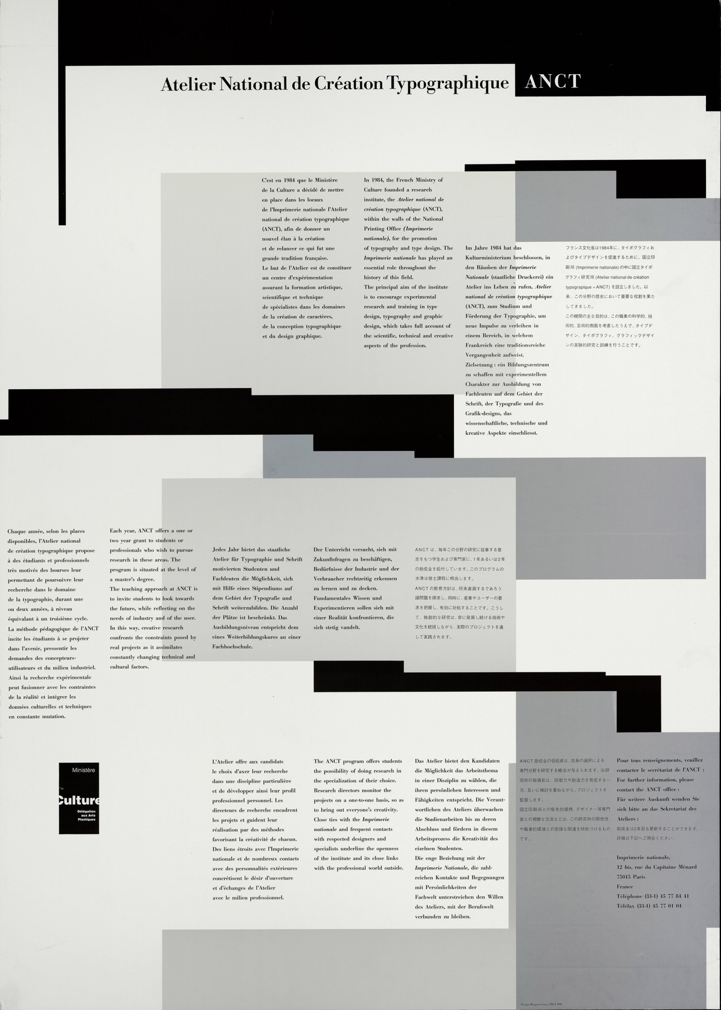
Margaret Gray, ANCT call for applications poster, first appearance of the visual identity of ANCT, 1990. ANRT Archives
As for typeface design, Boton (trained on the Lumitype by Frutiger) and Hunziker (student then collaborator of Frutiger) carried on the approach using drawing on tracing paper, first in pencil and then ink. Starting in 1991, the Atelier was equipped with Macintosh computers, and an Ikarus tablet (URW) which enabled the digitization of typefaces. The set up would accelerate further with the acquisition, five years later, of Altsys Fontographer software, first publisher of fonts for a wide public, which introduced the description of contours in Bézier curves and allowed PostScript Type 1 fonts to be exported.
The Atelier de création typographique in the École Estienne (1992)
In 1991, Franck Jalleau created, along with Michel Derre, the Atelier de création typographique (ACT) in the École Estienne. They were joined by Margaret Gray in 1994: all three came from the ANCT. Sébastien Morlighem, who was one of the students in the first class, relates: “We were five young men (Bertrand Clerc, Stéphane Darricau, Jean-Marc Denglos, Emmanuel Benoist and myself) learning typeface design, calligraphy and their layout in a very concentrated and intense fashion. The methods taught were directly derived from those developed and perfected by Mendoza and Mandel at the ANCT: drawn using 2H pencils (minimum) on tracing paper, or on scratchboard, then filled in with felt tip or China ink”.
Adrian Frutiger taught the fundamentals of typography at the École Estienne from 1952 to 1960, but the practice of this discipline had gradually disappeared from the historic institution. The Atelier de création typographique thus signaled a new and spectacular beginning which, in the early years of its existence, remained quite close to the spirit of the early years of the ANCT, thanks to the profile of its teachers and the personalities that one might have encountered there: Gérard Blanchard, José Mendoza and Bernard Arin, among many others. It continued nonetheless to maintain the ambition of approaching typeface design in the broadest possible sense, and this continues to be the case today.
The DSAA Design création typographique, and Design typographique, each year takes on 8 to 10 students and is still run by the original team, now joined by Philippe Buschinger, Raphaël Lefeuvre and Mathieu Réguer. This excellent program has introduced a large number of students to typography. Many of the most visible representatives of French design are direct results of it: one could cite for example Damien Gautier (205TF), Jean-Baptiste Levée (Production Type), Ludivine Loiseau (OSP), Julien Priez and Yoann Minet (Bureau Brut).
1999 : expanding boundaries
In 1999, in Graphisme en France, Muriel Paris detailed: “The singular character of French typography”. The panorama that she outlined, after a rapid summary of its history, confirmed the indisputable progress that had been accomplished over the previous fifteen years.
It is however important to note two major flaws: the small number of women involved (a criticism that could be extended to the graphic design scene of the time, as well as its teaching), and its relative isolation. Pierre di Sciullo and Jean Fran.ois Porchez are two of the rare figures whose productions radiated well beyond our frontiers. The latter (fellow student of Muriel Paris at the ANCT in 1990-1991) launched his own foundry, Typofonderie, in 1994, which allowed him to distribute his designs, in parallel to the many made-to-measure typefaces that he created for large corporations in France and abroad. He was the first to gamble on independence and the use of internet to distribute his fonts: something which represented a radical change in paradigm, and which has today become the norm. This new factor would progressively break with the isolation of French production, which had depended on foreign foundries for the last two decades: a hiatus which covers an entire generation, one that saw a number of promising creators embark on other paths. Claude Mediavilla or Jean Larcher for example, who turned to calligraphy, or Thierry Puyfoulhoux, who sails today on other seas. Let us also cite François Boltana (1950-1999), a rising star of French typography who, coming from Toulouse, signed his name to some of the most ambitious work of the time.
At that time, Jean Fran.ois Porchez was an active participant in the Rencontres de Lure, where he exchanged with Mandel, Mendoza and the many foreign participants who come to Provence. He was involved in the Association typographique internationale, and became its President a number of years later. In 1998, the international congress of ATypi was held in Lyon and paid tribute to Gérard Blanchard, who had passed away a few months before. A booklet, Lettres françaises, was published for the occasion, with a layout by SpMillot, and showed the state of affairs of typeface design in the Hexagon. In his preface, Gerard Unger mischievously evokes “The border that separates Beer and Wine”: using this image to describe the differences and movements that existed between Dutch and French typography. It turns out that this frontier still seemed, at the time, to divide the country in two.
In 1997, the ANCT left the Imprimerie nationale to join the Ensad, becoming the ANRT in the process. Peter Keller replaced the word ‘Creation’ with the word ‘Research’: a visionary approach, which translated a desire for openness and, even then its ambition of aiming for the European level of Master. The Atelier would move once again in 2000, this time to the École nationale des beaux-arts de Nancy (which became the Ensad Nancy), with a partly renewed team (with Peter Keller, Jean Widmer, Hans-Jürg Hunziker, but also Jean- Philippe Bazin, André Baldinger and Philippe Millot). A very dynamic period indeed, which suffered nonetheless from a lack of communication with the exterior.
Following a change of Director at the school in Nancy, the situation rapidly degraded, leading to the resignation of the whole team in 2006. Despite repeated warnings, nothing was done in Nancy to save this curriculum. It was a harsh blow to typographic teaching in France. Two decades after its creation, having educated a hundred students all over the world, the adventure of the Atelier came to an end.
In 2008, in an interview by Samuel Vermeil with Annick Lantenois and Gilles Rouffineau, the latter made a bitter, but lucid observation: “The ANRT was doubtlessly one of those places in France where something close to typographic research really existed, when one considers the quality of the people that it has trained and educated. A number of them now work in art schools. It had almost everything that a place of research might need: a specific field of investigation, a certain set of standards, and an openness to new forms… However at the same time, in terms of its ability to communicate, it was a total failure. […] [its history] was never communicated in any other way than through a pretty poster that appeared once a year.”.
The Scriptorium of Toulouse closed its doors in 2005, the ANRT in 2006; the following year, Jean François Porchez’s weekly class at the Ensad was also interrupted. In 2007, the .cole Estienne was the only place in France where typeface design was still being taught. This worrying situation would however provoke a spectacular rebound, kick starting a true revival of French typography.
A generation of students, graduates of the École Estienne and other advanced art schools, left France in order to join Master programs which specialized in type design. This was the case for example, with Laure Afchain, Charles Mazé, Yohanna My Nguyen at the Type[Media master of the KABK of La Haye; and Malou Verlomme, Jérémie Hornus, Émilie Rigaud, Alice Savoie, Amélie Bonnet, Mathieu Réguer, Adrien Vasquez at the MATD of the University of Reading.
These students discovered a very high quality of teaching, in direct contact with an International scene. They also discovered other methods, other interlocutors, new collections, and (a detail of some importance) were obliged to express their ideas in English: this linguistic barrier has accentuated the autarchy of the French scene. Many of them pursued and continued their careers by joining major foundries: Alice Savoie and Malou Verlomme with Monotype, Amélie Bonnet, Naïma Ben Ayed and Jérémie Hornus with Dalton Maag, etc.
At the same time, a new generation of teachers (most of them coming from the ANRT) introduced typeface design into schools of art and design by way of workshops, research studios and regular classes.
2009: a new dynamic
In 2009 I was invited to express myself in Graphisme en France for the first time, where I argued in favor of “An enlarged apprenticeship of typeface design”: “I think that it would be of benefit to integrate the practice of typeface design as early as possible when learning graphic design. Not with the intention of specializing, but rather as a way of approaching typographic forms, “from the inside”, so as to better understand them”.
My convictions remain unchanged. I discovered typography at the Beaux-Arts of Besançon, with Claude-Laurent François. Gérard Blanchard had been the co-ordinator of the communication section in the 1980s, and his presence could still be felt. I taught in this school from 2002 to 2012, and intervened regularly at the Esad in Amiens. During that time, I animated dozens of workshops intended to introduce students to typeface design: a practice often perceived as being mysterious and inaccessible, but which seems useful, essential even, when teaching and learning graphic design.
My choices overlapped with a number of typographers of my generation: being freelance, advocating an open practice (blending graphic and typographic design), developing personal research and teaching.
Similar to David Poullard (1972), graduate of the École Estienne, who pursued his research into letters in the street in the 7th district of Paris at the ANRT (1997 – 1998): Ordinaire, a character inspired by the lettering of the Paris metro, irrigates both his poetico-typographic creations and his graphic design work; teaching at the Esad in Grenoble Valence from 2009 to 2018, he today intervenes in the Esa at Aix-en-Provence.
This was also the case with François Chastanet, whose research into urban writing simultaneously questions writing, typography and graffiti. Chastanet studied at the ANRT in 2000 – 2001 with Alejandro Lo Celso (born in 1970), an Argentinian typographer coming from the first class of the Type Design Master in the University of Reading the year before. Lo Celso would go on to animate many workshops in France over the following years, which we will see later.
One could also mention Jérôme Knebusch (born in 1978), who met Chastanet and Lo Celso in Nancy, before joining the final class of the ANRT in 2005 – 2006 ahead of its temporary shut down. He designed Instant, a remarkable consideration of rhythm and curvature within a typographic family. Mathieu Cortat studied in the ANRT in the same year, and designed Stockmar, a baroque roman with three italics; he would go on to become assistant conservator at the Musée de l’imprimerie of Lyon where, with Alan Marshall, he would put together the Corpus typographique français. Having intervened in the Observatoire des polices at the Ensab in Lyon. Mathieu Cortat has directed the prestigious Type Design Master in the Ecal, Lausanne since 2016.
MESSINE, a type design project carried out by Alejandro Lo Celso (left) and Jérôme Knebusch at the École supérieure d'art of Lorraine, Metz since 2011.
Teaching typeface creation in France today
For around ten years now, teaching typeface design has in general become a part of French training, in first, second and third cycles. In the École Estienne of course, as we have seen, and at the Esad d’Amiens, the Ensad Paris and the Ensad Nancy, which we shall look at in more detail later on. But also in schools of art and design, thanks to classes, workshops and large scale projects. Here are some examples:
In the Institut supérieur des arts de Toulouse (Isdat), right from the time he arrived, François Chastanet incorporated a practice of type design based on his personal research on urban writings. From 2006 – 2008, he invited Alejandro Lo Celso to work with students (particularly Laure Afchain and Géraud Soulhiol) on the design of a character inspired by the city of Toulouse, the Garonne, which has since been employed by the municipality for its communication media. Other workshops, exhibitions and studios came after, like recently, the Monolinear research and design workshop, with interventions by Lo Celso, Hans-Jürg Hunziker, Frederik Berlaen and myself. These pedagogical initiatives gave rise to a retrospective publication, Lettres de Toulouse, published by B4232. Even if these two programs have never been linked, it is remarkable to note that after the Scriptorium, Toulouse saw the development of typography teaching which was dynamic, centered on the gesture of writing.
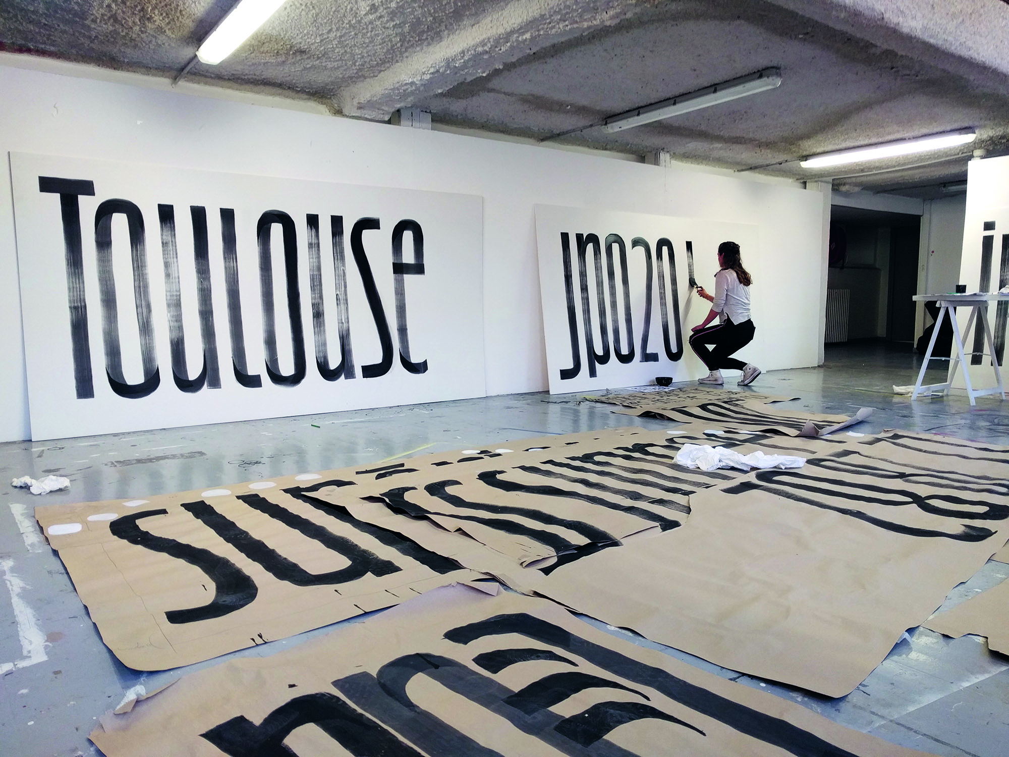
Lettering for Isdat Toulouse Open days, obtained by the layering of two differently oriented calligraphic gestures. Lori Marsala, Guillaume Berneau, Sarah Spruijt under the direction of François Chastanet, 2018
In the École supérieure d’art de Lorraine de Metz (Esal), Jérôme Knebusch also invited Alejandro Lo Celso, with whom he would begin a project on a never before seen scale in 2011: the Messine, a transitional type face (between Baskerville and Didot) intended for the school’s publications. Each year, a new workshop allowed the family to be enlarged and extended: the design was done in groups, in each class, and even more remarkably, was pursued from one year to the next. A workflow which was iterative and collective, admirable because of its results and also because of the pedagogical dynamic that it developed over a number of years.
In the same school, in 2015, Jérôme Knebusch launched “Pangramme”, an international exhibition of typefaces designed by students. At the end of February 2016, with the end of the call for applications, the result far exceeded expectations: 194 applications, coming from 25 different countries. This success reflected the extraordinary vitality of typeface design today, in schools of art and design all over the world: a situation that would have been inconceivable only ten years before. The exhibition that arose from it was presented in Metz, Amiens, Chaumont, Montréal and Leipzig.
In the École européenne supérieure d’art de Bretagne (Eesab Rennes), Benjamin Gomez runs a typographic studio as part of the graphic design master, which regularly generates ambitious projects, such as XXI XIX, directed with Sonia Da Rocha (graduate of the post-graduate program of the Esad of Amiens, having collaborated with Claude Mediavilla and Jean François Porchez), who taught in the same establishment on the Le Havre site, and Brice Domingues (Esad of Reims). The alphabets that were designed using the posters from the Dutailly funds were exhibited in Chaumont during the 2017 biennial. Not forgetting the Compagnon project, a family of five single space, but not single tone, typefaces, recently published under an open-source license by Velvetyne.
In the École nationale supérieure des beaux-arts de Lyon (Ensba), students create fonts during the first cycle (with Damien Gautier and now Alice Savoie) and participate in workshops each year. This practice continues in the second cycle with Alaric Garnier, a former graduate of the school.
One could also mention the École supérieure d’art et design de Valence (Esad), a pioneer in France in the field of research in graphic design, the École supérieure d’art des Pyrénées (Esa) in Pau, with Perrine Saint-Martin, the Haute École des arts du Rhin (Hear) in Strasbourg, with Yohanna My NGuyen, the École de création visuelle (ECV), with Jean François Porchez and Mathieu Réguer, and the École supérieure d’arts appliqués de Bourgogne (Esaab) in Nevers, a real breeding ground for talent, where Sarah Kremer and Thomas Bouville participate in annual workshops. Not forgetting the activity of numerous teachers, in first and second cycles, like Hervé Aracil, at the origin of so many vocations in the Duperré school.
The development of research
Since 2010, the DNSEP, a five year degree from schools of art and design under the supervision of the Minister of Culture, has conferred the grade of Master. The DNA, in third year, with its grade of license (Bachelor), like the BTS, which has become the DNMade since the reform which took place in 2017- 2018. This harmonization of art education in line with the European model for higher education (the Bologna process, LMD) has opened up the way to research after the master cycle with the prospect of a PhD.
The Typographie et langage Post Graduate program of the Esad d’Amiens (EsadType)
In 2006, the Esad in Amiens began a post graduate program called “Typographie, syst.mes graphiques et langage”. Imagined as a continuation of an ambitious project of notation of sign languages (Gestural script), in its early years this program brought together Patrick Doan, Sébastien Morlighem, Catherine de Smet and myself. Renamed “Typographie et langage” (and now “EsadType”), this Post graduate program takes place over 18 months, and since 2008 has specialized in typeface design. It recruits from an international pool, and in 2016, began to teach classes in English. The path of these graduates testifies to the excellent quality of this training: for the most part they establish practices as type designers and spread the reputation of young French design well beyond the borders of France: for example Damien Collot (Dalton Maag, London), Chorong Kim (Sandoll, Seoul), Sandrine Nugue (whose typeface Orientation is published by Commercial Type), Sophie Caron (Alphabet Type, Berlin), as well as Alisa Nowak, Roxane Gataud and Quentin Schmerber (all three feature in the Typetogether catalogue). The teaching staff is today composed of Frederik Berlaen, Jean-Baptiste Levée, S.bastien Morlighem and Mathieu Réguer.
4 projects are run in parallel in the De-Sign-e research unit of the Esad of Amiens, with two of them dealing specifically with writing and typography. Gestural Script has been developed over the last ten years. Starting methodological, linguistic and graphic questions, raised by the transcription of the gesture, it has seen the emergence of a number of innovative systems and mechanisms: Photocalli, for movement capture; Typannot, a typographic and computer based solution which allows sign language researchers to annotate video corpuses; in connection with the Université de technologie de Compiègne (UTC), Descript and Inscript, an augmented environment for learning and save-guarding of scriptural gestures. The thesis of Claire Danet (graduate of the Esad) and Patrick Doan (project co-ordinator) in the UTC will in the coming months sum up the large amount of research generated by the project.
The second line of research, called “Typographie, histoire et création”, is co-ordinated by S.bastien Morlighem. Every year since 2011 it has hosted themed exhibitions and seminars, and has progressively constituted a resource center for typography. A project has just been completed around the figure of Ladislas Mandel, in partnership with the Musée de l’imprimerie et de la communication graphique of Lyon, undertaken by Alice Savoie for the most part.
The Ensad Lab Type is a program which deals with type design and typographic readings, set up by André Baldinger and Philippe Millot in the Ensad of Paris in 2008. The Ensad rekindled its relationship with the teaching of this discipline, taught successively by Adrian Frutiger (1952 – 1960), Albert Boton (1968 – 2004) and Jean François Porchez (1998 – 2007). Despite its limited means, this research laboratory would carry out a number of collective projects, in two or three year cycles, with groups of four to six student-researchers.
The first cycle, called ELT H/V, is dedicated to the comparative study of the layout of books which use Chinese writing and latin typefaces. Following three programs of type design: the first cycle, which deals with typefaces engraved at the Sorbonne around 1470, gave rise to the Sorbon R (roman) and the ELT Sorbon G (gothic). The second questions legibility of type on screens through the design of two sans serif typefaces, the ELT Gaston and the ELT Incision. The third cycle, structured around an “ordinary classic”, the Times New Roman, stopped in 2014 with the interruption of the laboratory’s work. Its relaunch is currently being studied.
The research of the Ensad Lab Type is presented during the colloquium “Graphic design, the forms of history”, organized by the Cnap, the Centre Pompidou, Ensad and the Labex Arts H2H (Paris 8 University) in November 2014, whose proceedings are published by B42.
L’ANRT
Peter Keller passed away in July 2011 after a long struggle with illness; at the same time Christian Debize was named Director of the Ensad in Nancy and made the reopening of the ANRT a priority: he put together a work group to create the conditions for this to happen. In Autumn of 2012, I was named director of the ANRT, and was given a number of objectives: to treat and valorize its archives, put together a new team of teachers, define its scientific project, to position its training on a third cycle level by establishing research projects, providing it once again with an international reputation and improving the communication of its activities. These challenges have since been met thanks to a team which includes Roxane Jubert, Jérôme Knebusch, Charles Mazé, Émilie Rigaud, Alice Savoie and Jérémie Hornus, as well as six classes of student-researchers which have succeeded one another since 2013.
Today the Atelier is located in the new building of the Ensad, on the Artem campus in Nancy. The course now lasts for 18 months, with an overlap in the class groups who arrive every 12 months; the recruitment is international and based both on the projects proposed by applicants and on research programs established with partner laboratories. This new format has generated numerous collaborations, in domains as diverse as computer science, linguistics, epigraphy, cartography or egyptology. A frequent concern is that of questioning the role of typographic design in the field of digital humanities: developing specific systems of notation, adapted digital tools, interfaces for consultation and made to measure typefaces… There is no lack of themes and the laboratories which are confronted with these issues are rarely in a position to solve them: leading to the choice of a greater transversality and a constant dialogue with specialists from other domains and horizons. There is a strong desire to do research through design, advocating type design as an essential lever, and not only a subject for study.
At the same time considerable work on the indexation, digitization and valorization of the archives was undertaken, giving rise in 2016 to the publication of the catalogue ANRT Archives 1985 – 2006, followed by a retrospective exhibition at the Musée de l’imprimerie et de la communication graphique. This catalogue covers the history of the Atelier in great detail (with contributions by Sébastien Morlighem, Roxane Jubert and myself) and presents the research work which took place over two decades marked by profound technological upheavals.
Each year international seminars are organized: “Automatic Type Design” (in 2014 and 2016), which deals with technological innovations in terms of typography and the “Rencontres du 3e type” (in 2015 and 2018), which deals with typefaces which are “neither latin or non-latin”.
On April 25th and 26th, 2019, a seminar and exhibition entitled “Gotico-Antiqua, Proto- Roman, Hybrid. 15th century types between gothic and roman” had just concluded a vast research program initiated by Jérôme Knebusch. It covered metal typefaces cut in Europe between 1458 and 1482, from Mayence to Venice, and the passage from gothic to roman: within this framework 12 workshops were organized over the last three years, in Germany, France and Italy, bringing together more than 150 students. 14 digital fonts and a set of initials were created (then published and augmented by Rafael Ribas and Alexis Faudot, student-researchers at the ANRT) based on models observed in the incunabula of the collections of each city: they were distributed, under a royalty free license, at the opening of the exhibition. A way of mixing research and transmission, and of placing typeface design at the heart of a historical investigation.
Finally, the goal of the doctorate had been achieved: on December 20th, 2018, Sarah Kramer defended her thesis, entitled “La réalisation matérielle du Französisches Etymologisches Wörterbuch. Impact de la mise en forme typographique sur le développement d’un projet lexicographique”. Arising from a collaboration between the ANRT and the Atilf-CNRS (Analyse et traitement informatique de la langue française, the laboratory of the CNRTL or the TLFI, based in Nancy), this doctorate is based on an original typographic design, responding to the specific needs of FEW, a vast and complex pan- lexical gallo-roman dictionary: it is not only a matter of creating an extended family which integrates signs that have been inaccessible until now (like multi-accentuated phonetic typefaces), but of developing a longterm strategy of encoding for its digitization, its macro- typographic form for the shaping of inputs, an interface to be consulted and even a made-to measure interface for data entry by users. Sarah Kremer’s accomplishment is exemplary, not only on a typographic level, but also from a methodological point of view: research through design, using a wealth of references, which far surpass the boundaries and limits of our discipline. Two other doctorates are currently in progress at the ANRT: Éloïsa Pérez is working on the contribution of typography to learning sign language in kindergarten or pre-school (with the Celsa, Universit. Paris Sorbonne), and Sébastien Biniek is working on parametric typography in the service of digital cartography (with the IGN and the Esad of Grenoble – Valence).
Researching typography in a university context
In Graphisme en France 2014, Alice Savoie was right to state: “Today, typeface design education in France appears to be in good hands. But beyond these reassuring prospects, it is essential that the revival of the typographic scene is underpinned by knowledge based on robust research”. The Graphisme en France website currently identifies 18 doctorate theses in progress, in various laboratories, as well as 21 theses that have been defended since 1987: most are concerned with research around graphic design and typography envisaged through a prism of the humanities and social sciences. This budding interest of the academic world for these questions is of course positive when it comes to exploring the corpus and the development of methodologies for work. At the same time, it seems to me to be essential to support research through practice in this domain, done in schools of art and design, while at the same time maintaining a beneficial porosity with the University world.
Professional formation
Considered to be a poor cousin in the past, typographic design is today quite present in French schools of art and design, in first, second and third cycles. Previous generations were not so lucky: to make up this lost ground and also open up this practice to professional users, continued education constitutes an important relay which is also being developed.
Type@Paris
Based on the Type@Cooper model, an intensive program of type design developed at Cooper Union (in New York and in San Francisco), in 2014 Jean Fran.ois Porchez created Type@Paris, a 5 week program for learning typeface design. The recruitment is international and geared towards seasoned graphic designers and art directors: the program is dense and employs experienced teachers, visits to French typographic collections and features participants from all over the world. The program has been very successful, as have the public conferences that are organized each week.
In his program, Jean Fran.ois Porchez advocates a “French technique” of typeface design: first calligraphy, then drawing on tracing paper, an essential step in fixing forms before their digitization.
ANRT / Hear
In partnership with the Hear in Strasbourg which has developed a significant offer in this area, since 2018 the ANRT has also been organizing continued training courses aimed at professionals. Short (four days), paid for by training funds, they allow participants to discover or perfect their skills, according to their needs.
De main en main
The transmission of know-how at the Imprimerie nationale
Schools are not the only places where transmission occurs. The Imprimerie nationale, with its rich history and prodigious collections, is committed to preserving unique gestures and know-how.
Nelly Gable, one of the last active punch-cutters in the world, has been preparing her succession and has been transmitting his know-how to Annie Bocel since 2013: thanks to their initiative, and with help from Élodie Bayard, typographic punch-cutting is now part of the national inventory of immaterial cultural patrimony.
In this venerable institution, it is not only secular gestures which are perpetuated but also new forms which see the light of day. The Faune typeface by Alice Savoie, commissioned in 2017 by the Cnap in partnership with the Imprimerie nationale illustrates this perfectly.
Franck Jalleau, Salamandre. Création de huit caractères exclusifs pour l'Imprimerie nationale. Dessins humanistique et linéale en romain, italique, gras et gras italique, 2019.
In 2019, the Cnap saw the design of its 8th exclusive typeface, the Salamandre, designed by Franck Jalleau, who joined the Imprimerie nationale in 1987. He has been creating typefaces for the fiduciary for more than 30 years – commissioned typefaces and adaptations of patrimonial types, both latin and non-latin. This is the crowning achievement of an impressive career and places him alongside Garamont (Grecs du Roy, 1544 – 1550), Jannon, (Romain de l’Université, 1641), Grandjean (1694 – 1714), Jaugeon (1904), Luce (1773), Marcellin Legrand (1825 – 1832), Firmin Didot (Didot millimétrique, 1811) and Gauthier (1969 – 1978). Jalleau embodies the role of passer, from one generation to the next. Marked by his apprenticeship with Bernard Arin43 and by the practice of stonecutting, at the ANCT he became the privileged interlocutor of Jos. Mendoza. His design is somewhat the extension of that of the Spanish master: strongly anchored in a humanist tradition but calligraphic nonetheless. Forms captured, as if engraved, but never frozen. Often with audacious synthetic stylistic syntheses, similar to Mendoza’s “mécaldes”, and, beginning at the end of the 1980s, a consideration of multi-style families – with the Jalleau for example, four complementary designs for 32 styles, imagined for the General Tax Code. An approach to type design that he has been transmitting for more than 25 years in the .cole Estienne, and which sees with this historic design, its accomplishment.
Though it may be in the form of a kaleidoscope, this necessarily brief history is nevertheless marked by the profound furrows and tracks left by a number of essential figures: Bernard Arin, Gérard Blanchard, Albert Boton, Hans-Jürg Hunziker, Franck Jalleau, Peter Keller, Ladislas Mandel, José Mendoza and Jean François Porchez… Witnessing a tumultuous period and a complete change in both the economic and technological paradigms, they tirelessly endeavored to transmit, exchange and share so as to allow a new generation of designers to flourish, a generation which will have moved beyond the rifts and divisions that in the past opposed antagonistic visions of the profession and its transmission.
When it comes to typography, the variety of approaches can not be a bad thing: in the current instance, these different methods have enlarged the spectrum of the discipline, authorizing all of the different conjugations. More women are participating in the French typography scene today than ever before. “For years I used to refer to typographic France as “the sleeping giant”. In recent years I think the giant is beginning to wake up”. What a road has been traveled indeed since Charles Peignot’s note and the early work of Cert. The gamble of those involved has ultimately paid off: the revival of French typography, through its transmission.
-
On this subject see Alice Savoie’s dissertation for the MATD at the University of Reading, French Type Foundries in the Twentieth Century. Causes and Consequences of their Demise, September 2007, available for consultation at www.typeculture.com →
-
The full letter is reprinted in the catalogue Atelier national de recherche typographique ANRT. Archives 1985-2006, Dijon, Les Presses du réel, 2016, pp. 40-43 →
-
See Sébastien Morlighem, « La Graphie latine et la création typographique en France (1949-1961) », in Enric Crous-Vidal, De la publicitat a la tipografia, cat. exp., Lleida, Museu d’Art Jaume Morera, 2000. →
-
Paul Iribe, Choix, Paris, éditions Iribe, 1930. →
-
Maximilien Vox, « Pour une graphie latine », Caractères, 1950. See also the Dossier Vox prepared by Fernand Baudin and edited by Rémy Magermans, 1975. →
-
Adrian Frutiger Caractères. Complete Works, Bâle, Birkhäuser, 2008, p.77 →
-
See the article by Roxane Jubert, « Typographie & graphisme. Dissemblances, dissonances… Disconvenance ? La France en marge de la “révolution typographique” », in Isabelle Ewig, Thomas W. Gaehtgens et Matthias Noell (dir.), Le Bauhaus et la France. 1919-1940, Berlin, Akademie Verlag, Centre allemand d’histoire de l’art, 2002. →
-
On this subject, see also the remarkable Histoire du graphisme en France by Michel Wlassikoff, Paris, Les Arts décoratifs et Dominique Carré éditeur, 2008. →
-
Georges Bonnin et Charles Peignot, De Plomb, d'encre et de lumière, Imprimerie nationale, p.18 — 19 et p.22 — 23. →
-
Juliette Flécheux, in the context of her DNSEP at the Isdat in June 2018, carried out a remarkable inquiry into the history of the Scriptorium, based on private and public archives and interviews with many former members. The publication of this Dossier resté sans suite would allow this important but quite little known program to be revealed. →
-
Gauthier was the famous punch-cutter, who was “retiring in a fewshort weeks”, evoked by Charles Peignot in his his note of 1979. →
-
These projects are presented in detail in the catalogue Atelier national de recherche typographique ANRT. Archives 1985-2006, op. cit. →
-
See Martin Majoor and Sébastien Morlighem, José Mendoza y Almeida, Paris, Ypsilon.éditeur, 2010. →
-
The rupture operated by Frutiger in the production of typefaces was radical: he immediately understood the impact of the change in paradigm that the passage from lead to film represented. Typefaces were no longer three dimensional objects but rather two dimensional images. By reforming the organization of creation he repositioned the designer at the center of the system: by working closely with engineers (on questions linked to the units which subdivide the approaches, for example), the drawings and designs created in his workshop could be used directly to produce matrixes. On this subject, see the PhD thesis by Alice Savoie, International Cross-Currents in Typeface Design : France, Britain and the USA in the Phototypesetting Era, Université de Reading, 2014. →
-
Heidrun Osterer and Philipp Stamm, Adrian Frutiger. Adrian Frutiger Typefaces. Complete Works, Bâle, Birkhäuser, 2009, p.77. →
-
Some resources on Ladislas Mandel : Olivier Nineuil, «Ladislas Mandel, explorateur de la typo française», étapes :, no 55, 1999 ; Alice Savoie, Dorine Sauzet and Sébastien Morlighem, «Everyday Type: Researching Ladislas Mandel’s Typefaces for Telephone Directories (Part 1: Galfra)», Footnotes, issue B, 2017 ; Alice Savoie, «Everyday Type: Researching Ladislas Mandel’s Typefaces for Telephone Directories (Part 2: Lusitania, Linéale and Nordica)», Footnotes, issue C, 2019. →
-
Ladislas Mandel développe ces idées dans ses deux ouvrages parus aux éditions Perrousseaux : Écritures, miroir des hommes et des sociétés(1998), et Du Pouvoir de l’écriture (2004). →
-
This is the title of a remarkable exhibition presented from November 4th, 2016 to March 19th, 2017 at the Museum für Gestaltung in Zurich,which presented the work done by this generation. →
-
See the book of Roger Chatelain, La Typographie suisse, du Bauhaus à Paris, Lausanne, Presses polytechniques et universitaires romandes, 2008. →
-
This “Swiss school” would largely establish the teaching of the fundamentals of graphic design and would allow the late appearance of Modernism in France. See the essay by Roxane Jubert, “Une génération de passeurs”, in Les Suisses de Paris, cat., Zurich, Museum für Gestaltung, 2016. →
-
Quoted in Thomas Huot-Marchand, “Two conceptions of the Atelier”, in. Atelier national de recherche typographique ANRT. Archives 1985-2006, op. cit. →
-
Ibid. →
-
The handwritten text of this conference is conserved inthe Mandel funds of the Musée de l'imprimerie et de la communication graphique of Lyon. The context is spoken about in Le Rôle de Ladislas Mandel dans le Cert et les débuts de l’ANCT, a conference by Thomas Huot-Marchand given during the seminar “Ladislas Mandel (1921–2006) ou l'humanisme de la lettre” at the Bibliothèque de l'Arsenal, Paris, June 11th, 2018 https://vimeo.com/275099351. →
-
Sébastien Morlighem, « Champ Fleury 2.0 », étapes :, no 203, avril 2012, p. 28-31. →
-
See Franck Adebiaye et Suzanne Cardinal, François Boltana et la naissance de la typographie numérique, Gap, Atelier Perrousseaux, 2011. →
-
Lettres françaises, specimen de caractères français, Paris, Association typographique internationale/ Association pour la diffusion de la pensée française, 1998. →
-
«Quelle recherche en école d’art?», in N+1, recherche et expérimentation en design graphique, numérique et sonore dans les écoles d’art et de design, Saint-Étienne, École supérieure d’art et de design de Saint-Étienne, 2008, p. 14. →
-
Thomas Huot-Marchand, «Pour un apprentissage élargi du dessin de caractères», Graphisme en France, 2009. →
-
Voir ses travaux dans les publications Pixação: São Paolo Signature, Toulouse, XGPress, 2007 ; Cholo Writing: Latino Gang Graffiti in Los Angeles, Årsta, Dokument Press, 2009 ; et Dishu: Ground Calligraphy in China, Årsta, Dokument Press, 2013. →
-
See Alice Savoie, « Incarner le texte, une conversation avec Alejandro Lo Celso », in Nouveau Document, Villeurbanne, éditions Nouveau Document, 2017. →
-
www.imprimerie.lyon.fr/imprimerie/sections/fr/documentation/corpus. →
-
www.ecal.ch/fr/3074/formations/master/type-design/descriptif. →
-
Alejandro Lo Celso, François Chastanet, Frederik Berlaen, Hans-Jürg Hunziker, Thomas Huot-Marchand, Lettres de Toulouse. Expérimentations pédagogiques dans le dessin de lettres, Paris, B42, 2018. →
-
1 . http ://compagnon.eesab.fr. →
-
See Sébastien Morlighem, Graphisme en France 2019, p.92. →
-
Parallèlement aux cours réguliers d’André Baldinger et de Philippe Millot, Émilie Rigaud, Sandrine Nugue ou Alisa Nowak interviennent ponctuellement à l’Ensad sur ces questions, à des niveaux divers. →
-
Design graphique. Les formes de l’histoire, Paris, B42, 2017. →
-
In parallel to the regular classes by André Baldinger and Philippe Millot, Émilie Rigaud, Sandrine Nugue and Alisa Nowak occasionally intervene around these questions, on various levels, at the Ensad. →
-
Exhibition «TYPO&!.,– :;?”, 30 ans de créations à l’Atelier national de recherche typographique», Lyon, musée de l’Imprimerie et de la Communication graphique, November 10th, 2016 - February 12th, 2017. →
-
Alice Savoie, « Dessiner la recherche en typographie », Graphisme en France, 2014, p. 50-51. →
-
www.cnap.graphismeenfrance.fr/page/liste-theses-doctorat. →
-
After quite an eventful period, the Atelier du livre et de l'estampe and the Cabinet des poinçons of the Imprimerie nationale are today united on the main production site of the group, near to Douai. A collection which is unique in the world, which boasts more than 500,000 punches, 35,000 books and a large number of machines which are still active. This is the memory of the French Typographic Industry, covering five centuries of uninterrupted history. New life was breathed into it under the presidency of Didier Trutt, and with the arrival of Pascal Fulacher as Director of the Atelier du livre in 2016. →
-
This know-how is described and illustrated in the book by Nelly Gable and Annie Bocel, Dessins de geste. Gravure & poinçon typographique, Paris, Éditions des Cendres, 2018. →
-
Franck Jalleau’s first typeface, ARIN, winner of the Morisawa competition in 1987, pays homage to him. →
-
See Martin Majoor et Sébastien Morlighem, José Mendoza y Almeida, op. cit. →
-
«For years I used to refer to typographic France as “the sleeping giant”. In recent years I think the giant is beginning to wake up.» Gerry Leonidas, interview with the author, december 2018. →