Strange Types
Text published in the journal Azimuts №48-49, ESADSE/Cité du Design, 2018. The incunabula images have been replaced by photos and extended captions from the exhibition Gotico-Antiqua, Proto-Roman, Hybrid. 15th-century type between Gothic and Roman, ENSAD Nancy, April 2019. gotico-antiqua.anrt-nancy.fr
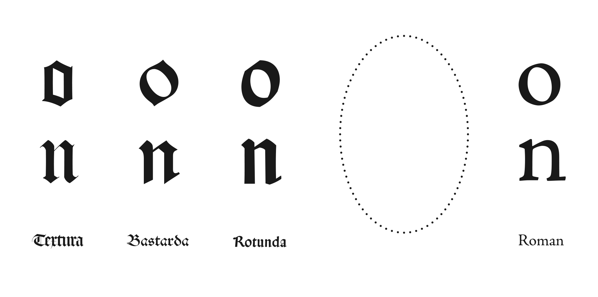
Types of the 15th century, from most to least broken. Many types encountered in incunabula do not fit in one of these four established groups.
This text is devoted to the study of typefaces created during the 15th century which are neither roman nor gothic. Our main concern here is to offer a description and nomenclature. This research has been undertaken within the framework of an on-going programme at the Atelier National de Recherche Typographique (France) entitled Halbgotische, Gotico-Antiqua, Fere-Humanistica: between Blackletter and Roman.
All types from the 15th century: Typenrepertorium der Wiegendrucke, Konrad Haebler, 1905–1924, updated in 1966. From the online version, Staatsbibliothek zu Berlin.
All 15th century types
The 15th century—or, rather, the second half of it, if we take into consideration the (unattested) fact that the first typefaces must have seen the light of day with Gutenberg in Strasbourg as early as 1440 and, at the latest, at Mainz in 1454 (attested)—was extremely productive in the typographic domain. Any attempt to consider the present day as the golden age of typography is challenged by the Typenrepertorium der Wiegendrucke (TW) which inventories around 2,000 foundries/printers and more than 6,000 types created during the 15th century—an average publication rate of one fount every three days. The British Library’s Incunabula Short Title Catalogue (ISTC), itself based on the older and more detailed Gesamtkatalog der Wiegendrucke (GW) of the Staatsbibliothek Berlin, inventories more than 30,000 printed editions, corresponding to a ratio of about two achieved works a day. And this is only those books printed with movable lead types, not entire texts printed using a wooden engraving called xylograph or Blockbücher in German. These already impressive figures are significantly augmented by the incommensurable amount of lost elements, not just those in print—particularly the smaller formats and individual sheets—but also all the typographical equipment: matrices, punches, lead type, presses… These losses invite us to apply the greatest prudence to any hypothesis, all the more so as dates are often unknown or erroneous. As Guy Bechtel reminds us: “Man does not like saying ‘I do not know’”; we have to admit that the sum of those things we know of is smaller than that of those we ignore—an admission which leaves the mark of fiction upon the rest of this text.
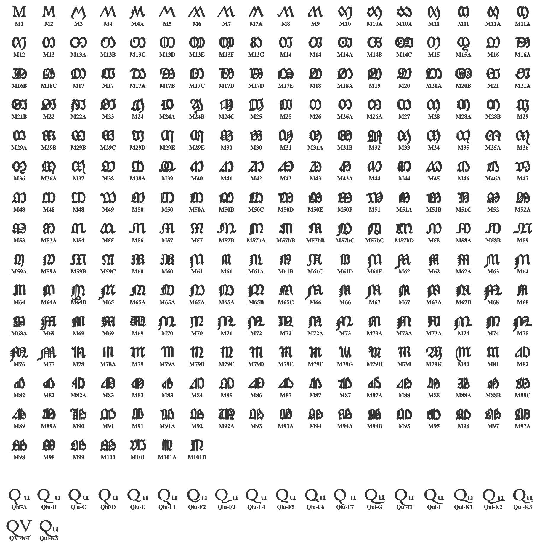
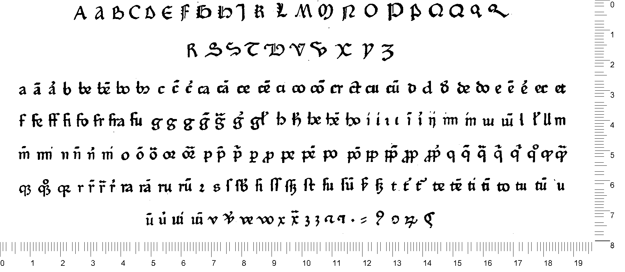
Initiated at the beginning of the 20th century by Konrad Haebler, the TW inventories the types of the 15th century so as to enable the identification of works; it still constitutes a fabulous online research tool. It provides not only numerous types along with a complete set of glyphs but also an inventory of the books which use them referring to the classification of the GW, also initiated by Haebler, and which refers users to the libraries which offer free online consultation of digitalised versions. The TW also lists the wooden initials or marks of printers. To facilitate identification, Haebler has also provided a table of 101 gothic capitals of the letter “M” (a total of 258 forms including variants) and 11 roman “Qu” pairs (a total of 20 including variants), a table which allows direct searches using letters which Haebler considers are highly distinctive and recurrent. Following the example of these “M” and “Qu” entries, the TW proposes a nomenclature for each type supplemented by its size and chronology in each printing press. For example, reference 4:96G designates the fourth character of the printer in question, a format of 96mm for 20 lines and the fact that the character belongs to the gothic category (R signifying roman).
Type 5:118G (Durandus): Johann Fust & Peter Schöffer, Mainz, 1459. TW 5:118G.
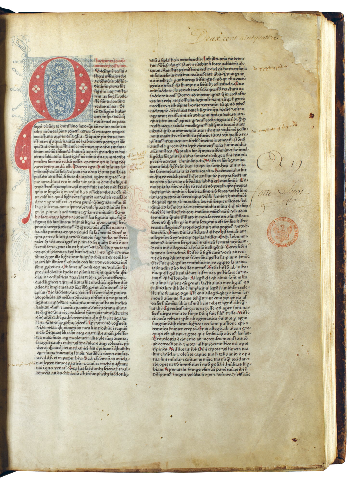
Gotico-Antiqua: Guillelmus Durandus, Rationale divinorum officiorum [Mainz]: Johann Fust & Peter Schöffer, 6 October 1459. 30×42cm, folio. Courtesy Bibliothèque et archives municipales de Besançon. Photo: Nabila Halim / ANRT. ISTC id00403000 | TW 3:91G (text), 5:118G (colophon).
An insufficiently identified type
The TW is not a typographical study; it is above all a book-identification tool—the principal quest of incunabilists. Only 40% of incunables mention the printer and only 30% have a complete colophon (place, printer, date). Although the TW archive is infinitely rich, to our eyes, as type designers, it lacks important information. Apart from the resolution of the characters being too low for essential details to be seen, the TW does not go beyond the gothic/roman dichotomy in its description of letters. The different types could be more precisely described: the famous BMC (Catalogue of Books printed in the XVth Century now in the British Museum) initiated at the same time in London was already more precise. Greater precision would also be very useful for the recognition of the type of letter which interests us here: this is neither the roman model which found its perfect expression in the work of Nicolas Jenson in 1470 at Venice, nor the well known gothic types that are Textura, Rotunda or Batarde. Although this fifth letter which interests us might resemble the types we have just cited—most often Rotunda—it is sufficiently singular and recurrent in the 1460’s and 1470’s to warrant more in-depth study.
Surprisingly ‘our’ field provides few answers: indeed, the history of typography moves rapidly from Gutenberg to Jenson and then jumps directly to Aldus Manutius at the end of the century. While refinements and nuances feature in the classifications for other centuries, this is only rarely the case for the 15th century. However, librarians and book history researchers have taken a keen interest in the various printers and their typefaces, and palaeographic research has provided elements concerning their origins, although there has been no transversal study of the possible models for these typefaces.
A brief history of the (numerous) terms
The fact that—in the past, above all in the early 20th century—the object of our investigation (the typefaces between gothic and roman) has aroused some interest does not make the task any easier: the bibliography is confused and a clear understanding requires a certain effort. There is little exchange between the three overlapping fields of research, namely, palaeography, incunabula research and typography; one seems to end where the next starts. This explains the multitude of names applied to our object of study, including: Halbgotische, Gotico-Antiqua, Fere-Humanistica, Halbromanisch, Semigotica, Gotico-Humanist, Gothic-Prehumanistica, Petrarcaschrift, Roman-Gothic, Half-Gothic, Semi-Roman, Italo-Gothic and Proto-Roman or, more generally, Mixed, Transitional and Hybrid—mainly German and English names laced with Latin.
Logically, for a from to be situated between gothic and roman, it should be more or less linked to these two poles without fully belonging to either. Halbgotische, Gotico-Antiqua, Fere-Humanistica are the most commonly encountered forms describing this in-between space. The first, a German term, signifies semi- or half-gothic, a rather vague term which may easily designate different forms without specifying of which gothic writing it is a half nor if there is any roman influence (is half-gothic equivalent to half-roman?) Gotico-Antiqua, another German term, is composed of two extreme terms mechanically linked by a hyphen. It was created in Germany in the early 20th century and suggests that modernity is to be found in gothic (the contemporary style of the period used from its beginnings in Germany) whereas roman is considered antique —thus the term Antiqua. However, the ambiguity remains: does Gotico-Antiqua designate a perfect in-between or all the possible mixes of gothic and roman? The Fere in Fere-Humanistica signifies “almost”. It is widely used by palaeographers to describe the “almost-humanistic” writing of the first humanists, also called “pre-antique” or “gothic-humanistic. This expression is emblematic of the desire to liberate Carolingian writing, a prisoner of its evolution towards gothic, a letter Petrarch wished “clara et castigata”, clear and restrained, which would no longer tire the eye like gothic did, considering gothic as belonging to pictorial decoration.

Fere-Humanistica: Franciscus Ehrle & Paulus Liebart, Specimina Codicum Latinorum Vaticanorum, Berlin: Walter de Gruyter & Co, 1932 (1912), p.45. Private collection. Photo: Nabila Halim / ANRT. A text by Petrarch, written in his own hand (“ipsius manu”) in 1370 shortly before his death. Described as “almost humanistic” (Fere Humanistica).

“The transitional type” (“a” top right, de Sweynheim & Pannartz in Rome): Frederic W. Goudy, The Alphabet, New York: Mitchell Kennerly, 1918. 24×32cm. Private collection. Photo: Nabila Halim / ANRT.
Amongst these terms, Fere-Humanistica is the first to be close to the object of our study. The German theologians and palaeographers, Franciscus Ehrle and Paulus Liebaert, present it in 1912 in their palaeographic Vatican collection entitled Specimina Codivm Latinorvm, with, as an example, the handwriting by Petrarch from 1370. In 1918 in his The Alphabet, the American type designer Frederic Goudy proposed an overview of the history of typography providing for each letter a plate declining the different historical styles. This is one of the few times in the history of typography that what Goudy called “the transitional type” can be found alongside the well-known types. In 1922, the eminent American historian of typography, Daniel Updike, grouped the Pointed, Round and Cursive types under the term gothic and Pure and Transitional under the term roman.
A year later, the German historian, Alfred Hessel, distinguished four types of 15th century gothic: Textura, Rotunda, Bastarda and Gothicoantiqua. This was the first appearance of not only the term Gothicoantiqua (without the hyphen and amongst the gothic types), but also of the terms to describe the gothic types to which we are used today. Then, in 1928, Ernst Crous and Joachim Kirchner (librarian at the national library in Berlin and palaeographer at Munich, respectively) used the same terms as Hessel in Die Gotischen Schriftarten thus giving them acceptance. The same year, to describe the gothic family, Stanley Morison proposed five styles of types, based on the British Library’s rich collection of German incunables: Pointed-Text, Round-Text, Fere-Humanistica, Bastard and Mixed. Morison re-used Updike’s terms while preferring Pointed-Text to Textura and Round-Text to Rotunda, as well as the palaeographic term Fere-Humanistica from Ehrle & Leibhaert to the German term Gothicoantiqua proposed by Hessel. As he explained: “Failure to invent a satisfactory English equivalent has obliged me to retain this term.” Finally, Alfred Johnson, a librarian at the British Library, underlined the existing confusion and the need for agreement over the terms. In 1929, he completed the initiatives adding significant remarks in his essay The Classification of Gothic Types. Like Hessel, he proposed distinguishing four gothic types including Gotico-Antiqua, placed second after Textura and before Rotunda and Bastarda. For Johnson, Fere-Humanistica and Gotico-Antiqua are equivalent; one has to choose between them or invent a new term.
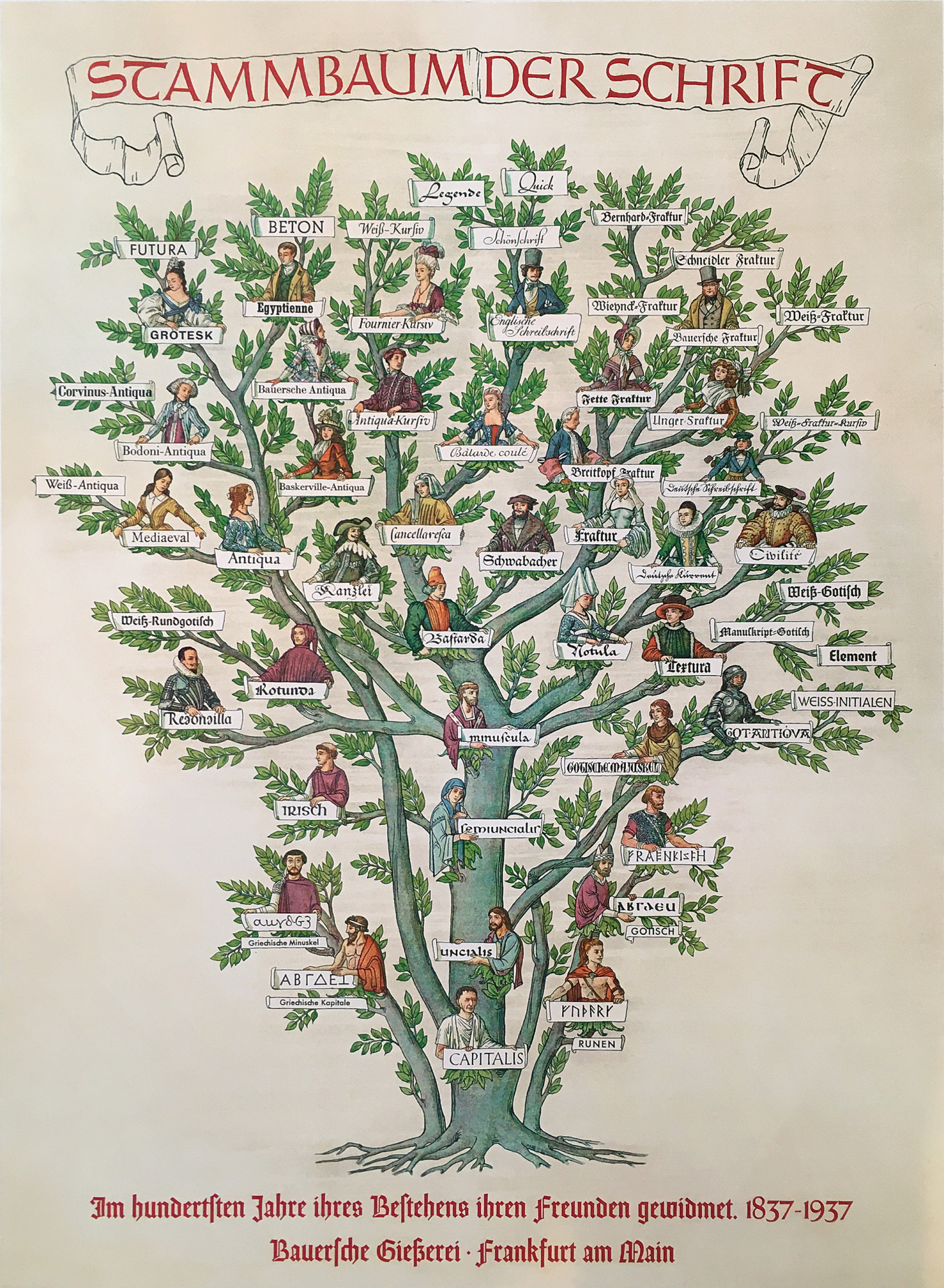
Konrad F. Bauer and Fritz Kredel, Stammbaum der Schrift, Bauersche Gießerei, Frankfurt am Main, 1937. Private collection. Photo: Jérôme Knebusch. Published on the occasion of the foundry's centenary. Gotico-Antiqua is shown as a knight on the right. At the ends of the family tree are no longer type categories, but creations of the foundry.
To this early 20th century activity one could add several definitions such as the genealogy of typefaces published by the German foundry Bauer at Frankfurt in 1937 and 1962—the Stammbaum der Schrift at the extremities of which the productions of Bauer can be found. This richly illustrated family tree shows numerous gothic types including Goticoantiqua, thus legitimising its place in the general history of typography. In 1969, in his substantial A view of early typography: up to about 1600, Harry Carter nuances the terms Roman, Humanistic, Gotico-Antiqua and Hybrid. From the 1970’s, Gotico-Antiqua only rarely appears in publications on typography. In palaeography and incunabula research, on the other hand, it is still considered; it is classified either as a type belonging to the gothic world—by Ferdinand Geldner, for example— or as a distinct category—by Geoffrey Hargreaves or Otto Mazal, for example.
From the more recent considerations we would like to mention Stan Knight, who distinguishes, along historical lines, Medieval types from Italian Renaissance types, with, in this latter category, B1 Semi-Gothic or Fere-Humanistica and B2 Fully Roman. We would also mention John Boardley who focuses on the development of roman, proposing Proto-Roman, Jensonian Roman and Aldine Roman. Paul McNeil, the author of a recent richly illustrated work on the history of typography from Gutenberg to the present, in which Gotico-Antiqua appears as a sub-element of gothic (Blackletter); and finally Paul Shaw who presents it as a sub-element of roman (mentioned in the introduction to the chapter “Venetian Old Style and Aldine Type” of his Revival Type).
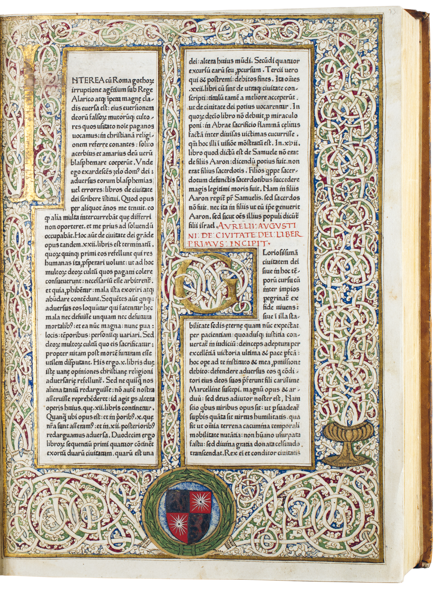
Proto-Roman: Aurelius Augustinus, De civitate dei [Subiaco: Konrad Sweynheim & Arnold Pannartz], 12 June 1467. 28,7×38,5cm, folio. Courtesy Bibliothèque municipale de Bourges. Photo: Nabila Halim / ANRT. ISTC ia01230000, TW 1:120R.
Which form for which name?
On reading this short and incomplete chronology, one might think that the place of our object of study varies considerably according to point of view or opinion. Although Gotico-Antiqua seems to be the most recurrent term among typographers, no term is definitively adopted. Moreover, the names differ as much as the forms they designate. There is much confusion, particularly in Updike, who, as Johnson underlines, was unable to benefit from various later initiatives: he uses different terms and uses as examples equally different typefaces. To illustrate “the transitional type”, Goudy employs Sweynheim & Pannartz’s example (the second typeface, engraved in Rome), which he also describes as “neither black-letter nor Roman, but a type that was back-letter in color but nearly Roman in form”; then specifies: “Their type shows plainly an unconscious leaning of its designer toward the mannerisms of the Gothic black-letter — the only form of letter used until these printers established their press. This transitional type, then, marks the beginning of the Roman type-form; it is the prototype from which all other Roman types are descended, and for that reason it is extremely interesting (…)”. As an example of Gotico-Antiqua, Carter and Shaw also cite Sweynheim & Pannartz (the first typeface, engraved at Subiaco, named Subiaco in the rest of this text), just like Mc Neil, who, however, also uses other, rather different typefaces to illustrate the term. Boardley finally rejects the terms semi-gothic and semi-roman proposing Proto-Roman for all initiatives prior to Jenson, without, however, mentioning the important Durandus. If, mainly for typographers, Sweynheim & Pannartz’s Subiaco is a typical example of Gotico-Antiqua, librarians prefer to cite Durandus created by Fust & Schöffer in 1459 at Mainz (Hessel, Crous & Kirchner, Morison, Johnson, Geldner, Hargreaves), sometimes also called Fere-Humanistica.
The definition of Gotico-Antiqua is difficult to establish since it is closely linked to the model of writing. As the first types were extremely close to their model a common appellation could make sense. This is the case for classic gothics. Without hesitation we apply Textura to written or printed forms, the latter produced directly from a contemporary manuscript. On the other hand, for Fere-Humanistica, the problem is to be found in the fact that Petrarch’s handwriting does not seem to have been used in Germany at the time of the creation of the Gotico-Antiqua typefaces, but about a century earlier in Italy. Moreover, the contemporary writing of the Florence and Padua humanists upon which roman is based and which represents an evolution of Petrarch’s Fere-Humanistica was being created at this time—unstable models that engraving would have to define and finally outstrip, unlike gothic writing which had stabilised over the centuries and presented no stylistic issues when transposed into typefaces by the printers. Historians often grant much importance to the first creation, in this instance, the “first roman”. Amongst those typographers who have most studied palaeography, Morison insists that roman and humanistic should designate the same forms. Thus, for him, when, in 1465, Sweynheim & Pannartz engraved “the first roman or humanistic type” at Subiaco, it was the first attempt to transpose humanistic handwriting into (roman) type. Afterwards, he adds, nothing changes fundamentally until the work of Aldus Manutius. Carter counters: “It is humanist; but it is a German’s idea of Italian humanism”; then continues: “The German name Gotico-antiqua and the Latin-English fere-humanistica are often applied to the Durandus type in particular. It seems best to reserve these names for founts of type that in at least some of their sorts have been influenced by Roman inscriptional capitals.” Therefore, for Carter, Subiaco, not Durandus (for which he proposes no appellation), should be qualified as Gotico-Antiqua. In his excellent Historical Types, Stan Knight is in agreement concerning Subiaco; he does not show Durandus and considers Jenson’s typeface to be the “first fully-developed roman type”.
Although a clear picture is quite difficult to establish, two points raise no doubts: Subiaco and Durandus, the two types which are sharply distinguished, are sufficiently important to deserve a name; moreover, they are different enough to have separate names. Apart from the presence of roman capitals in Subiaco, as opposed to the mix of gothic, uncial and rustic capitals in Durandus, these two typefaces do not seem to have the same handwriting as a model. Secondly, there is general agreement in recognising Nicolas Jenson’s roman as the first accomplished roman, or, to use the words of William Morris, the first to have “carried the Roman type as far as it can go”.

Hybrid: [Dionysius Carthusiensis, Gerardus de Vliederhoven], Cordiale quattuor novissimorum [Speyer: Printer of the Postilla Scolastica, about 1471]. 14×19,5cm, quarto. Courtesy Universitätsbibliothek Leipzig. Photo: Nabila Halim / ANRT. ISTC ic00882000, TW 1:108G.
A space of tension between gothic and roman
From these assertions it is possible to define a space containing the typefaces of our corpus—some sixty so far. It should be noted that only typefaces presenting noteworthy differences have been retained; the corpus would therefore be much larger if it included variants of typefaces and copies. Types which are stylistically less accomplished than Jenson can also be admitted to this space of tension between gothic and roman. On the opposite side, there can be no doubt about the typographic transpositions of gothic handwriting. The first type to differ from it is thus the Durandus engraved in 1459 by Peter Schöffer for the Rationale Divinorum Officiorum by Guillelmus Durandus. Thus the types in question, created between 1459 and 1470, are all characterised by a roman tendency with gothic roots or by an almost-roman design with gothic reminiscences. We know that typefaces do not evolve by direct derivation; their mutation can often be explained by palaeographic reasons, and the relationships and influences are always complex. Nevertheless, it is possible to situate a design along a main Durandus-Subiaco-Jenson axis. Naming it is, however, more difficult. In his emblematic text, Call it what it is , John Downer asserted the importance of the accuracy of names. Here, the issue is the reverse: we need to weed out the inappropriate names, that is, the vague terms starting with semi, half, or halb, the repetitions such as Gothic-Roman or Gothic-Humanistic for Gotico-Antiqua; and we need to exercise prudence in the use of the terms transitional and hybrid. It is certainly not possible to settle in favour of a single denomination; and to invent a new terminology would only overload an already saturated discourse. But we can limit ourselves to the most convincing expressions: Gotico-Antiqua, Proto-Roman and Hybrid.
As for the term Fere-Humanistica, it remains pertinent if it does not duplicate Gotico-Antiqua. If typographers and palaeographers could reach agreement, the term could suffice to describe hand-written forms close to Gotico-Antiqua. Similarly, we recognise that humanistic written forms are the origins of roman type, just as cursive humanistic written forms are the origins of italic type.
Despite being a generic term, Hybrid—proposed by Carter and also called Mixed by Morison—seems quite relevant to designate numerous surprising mixtures of style after 1470. This kind of deliberate design attempts a compromise between gothic and roman, either in one form or in a puzzle set in which certain letters are gothic and others roman. Therefore, Hybrids are neither Proto-Romans nor Gotico-Antiquas, although they might borrow forms from them.
As for the use of the term transitional, only a Proto-Roman type can really justify its use. From a distance, of course, all types work in a period of transition, but only Proto-Roman truly aspires to be roman. If Proto-Roman typefaces are not (yet) roman this is because they are still marked by gothic reminiscences, a lack of rationalisation or an insufficient degree of technicity—roman demands finesse in engraving. A Proto-Roman such as Subiaco constitutes a historical moment in the very rapid progression towards roman; so rapid that once Nicolas Jenson had perfectly fixed its style a decade or two had to elapse before a ‘pure roman’ was seen elsewhere.
Conversely, Gotico-Antiqua is more of a “conscious” creation. As early as 1459, a Gotico-Antiqua type is defined and repeated. Durandus was engraved in several sizes and used until the end of the century by Schöffer; it neither changed its state nor turned into roman type. No other typeface had such a long life in the 15th century. Its success was instant and it became a reference for other printers. In its time, it gave rise to numerous derivatives and copies dominating the Germany of the 1460’s and 1470’s. It is even possible that, after studying in Paris in a humanistic context and before settling in Mainz, Schöffer aspired to a “German roman” created from the semi-humanistic handwriting of Petrarch, a roman in which he would have wanted to preserve gothic elements. Thus elements are visible not only in the form of the letters but also in their recurring “fusion” (ligatures in which round parts overlap as in the “œ”), in the use of the gothic Tironian ampersand, of the “s” at the end of a sentence (the long “s” being standard) or of a bowed “r” associated with the letter “o”, as well as in the use of numerous grammatical abbreviations which all the humanists attempted to eliminate. On the other hand, the “open” characteristics, as Johnson describes them with long ascenders bringing light between the hitherto dense lines, and the rather rounded proportions of the letters as well as individual letters such as “a” and sometimes “d” in roman form, all contribute to a strong tendency of this type to lean towards humanism. As humanism started in Germany later than in Italy, this would also make Schöffer one of the first German humanists, and all types in our corpus of more or less humanistic origin. In 1465, Schöffer was also the origin of the first publication of a humanist text (De Officiis by Cicero), composed in Durandus, before Sweynheim & Pannartz printed Cicero’s De Oratore later the same year. However in the following years Schöffer published few classic texts from ancient Greece and Rome. We do not have sufficient information to ascertain how far he was driven by a desire for humanism; but at the very least, Durandus was born out of the will to conceive a more versatile and legible typeface; it could even be considered as the first typographic creation insofar as it emancipates itself from its written model. In any case, this typeface and many more from the same period merit greater consideration. Often qualified as incomplete or amateur work, these forms can be inspiring for designers today, and contribute to the contemporary reflexion on the consistency in type design.
-
The research programme now includes two research students, Rafael Ribas and Alexis Faudot, and organises workshops involving students from schools of art and design in France and Germany (at present: Mulhouse, Valence, Mainz, Saarbrücken, Lyon, Aachen, Weimar and Toulouse). →
-
See: “Premières impressions supposées”, in Guy Bechtel, Gutenberg (Paris: Fayard, 1992), p. 333. →
-
This calculation comes up against the difficulty of defining what is meant by “type”. The TW lists the different sizes of type possessed by each printer, and thus the possible identical types which could have been used by different printers (copies, recasting, sale of matrices and letters). →
-
Konrad Haebler, Typenrepertorium der Wiegendrucke (TW), 5 volumes (Halle: Rudolf Haupt Verlag, 1905–1924). Online: tw.staatsbibliothek-berlin.de →
-
Textura is the most gothic form, using only straight lines and producing the dense vertical texture typical of high gothic art. Bastarda (in German also Schwabacher) is the most cursive form, close to contemporary vernacular writing; it has many regional variants. Rotunda, was more popular in the southern countries and is the only gothic type with straight stems (like a sans serif) and round curves. It could thus be described as the least gothic form, or, like Bringhurst, as the only “unpointed” gothic form. The notion of breaking round parts (from which the German term designating gothic typefaces in general comes: Gebrochene Schriften, “broken types”) is nevertheless present in Rotunda. It is an essential feature of gothic type, undoubtedly more essential than the blackness giving rise to the English term Blackletter. One should note that italics—on the roman side—or Fraktur—on the gothic side—have not yet been born. →
-
Except that Rotunda is blacker and has, like Textura, an “a” with a closed upper part. Bastarda is more cursive, with an “f” and a long “s” going below the base line and a letter “g” with a distinctive cross of the bar with the stem in the upper right corner. Roman is larger, lighter, less calligraphic and has serifs. Most Gotico-Antiqua typefaces have a letter “g” which resembles the figure “8”, which is present in no other typographic style and which can find its origins in the proto-gothic writing of the 12th century. As far as the capitals of Gotico-Antiqua are concerned, they are very varied, mixing rustic, uncial, gothic and, later, roman origins. →
-
The online version of the TW was updated in autumn 2019, following the Gotico-Antiqua conference in Nancy. The TW now offers a nuanced classification of Gothic (Textura, Rotunda, Bastarda, Goticoantiqua) and Roman types (Antiqua, Kursiv, Mischtype). →
-
The same goes for the terms Germanische Antiqua (Germanic Roman) or Neudeutsch (New German), in a Germany that was looking for the compromise between gothic and roman at the beginning of the 20th century. See “German Hybrid Typefaces 1900-1914”, Christopher Burke in Peter Bain & Paul Shaw (ed.), Blackletter: Type and National Identity (New York: Princeton Architectural Press, 2005). →
-
D.B. Updike, Printing Types: Their History, Forms, and Use [1922], vol.1, (Delaware: Oak Knoll Press & British Library, 2001), p. 60. The terms are equivalent to the later Textura, Rotunda and Bastarda, as well as to the terms already used in French: lettre de forme, lettre de somme and lettre batarde. →
-
Replacing Square Church Types by Textura, Rounded Church and Heading Types by Rotunda (titling), Latin Text Types by Rotunda (text) and Vernacular German Types by Bastarda, an older classification (in which Gotico-Antiqua does not appear) by Robert Proctor in Index to the Early Printed Books in the British Museum (1898–1903). →
-
Preface to Stanley Morison, German Incunabula in the British Museum [1928] (New York: Hacker Art Books, 1975). Morison was not aware that, in the same year, Crous & Kirchner had also used the German term Goticoantiqua proposed by Hessel. →
-
Ferdinand Geldner, Inkunabelkunde (Wiesbaden: Dr. Ludwig Reichert Verlag), 1978. →
-
Geoffrey Hargreaves, Some characteristics and antecedents of the majuscules on fifteenth-century German gotico-antiqua typography (Mainz: Gutenberg-Jahrbuch, 1986). →
-
Otto Mazal, Paläographie und Paläotypie, Bibliothek des Buchwesens, vol.8 (Stuttgart: Anton Hiersemann Verlag, 1984). →
-
Stan Knight, Historical Types (New Castle: Oak Knoll Press, 2012). →
-
John Boardley, «The First Roman Fonts», I Love Typography, online [2016]: ilovetypography.com/2016/04/18/the-first-roman-fonts →
-
Paul McNeil, The Visual History of Type (London: Laurence King, 2017). →
-
Paul Shaw, Revival Type (London: Thames & Hudson, 2017). →
-
Frederic Goudy, The Alphabet (New York: Mitchel Kennerly, 1918), p.29. →
-
See Fred Smeijers, «Letters and the Italian intellect», in Counterpunch: Making Type in the Sixteenth Century, Designing Typefaces Now (London: Hyphen Press, 1996), p.43. →
-
Stanley Morison, J. McKitterick (ed.), «Early Humanistic Script and the First Roman Type», in Selected Essays on the history of letter-forms in manuscript and print [1943], vol. I (Cambridge University Press, 1981). →
-
Harry Carter, A View of Early Typography: up to about 1600 [1969] (London: Hyphen Press, 2002), p.34 et 47. →
-
Quoted by Frederic Goudy in The Alphabet (New York: Mitchel Kennerly, 1918), p.30. →
-
Text of the Tribute typeface specimen, published by the Emigre foundry in 2003. Online: emigre.com/Essays/Type/CallItWhatItIs. French translation by Gwenaël Fradin and Samuel Vermeil published in Azimuts №43. →
-
Lotte Hellinga has argued that its surprising and early technical quality could be due to the fact that Jenson was at that time in the Fust & Schöffer workshop and could thus have brought his know-how from the mint at Tours (France) where he had previously worked. The French king had sent Jenson to learn the German secrets and at the same time he would have exported French know-how. See Lotte Hellinga, Johann Fust, Peter Schöffer and Nicolas Jenson (Mainz: Gutenberg-Jahrbuch, 2003). →
-
“It is a gothic hand with considerable roman tendencies. (…) It is a renaissance letter in its openess.” Johnson in “The Classification of Gothic Types” in Selected Essays on Books and Printing [1929] (Amsterdam, Van Gendt & Co, 1970), p.4. Traduction de l’auteur. →