From Univers to Multivers
First published in Revue Composite, Issue 5, September 2024.
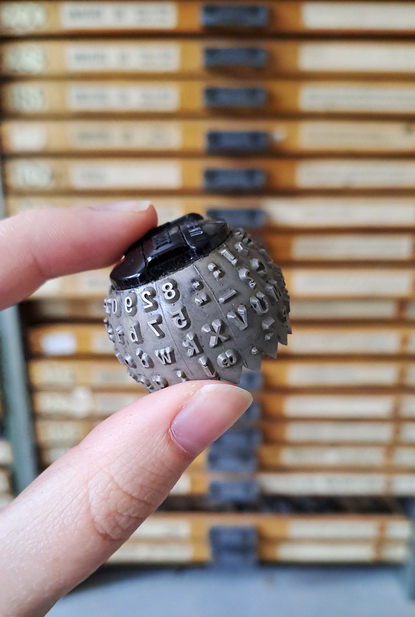
IBM typeball. Photograph taken by the author at ANRT, Nancy.
Many of Adrian Frutiger’s best-known works were created during his time in Arcueil, in the southern suburbs of Paris. For decades, Frutiger had his studio there in collaboration with Bruno Pfäffli. When the house in which the old studio was located was sold in 2019, a number of treasures were found under the roof: original documents and drawings by Frutiger dating from 1964 to 1975. We are pleased to temporarily keep these works at ANRT in order to carry out some research before uniting them with the rest of Frutiger’s Archive at the Museum für Gestaltung in Zürich. The majority of the documents from Arcueil include drawings, test prints and film footage of the typeface Univers.
The second half of the 20th century was a special time for typedesign. The technical possibilities developed faster and faster, as did the typesetting techniques. From lead typesetting to hot metal type, phototypesetting, typewriters and digital design, the Univers typeface and its designer Adrian Frutiger were involved in all processes.
Univers evolved with the history of typesetting. It adapts from one technology to the next, the number of different versions is immense. What is not obvious at first glance is that the design of the letters also changes with the technical conditions.
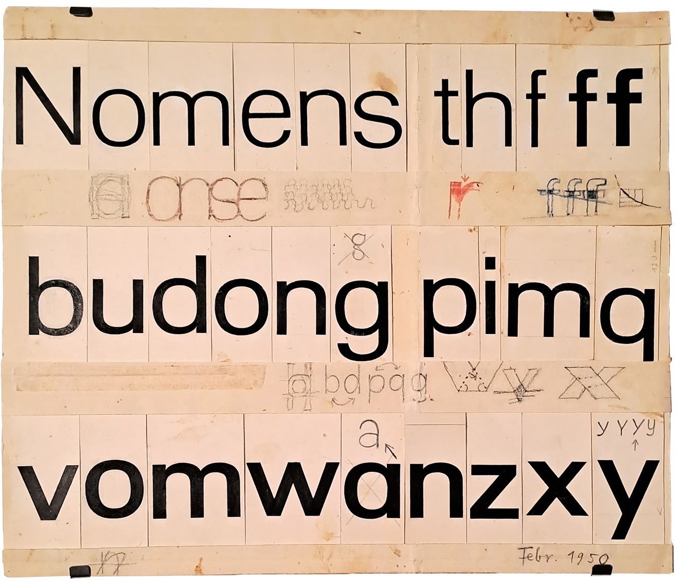
01. Draft of a sans-serif during Frutiger’s studies, February 1950. Many similarities to Univers can be found already, like the horizontal endings, the corrected form of a and the mirrored b becoming d and p becoming q. Photography taken by the author at the Museum für Gestaltung Zürich, April 2023.
During his studies in 1950, Frutiger created sketches for a sans-serif typeface, which were later used as the basis for Univers [01]. It first appeared in 1957 at Deberny & Peignot in Paris, where Frutiger was working on type adaptation for phototypesetting machines. Instead of reworking the already familiar Futura, Frutiger wanted to design a new sans-serif. Not just one style, but a typeface family with 21 different variations, making it the first systematically extended typeface family ever, being published without even testing a single style on the market beforehand. This was an enormous risk for a foundry at the time. Nevertheless, Charles Peignot, the foundry’s head, believed in Frutiger’s idea and Univers was initially released for phototypesetting in 1957.
While Frutiger produced final drawings of the letterforms, he decided to produce a set of drawings that didn’t take into account all of the optical adjustments required by the phototypesetting technology. He wanted his original design to be free from such restrictions. A year later, in 1958, the production of the characters for lead typesetting was based on these original artworks.
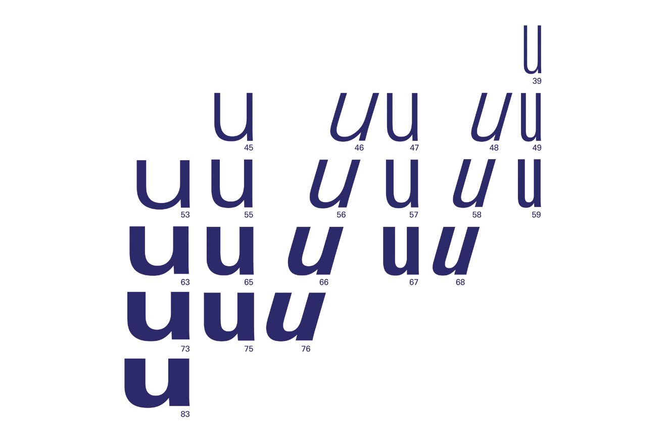
At the time, there was not even a suitable naming system for such a large font family. Inspired by Maximilian Vox’ classification of typefaces by giving style names, Frutiger created a numbering system to make it easier to recognize the different styles. The numbering system was firstly invented for the Lumitype Univers, but got modified later for Univers in general and can still be found in Frutigers typefaces today. In this simplified version, each style was assigned a 2-digit-number [02]. The most elementary regular style is number 55. The tens digit shows the weight of the style: the smaller the lighter, the larger the bolder. The following unit indicates the slant and the width: if the number is odd, it is an upright variation; if the number is even, the style is cursive. The higher the number gets, the more condensed is the letterform. [03]
After Univers got very popular in photo- and lead typesetting (and from 1961 on as well in Monotype hot metal), a new application arose for the IBM typeball typewriter.
However, the design had to be adapted for each typesetting technique. The corresponding unit system was often decisive for this. Not every typesetting technique allowed free design; technical restrictions were part of the design process.
The main part of the newly found archive displays how the typeface had to adapt to the new technology of typeball typewriters, considering its required Unitsystem.
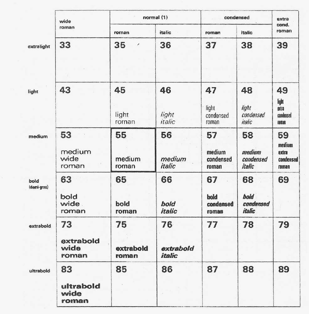
02. Numbering system. Source: Table of width and weights for Lumitype faces. From Alice Savoie, International cross-currents in typeface design: France, Britain and the USA in the phototypesetting era, PhD thesis (Reading: University of Reading, January 2014). From International Photon Corporation, Typefaces.
03. Reproduction created by the author of the Univers Graphic by Deberny & Peignot using Univers Next Pro.
This part of the archive consists of 15 folders with Univers blueprints for the IBM typeball typewriters. A total of 20 different Univers versions were produced for the typeballs, 14 of them are included in the archive. The prints display individual letters on an IBM template in different sizes, thicknesses and variants. They show the handwritten comments of Frutiger and his colleagues. It can be assumed that the blueprints were sent back and forth between IBM and Frutiger’s studio as test prints. The final drawings should therefore have been at IBM for production. The existing blueprints are thus a non-final version with suggestions for improvement.
An inconspicuous box includes a collection of microfilms, presumably from Frutiger’s time at Deberny & Peignot. These depict the individual characters of Univers for phototypesetting in negative and positive form.
The access to the original documents provides an inspiring insight into processes, samples, correction loops and the everyday work of a type designer in the 20th century. The archive opens up a variety of approaches to researching the material, classifying it, writing a theoretical discourse or integrating it into a design project. It can be researched in a wide variety of ways.
In my work I chose to combine theory and design. The archive documents show a high complexity of the design processes in two different typesetting technologies: Phototypesetting and the IBM typewriter system. The first one is based on the exposure to light of characters shown on a photosensitive film or disc, while the second one is based on physical characters on a typeball striking the paper through an inked ribbon. How can one typeface concept exist within two such different technologies? What influence does the technology have on the letter shapes? And how to link these two past technologies with the technological context of today, meaning digital fonts?
Univers for IBM
IBM golfball typewriters are a true innovation in technology. In 1961, IBM develops the golfball typehead for the electric IBM Selectric typewriter. It is used in the IBM Composer Systems and the Magnetic Tape Selectric Composer launched in 1966. Instead of a type lever, the IBM machine is based on a ball system with an interchangeable typeball (also known as ‘golfball’ because of their particular size and shape). Where previously there were typewriters with one typeface in one size and style, there is now a wide collection of typeballs with font sizes ranging from 6 pt to 12 pt, and in a variety of styles that could be changed freely.
For functional reasons, a unit system consisting of nine units was created. Each character can be assigned to exactly one unit, regardless of size or style. However, this also meant that the lowercase a of Univers had to be exactly the same width as the same letter in a serif font such as Baskerville. Since the allocation of a specific unit to each letter is based on the proportions of the serif typeface ‘Times’, the chosen width did not always correspond to the optimal ratio of a sans-serif typeface. This led to severe restrictions in the design of some characters. Looking at the letters g, s or e of IBM Univers, they appear far too narrow. In their serif counterparts, however, they might be just right. The interchangeable golfballs gave users the opportunity to customize the look of their documents and make their own design decisions for the first time.
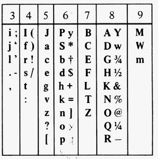
88 characters fit on one typeball. These are put together a little differently for each language and also have a slightly different arrangement depending on the country’s keyboard [04]. The typeball itself was cast from plastic in a mold and then coated with nickel [05]. Looking more closely at the corresponding mould, the slightly rounded corners of the letters are noticeable [06].
This can be attributed to the tools used in the production process. The letters were worked into the mold using a milling machine. This tool has a diameter that does not allow to form sharp corners. Referring back to the archival documents hosted at ANRT, there is evidence that Frutiger had already incorporated the rounded corners into his drawings. There is a document in the archive that shows some circles, but always in the same size [07]. The diameter of the circles corresponds exactly to 100 times the diameter of the milling machine. The technical requirements of this tool thus had an influence on the design of the font.
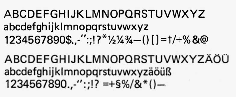
04. Overview of the english and german characterset for the IBM typeball. Heidrun Osterer, Philipp Stamm (eds), Schriften. Das Gesamtwerk (Basel: Birkhäuser, 2014), p.192.
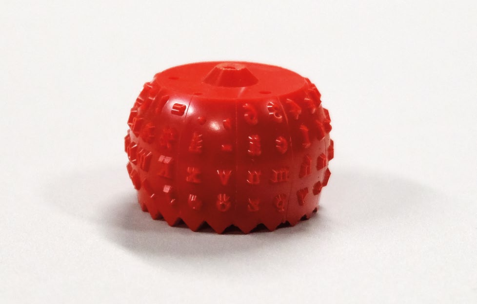
05. Plastic typeball before being nickel-plated. Photograph of IBM mold and typeball taken by the author at Museum für Gestaltung Zürich.
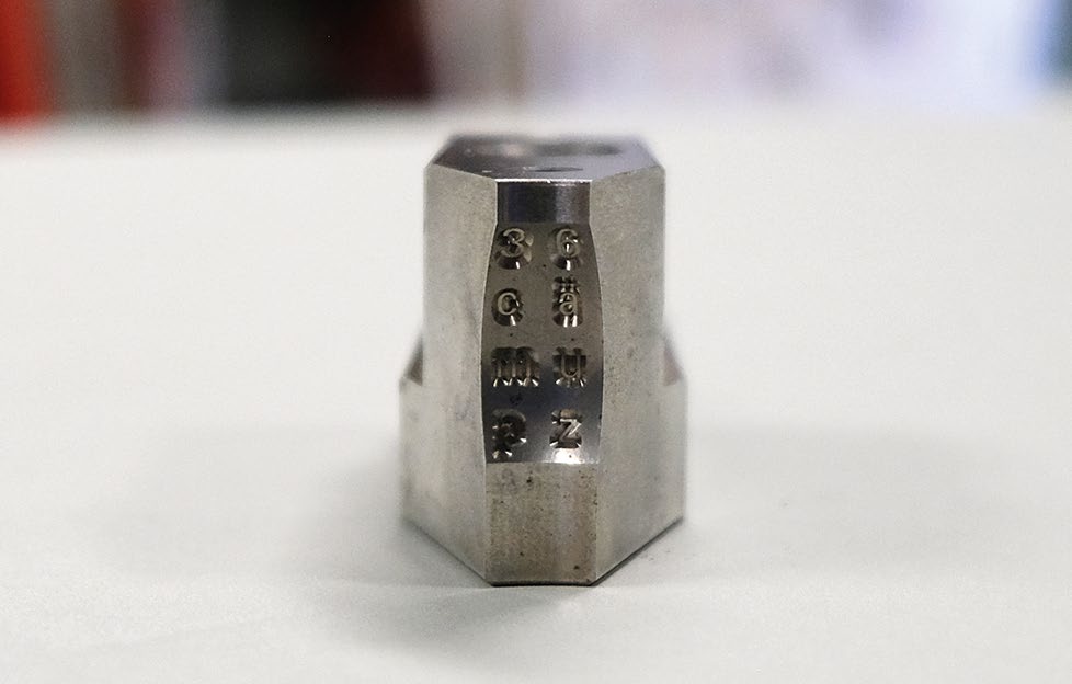
06. Part of the mold for the typeball. Photograph of IBM mold and typeball taken by the author at Museum für Gestaltung Zürich.
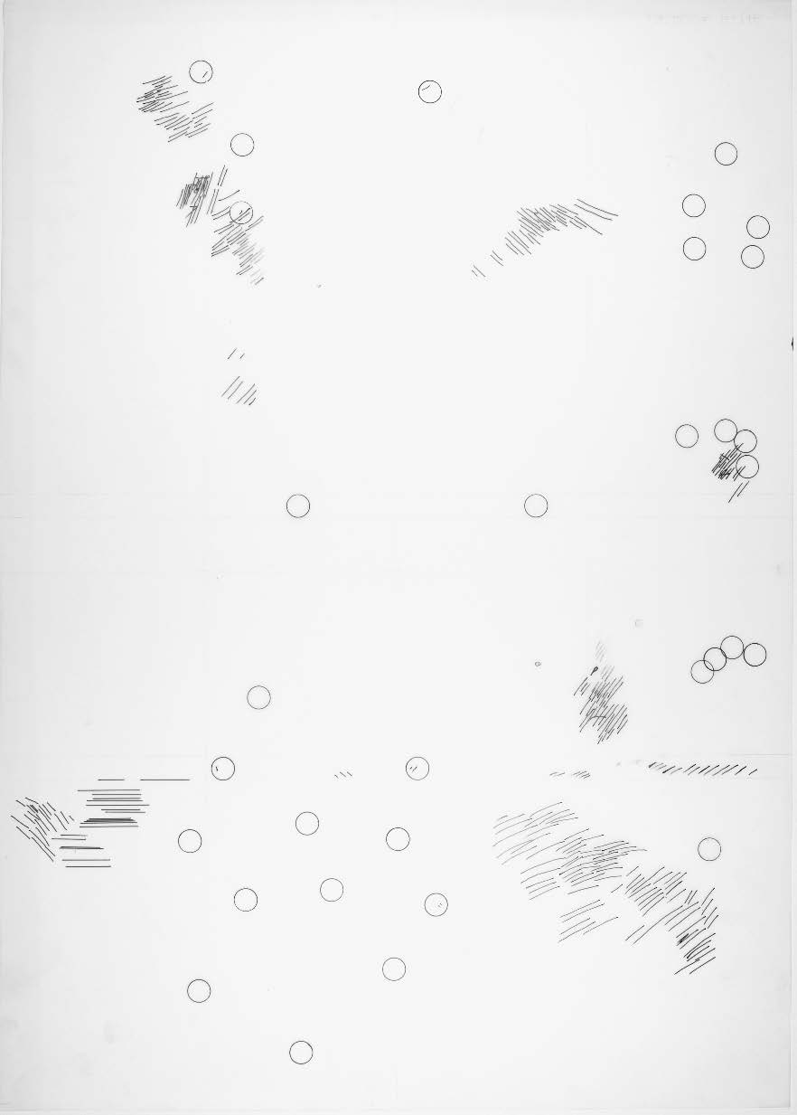
07. Circles show the diameter of the used milling machine for the typeball production. Photographs of the archive temporarily held at ANRT taken by the author.
Univers for Lumitype
In the 1950s, the typographic world was revolutionized by the innovation of phototypesetting. Compared to previous techniques such as manual type or hot metal, phototypesetting was based on a completely different, material-saving printing technique. Before, tons of lead type in different sizes and styles were stored in drawers. The new technology makes it possible to replace this mass of type with a type sample in the shape of a disc or film including different weights of the typeface. This type sample was used to reproduce the desired letters using exposure and photosensitive paper.
Due to technical limitations, a unit system was also necessary for phototypesetting. However, this one was much finer than the one used on the IBM typewriter. Displaying its typefaces on a rotating matrix-disc, the Lumitype phototypesetting machine had a total of 36 units.
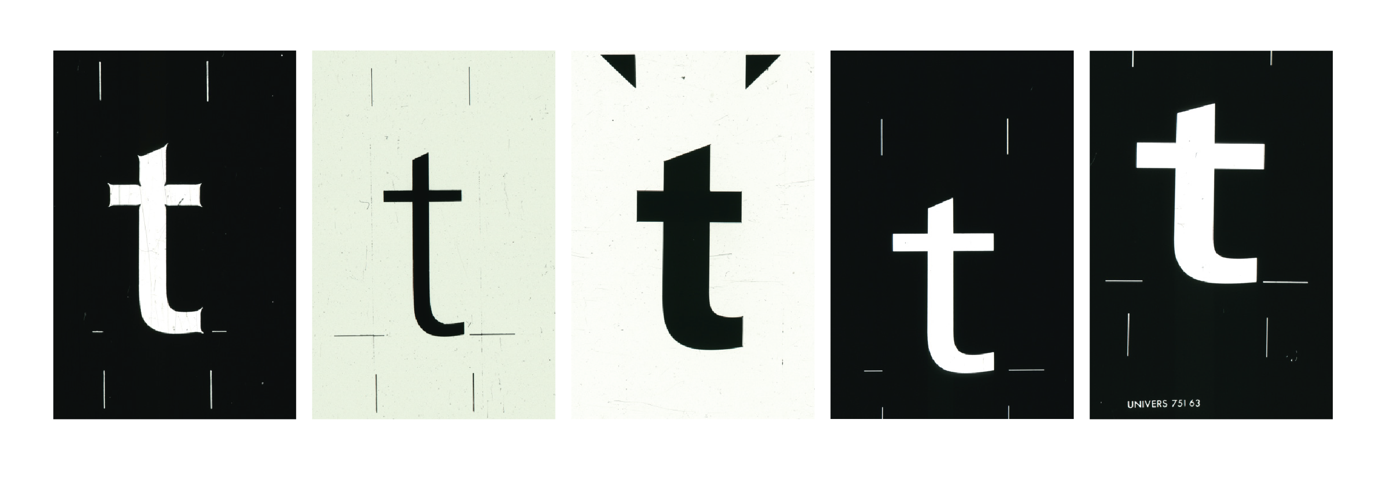
For the design of the letterforms, this made it necessary to adapt the individual width proportions to the system. Univers for phototypesetting is much closer to the original final drawings than IBM Univers, but its strength and details still had to be adapted. As less light passes through smaller openings than through larger openings, thin hairlines, for example, would have been barely visible in the photoset result. Therefore, all fine lines, corners and dots had to be adjusted. Lines and dots were slightly emboldened, whereas special spikes were introduced at corners [08-09]. If the type sample had letters with normal corners, they would look slightly rounded in the final result. To compensate for this, the corners were made much more pointed. This allowed more light to pass through and the corners looked normal again in the final print.
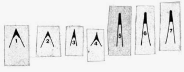
08-09. Different forms of spikes used for the corners of phototypesetting drawings. Heidrun Osterer, Philipp Stamm (eds), Schriften. Das Gesamtwerk (Basel: Birkhäuser, 2014), p.104.
Adapting an existing typeface to severe technical restrictions is a process that requires breaking down the design to its most fundamental elements. How can a typeface remain unmistakable even though it has endured significant changes, and why is Univers in all its forms still recognizable as Univers?
The archive held at ANRT, with its blueprints for the different styles of Univers gave me the opportunity to create a digital version based on the original drafts instead of the printed version. With this chance I decided to design a typeface that comes close to the basic idea of Univers for Typewriter. Where normally the technical printing limitations by the typewriter reproduction were an obstacle, I have the unique possibility to have direct access to the originals and to incorporate Frutiger’s elementary thoughts into the design without distorting the typewriter’s impurities.
10. The IBM units table shows the corresponding width unit for each character. Heidrun Osterer, Philipp Stamm (eds), Schriften. Das Gesamtwerk (Basel: Birkhäuser, 2014), p.192.
11. One of the grid templates corresponding to the Blueprints. Photograph of the archive temporarily held at ANRT taken by the author.
The blueprints, which are 100 times the size of the original letter, offer a huge amount of information, even if it is only recognizable at second glance. A closer look at the prints reveals a unit system. Seven different units are depicted with their corresponding numerical value. This value, together with the IBM units table, can be used to calculate the exact width for each character [10].
By looking deeper into the archive, several grid templates can be found [11]. The grids have different unit values, so the sheets correspond to different templates. This suggests that there were different unit values for each font size. The rounded corners have also already been incorporated into the blueprints. They correspond to the diameter of the milling machine used in production.
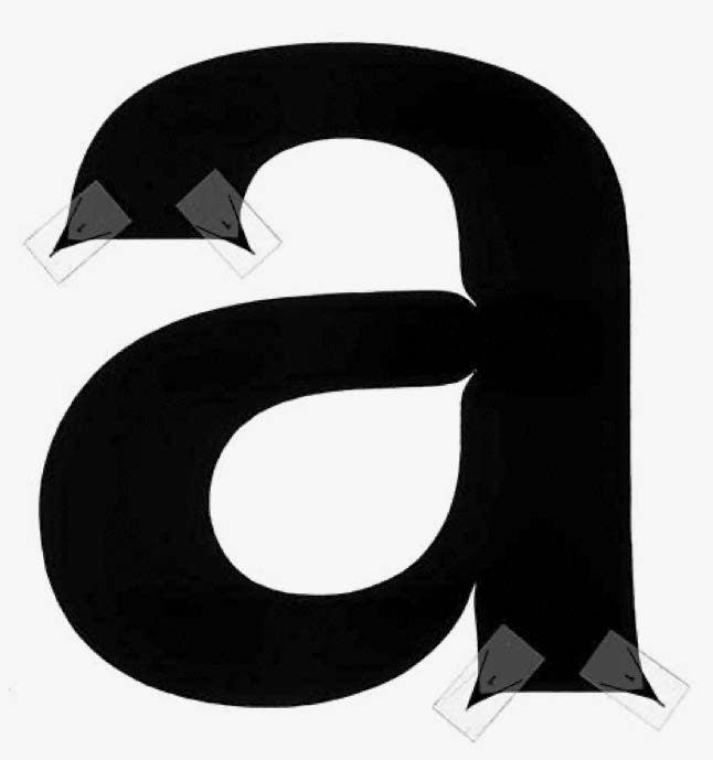
The generally high x-height and low ascenders and descenders are a characteristic feature of Univers. This also includes the fact that there is no difference in cap height and ascenders. However, if you compare different capitals such as Z, L and H, you will find a difference in their size. According to Frutiger, letters that are strongly emphasized horizontally appear too high compared to vertically emphasized letters such as H. They must therefore be minimally reduced in size [12]. This applies to B, D, E, F, L, P, R, T and Z, in each case the horizontally emphasized side(s) is/are shortened. For lead typesetting, the differentiated cap height was only theoretical, as it would have complicated production.
It is noticeable in the blueprints that this principle was not always applied. Although it is used throughout the light version, it is missing in bold. As the proofs are not the final versions and the typewriter print is not accurate enough, it is difficult to say in retrospect whether this was ever revised.
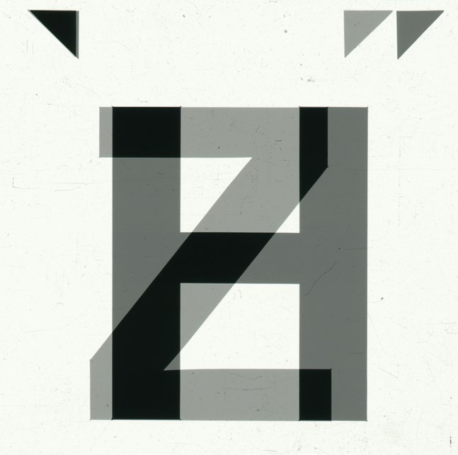
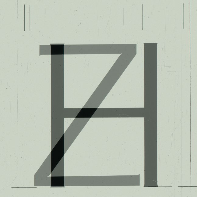
12. Height comparison of uppercase letters for Phototypesetting. While in the bold style the letter height seems the same, in the light version Z is smaller than H. Overlap of Microfilms scanned and edited by the author.
When comparing the blueprints of the different font sizes, it’s immediately noticeable that the corresponding Univers version with its numbering is shown at the top right of each print. For sizes 8, 10 and 11, there’s therefore always the number 55 in the regular size, but if you compare the blueprints of the smallest font size with the others, you can spend a long time looking for the 55. The number 53 is shown [13-14]. According to Frutiger’s graphic, however, this naming no longer corresponds to the normal regular style, but to the extended version. The letters in font size 7 also appear somewhat wider. If you set the entire line with the IBM typewriter, you can clearly see how wide it is. This simply means that Frutiger himself used an optical size for the typewriter. Instead of redesigning the regular forms, he decided to use the 53, the extended version. This still allows the font to appear perfectly legible in size 7.

13-14. Comparing the different sizes it becomes clears that different styles were used. As optical size for the small 7 pt typeface, Univers 53 (extended) was applied. The number can be seen in the upper right corner. Photographs of the archive temporarily held at ANRT taken by the author.
The fascinating thing about Univers is that it has evolved over time in a wide variety of typesetting techniques and could be adapted to each of them. Univers plays a role in all typesetting ‘worlds’. It changes and adapts to its external influences.
As described above, the archive contains both the IBM Blueprints and microfilms with the original versions of Univers for phototypesetting. To extract all possible from the archive, I decided to include the Phototypesetting technique in my typeface. If only considering the shape of the letters, it clearly shows that the two versions could hardly be more different. The combination of these two versions within a type family creates a strong field of tension between the contrasting shapes of the corners. The fascinating images of the phototypesetting templates show a completely new way of Univers. The spikes, which were only attached to the corners for technical reasons and are not visible in the final result, are decisive for the templates and produce an extraordinary form. I wanted to take up this play with shapes in my digitization and thus also counteract the loss of influences in the forms through phototypesetting and incorporate the characteristics into a digital version.
Multivers
The outcome is a variable font that can be transformed from typewriter style to phototypesetting style. The basis of my work consists of three parts:
Designing different weights to make the font usable in various contexts.
The visualization of discovering the optical size.
Displaying two typesetting techniques in one typeface.
The idea is to create a variable font with three axes: weight, optical size and typesetting technique. As I’m working faithfully to the original, it was also necessary to design the regular styles so that the interpolation runs smoothly. The result is a design spectrum of 12 different masters: Univers for Typewriter in light, regular and bold with the corresponding optical sizes and Univers for Phototypesetting light, regular and bold with the matching extended versions.
It was important for me that I didn’t have an already existing template for all the styles, instead I was required to incorporate my own design. For example, there was no optical size in light and bold for the typewriter. In general, there was no light extended version in the beginning of Univers, which means there was no number 43, but I decided to include it to complete my masters [15].
The axis of the typesetting technique in particular creates an exciting design. The corners of the two versions are as contrasting as possible. The typewriter font with its rounded corners opposes the phototypesetting version with its spikes [16]. Somewhere between these two very contrary masters, a new Univers with ’normal’ corners was created. This is produced from the interpolation of the two extremes and thus has a mixture of shapes and proportions.
The variable font therefore depicts two different typesetting techniques and everything in between. From one Univers to many in one font. This is where the new name Multivers comes from. Many universes are found in one multiverse.
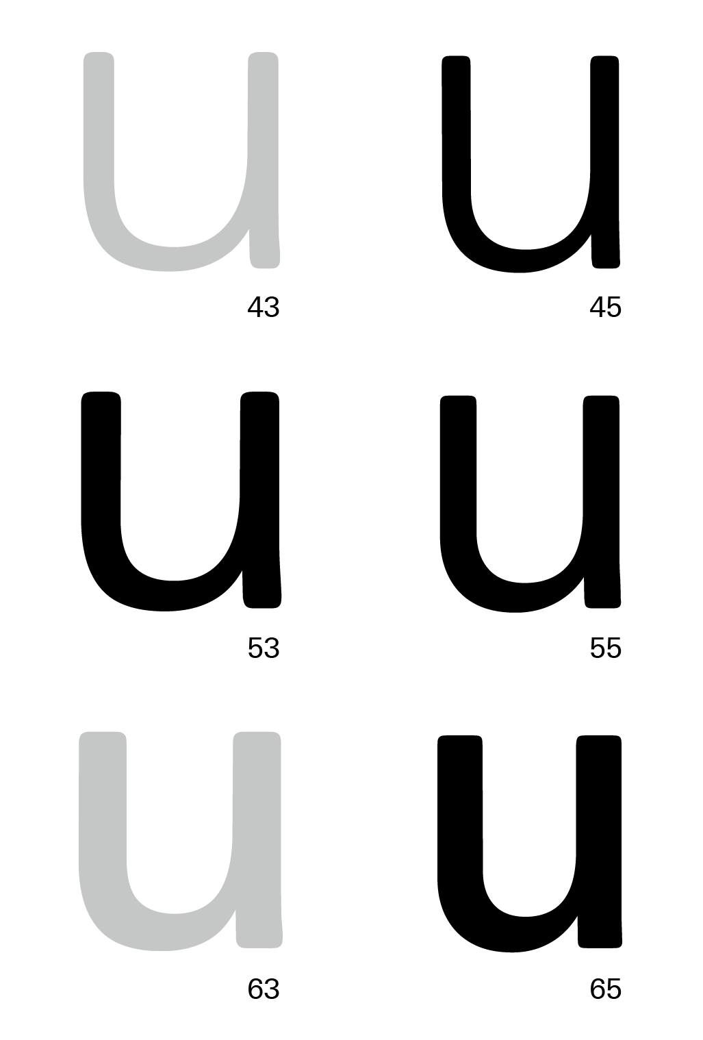
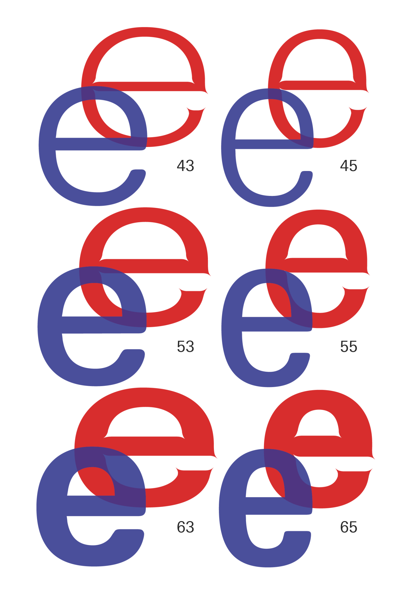
15. For the IBM Typewriter the Univers styles 43 and 63, meaning the point size 7 light and bold versions were not existing. Graphic designed by the author showcasing the various Multivers styles.
16. Comparison of the Univers B in weight 55 for typewriter and phototypesetting. Graphic designed by the author showcasing the various Multivers styles.
In order to combine the phototypesetting version with the typewriter version in one Glyphs file, the metrics had to be adapted. The different styles have slightly different height proportions. To design a usable font that does not change its proportions during use and when switching from one style to another, the metrics had to be adjusted. The x-height, ascender and descender are therefore the same in both versions. Somewhat stronger adjustments had to be made for the extended versions. As I decided to use the IBM optical size as base, the height proportions of the Phototypesetting extended versions had to be adjusted accordingly.
This also includes the overshoot. In general, it can be said that the different methods of digitizing the original materials resulted in many potential sources of mistakes. As with the photography of the IBM versions, the scanning and compression of the microfilms can result in numerous untraceable errors. I have therefore taken the necessary freedom to adapt the drawings slightly.
Especially when using the spikes, I have decided in favor of a homogeneous design. The various microfilms show the Univers versions for the different weights in positive or negative [17]. Although all the fonts are labelled with a DP shorthand for Deberny & Peignot, we do not know exactly what they were used for. Perhaps the letters were developed for the Lumitype phototypesetting machine or the microfilms only show backups of the letterforms. It is interesting to note that each microfilm has a slightly different character design. In the regular style, the spikes are very pronounced and the inktraps are clearly visible. This is different for the bold and light style. Here, the shape of the spikes changes considerably and their orientation is also different. In other weights, there are no spikes at all. One explanation for this could be that the versions were designed for varying phototypesetting machines and at different times. The diverse machines and techniques have distinct requirements. For example, small spikes are sufficient for one machine, while the other requires strong changes in the shape design. In the end, it is difficult to say what the reasons for the different designs are. I decided to harmonize Multivers. The phototypesetting styles are all based on the regular style of the microfilms, meaning the strongly pronounced spikes and inktraps.
17. Microfilms showing Univers in version 55, 45, 65, 53 and 63. In each style the corners are formed differently. Scans of microfilms from the archive by the author.
With his pioneering approach, Frutiger always had the future in mind when designing his typefaces. The systematic typeface family was an unprecedented innovation. In his work, he exploited everything technically possible to incorporate the latest technological advances into his designs. Always up to date, he revised Univers and adapted it to the times.
Multivers looks back on this pioneering evolution and puts it in a new context. It reflects the prospective of Univers and expands it through the technical possibilities of the variable font format.
In my work I merge the two technical implementations of phototypesetting and the typewriter technology into a combined design synthesis. Multivers displays a part of the history of typesetting linked in one typeface. Comparing simply the letterforms of the IBM Univers with the Phototypesetting Univers, they could hardly look more dissimilar. Each typesetting technology had a different influence on the design. One technology requires round corners, the other needs extreme spikes as a corner. Integrating these contrasting ideas into one project was a challenge. If the letterforms are taken out of the context of their technology, only the high-contrast design remains. This already invites to design a typeface with at least two extreme masters, a spiky and a round one.
A variable font can be used to create a field of tension between these two extremes. The different axes therefore show the change in shapes when a font had to be adapted for a different typesetting technique. Not only do the spacing and the letter forms change, but the font proportions also show significant differences in the change from phototypesetting to typewriting. The second axis of the variable font can be used to demonstrate the effect of optical sizes. It can be seen exactly how the shapes change in order to remain legible in a small font size. However, the font is not a dry representation of theory. The third axis changes the weight of the letters and the typeface can be used in a wide variety of contexts. With its twelve different masters, the variable font offers an exploratory playground to better understand the specificities of various typesetting techniques as well as a functional array of typographic options for a wide range of applications.
Multivers graphic with its 12 masters from Phototypesetting to Typewriter. Graphic designed by the author showcasing the various Multivers styles.
-
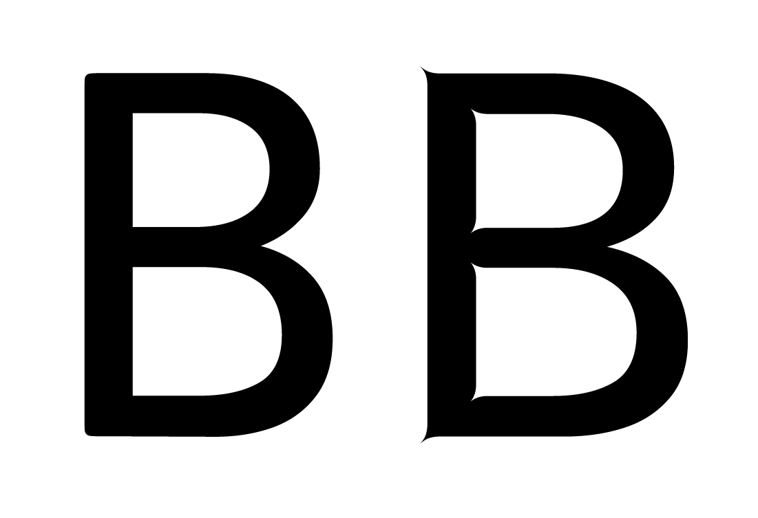
Univers is a neo-grotesque sans-serif from the 1950s. It is characterized by its high x-height and low ascenders and descenders. The ascender corresponds to the height of the capitals and the thickness of the capitals is slightly greater than that of the lowercase so as not to stand out too much in the German setting. Univers is kept clean with horizontal straight ends. The top of the t is angled, the Q-tail runs along the baseline and the y has a straight descender. Even in an early draft of today’s Univers, it is visible that letters such as p and q as well as b and d are mirrored. The R has a slight curve in the stem and the curve of the a runs straight into the stem. Frutiger avoided additions in the design, such as the swash-ending of the a and the stroke of the G. Thanks to its visual adjustments, the font appears uniform and balanced. →
-
Looking at the concept of a font family, its definition is relatively open. It is obvious that different font weights that fit together can form a family. The regular version is usually designed as the first face. In font history, italic and small caps are frequently added. It is not defined whether this can already be described as a family or how many different styles must be included. In addition to the existing weights, there is in many cases a bold version, possibly a light, extended, condensed etc. An extended font family suggests that it is a family with even more different styles. Where the boundary between family and extended family lies is nevertheless undefined. →
-
Heidrun Osterer, Philipp Stamm (eds), Schriften. Das Gesamtwerk (Basel: Birkhäuser, 2014), p.109. →
-
Osterer, Stamm (2014), p.77. →
-
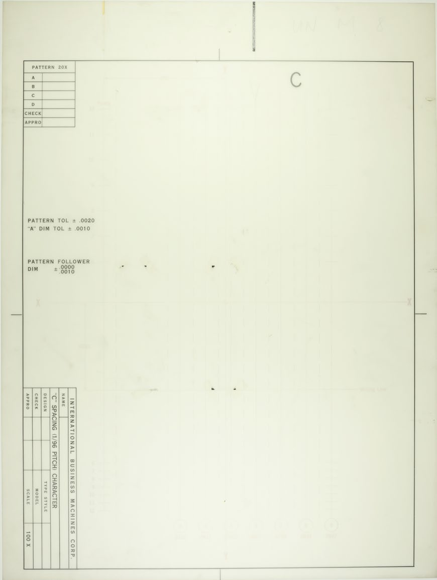
Blueprints are test prints produced with the fast printing process called Ozalid. It’s an anagram of diazol, which is the substance used for fabricating the light sensitive paper. →
-
The IBM Univers exists in 8 different styles for 4 different sizes. Not all sizes contain every style. →
-
Osterer, Stamm (2014), p.189. →
-
IBM, Guide d’utilisation compocarte (France: Compagnie IBM France, 1979), p.19. →
-
Osterer, Stamm (2014), p.190. →
-
Adaption of Universfor the IBM typeball. →
-
Osterer, Stamm (2014), p.59. Alice Savoie, International cross-currents in typeface design: France, Britain and the USA in the phototypesetting era, PhD thesis (Reading: University of Reading, January 2014), p.225. →
-
Adrian Frutiger, ”Der Werdegang der Univers“, In Typografische Monatsblätter, Issue 1 (St. Gallen: Schweizerischer Typographenbund zur Förderung der Berufsbildung, January 1961), p.12. →
-
Frutiger (1961), p.12. →
-
Osterer, Stamm (2014), p.59. →
-
Only the units from 3 to 9 were usable. The minimum width of a character was therefore 3 units. →
-
Frutiger (1961) p.11. →
-
Frutiger (1961) p.12. →
-
Osterer, Stamm (2014) p.96. →
-
Used software to design lettershapes. →