History through design: potential and objectives of reviving ancient typefaces
Originally published in Gotico-Antiqua, proto-roman, hybrid. 15th-century types between gothic and roman, edited by Jérôme Knebusch and co-published by Atelier National de Recherche Typographique (ANRT), ENSAD Nancy and Poem in 2021.
In essence, the history of early typography retains two names, Johannes Gensfleisch known as Gutenberg and Nicolas Jenson. The first is responsible for the invention of modern printing, the second for the design of a typographic archetype that serves as a canon to this day. While their fame is unquestionable, it often conceals an extraordinary fact: these two major events are only fifteen years apart. A little over a decade separates the first fonts transposed from the Bastarda and Textura scripts, and those of the new roman model. This short period and the itinerant experience of the first printers in Western Europe was the scene for the transitions from manuscript to print, and from gothic to roman. At the height of the Renaissance, the fertile exchanges between Germanic and Latin cultures were reflected in the typographic form.
Despite the appeal of this dazzling and founding epic, the types of the period remain to a large extent unstudied, and their transitional or hybrid attributes neglected. Numerous factors make exploration difficult: the total disappearance of both the typographic material of the period and potential preparatory drawings and designs; the profusion of influences, styles and intentions; as well as the temporal, cultural and technical distances from the object of analysis. Additionally, there is a lack of exchange between the fields of palaeography, book history and typography. In view of this, is a contemporary study of early typefaces conceivable?
Jérôme Knebusch, the initiator of a dedicated research programme of the Atelier national de recherche typographique (ANRT), assisted by its director Thomas Huot-Marchand, has assembled a corpus of some sixty typefaces representative of the period and has begun, in collaboration with art school and library partners, the revival of fifteen of them. The aim of the project is to shed light on this little-known part of typographic history by making the expertise of the type designer available to research.
We, Alexis Faudot and Rafael Ribas, were actively involved in this project from October 2017 to March 2019. Our two main missions during our studies at ANRT were to finalise a first version of the types started in collective workshops, and to contribute to the delimitation and organisation of the corpus. This was the opportunity for us to measure the extent to which revival and classification attempts could contribute to the historical understanding of the prototypographic types.
1. Workshop schedule and method. A. Sampling the source
1.B. Analysing the source through comparison
1.C. Manual tracing stage
1.D. Correcting and selecting manual drawings
1.E. Vectorisation
I. Reviving ancient typefaces: specificities and methods
From text to type, the legacy of the manuscript
The first printers had no typographical model, and one only has to peruse a few medieval works to see that a considerable proportion of what is now called typography was borrowed from the handwritten manuscript text, and more precisely from the codex. The architecture of the page as a whole—margins; layout; justified or more rarely flush left or right composition; one or more columns; glosses; footnotes and footnote references; tighter or looser line spacing; coloured text—existed before Gutenberg’s invention. And the work of illumination and calligraphic additions for historiated initials, certain passages or the folio were often added to the typographical compositions of incunabula.
Handwritten usage is also found at the level of the letter. The first types inherited much from the manuscript: alternative contextual signs, numerous ligatures and complex systems of abbreviations and contractions. Signs sometimes take alternative forms [contextual variants, fig. 2] are joined [ligatures, fig. 3] or contracted [fig. 4]. The types being studied display the strong elasticity of the written language, and pay little heed to the integrity of the sign.

2. Alternative forms of e, Spira 110R, Venice, 1469
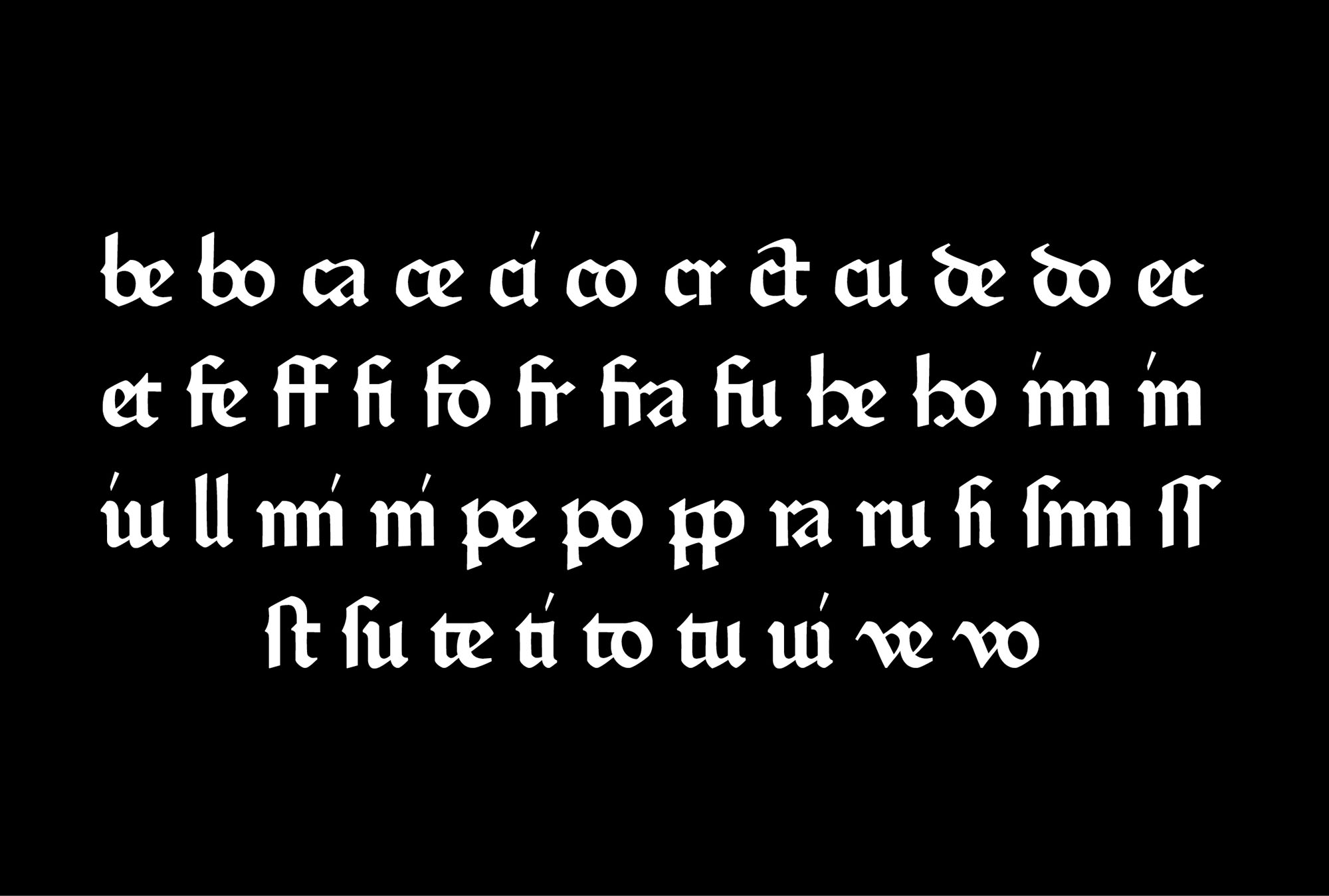
3. Ligature set, Fust & Schöffer ‘Durandus’ 118G, Mainz, 1459

4. Abbreviations of quid, qua, quam, Sweynheim & Pannartz 115R, Rome, 1467
Moreover, certain technical pitfalls, due to the precocity of our specimens, further augment this instability. Apart from the fact that the quality of punchcutting and printing can corrupt forms, the counterpunch does not yet seem to be used systematically, resulting in variations in groups of letters such as b d p q [fig. 5], which we are used to seeing as related. Finally, the striking of multiple punches does not always seem to be practised, which leads to variations between simple signs, and signs composed with diacritics [fig. 6], which have different designs [fig. 7].
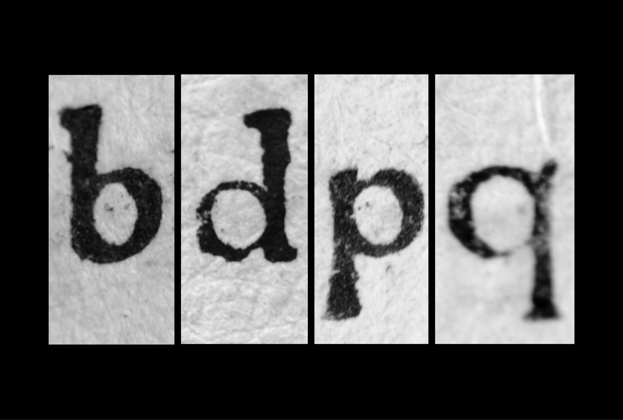
5. Very different counterpunches for b d p et q, Parix 111R, Toulouse, 1480
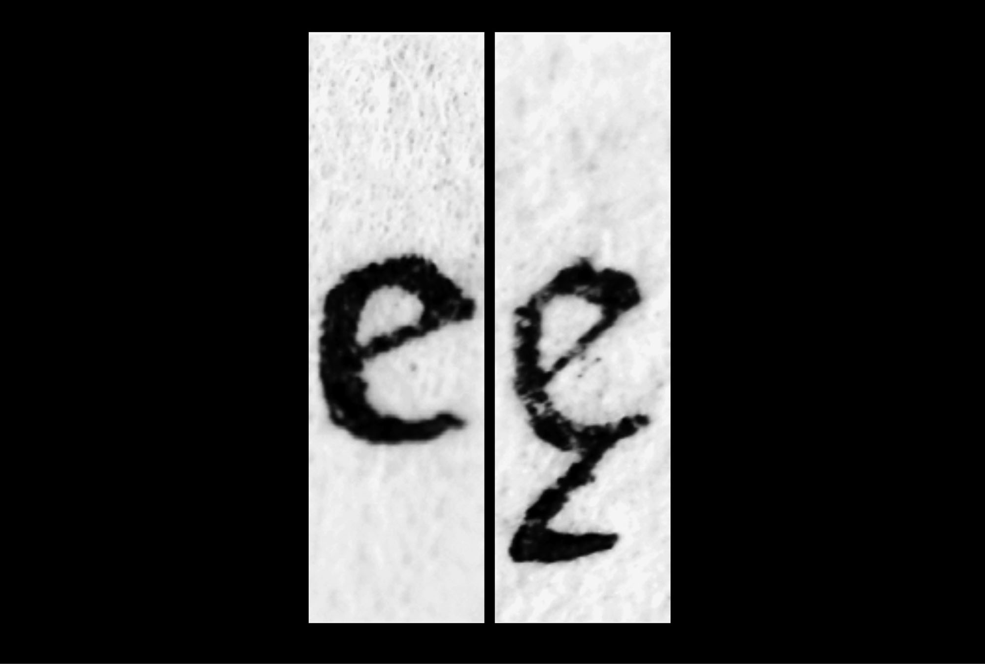
6. Change of form between e and e ogon, Spira 110R, Venice, 1469
7. Several forms for the same diacritic (tilde), Spira 110R, Venice, 1469
For the types studied here, in addition to this lack of consistency of the sign, there is often a lack of consistency in style. Some printers combine rustic, gothic, and uncial capitals, while others go so far as to cut two sets of capitals, one gothic and the other roman, used simultaneously. The lowercase is also constantly marked by several references: additions by borrowing from other types are sometimes made over time. In the revival workshops, we were faced with these prototypographic phenomena, as rich as they are unstable.
From printed page to vector: potentials and objectives of a digital revival
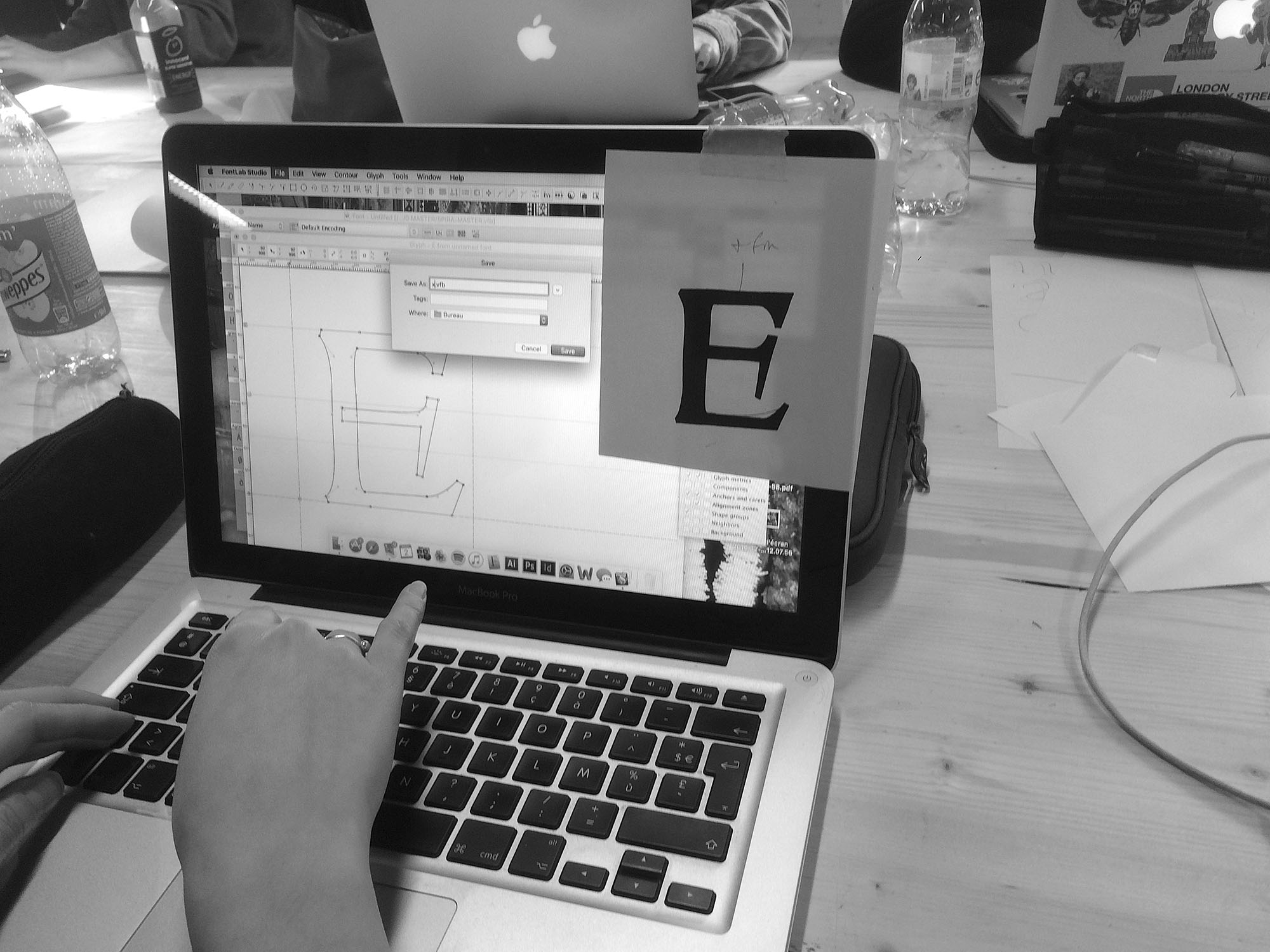
In order to establish both the conditions for a revival faithful to our sources, and a beneficial pedagogical experience for the students, we applied a three-step method: the sampling of the sources, their graphic apprehension, and the digitisation [fig. 1].
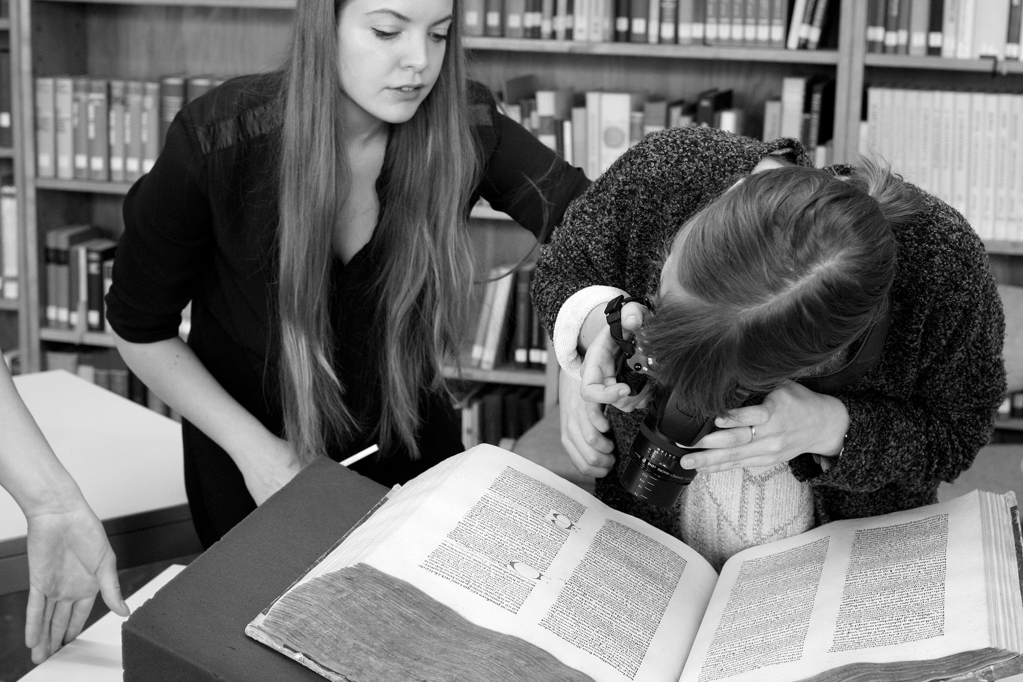
The workshops, comprising some fifteen students, took place over a period of 3 to 5 days. They always began in the library with the consultation of the work typeset with our reference typeface. For reasons of conservation, this kind of book can hardly be expected to leave its home. We, therefore, spent a morning on-site collecting as many images as possible. Particular attention had to be paid to the collection of types, with the objective of having obtained a complete set by the end of the session. Three types of photograph are necessary:
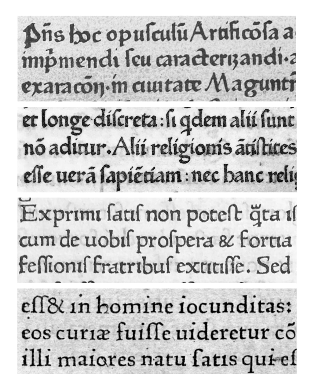
First of all, the whole page, which provides information about the grey of the text [fig. 8]. In addition to providing data about the composition of the page and the use of margins, these images are mainly used to compare the source and our full-size revival to get as close as possible to its colour.

8. Comparison of the type and its revival at the scale of the page. Observation of the general texture and typographic grey. Avicenna, Canon medicinae, Strasbourg: Adolf Rusch, after Feb 1473. ☞ ISTC ia01417700 ☞ TW.2:100G
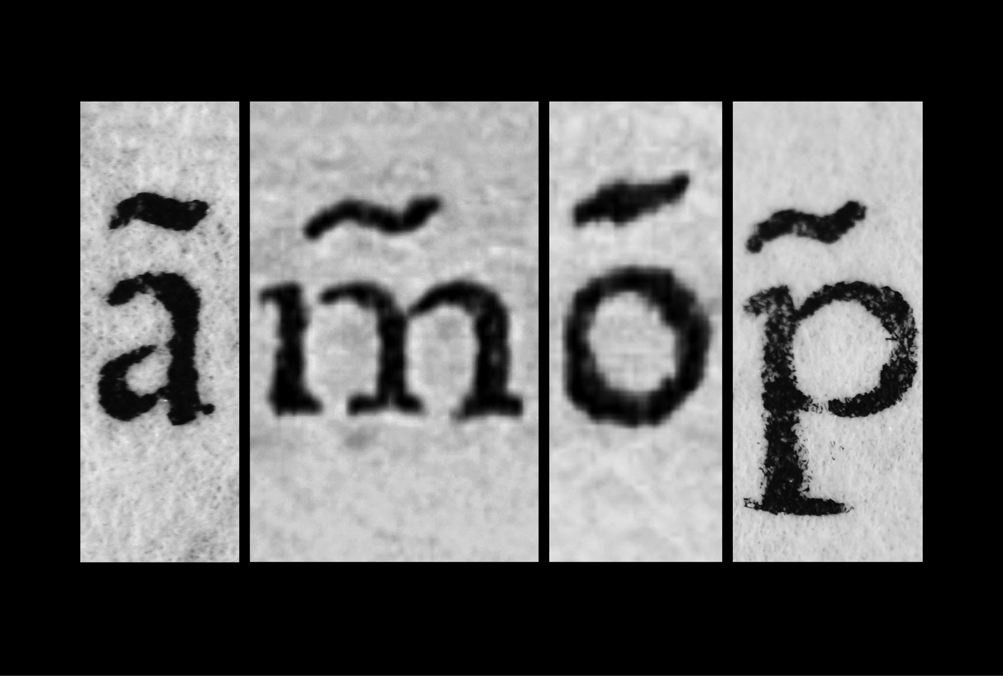
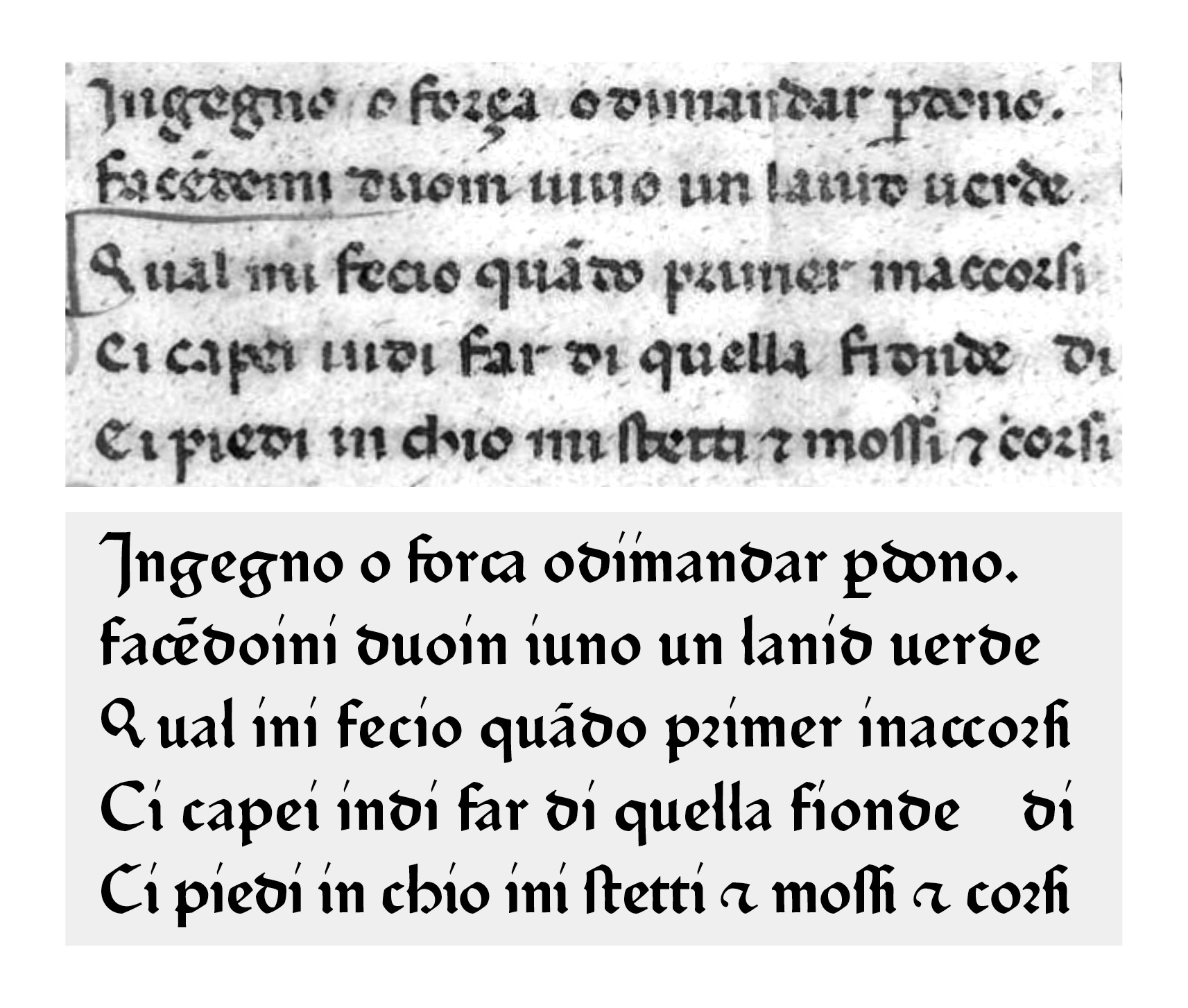
Entire paragraphs [fig. 9], to enable the study of line composition, leading, inter-word spacing and the use of alternative contextual types. When are they used? How often are they used? Are they used systematically?
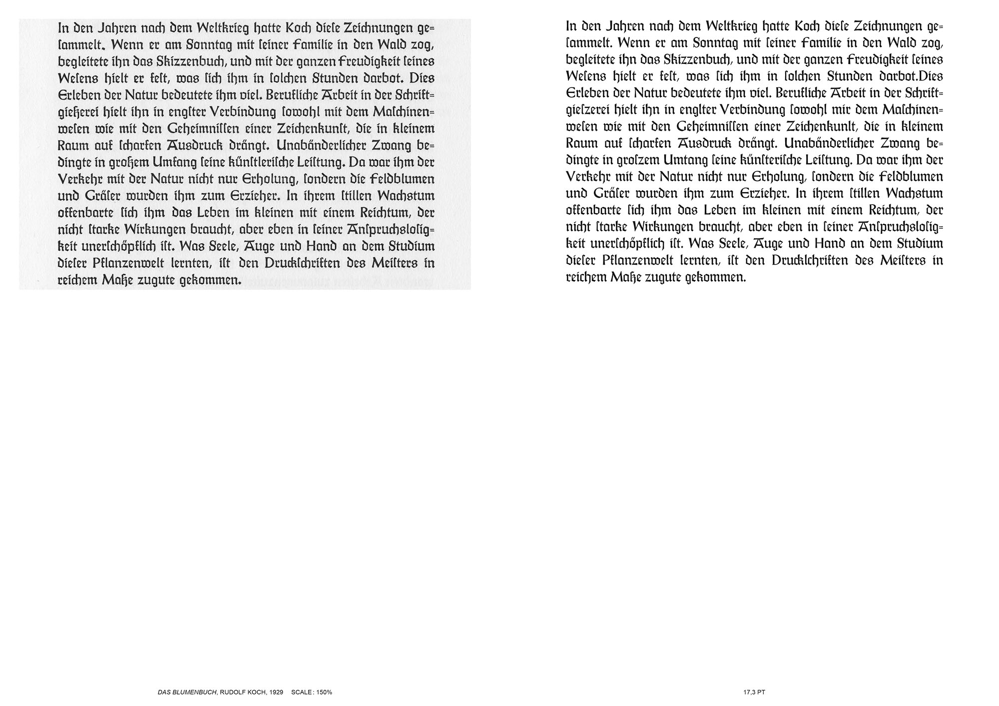
9. Comparison of the type and its revivial at the scale of the paragraph, enlarged. Observation of the spacing between words, letters and lines. Rudolf Koch, Das Blumenbuch, Leipzig: Insel Verlag, 1942.
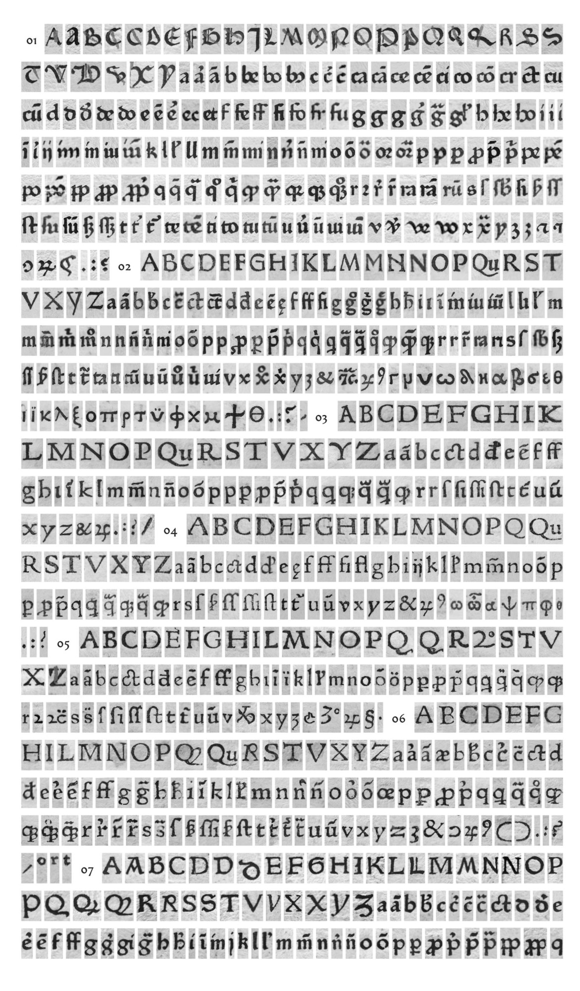
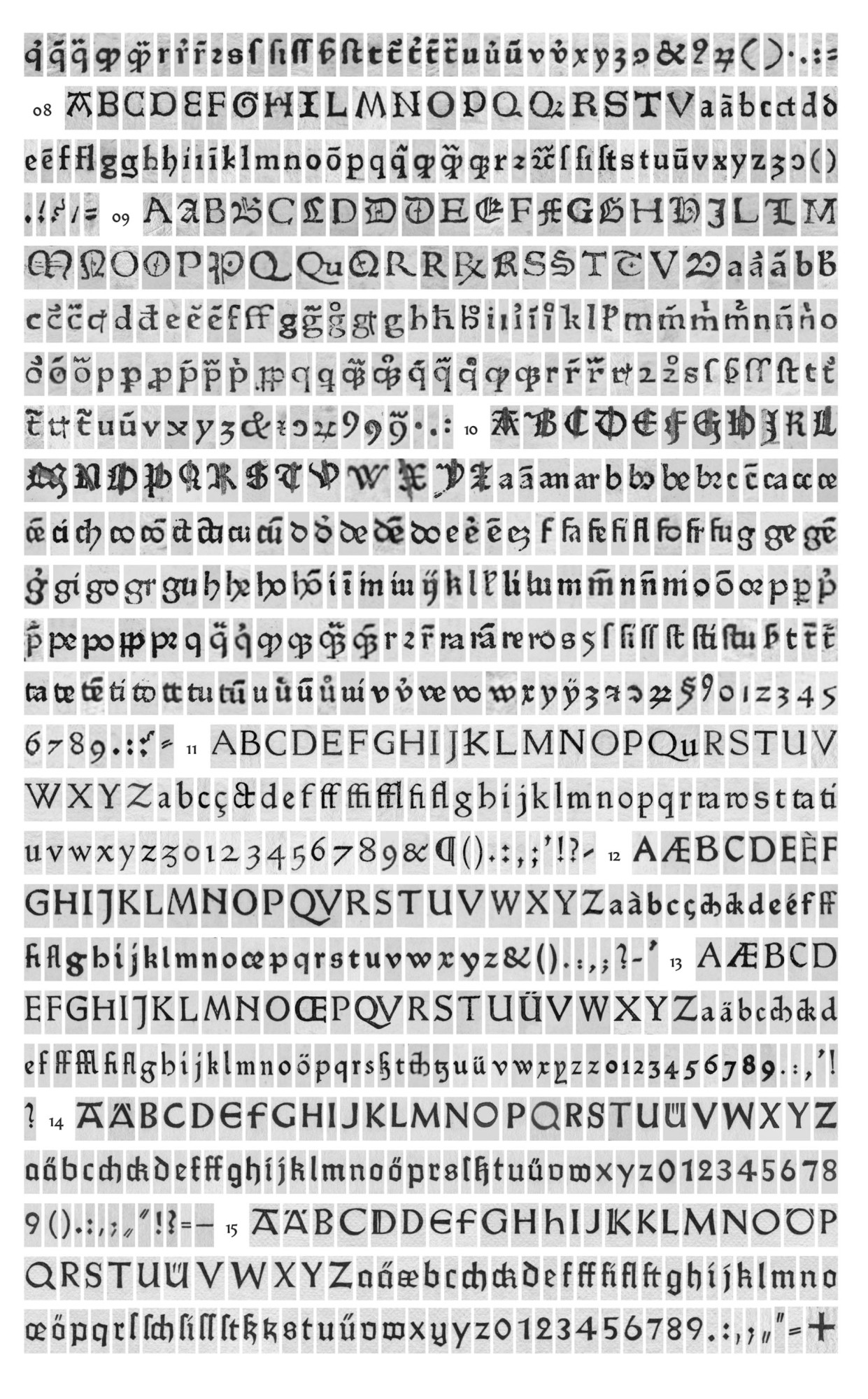
Finally, photographs focusing on each individual letter [fig. 10] provide maximum design information. It is important to have several occurrences of the same sign. Firstly, because some information will not be clearly identifiable in one image but may appear clearly in another, but also because several occurrences enable the punchcutter’s intention to be ascertained.
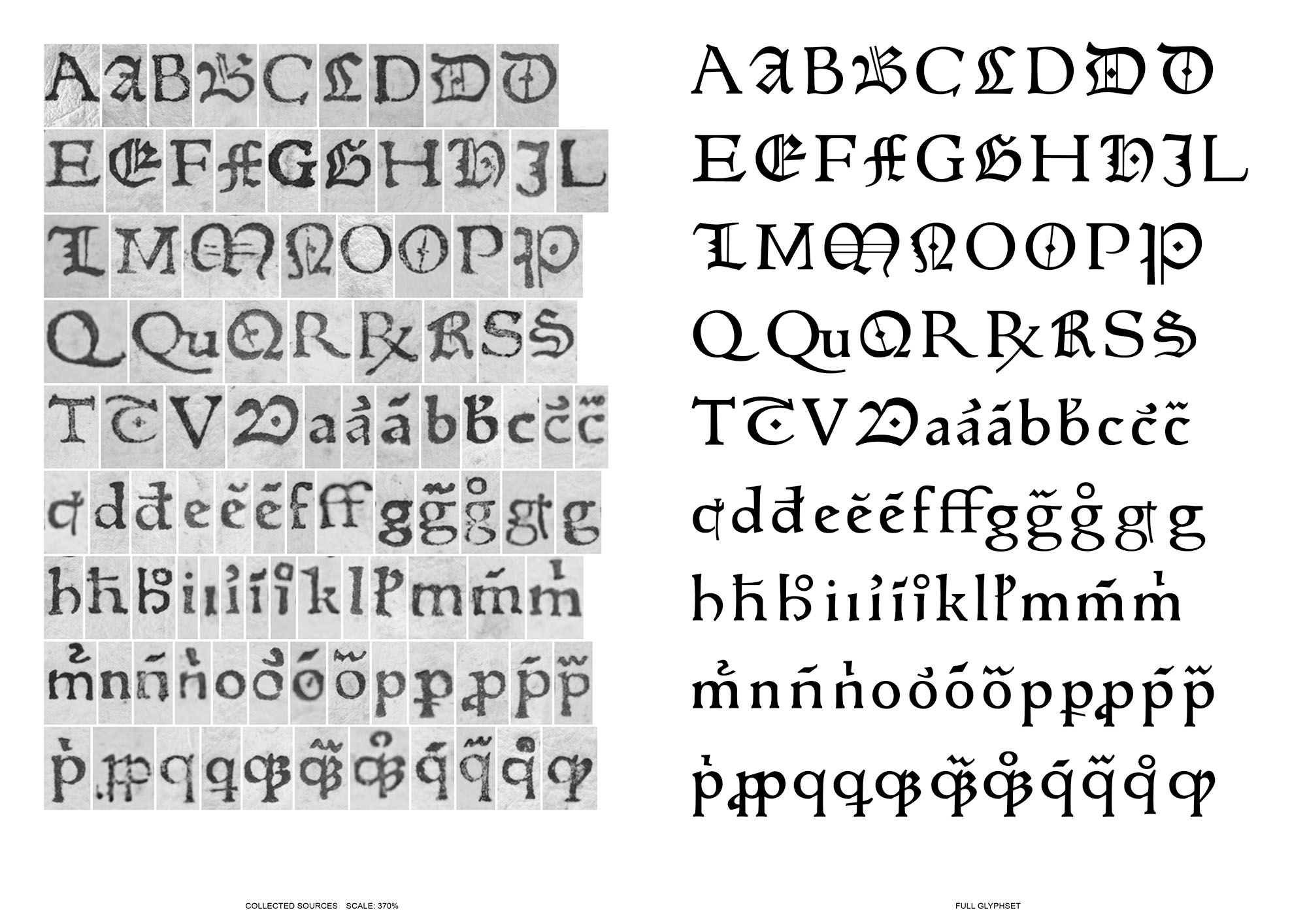
10. Comparison of the type and its revival at the scale of the sign. Detailed observation of the form of the signs. Parix 111R with its double set of roman and gothic capitals, Johann Parix, Toulouse, 1475 (?). ☞ TW.3:111R
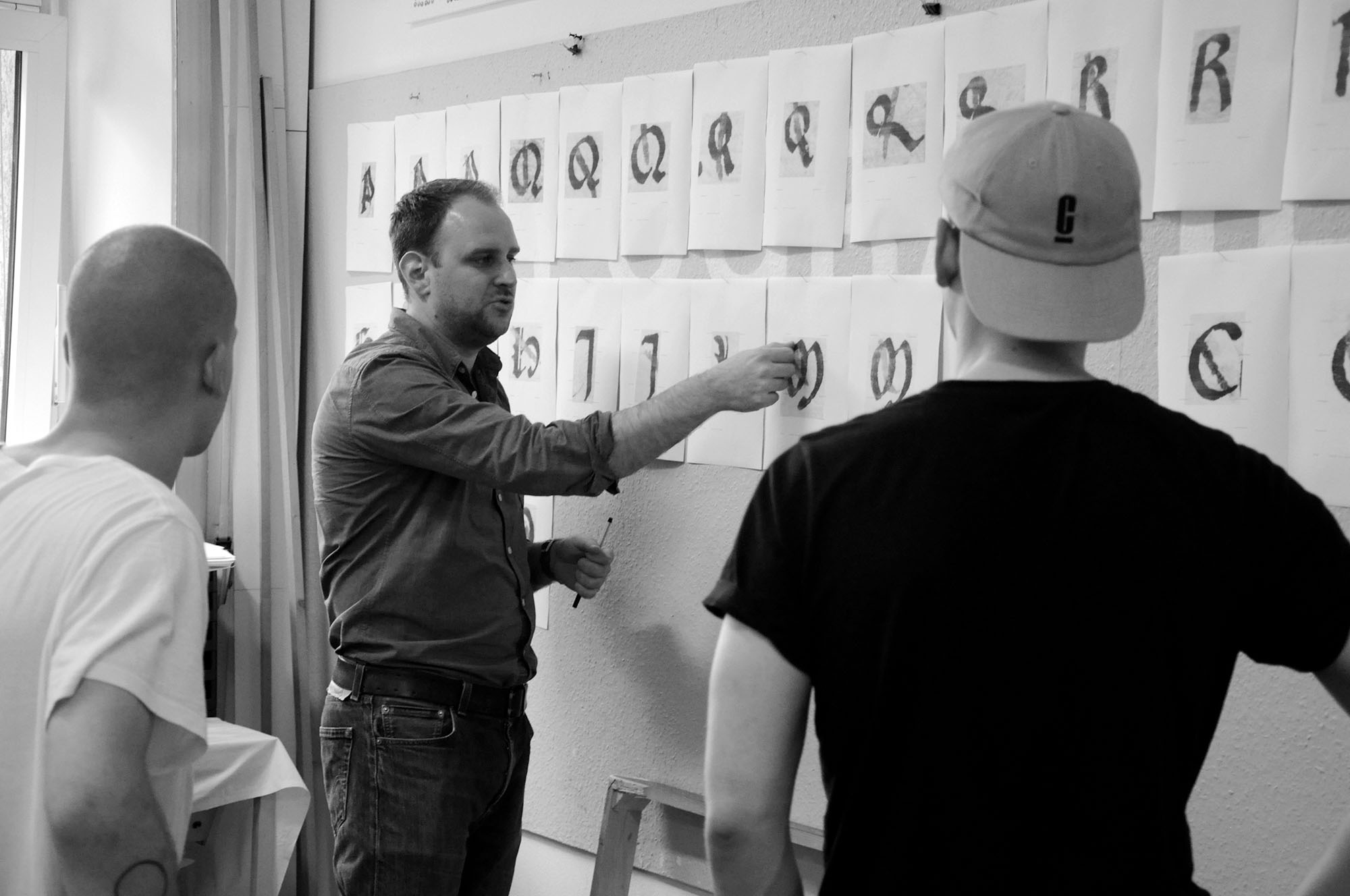
Then the first stage of ‘rationalisation’ began. After initial sorting, each type was catalogued and imported into the template, in which the main reference lines, calculated from an analysis of the type, appear: capital height, ascender height, face height, baseline and descender line. It should be noted that at the time our typefaces were cut—before the roman of Aldus Manutius and Francesco Griffo—the differentiation between capital and ascender heights was not yet established. The template is a kind of identity card for the typeface, a global view of the object of study.
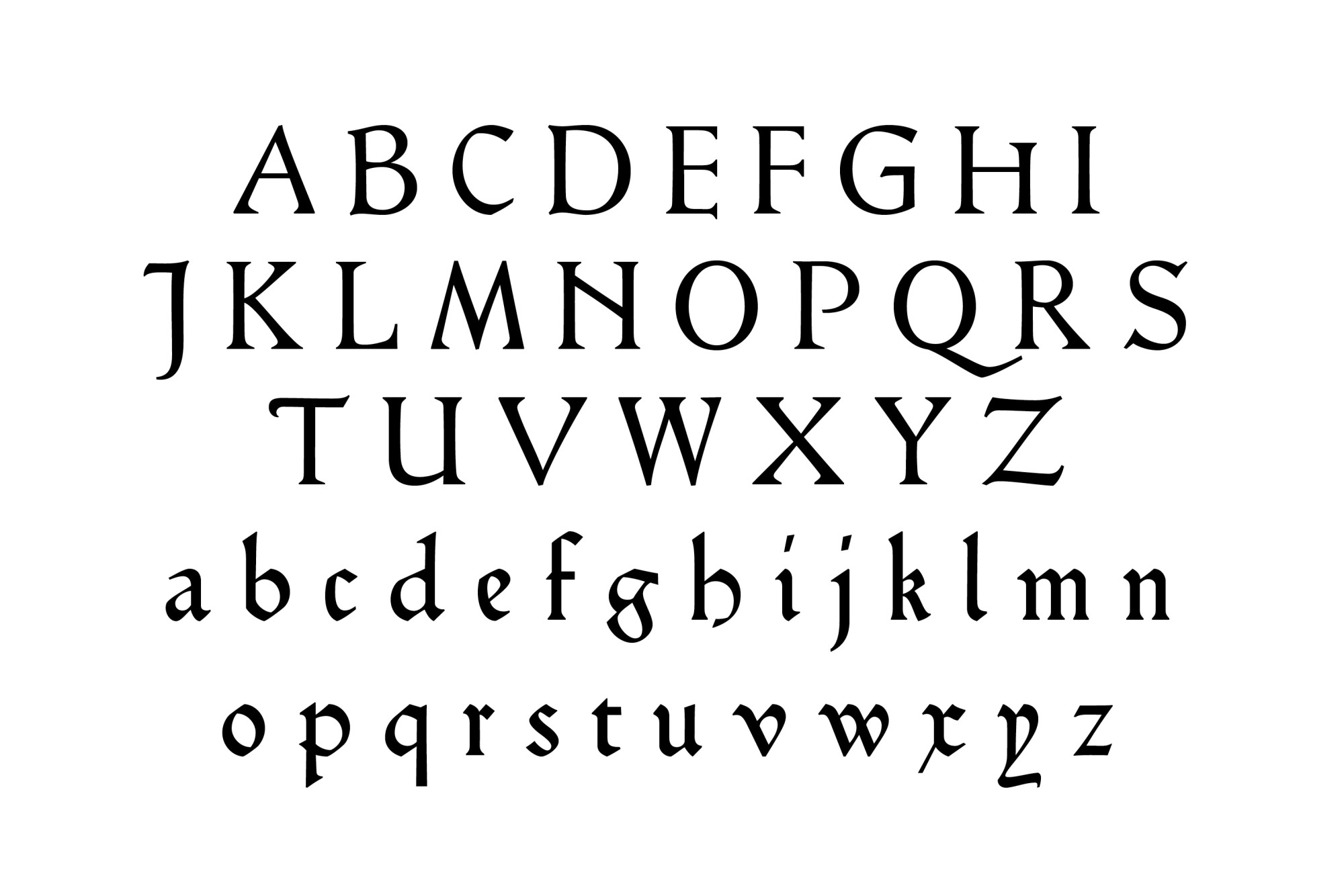
Then, when time allowed, we started the practice with a calligraphy session. Finally, we explained to the students what kind of revival we wanted: in our case, as faithful as possible to the source. What interests us above all is to account for the forms of this period fully. To be more precise, we have attempted to find the shape of the punch, while preserving the texture of the printed page: the only available source. By comparing several occurrences of the same sign, we established the rhythm, weight and colour of the printed letter, while trying to free ourselves from printing incidents on the form, such as excessive print density, mackling or undulations in the paper. For all the types, capitals are set at the same height of 700 units, making comparison easier.
In keeping with our aim of transcribing the source as faithfully as possible, we retained only the letters sampled. Since most of the texts were published in Latin, letters such as j k w were rarely cut. However, these have been designed with reference to types or calligraphic models of the period, with reference to the more recent revival projects of the 19th-century private presses, or by analogy with the logic of the features of the typeface under study. However, since this project was primarily the work of researchers, the ‘typographical fictions’ represented by these additions are not presented in our specimens.
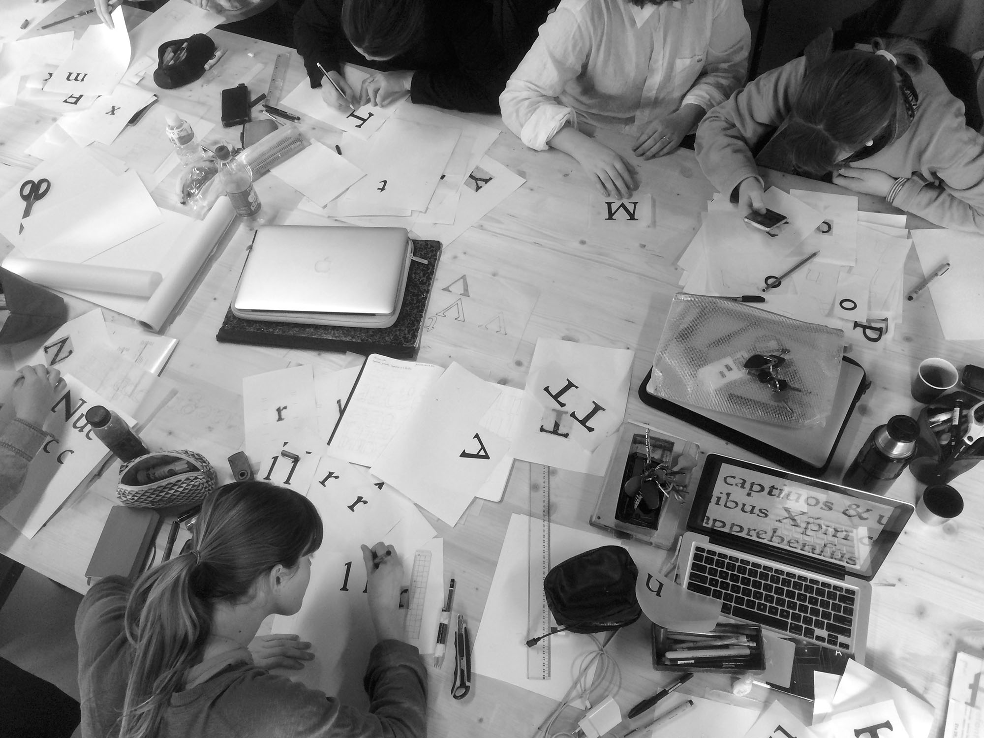
Back to the workshop, a first step in the drawing process was to trace and transfer the outline of the letter by hand, using the printed images of the template. Often, the students we supervised had little experience in font design. The transfer is therefore an important step in understanding the forms: it is initially more natural to trace by hand than to effect this operation by positioning dots. It has often been observed that the more precise the drawing of the transfer, the easier it is for the student to reproduce it in vectors.
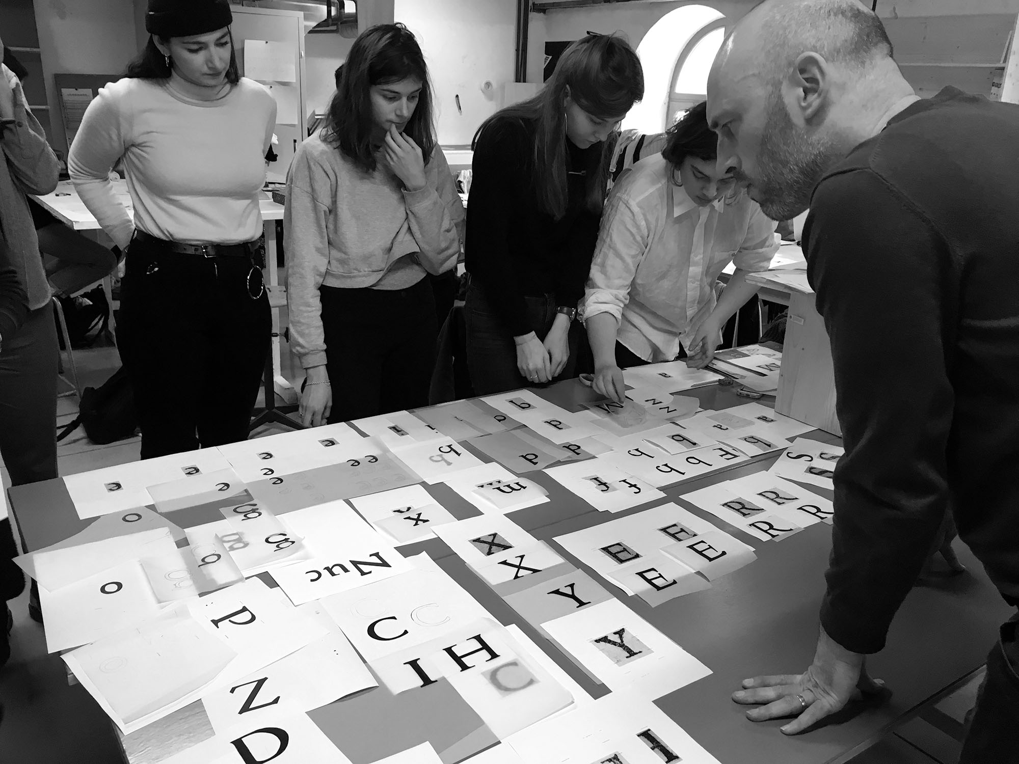
Finally, the type must be presented as a coherent whole. To do this, we divided the set of signs and attributed each subset to a small group of four or five students (one group would deal first with part of the capitals, another part of the lowercase, etc). After a first plenary meeting, the group which dealt with the capitals would take over the lowercase, and so on. This system makes it possible to intensify exchanges, encourages collective analysis and gives an overview of the diversity of type forms.
On the last day, we would export a final version of the font and would compare it with a paragraph or a whole page of the incunabulum studied. We could then appreciate the work done.
A few days later, we would undertake further work on the fonts. One document was then very useful for us for knowledge of the whole set of signs. Each of our references has an informative datasheet which can be consulted on the website of the Typenrepertorium der Wiegendrucke (TW).
This database is the result of a project initiated in 1879 by Konrad Haebler, a German librarian, historian and incunabulist. Its digitalisation was initiated in the mid-1990s by the Berlin State Library, and it became available online in 2013. It currently contains more than 6,000 types. Since their names (if printers gave them one) are unknown, they are identified using a systematic naming procedure. For example, the typeface studied in Aachen is ‘Type 4:96G bei Johann Zainer’. Type 4 means that we are dealing with the fourth type ‘in use at’ Johann Zainer. The 96 corresponds to the height in millimetres for twenty lines of text. Finally, each character is assigned the letters G or R depending on whether it is considered gothic or roman.
Although we are trying to be as faithful as possible, we have to keep in mind that we are dealing with the transmutation of two tools that have little in common. Our letters are no longer metallic. Whereas the cutting of the punch, the font, and the subsequent printing lead to variations of the sign within the same page, digital rigidifies, radicalises and fatally drains the whole. The same is true for typesetting: lines printed with lead type are never as perfectly straight as those composed with word processing software. Also, whereas inter-word spacing used to be adjusted manually in order to balance the lines and obtain the most harmonious justification possible, nowadays, we operate using automated computer adjustments. The digital tool thus allows increased consistency regarding the areas of alignment and the regularity of forms and blanks (spacing between letters, words and lines) but makes it difficult to reproduce the fine detail and delicacy of the manual work and case-by-case decisions (sign by sign and line by line) of typesetters and engravers. In this respect, the design of our study documents allowed us not only to get closer to our sources but also to account for the differences between the two tools. Digital versions of 15th-century types designed with precision are rare.
Once the design work had been completed, one last point remained to be determined. In what form should these fonts be presented, distributed and archived? This project is primarily aimed at typographic historians, incunabulists and palaeographers. It seems important to us, therefore, that the distribution should be as large as possible, in open-source and under a free license. We are presenting here a first attempt to revive little studied sources, with the ambition of retrieving their original form, these productions need to be archived on a file-sharing platform, so that everyone can, from the source file and supporting documents, verify and contribute to the process. When downloading, each font is accompanied by its specimen, and a selection of images from the source studied.
II. Typology of the first types: new departures and filiations
Gothic and roman
The ideological war waged during the Renaissance against what would be pejoratively described as the Middle Ages also affected typography. Just as in architecture and painting, a quest for rationality and clarity of form based on the aesthetic precepts of Greco-Roman Antiquity asserted itself. This began in the 14th century with humanist scribes and scholars who restored the works of the classics while developing the calligraphic models known as humanistic. This was notably the case in Florence with Petrarch, Boccaccio, Collucio Salutati, Niccolò Niccoli or Poggio Bracciollini, whose models—inspired by the Carolingian minuscule—influenced the prototypographers of Rome and Naples. This was also the case in Venice and Padua with Felice Feliciano and Bartolomeo Sanvito whose models—inspired more by engraving and roman capitals—seem to have directly influenced the Venetian roman types of the Spira brothers and Jenson. These models prefigure the typographic roman, which would gradually become hegemonic over the following centuries.
In the 15th century, in parallel with the nascent roman, three gothic styles continued to be written and cut. The lettre de forme, more commonly known as Textura, in reference to the visual grid pattern it produces once typeset, is tall, condensed, straight, black, sharp, angular and highly ornamented. Its curves are broken at a constant angle. A first typographical version (DK-type) can be found in the editions of the grammars of Donatus which Gutenberg printed after his return to Mainz in 1448. Bastarda takes its name from the formal compromise which constitutes it: between rigid formalism and cursiveness derived from everyday writing. It is characterised in particular by a single-looped a, which will survive in italics, and by long s and f which stretch down to the descender. The first Bastarda fonts appeared in the indulgence letters of 1454-55 printed at Mainz. Finally, the Italian gothic model Rotunda or lettre de somme, was more extensively employed in southern Europe. As indicated by its name, it is a highly rounded, cursive model, with: short ascenders and descenders; stems alternating between straight end and calligraphic exits; a closed a; and little ornamentation. The first Rotunda typeface appeared in Ulrich Han’s edition of the Meditationes vitae Christi in Rome, 1467. In this scriptural environment, between established gothic models and humanistic tendencies, intermediate and derivative territories were explored.
Gotico-Antiqua, proto-roman, hybrid
In view of a more in-depth typological analysis, let us now focus on three typefaces of our corpus. Apart from the fact that they come from the three main countries of investigation (Germany, Italy and France respectively), they testify to the different attitudes adopted between, and beyond, the gothic/roman dichotomy.
Durandus 118G is the starting point of our corpus, and the first type to open the door to humanistic writings. Sweynheim & Pannartz 115R is the first typeface which displayed a willingness to adapt the lowercase to the engraved form of roman capitals, and thus a clear distance from handwritten models. Soufflet Vert 106R is a unique example of sophisticated hybridity that blurs and transcends stylistic boundaries.
In addition, we will also discuss a 19th-century private press typeface (Hamlet). With a development which echoed the Arts & Crafts movement, these presses shared the opposition to the industrialisation of the book and its crafts combined with a specific fascination with the artisanal sophistication of incunabula. On the initiative of William Morris and Emery Walker, printers, engravers and bibliophiles revisited, as we, in our turn, have done, the proto-typographic resources.
11. The writing of Petrarch in Rerum vulgarium fragmenta (1366–1374) ☞ Vat.lat.3195, 4r., compared to Fust & Schöffer ‘Durandus’ 118G (digital)
12. To the roman, from top to bottom, at same size:
Fust & Schöffer ‘Durandus’ 118G (Mainz, 1459, B48) ☞ TW 5:118G;
Sweynheim & Pannartz ‘Subiaco’ 120R (Subiaco, 1465, Lactantius) ☞ TW 1:120R;
Sweynheim & Pannartz 115R (Rome, 1471, Cyprianus) ☞ TW 2:115R;
Valdarfer 110R (Venice, 1470, Cicero) ☞ TW 1:110R.
Courtesy Bayerische Staatsbibliothek München & Biblioteca Statale del Monumento Nazionale di Santa Scolastica, Subiaco.
Fust & Schöffer ‘Durandus’ 118G
In 1459, in Mainz, Peter Schöffer and Johann Fust, who had participated a few years earlier in the development of the very first typefaces with Gutenberg, developed Durandus. Its name is taken from its first use: Rationale Divinorum Officorum, a liturgical work written by the French ecclesiastic Guillaume Durand (1230–1296), which specifies in detail the functions of the services and the elements necessary for their celebration. It is the first time that such a small typeface was cut (~13 pt), for daily use, and for the printing of an impressive quantity of different types of text: religious, scientific, or vernacular. The capitals constitute an intersection of influences. There are: gothic initials with ornaments, notably for F G H and V; uncial style capitals for E T and an alternative A; while others are in rustic style, the roman capitals A M Q and R, amongst others. The lowercase is probably based on the writing of Petrarch [fig. 11], a model of writing showing a return to the (late) Carolingian minuscule and also referred to in palaeography as Fere-Humanistica—‘almost humanistic’.
The set of signs is very extensive, with numerous ligatures and diacritic signs. There are variations in their design, such as in the ve ligature, in which the crossbar of the e is adjusted to the angle of inclination of the diagonal of the v. There are also alternative forms for the d—an uncial and an upright—and several for the g, including the new type form resembling the figure 8 which would remain attached to the Gotico-Antiqua style. In addition, the open a, and the rustic capitals marked an inclination towards roman. Finally, one can observe larger line spacing than for gothic types, due to the length of the ascenders.
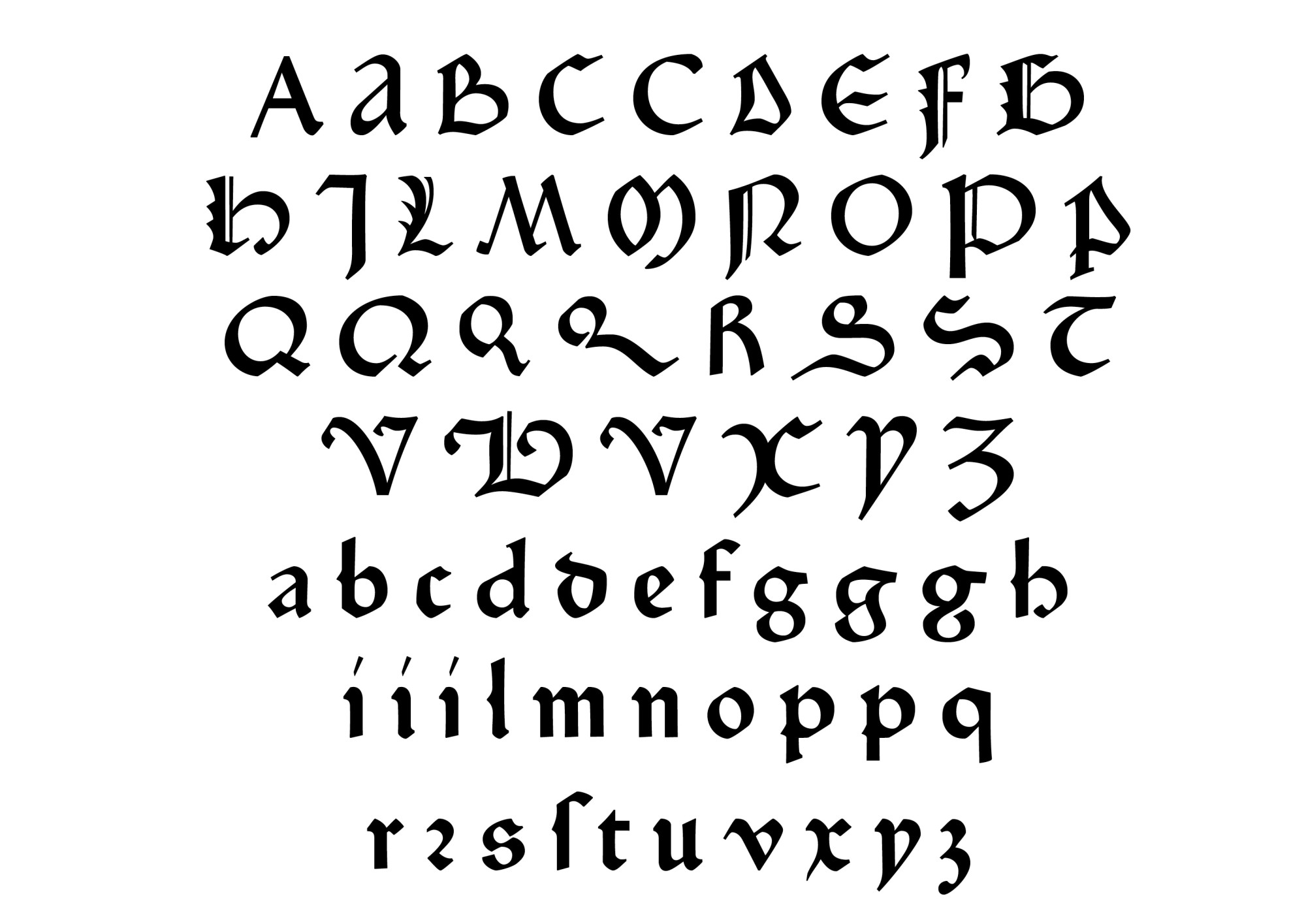
13. Fust & Schöffer ‘Durandus’ 118G, 1459 ☞ TW 5:118G
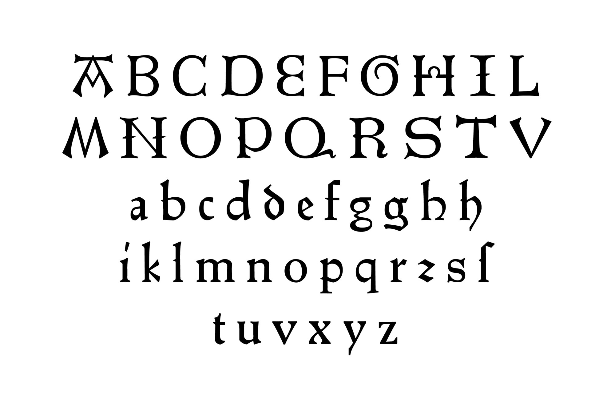
Sweynheim & Pannartz 115R
In 1467, Sweynheim and Pannartz left the Subiaco monastery for Rome, where other German printers—Ulrich Han and Sixtus Rissinger—were already established. They set up their new workshop in the palace of Francesco and Pietro de’ Massimi. There they printed classics from Latin and Greek antiquity, such as Hesiod, Pliny the Elder, Cicero, Livy, Strabo, or Virgil, as well as religious texts such as the work which served as a source here, the correspondence of St. Cyprian, bishop of Carthage in the 3rd century.
More directly immersed in humanism and ancient inscriptions in the Italian capital, the two clerics cut their second typeface, which is more oriented towards roman. The serifs are very marked on the capitals and, for the first time, are transferred to the lowercase. They can be seen, in particular, on the ascenders and descenders of h p and q, on the f and r, and on the diagonals of v and y. Most of them are bilateral and horizontal: the letters are beginning to distinguish themselves from the calligraphic patterns, and tend more towards the engraved form of the roman capital. The weight is reduced, and the colour of the typeface is lighter due to the relatively large proportions and substantial leading. However, some features were maintained in a prototype status. The rounded h, the exit serif on m n and the broken r are still gothic traces, and the width of the capitals, which are very wide, are not quite in keeping with the roman canon. These will be resolved three years later in Venice by the Spira brothers and Nicolas Jenson.

14. Sweynheim & Pannartz 115R, 1467 ☞ TW 2:115R
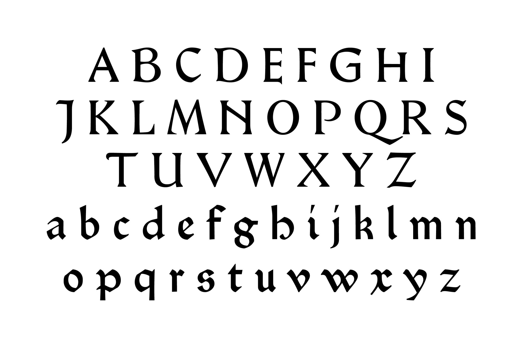
Soufflet Vert 106R
In 1470, at the request of the theologian Jean Heynlin, former rector of the University of Paris, and prior to the Sorbonne, three German printers set up a typographic workshop affiliated to it. Michel Friburger, Ulrich Gering and Martin Krantz, who later moved to the Soleil d’Or, rue Saint-Jacques, thus imported printing to France. They also trained the first French printers, notably those who later set up a workshop at the Soufflet Vert on the same street.
The Soufflet Vert was a cooperative workshop composed of Louis Symonel, Richard Blandin d’Évreux, Jean Symon, and Russangis, among others. It was not only close to the Soleil d’Or, but also followed its editorial programme. It printed classical literature, spelling and grammar treatises, such as that by Guillaume Tardif, the first printed book containing French words, and religious works, including the reference work here, the Manipulus Curatorum or Vicar’s Manual, written around 1330 by the Spanish priest and jurist Guido de Monte Rochen, a work intended for the training of priests and, more specifically, for the proper administration of the sacraments.
Although Soufflet Vert 106R tends towards roman, it still retains some gothic characteristics. First of all, in the capitals, there are many decorative additions, notably the crossbars of A and H, curved designs of E and G or thorns on I and N. Formal relationships are also to be noted: M and N are different, as well as E and F, but A M T or I N share particularities. The structurally roman lowercase, however, is narrow and often broken on a e f n r. The signs d g h and z have gothic alternatives, and some details, the exit loop of p, the construction of s and x, identify it more as belonging to gothic. On the whole many signs are ambivalent and make it impossible to make a firm decision for one style or the other.
Dating from 1476, six years after the appearance of Jenson’s roman, it is no longer a roman aspiration, but a typeface which deliberately seeks to reconcile gothic and roman. It should also be stressed that the particularity of this hybridisation lies in the mixing of typographical rather than manuscript inspirations.
15. Soufflet Vert 106R, 1475 ☞ TW 1*:106R
Hamlet Cicero et Tertia
Hamlet, a typeface nicknamed Kessler-Blackletter by Edward Johnston, famous calligrapher and author of the typeface, was commissioned in 1913 by count Harry Kessler for the edition of William Shakespeare’s Hamlet by the Weimar private press, Cranach Presse. The project included the engraver Eric Gill, Edward Gordon Craig for xylographic illustrations, advice from Emery Walker and Sydney Cockerell, and Edward Prince for the cutting of the punches.
The main text is set in 18 pt type, and the gloss surrounding the central block in 12 pt. The latter is heavier, wider, with a greater x-height, less detailed and contrasted, and has wider leading. The capitals of both sizes, however, share the same weight. A third size, 10 pt type, appears punctually for comments in the margins. As for the sources of inspiration, Kessler first asked Johnston to look closely at Peter Schöffer’s Durandus used for his 1462 Bible. The lowercase is very close to it, although the capitals are rather close to the types used by Sweynheim & Pannartz in Subiaco. This diversity of sources does not, however, prevent harmony within the typeface, quite the contrary.
16. Hamlet Cicero, 1929
17. Hamlet Tertia, 1929
Prototypographic classifications: objects, methods, limits
We have just seen printers producing typographic objects infused with both humanistic and gothic cultures. These shifts also continue in the choice of typefaces for page layout: religious or legal texts are traditionally typeset in gothic, often across two columns, and authors from Antiquity in a single column of roman, but many counter-examples exist.
All this contributes to the difficulty of classifying these typefaces. The Typenrepertorium der Wiegendrucke completely ignores hybrid forms and, in its current state, only offers the G and R labels, for gothic and roman. Between these two extremes, and on the basis of the writings of Harry Carter, Alfred Forbes Johnson and John Boardley, Jérôme Knebusch proposes the three categories we have just analysed: Gotico-Antiqua, for gothic typefaces of humanistic inspiration, mostly present in Germany during the 1460s and 1470s; proto-roman, for typefaces tending towards roman without achieving a completely accomplished model; and hybrid for typefaces, which came after Jenson’s roman, displaying an intention to mix roman and gothic styles.
However, like any classification, this provokes questions: for example, the case of Cosmographia 140R. With predominantly roman forms, but with some broken modulations, it clearly falls into the category of proto-roman. On the other hand, the stylistic coherence of the typeface, its degree of refinement, and its late conception (1482) could lead one to identify it as an intentional hybrid. Moreover, each group contains elements with notable differences. For the Gotico-Antiqua category, while the humanistic lowercase remains stable, the capitals range from gothic to roman with everything in between. For the hybrids, various directions also exist: a mixture of formal modulations for Cosmographia 140R and Soufflet Vert 106R; a jigsaw-puzzle for the typeface of Johann Parix with its double set of gothic and roman capitals [fig. 10]; or the alternation of predominantly roman and predominantly gothic signs as in the work of the anonymous printer of the Postilla Scolastica in Speyer. For proto-roman, there is a degree variation in the movement towards roman, from Subiaco to Jenson, which can make the whole seem very heterogeneous. Finally, we could mention the attitude adopted by the designers of private press typefaces, who mix references and still obtain typefaces of remarkable homogeneity.
In addition to these difficulties in differentiating styles, there is still indecision about the identity of the first roman typeface. Some attribute it to the Subiaco typeface of Konrad Sweynheim and Arnold Pannartz, the first to fully assume exclusively humanistic (g) and engraved forms, with the introduction of the bilateral serif, a non-cursive v and an unbroken s. Others prefer the Venetian typeface of the Spira brothers, with standardised bilateral serifs, which is very close to the typeface of Nicolas Jenson and the roman characters we use today, except for the rounded h, some ornamental eccentricities on the capitals and the width of the latter which are not quite within the classical canon. Finally, others simply attribute it to the Jenson typeface.
These disagreements also stem from the multiplicity of methods of typeface recognition. Konrad Haebler makes the choice of focusing on one letter, M for gothic and Q for roman. Harry Carter considers two factors to designate an accomplished roman, the epigraphic nature of the capital and the bilateral serif on the lowercase. One could also focus attention on a single letter; the g resembling the figure 8 is found exclusively in Gotico-Antiqua types, or the straight h only in ‘pure’ romans—the last letter to change structure in the transitional process towards roman. For us, our attempted classification is far-removed from the aim of rigidly serialising our corpus, rather it provides us with an opportunity to extend our observational work in order to reveal the directions taken, the singularities, and the relationships between the types studied. More than the desire to identify clearly defined spaces, it is the porosity, juxtapositions and points of ambiguity that nourish our reflection.
Conclusion
The first objective of our project was to propose a practical, contemporary and digital tool for type analysis and to attempt to go beyond our sources in precision through design. Without typographic material from the period and using printed matter of uneven quality, it is indeed difficult to see precisely the typefaces of the 15th century. With a digital version, the possibility of finding the forms in detail through strong enlargements presents itself—the incunabula studied being composed in sizes ranging from 12 to 18 point. Here the type designer can help advance research by applying her/his practical understanding. Moreover, this revival operation has led us to reveal links where distinctions are usually found: a quasi-identity between manuscript and the typography of the first published objects and the consequences on the shape of the letters; a difficulty in isolating and categorising the first types which challenge the dividing line between gothic and roman. These labels can only be partially attributed to our typefaces, which are essentially mixed influences. In this sense, the classification into Gotico-Antiqua, proto-roman and hybrid, for typefaces which are stylistically between gothic and roman, is quite indicative of the printers’ intentions and should serve as a basis for discussion. By extension, investing these intermediate areas has enabled us to see that far from evolving in isolation, typographic styles are deeply interconnected. This is perhaps the greatest interest of the specimens from this period, their atypical aspects transcend the divides and make them the manifest witnesses of their time.
18. 1: Fust & Schöffer ‘Durandus’ 118G; 2: Sweynheim & Pannartz ‘Subiaco’ 120R; 3: Sweynheim & Pannartz 115R; 4: Spira 110R; 5: Rot 102R; 6: Rusch ‘R-Bizarre’ 103; 7: Rusch 100G; 8: Soufflet Vert 106R; 9: Parix 111R; 10: Zainer 96G; 11: Ptolemy Great-Primer; 12: Hamlet Cicero; 13: Hamlet Tertia; 14: Jessen Cicero; 15: Jessen Mittel
-
Eleven typeface revival workshops were held in Germany, France and Italy between March 2015 and May 2018: Hear Mulhouse, March 2015 [Ptolemy], ESAD Valence, April 2016 [Jessen], Hochschule Mainz, June 2016 [Durandus], HBK Saar, December 2016 [Rot], ENSBA Lyon, March 2017 [Spira], Hochschule Aachen, October 2017 [Zainer], Bauhaus-Universität Weimar, January 2017 [Hamlet], isdaT Toulouse, February 2018 [Parix], ESAL Metz, April 2018 [Rusch], ISBA Besançon, May 2018 [Soufflet Vert], Biblioteca Statale del Monumento Nazionale di Santa Scolastica, Subiaco, May 2018 [Sweynheim & Pannartz]. →
-
Unlike Ricardo Olocco, who achieves remarkable precision, we did not photograph at a constant scale. The aim of the project was to account for the type through analytical drawing to reveal a formal work which photography cannot render. →
-
‘Aldus is thus the man who gave roman its new face. […] He was influenced by the “atmosphere of the period”, which propelled him towards a better downstroke-upstroke contrast, before gradually achieving a better balance between lowercase and capitals by reducing the height of the latter in relation to the ascenders, and finally, with Poliphilis, taking inspiration from the proportions recommended by Felice Feliciano: the width of the stem being contained ten times in the height of a capital.’ René Ponot in Yves Perousseaux, Histoire de l'écriture typographique de Gutenberg au XVIIe siècle, Paris: Atelier Perousseaux, 2005, p.177. →
-
John Downer's essay Call It What It Is is a good to place to start on this subject. Downer enumerates different possible approaches, the choice being determined by the objectives of the project. John Downer, ‘Call It What It Is', Rudy VanderLans, Zuzana Licko (eds.), Tribute, Berkeley: Emigre, 2003, pp.6–9. ☞ emigre.com/Essays/Type/CallItWhatItIs →
-
The x-height would be a preferable fixed value for an analysis of type, but the wide range of variations in this value between the references studied would provide contrasts in size which make a comparison of proportions difficult. →
-
We undertook these drawings during the intensive workshops first of all for reasons of pedagogy. The addition of types which do not exist in the original source allowed us to explore in greater depth certain issues of typographic creation, particularly with regard to the search for coherence in the design of a set of signs. Arabic numerals, also absent from our references, were excluded in that they respect formal logics which are, a priori, different from those underlying the Latin alphabet. →
-
In a workshop, since you have to go fast, many small details in the design are overlooked. Similarly for the photographs, because of the large amount to be taken, frequently some signs could not be found. Either because they were not used in the work being studied, or because they only appeared very rarely. →
-
Konrad Haebler, Typenrepertorium der Wiegendrucke, vol. 1–5, Halle (Saale)/Leipzig: Rudolf Haupt Verlag, 1905–1924. ☞ tw.staatsbibliothek-berlin.de →
-
Uncertain attribution. One of the limitations of the TW is that it lists types by association with the works which were typeset with them. The same type can therefore be indexed several times and assigned to several printers under a different name. Thus the TW does not take into account the circulation of types, punches or matrices, which were the subject of intense trade from 1470 onwards. See on these subjects: Claire Bolton, The Fifteenth-century Printing Practices of Johann Zainer, The University of Reading, Department of Typography and Communication, March 2008, and the communication of Oliver Duntze, The Incunabilist’s Approach to Typography and the TW, Nancy: ENSAD, 25 April 2019. ☞ vimeo. com/333787923 →
-
Apart from the many versions of the Jenson and Griffo typefaces, the 15th-century typefaces available online are mostly auto-trace versions. These versions remain imprecise because they are based solely on a recognition of the printed outline and not on a thorough structural and formal study of the sources. →
-
A first trace of this concept can be found in the work of Giovanni Andrea Bussi. He was an Italian humanist, an editor of classical texts, librarian to the Pope and a major supporter of Konrad Sweynheim and Arnold Pannartz. He called the period separating Antiquity and the Renaissance media tempestas—‘intermediate season'—in a 1469 preface to an edition
of Apuleius (printed in Rome by Sweynheim & Pannartz). See: Massimo Miglio, ‘Curial Humanism seen through the prism of the Papal Library', Angelo Mazzocco (ed.), Interpretations on Renaissance Humanism, Leiden: Brill, 2006, p.112. On this subject, see also: E.H. Gombrich, ‘The Conquest of Reality. The Early Fifteenth Century', Gombrich, The Story of Art, Paris: Phaidon, 2006, pp.169–183. First English edition 1950. → -
‘There is another style called gothic, the decorative elements and proportions of which are very different from the ancient and the modern. The good architects of today do not use it, they shun it as monstrous and barbaric. […] This style was created by the Goths. After they ravaged the ancient buildings and killed the architects in wars, they erected buildings of this style with the survivors. […] May God preserve every country from this conception and way of building.' Georgio Vasari, ‘Introduction, De l'Architecture', Vies des meilleurs peintres, sculpteurs et architectes, Paris: Dorbon-Ainé, 1990, p.38. ☞ archive.org/details/lesviesdesplusex01vasa/page/38/mode/2up →
-
On this subject, see: G.D. Hargreaves, ‘Florentine Script, Paduan Script, and Roman Type', Gutenberg-Jahrbuch, Mainz: Gutenberg-Gesellschaft, 1992, pp.15-34. See also: Riccardo Olocco, The Venetian Origins of Roman Type, Bolzano: CAST, 19 December 2017. ☞ articles.c-a-s-t.com/the-venetian-origins-of-roman-type-a856eb3f0cb →
-
See the complete list in note 1. →
-
This edition is one of the most important of the private press movement. Kessler surrounded himself with the best English craftsmen and set up a paper mill in France with Gaspard Maillol, nephew of the painter Aristide Maillol, of whom he was the patron, to manufacture his MK-Paper (for Maillol & Kessler). The book was printed in two colours, red and black. It took several years to complete the book, finally published in 1929: 230 copies on MK-Paper, 17 on Japanese paper, and 8 on parchment. It was distributed by Insel Verlag in Leipzig, English Edition in London by Emery Walker, and Random House in New York. Hamlet was awarded the German prize for the most beautiful book in 1929. The typeface was then used for the proofs of other unfinished books, such as Daniel Defoe's Robinson Crusoe. →
-
Since September 2020, and at the instigation of Oliver Duntze, the TW expanded its classification. One can now search for specific sub-groups for gothic—Textura, Bastarda, Rotunda, Gotico-Antiqua, and for Roman—Antiqua, cursive, mixed, as well as for Hebrew, Cyrillic and Glagolitic. →
-
Jérôme Knebusch, ‘Drôles de types/Strange Types', Marc Monjou (ed.), Azimuts, n°48–49, Le type. Règne, crise et critique, Saint-Étienne: École supérieure d'art et design de Saint-Étienne and Cité du design 2018, pp.112–125 and 244–250. Harry Carter, A View of Early Typography: Up to About 1600. Reprinted with an Introduction by James Mosley, London: Hyphen Press, 2002 [1969]. A.F. Johnson, ‘The Classification of Gothic Types' in A.F. Johnson, Selected Essays on Books and Printings, Amsterdam: Van Gendt & Co, 1970 [1929], pp.1–17. John Boardley, The First Roman Fonts, ilovetypography.com, April 2016. ☞ ilove typography.com/2016/04/18/the-first-roman-fonts/ →
-
See G.D. Hargreaves, ‘Some Characteristics and Antecedents of the Majuscules in Fifteenth-Century German Gotico-Antiqua Typography', Gutenberg-Jahrbuch, Mainz: Gutenberg-Gesellschaft, 1986, pp.162–176. →