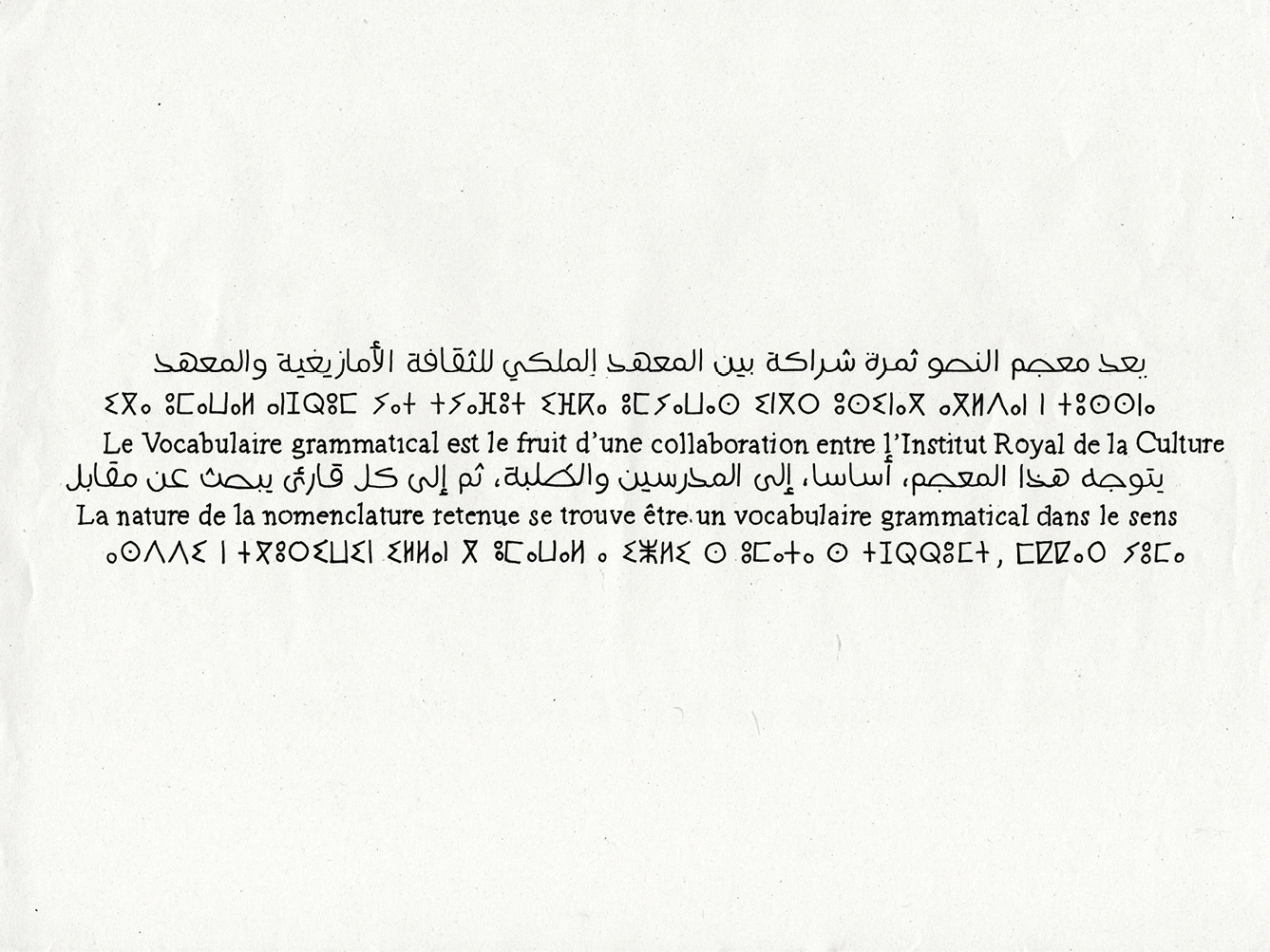
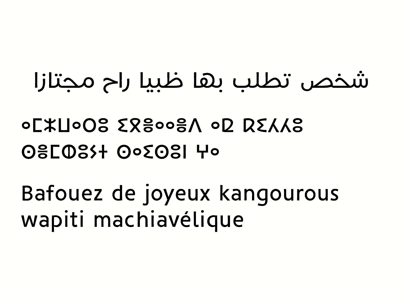
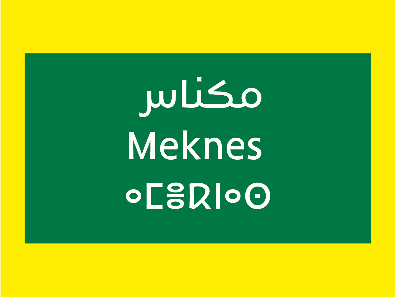
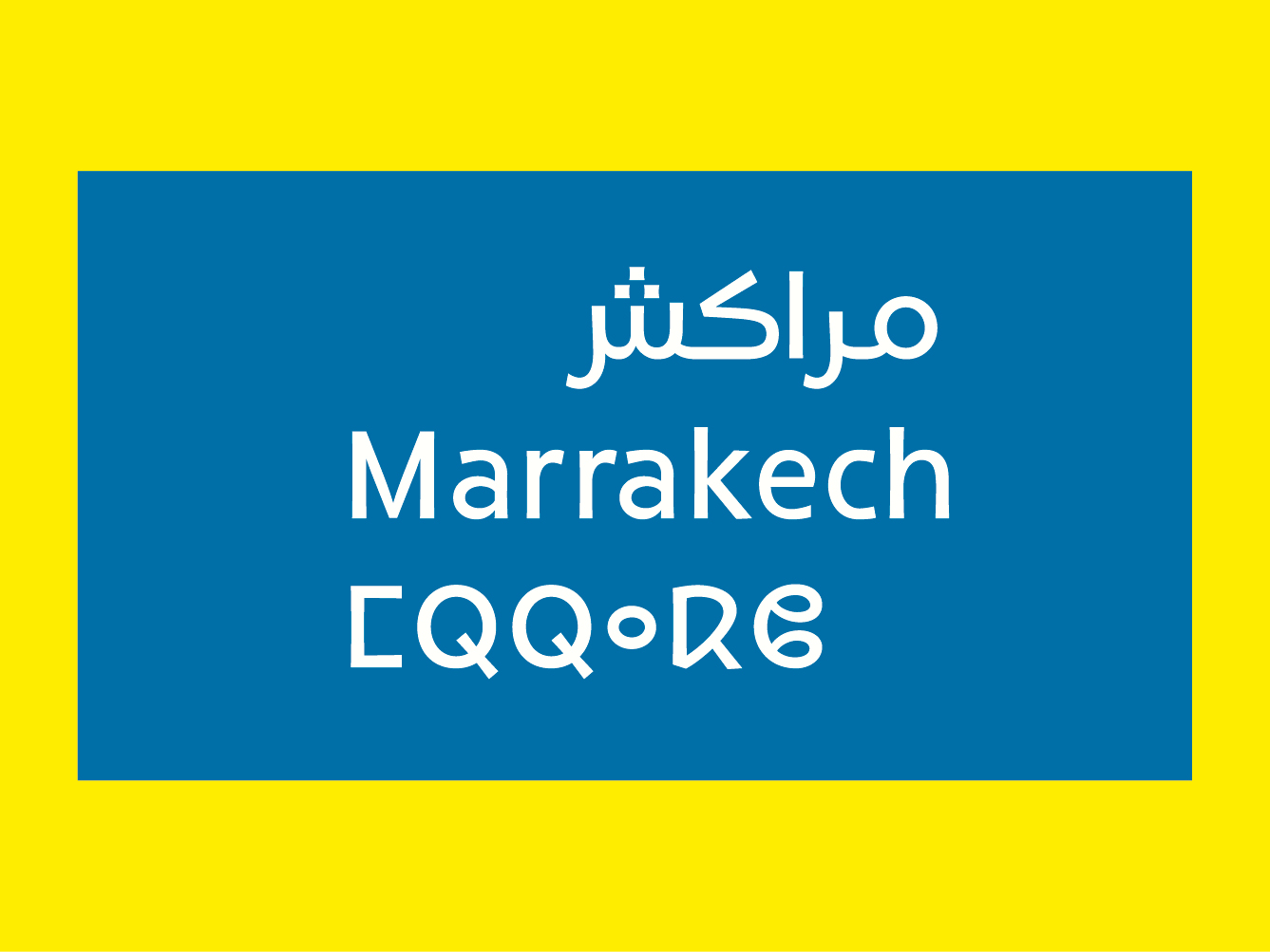
Awal. One country, three wrting systems
Redouan Chetuan zoomThe project is based on the Moroccan context. It is very complex regarding to the linguistic and the typographic aspects. Several languages are present. Two are official languages: Arabic and Tifinagh, and the first foreign language, French, is widely used. Power play is at stake between these three scripts, which have to interact in the urban space. There, letters are given to read, and sometimes even imposed to the reader. The ingredients for this project are three writing systems, with very different origins and stories. On one hand, there is Arabic, with its calligraphic tradition. On the other hand, Latin has a rich written and typographic history. Finally there is Tifinagh, with no writing, calligraphic or typographic history. It currently appears in a quasi-archaic state. Personal knowledge of the context was an advantage and also a disadvantage for the design. It was a source of hesitation on the method to use, and made me realize the heavy weight of the task at hand. How should one meet the challenges of a typographical coherence between the three systems, and avoid the trap of standardization and latinisation?
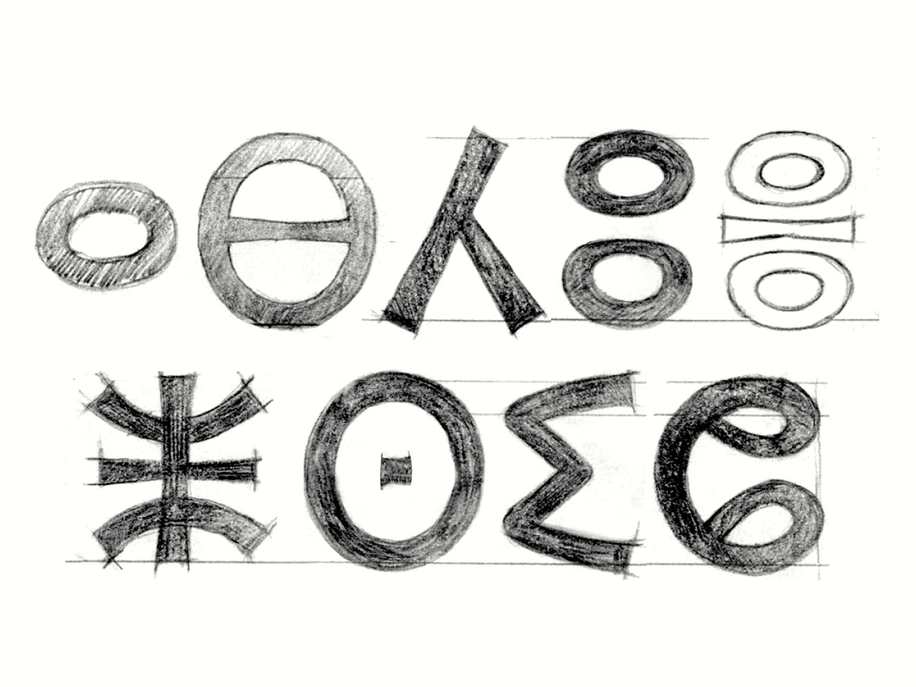
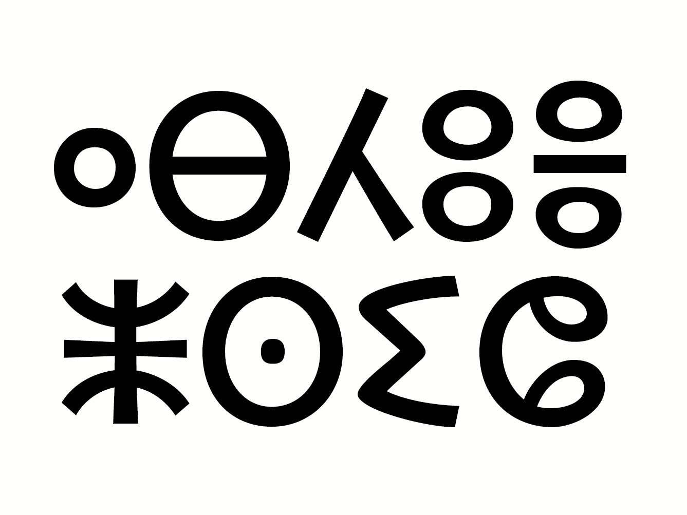
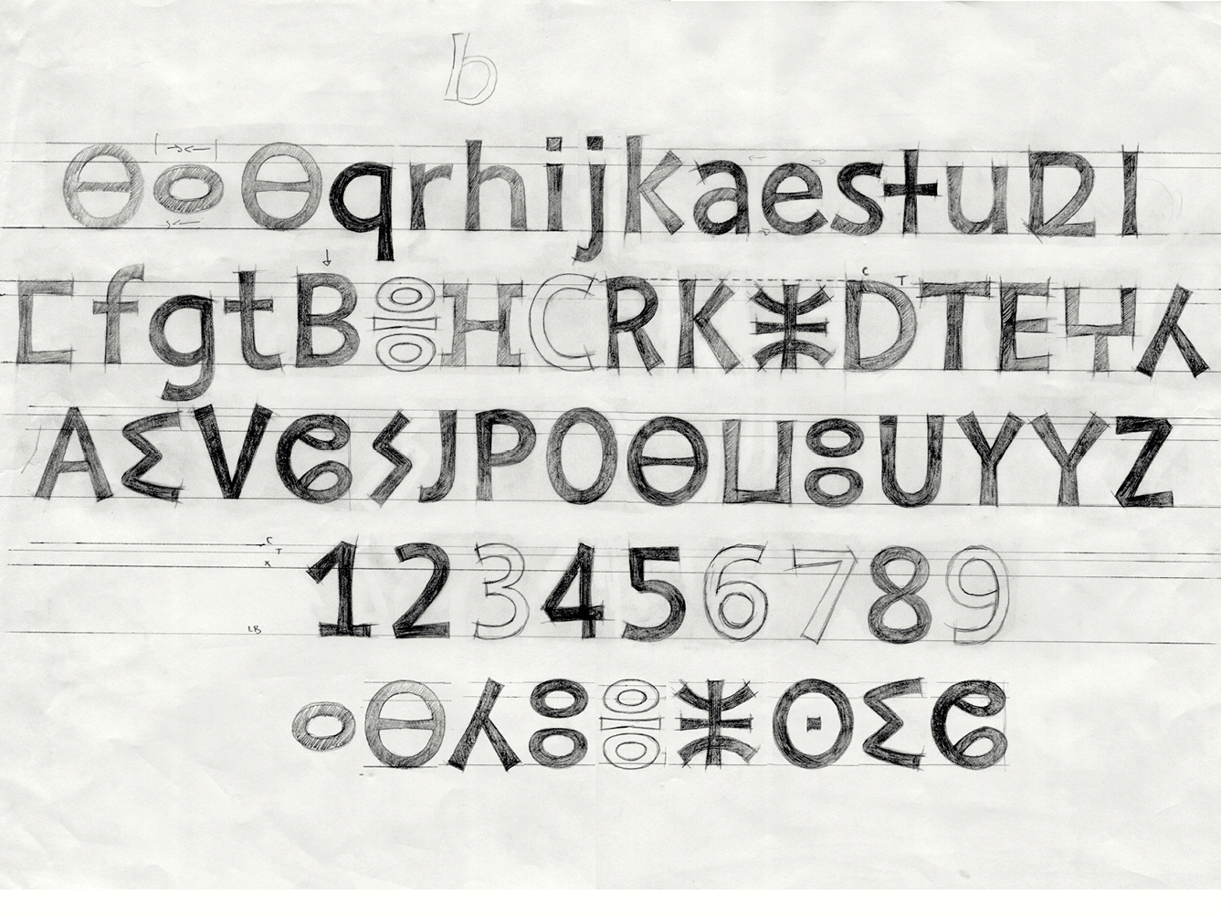
The chosen approach can be summarized with the formula: “Three scripts, one hand”. Dialogue is not a simple task to manage. We had to constantly go back and forth while drawing the three scripts, and take decisions. The starting point was Tifinagh. It had to display various corrections and subtleties, without, however, departing too much from the standardised model designed by the Royal Institute of Amazigh Culture in 2005 (which is currently taught at school), nor impose a radical change that would have been difficult to read for Berber people. After stabilizing the Tifinagh, it was time to make it coherent with the other two systems. The approach had a dimension of back and forth, of formal dialogue, which may also be a transposition of the vocabulary developed with the Tifinagh in the Latin and Arabic. The design of the numerals was a decisive step because they are shared between the three writing systems.
From the perspective of typographic choices, the intentions that were used to modulate the Tifinagh were to keep its epigraphic identity, but also to bring a handwritten sensitivity, more human. Its rigidity needed to be softened, and given movement, with slightly curved straight lines, and flared forms on the top and the bottom. This helped infuse the movement in the rigid structure. One of my biggest challenges was to keep the liveliness of the lines while remaining subtle. Because it was meant for signage, a form of authority must also be given to the typeface. The design has gradually evolved towards optimum readability and a regular typographic colour despite the structural differences. Each script retains its own identity, without creating internal conflicts. The project goes on, with the support of IRCAM, and ANRT. It will soon be formally proposed to the Moroccan Ministry of Equipment and Transport.