Letters that we expect to create an image
Julien Van Anholt zoomA typographic analysis of painted intertitles
Early cinema faced a major technical impasse: until 1927, it was impossible to synchronise sound and image on the same reel, which rendered the films silent. As the cinematic narration became more complex, images alone were no longer sufficient, and recourse to written language seemed necessary.
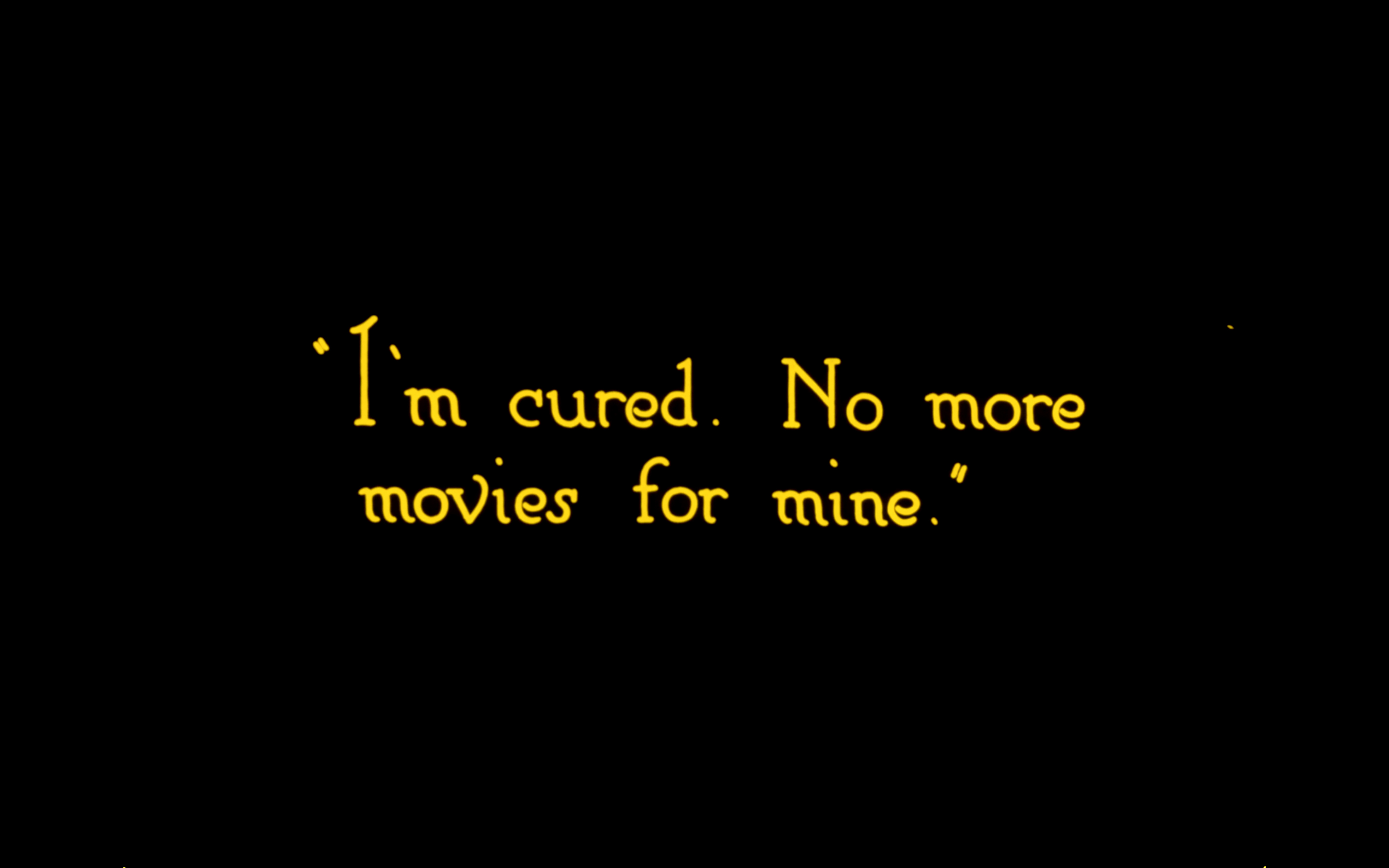
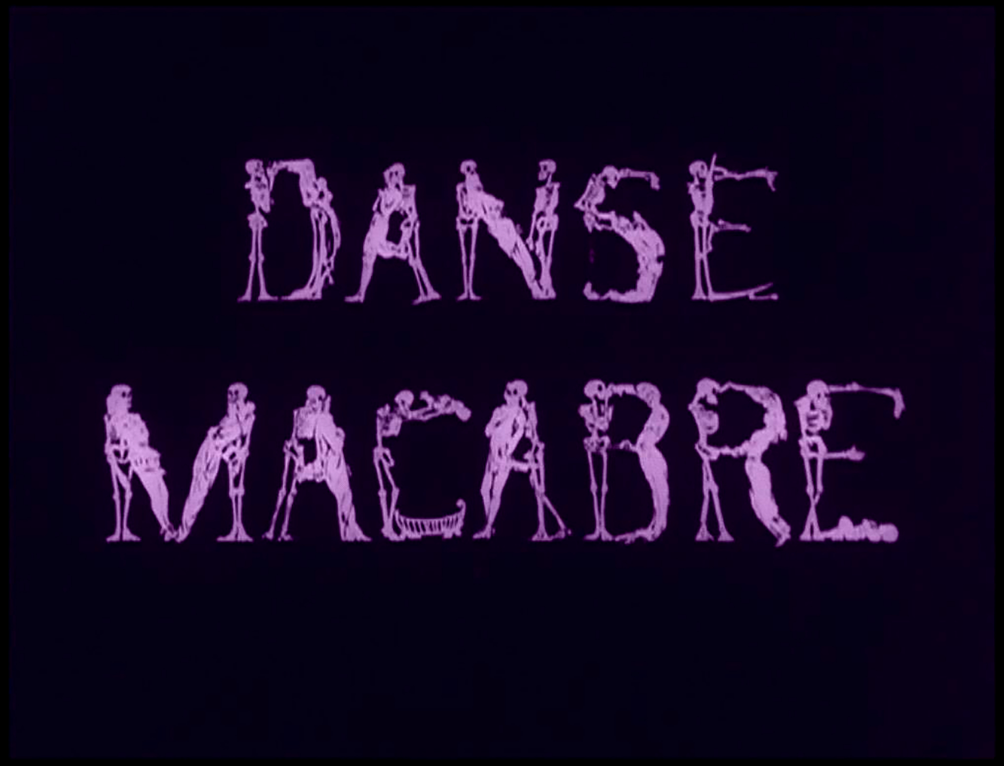
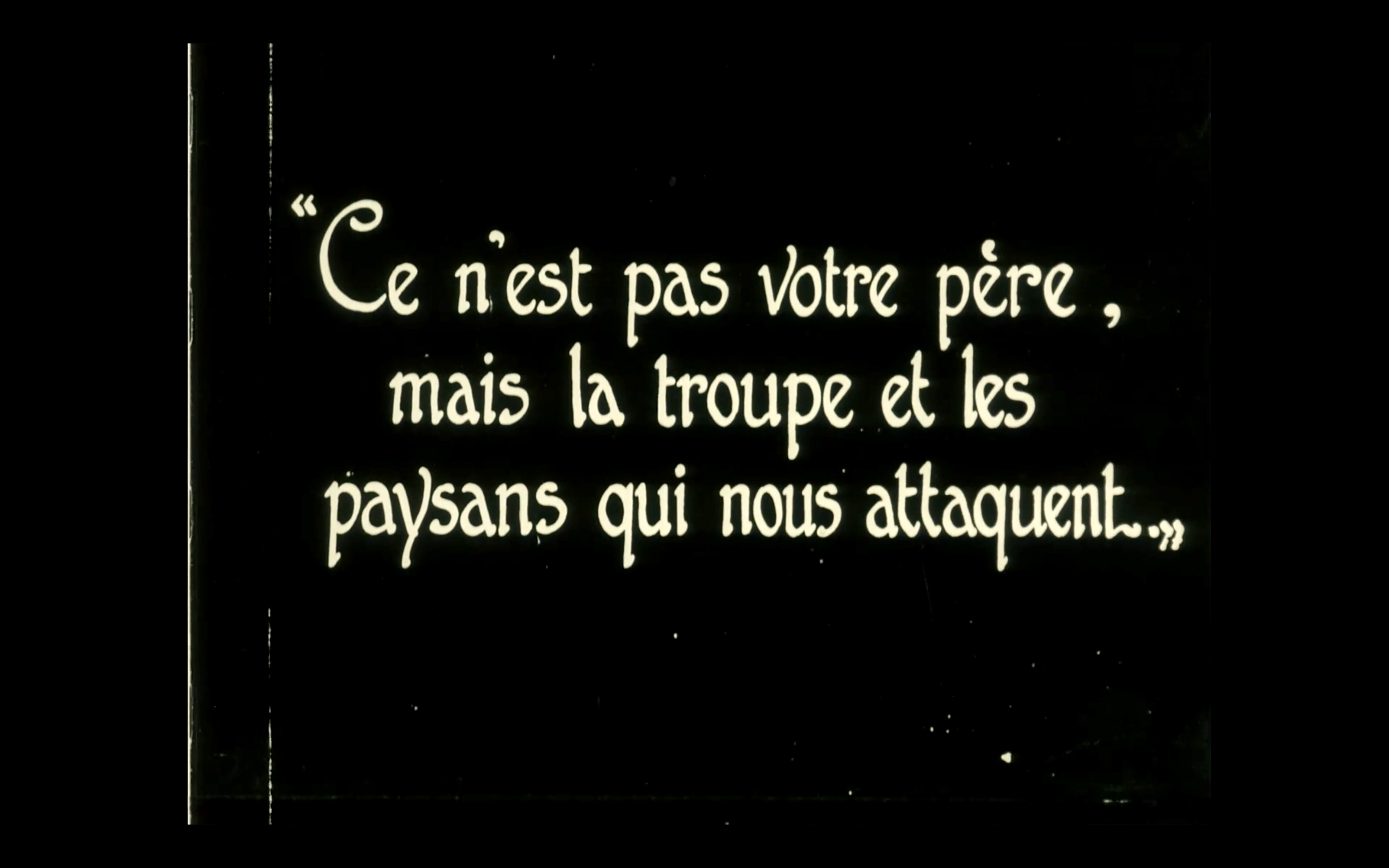
Intertitles – white letters on a black background – were inserted into the films. They were used as a convenient way of indicating a temporal ellipsis, giving information about space or simply establishing a dialogical situation. But this textual break, though necessary to deliver a message, is violent from a formal point of view.
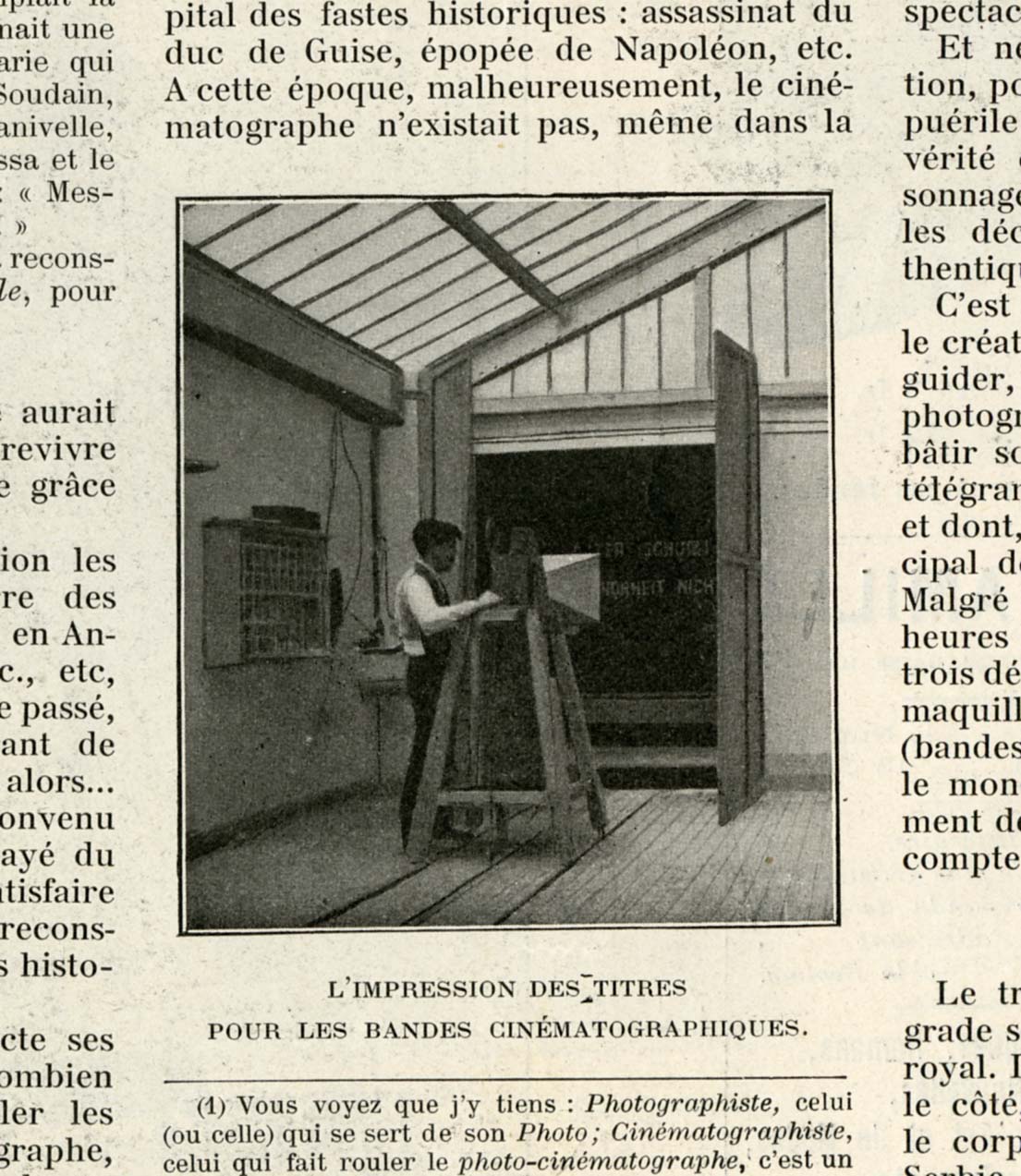
Therefore, the production of intertitles becomes a technical issue that engages typography fully. How to create, photograph and then serialise a printed board or a painted celluloid? Which type models should be used, whether one has to produce cards for a burlesque comedy or an adventure film?
In the 1920s, most movie studios had already tried different methods, established a rational work organisation and developed precise views on the letters and forms that would correspond to the taste of the time or that would best convey the moviemakers’ intentions. These preferences have an impact on the typography, which in turn evolves and adapts to remain a relevant aesthetic vehicle and to keep up with production rates.
The titles are thus a fascinating reflection of the changes in a frenetic industry; they testify both to the technical skill of letter painters – an occupation that was then invisibilised – and to the creative genius of specialised screenwriters. Yet, very few intertitles have survived. And their materiality is rarely questioned, especially from a typographic point of view.