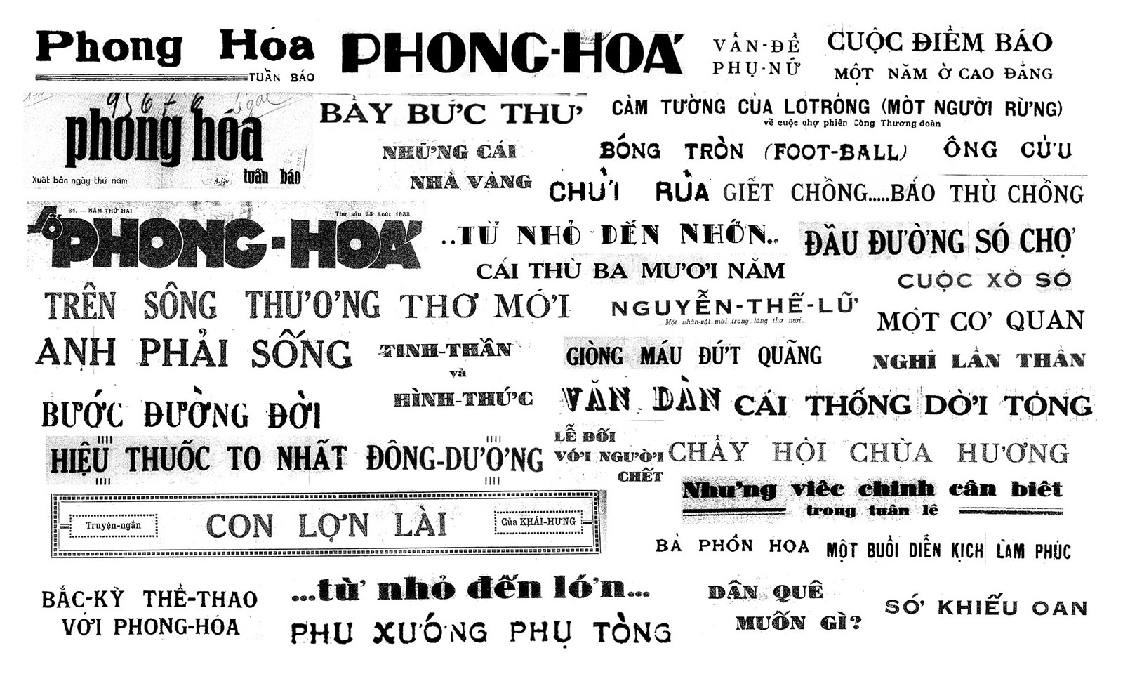
Phong Hóa
Khải Nguyễn zoom”An oddball in journalism! A new thing! Peppy discourse on essential matters: society, politics, economics.”
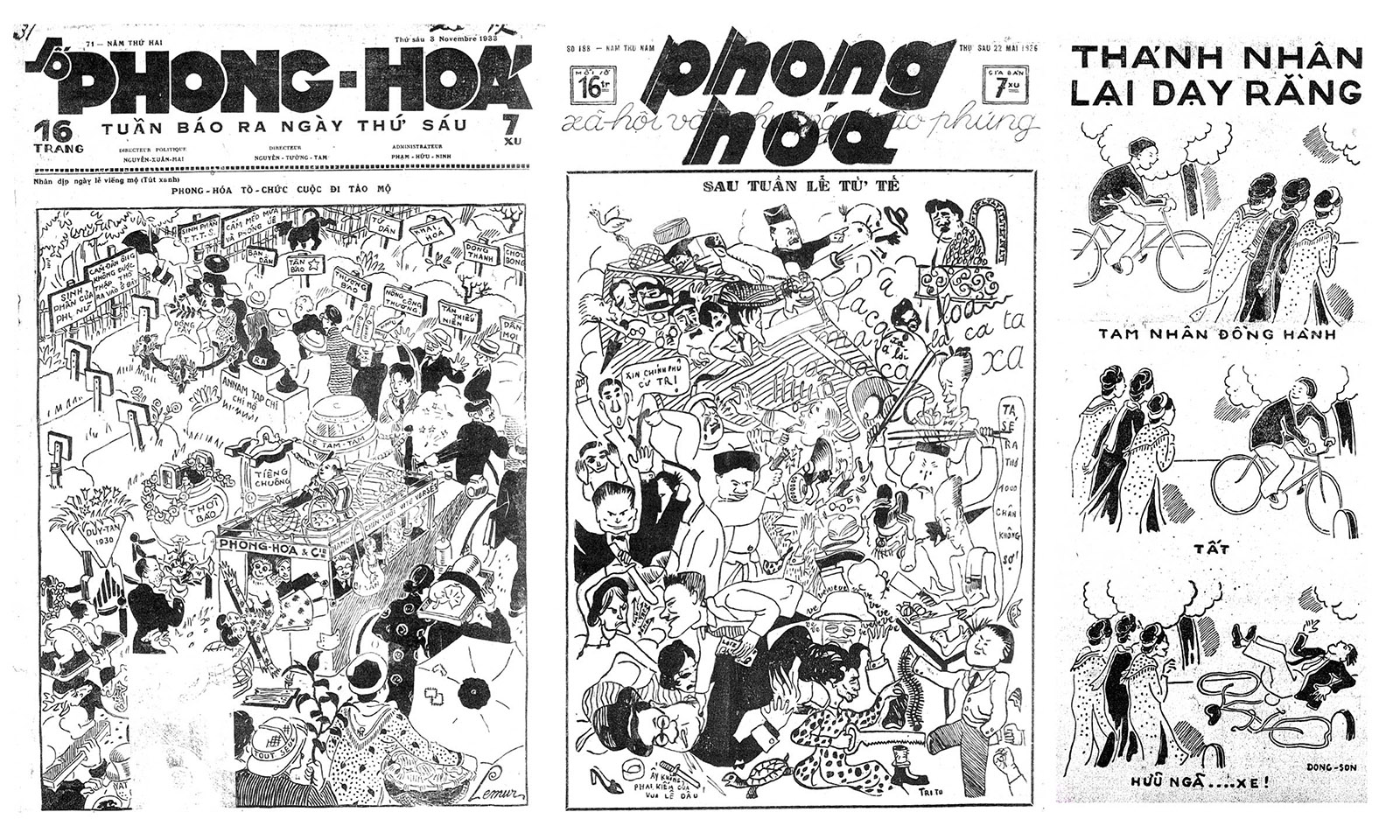
… are some statements Phong Hóa journal (roughly translated as Wind Erosion) made about itself upon its critical change in issue no.13. Such great confidence to self-righteously claim one oddness was not an empty promise. Phong Hóa is Vietnam’s first satire journal and perhaps the most forward conceptually and visually during the early 20th century. First published in 1932, Phong Hóa speaks on current matters with utmost irony and criticism, not with just play of words but also with graphics.
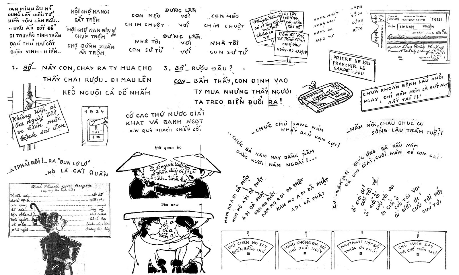
Compared to other best-selling journals at the time, Phong Hóa was always packed with illustrations and letterings. Among a set of recurring printed types with usually misplaced diacritics (all imported from France/Deberny & Peignot), it took some time to notice the almost-static all caps handwritings (so static that they resemble printed types) among the rich drawings. Acting as either description or dialogue, these handwritings reveal Vietnamese script in a more natural state - without the limitations of printing technology. The accents were calculated at the same time the illustrator draws the letters - they are not just an afterthought or some add-ons like the printed types.
This research project, therefore, focuses on the typographic treatments of the Phong Hóa journal to examine the metal typesetting struggles with a language full of accents like Vietnamese and to investigate handwritings/letterings that show a more faithful shape to the script. From there, it opens up questions about the relationship between handwriting and fonts - how one would try to look like another; the typographic representation of Vietnamese script.