The tsar’s roman
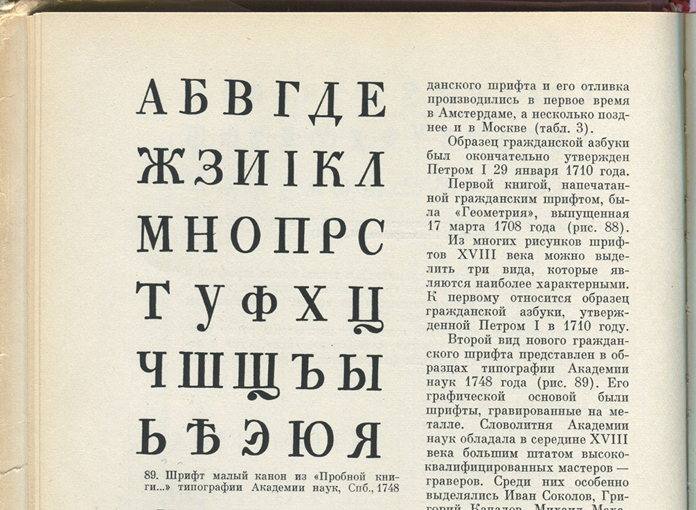
Isia Yurovsky zoomThe Cursif Paragon among the first Italic Cyrillic types. In 1708 the civil alphabet was officially established in Russia, resulting in a typographic reform promoted by the tsar, Peter the Great. The Tsar wanted to modernise the country and make it a more open state, especially towards Europe. It is in this context that the old Slavon gave way to a new azbuka (the civil types from the beginning of the 18th century were called “abécédaire”, azbuka in Russian). Its shapes were rationalised and westernized. This new azbuka became compulsory for setting official documents and profane books. The Tsar himself amended the final proofs he had commissioned from Amsterdam (the name of the engravers remains unknown to date). The structure of the civilian type would not change until the late 1730s. In 1725, the Tsar created the Imperial Academy of Sciences of St. Petersburg, a few months before his death. From that moment on, the Academy became one of the most important printing workshops in the country. During the reign of Elizabeth, the Russian engravers of the Academy of Sciences took stylistic liberties with the typefaces they produced. The azbuka “The Coronation” (at that period typefaces were named according to the title of the publication they appeared in, or to their body size) was used in the edition of Elizabeth’s Coronation in 1744. It is a new typeface, displaying a very different style from the first civil alphabets. The first cursive alphabets were born a few years earlier in the 1730s. One of the most amazing of them is the Cursive Paragon (former equivalent of a 20 pt body size, according to the old Anglo-Saxon classification), presented in the “Пробной книги” of the Academy of Sciences, and which was published in 1748. Its cursive shapes express a suppleness that contrasts with the Roman Paragon (Antique); especially because the rythm of the Cyrillic alphabets is very vertical. The s - с -, could almost be seen as a letter taken from an upright italic when the м (which looks like a smaller version of Latin capital letter M) and the л - l - leave a white space at each occurence, because of their slanted left leg. The highly decorative capital A could almost be derived from a western civility type. As part of our work at ANRT, I will collect a corpus of documents from the chosen period (1748-1800) where the typeface appears.
I will study this body of printed material, without excluding other cursive typefaces of the same period. I will then design a free and contemporary interpretation inspired by this typeface. I will attempt to reproduce its flexibility and dynamism. The Cyrillic will be drawn first, and then we will add a Latin character set. I will experiment other approaches as well, such as the addition of a sanserif design based on the same structure, a titling version, or the addition of alternate characters. Throughout this process, I will continue to enrich the body of collected material and familiarise ourselves with the spirit of Russian typography. This, in particular, with the help of precious books on Cyrillic typography, that were kindly donated by Mister Aslanoff, editor at the Slave Institute of Paris. This encounter with Mr. Aslanoff was decisive for the continuity of this project, which is why I would like to thank him.