Typography, a digital tool for the acquisition of written language
Rosalie Wagner zoomThis research aimed to create a typographic system adapted to the learning of reading and writing. In recent years, specific programs have emerged in French schools to include children with retardation, disability, or deficit into the mainstream school system. Because these children have a long-term risk of academic failure, they benefit from both an ordinary classroom program and a specialized group program.
These devices being relatively recent, educational resources need to be adjusted to inclusive teaching methods and the question of the typography is barely raised. Lettershapes being fundamental for decoding graphemes, we are entitled to ask what role does the typography play in this paradigm? How does typography influence reading? Are there particular typographic forms that can positively or negatively affect this process or its learning? Finally, what about dyslexia which is a common disorder affecting reading? By studying reading mechanism and dyslexia, I came to conclusion that no special typographical parameters will increase reading performances of a dyslexic reader compared to a regular reader.
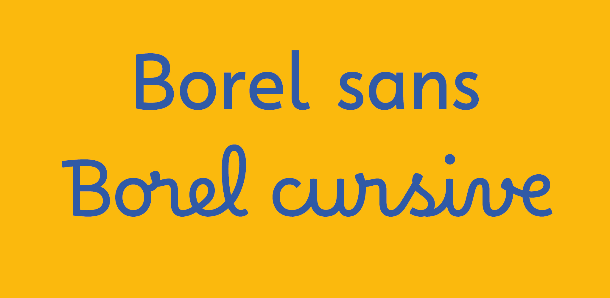
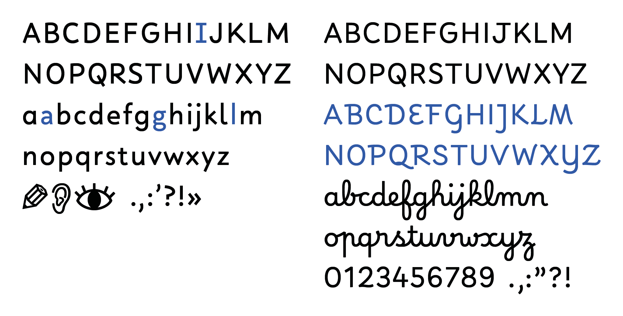
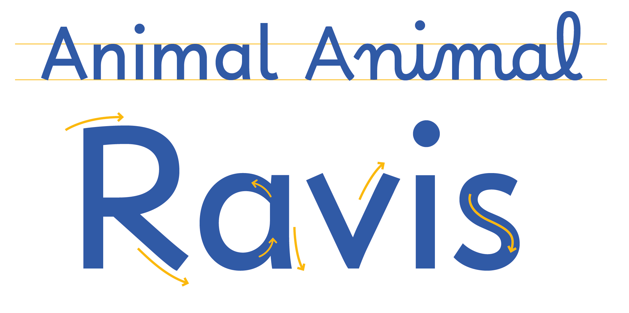
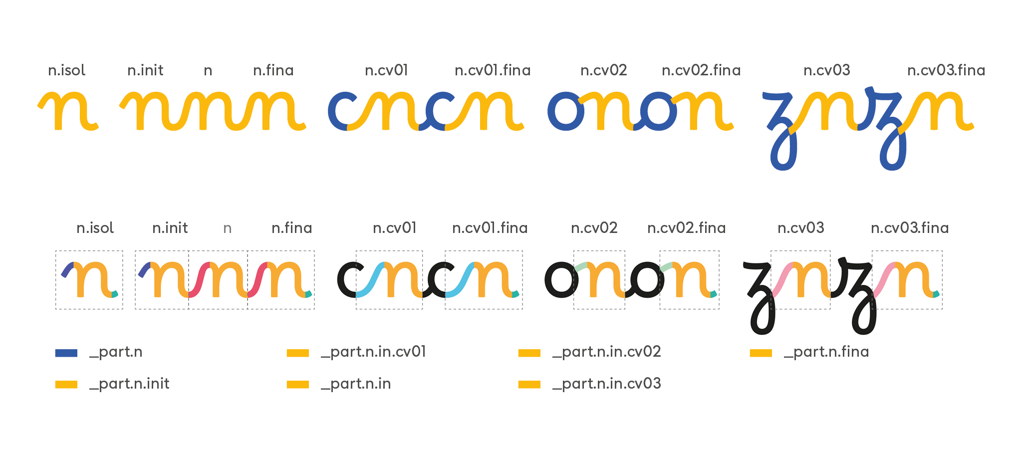
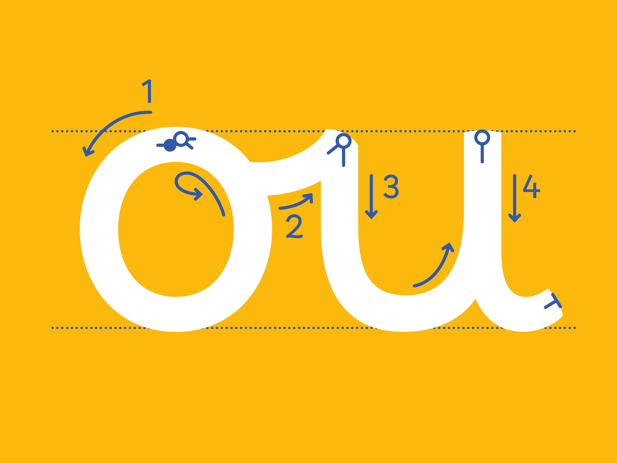
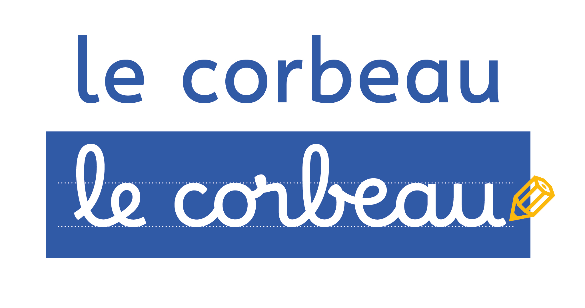
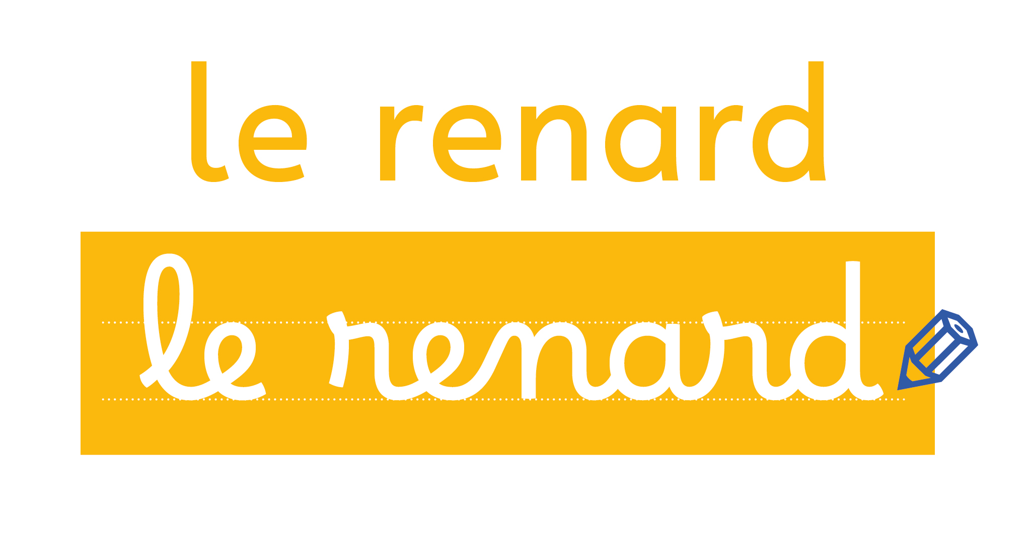
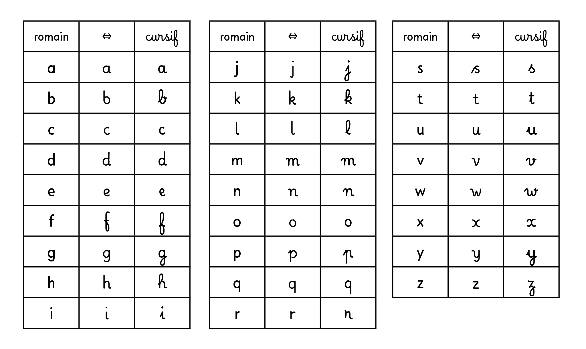
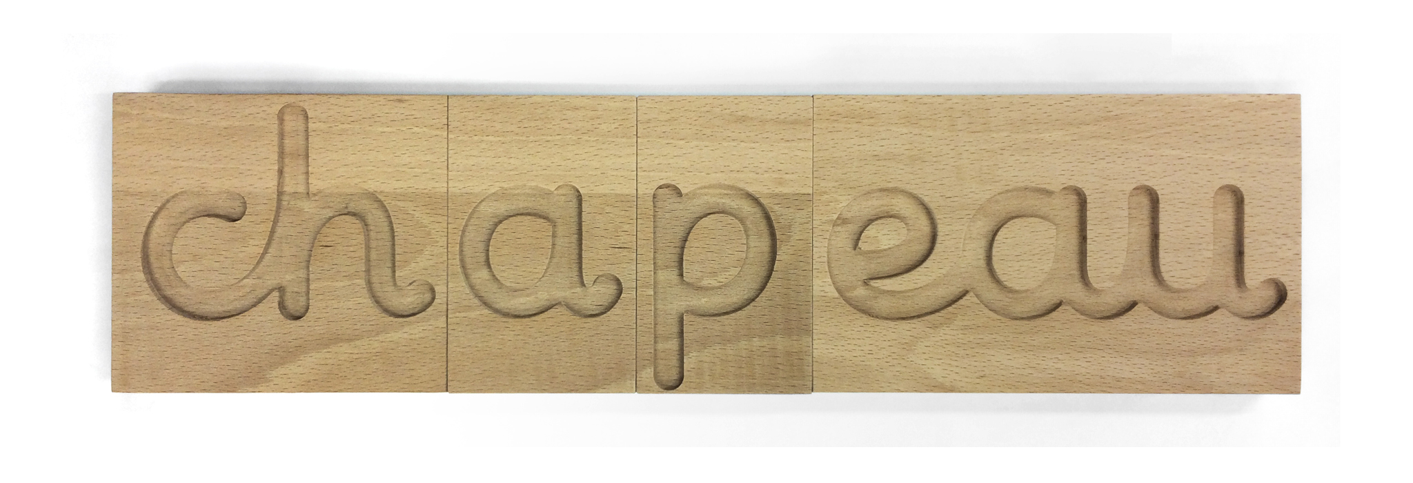
On the other hand, there are typographical parameters which have a negative impact on the effort made for reading, and those have an even worst effect on dyslexic readers. If fonts won’t « boost » reading performances; not to think their design and use may complicate their readability from the point of view of a child learning to read. It is therefore essential to design the pedagogical material in an accessible, ergonomic and pleasant way for a reader of that age. Firstable, roman and cursive typefaces are used together but with no consistency nor harmony in many educational resources. Borel Sans and Borel Cursive were created for that matter. They are quite bold and low contrasted with a slightly arhythmic width. Letters are open and well distinguished while respecting French school cursive writing rules. The roman and the cursive follow the same logic of ductus: the roman is therefore more humanistic than geometric. Furthermore, it seems appropriate to ask how can type design be adapted for learning both reading and writing? The ductus, among others, helps to memorise letters and graphemes and to differentiate them. Tracing letters may clarifies the principle of correspondence between the graphemes and the phonemes. On the other hand, we observe a dichotomy between roman types and cursive script: the signs that one learns for writing are quite different from the signs that one learns for reading, some letters do not even share a common base. A « transitional » font might help to understand the link between those two very different representations of the writing and the one I worked on is specially designed to be graved by CNC machines. I named this font family “Borel” in tribute to Suzanne Borel-Maisonny who was a pioneer in the field of speech therapy.