Font for Monetary Inscriptions:
Typographic Transcription of Antique Coins
Morgane Pierson (2020), “Beyond the Semantic. Typographic Representation of Ancient Monetary Inscriptions,” in Proceedings of Grapholinguistics in the 21st Century, 2020 (Yannis Haralambous, Ed.), Grapholinguistics and Its Applications, Vol. 4, Brest: Fluxus Editions, 455–488. [Revised version]
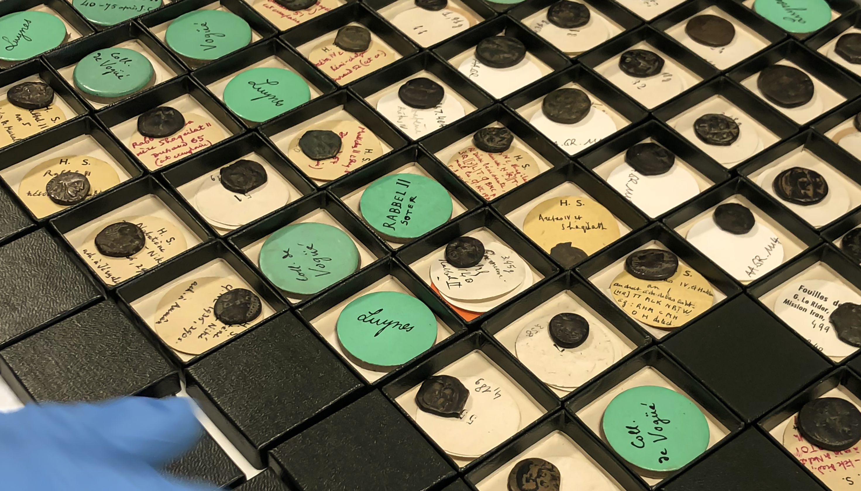
Fig.1 A tray of Merovingian coins at the BnF © BnF
The research project Police pour les Inscriptions Monétaires (PIM), or Font for Monetary Inscriptions, aims to produce a suitable tool for transcribing the information contained in monetary inscriptions beyond their semantic content. The textual information and graphic features that a coin carries can provide many valuable information regarding its origin and the society in which it was minted. Since there was previously no digital font that could fully and accurately render the monetary inscriptions, this project was initiated in 2013 by Florence Codine, at that time curator in charge of the Merovingian coins at the National Library of France (BnF), and is currently supervised by Frédérique Durat, director of the department of Coins, medals, and antiques at the BnF.
The PIM project
Current issues of the numismatic epigraphy typographic transcription
Since the invention of printing with movable type in Europe in the 15th century, engravers and typographers have tried to reproduce the world’s writing systems and transcribe the scripts of the passed. Technological advances have developed various transcription methods for scholarly publishing, such as engraving, lithography, autography, or photography. In the 20th century, digital humanities opened new possibilities besides the book for academic research through the digitisation technics of texts and images, indexing and networking. These have facilitated researchers’ access to sources, data processing and scholarly publishing. However, despite recent technological progress, typography appears to be a ‘poor relative’ of academic research. Researchers lack suitable tools such as digital typefaces, functional interfaces and encoding, and interoperability to support their work. The absence of well-designed typefaces and often the use of images instead of encoded and vectorial text have been one of the main shortcomings in conducting research on various historical fields. Therefore, a significant contribution to digital humanities research will be made by creating and using original fonts in digital publishing projects and different online platforms.
The Bibliothèque nationale de France
The BnF houses in the departments of Coins, medals and antiques (commonly known as Cabinet des médailles) one of the most extensive collections of coins in the world (fig.1). Most of which have already been digitised and are publicly available online through the Gallica website. Thanks to this extensive digital resource and software called NumiPal, scholars can study the coins precisely (fig.2), but most importantly, annotate the inscriptions. It was then possible to draw up an inventory of the letters and their variants present on the coins of their collection. In this case, not only the signs have been identified, but as well as all the graphical variants in which they appear in the corpus (fig.3).
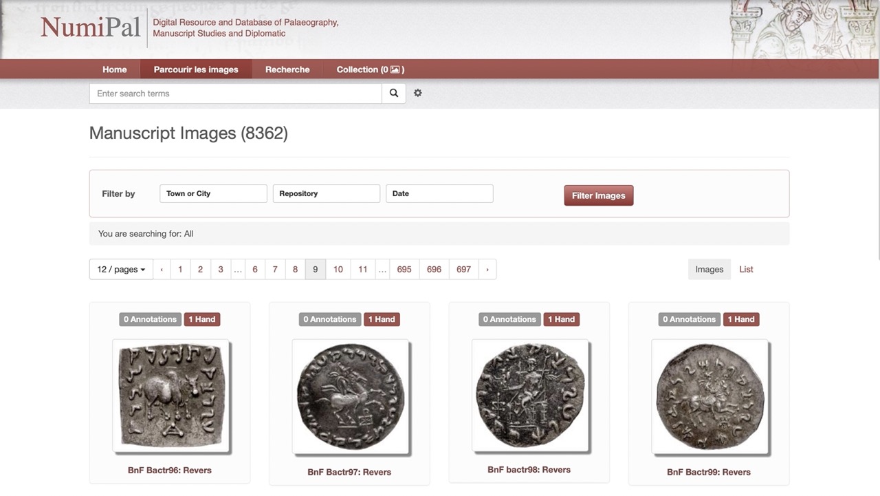
Fig.2 NumiPal interface
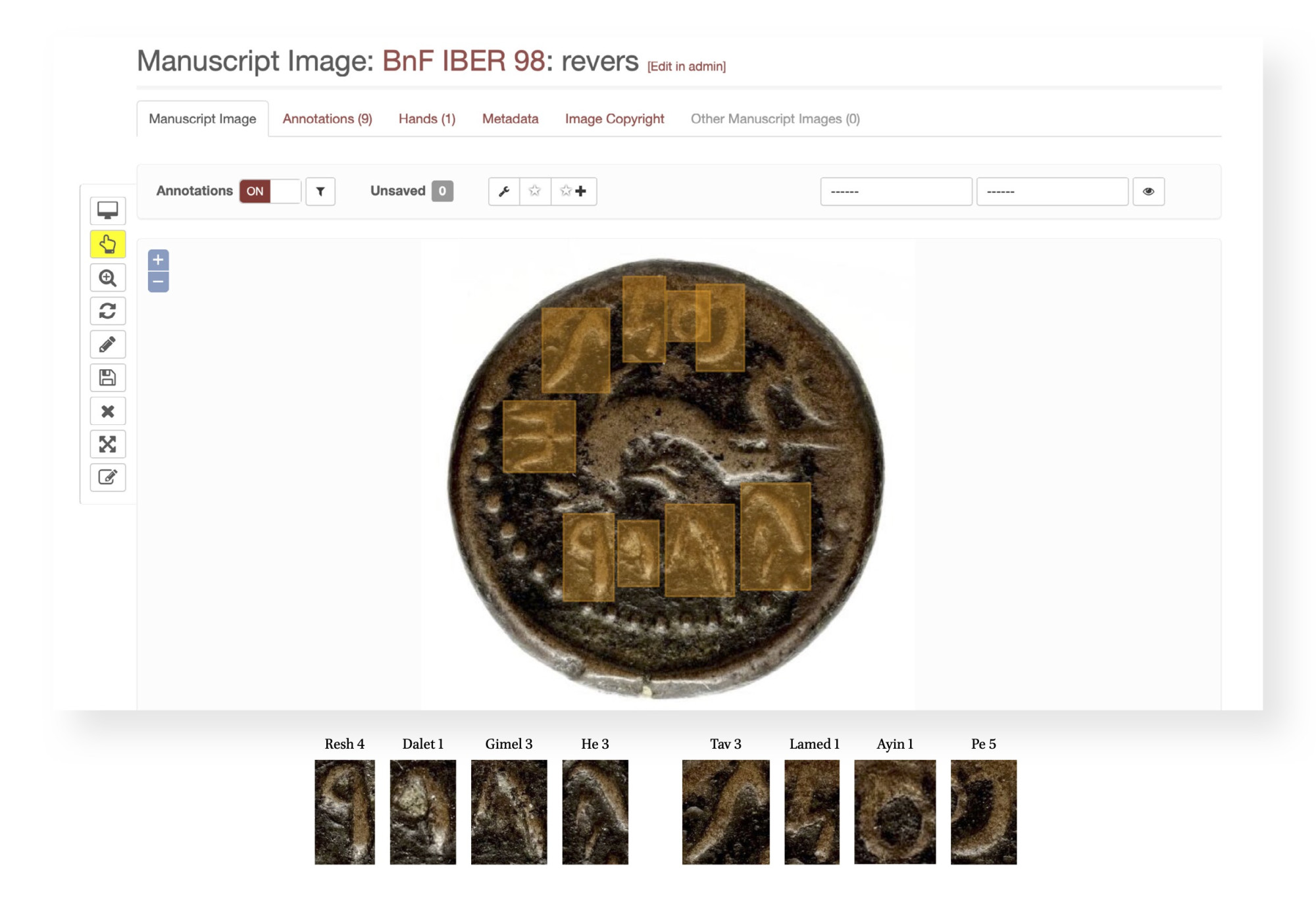
Fig.3 Example of coin’s annotation on NumiPal
The Atelier National de Recherche Typographique
In 2014, the department of coins, medals, and antiques at the BnF began a partnership with the Atelier National de Recherche Typographique (ANRT), post-master at the École Nationale d’Art et de Design (ENSAD) in Nancy. The purpose was first to develop a digital typeface that would bring together all identified stylistic variants of the inscriptions on the coins in a consistent manner.
This project began with Elvire Volk Leonovitch, a researcher-student at ANRT, under the direction of the director Thomas Huot-Marchand and the teaching staff. Initially, the main goal was to develop a digital font to transcribe the Merovingian monetary inscriptions on screen and paper (fig.4).
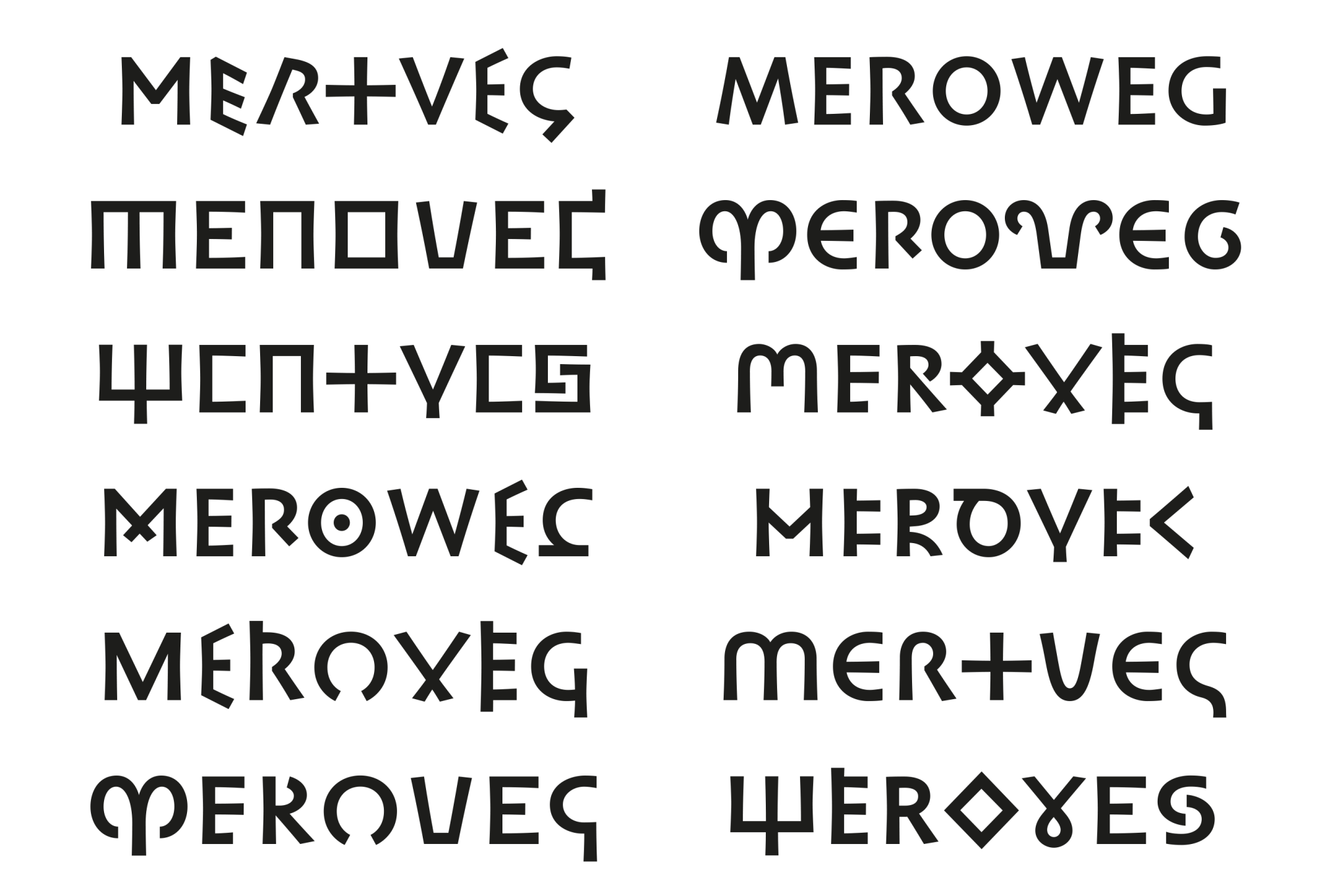
Fig.4 PIM Latin typeface (lately Meroweg) © E. Volk Leonovitch
In 2019, the PIM project was extended to other collections of antique coins from Italy, Greece, Spain, North Africa and the Middle East. The author has been in charge of creating fonts to support the following writing systems: Phoenician, Punic, Cypriot, Archaic Greek, Etruscan, Oscan, Paleohispanic, Lycian, Paleo-Hebrew, Kharoshti, and Nabataean. Initially, it was estimated that the PIM typeface would contain 1066 glyphs. However, more than 1550 glyphs have been designed so far, and this number is expected to grow even larger as the project proceeds (fig.5).
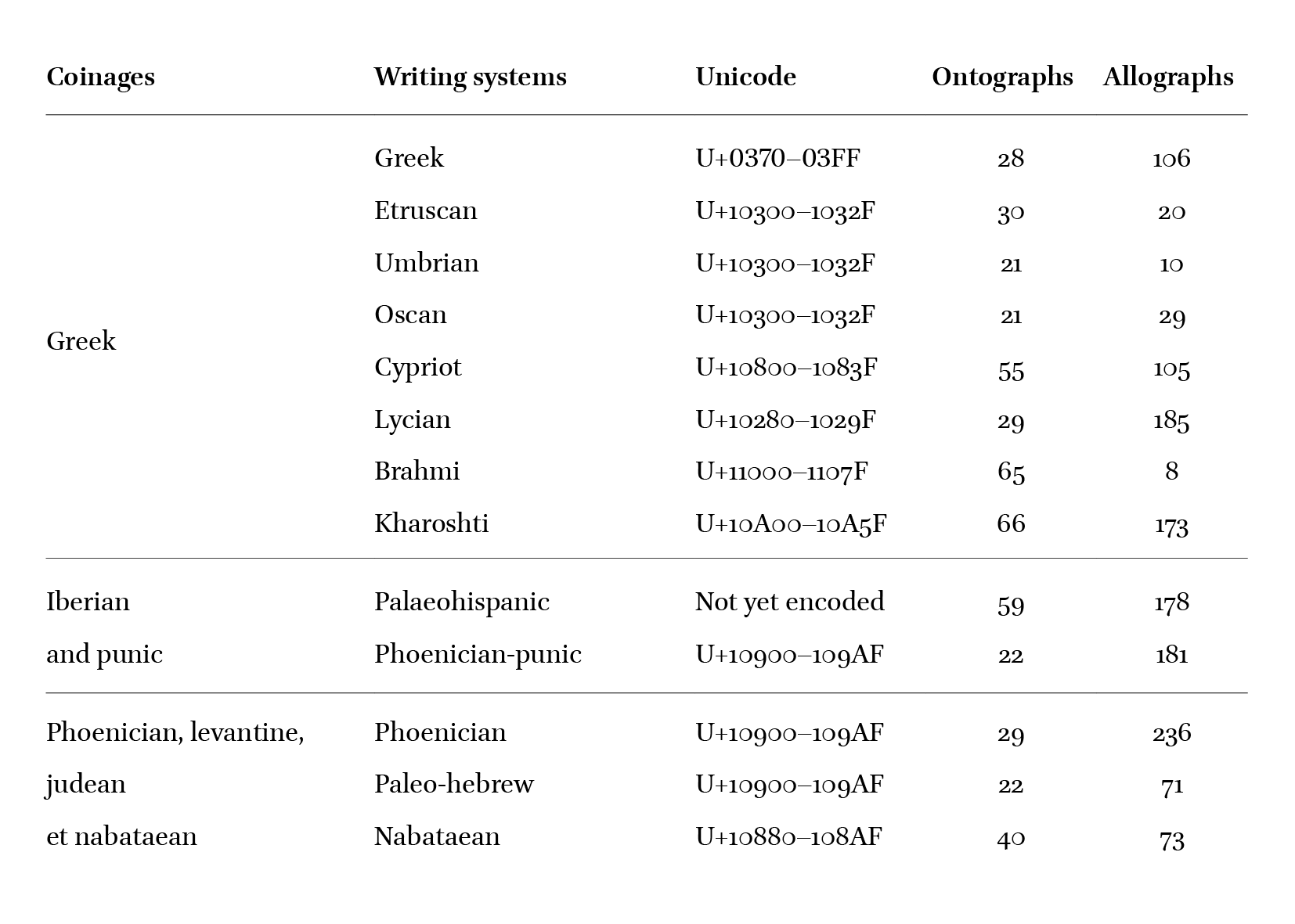
Fig.5 Summary table of PIM characters
Ontology
During the corpus annotation on NumiPal, the identified forms on each coin have been inventoried with a reference number. This database makes it possible to find every forms which have been assigned to a single variant. Based on this classification of the allographs, an accurate and relevant interpretation of the various letterforms can be deduced. However, it was important after this work to define the most revealing form in compromise to different criteria of readability in contemporary readership and loyalty to historical models. The goal is, therefore, to combine the advantages of imitative transcription with those of interpretative transcription to borrow the terminology of Marc Smith. In this ‘diplomatic’ approach, we distinguish the ontograph, which is the ‘standard’ representation of the grapheme, and the allograph, which is a morphological variant of the letter (fig.6).

Fig.6 Design process from the ontograph to the allograph
Encoding
The Unicode standard was created in 1990 to assign each ‘character’ of each writing system a unique hexadecimal code. The ‘glyphs’ in a digital font are the visual representation of these characters. Therefore, Unicode does not allow the integration of graphical variants. Admittedly, variant selectors exist (see sinograms or emojis), but these are the subject of a normalisation process and are not adapted to the case of monetary inscriptions.
In the encoding scheme adopted in the PIM project, the allographs share the same code as the concerned ontograph. Then, glyph variants viewing is done through the OpenType features integrated with the font. From a technical point of view, the OT stylistic sets (SS01-SS020) were not used due to the limitation of only 20 variants for each character, which is insufficient for numismatic. Instead, character variants (CV01-CV99) have been used, which allows the creation of 99 variants per glyph.
Creation of the PIM typefaces
The project’s first development phase from the Merovingian corpus between 2014 and 2015 led to the creation of the PIM Latin font (initially named Meroweg). The font designed by Elvire Volk Leonovitch contains 345 glyphs. Stems are slightly flared and heavy to produce a visible typographic contrast and to distinguish it from other typefaces used to typeset the text around it (fig.7). Thus, when the project was extended to the antique coins corpus in 2019, it was agreed to keep these same graphic characteristics.
Fig.7 Example of the font PIM Latin in use
Instead of unifying all the writing systems in one single font file, creating one font for each script was decided. This choice was partly made for ease of use: scholars can focus conveniently on the writing system concerned in their study. Then the technical reason is that some writing systems share the same Unicode encoding (as the Phoenician with the Phoenician-Punic and Paleo-Hebrew or the Etruscan with Umbrian and Oscan). Since the project’s purpose wasn’t to unify and simplify the monetary inscriptions but the opposite: to be as exhaustive and precise as possible in the characteristics of each script, the creation of specific fonts was an obvious solution.
The PIM’s writing systems
Phoenician and Phoenician-Punic
Integrating legends in publications have always been a challenge for numismatic researchers (fig.8), especially in the case of the Phoenician, which significantly evolved over the centuries and has been well studied. For instance, in 1867 and through the initiative of Ernest Renan, the Académie des Inscriptions et Belles-Lettres commissioned the Imprimerie Nationale to engrave transcription characters to publish a study of all known Semitic inscriptions entitled Corpus Inscriptionum Semiticarum (fig.9). The Phénicien Classique engraved by the Imprimerie Nationale is based on the inscription of the Eshmunazar II sarcophagus, considered iconic of the metropolis Phoenicia’s writing (fig.10). Thus, these two sources were the base for designing the ontographs of the font PIM Phoenician.

Fig.8 Catalogue of Greek Coins, Sicily, The British Museum, 1876 (Courtesy of the British Library)
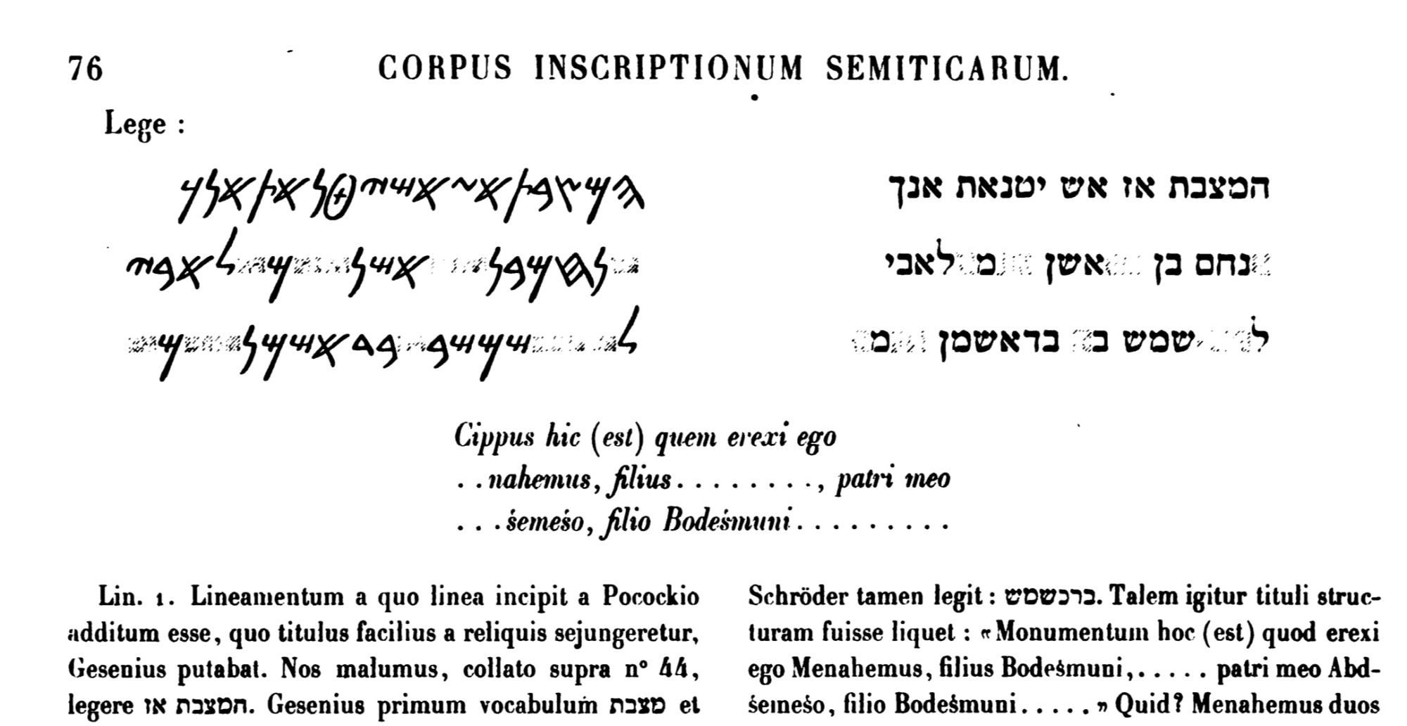
Fig.9 Corpus Inscriptionum Semiticarum, 1907

Fig.10 Eshmunazar sarcophagus (Louvre), and its typographic transcription (PIM Phoenician)
The legends on the coins produced in the Phoenician cities during the high period (that is, under Persian domination, sixth-fourth century BCE) display neat and easily recognizable letterforms (fig.11). Then, the inscriptions gradually deteriorated with the appearance of bronze coins under Hellenistic domination (Ptolemaic dynasty, then Seleucid).
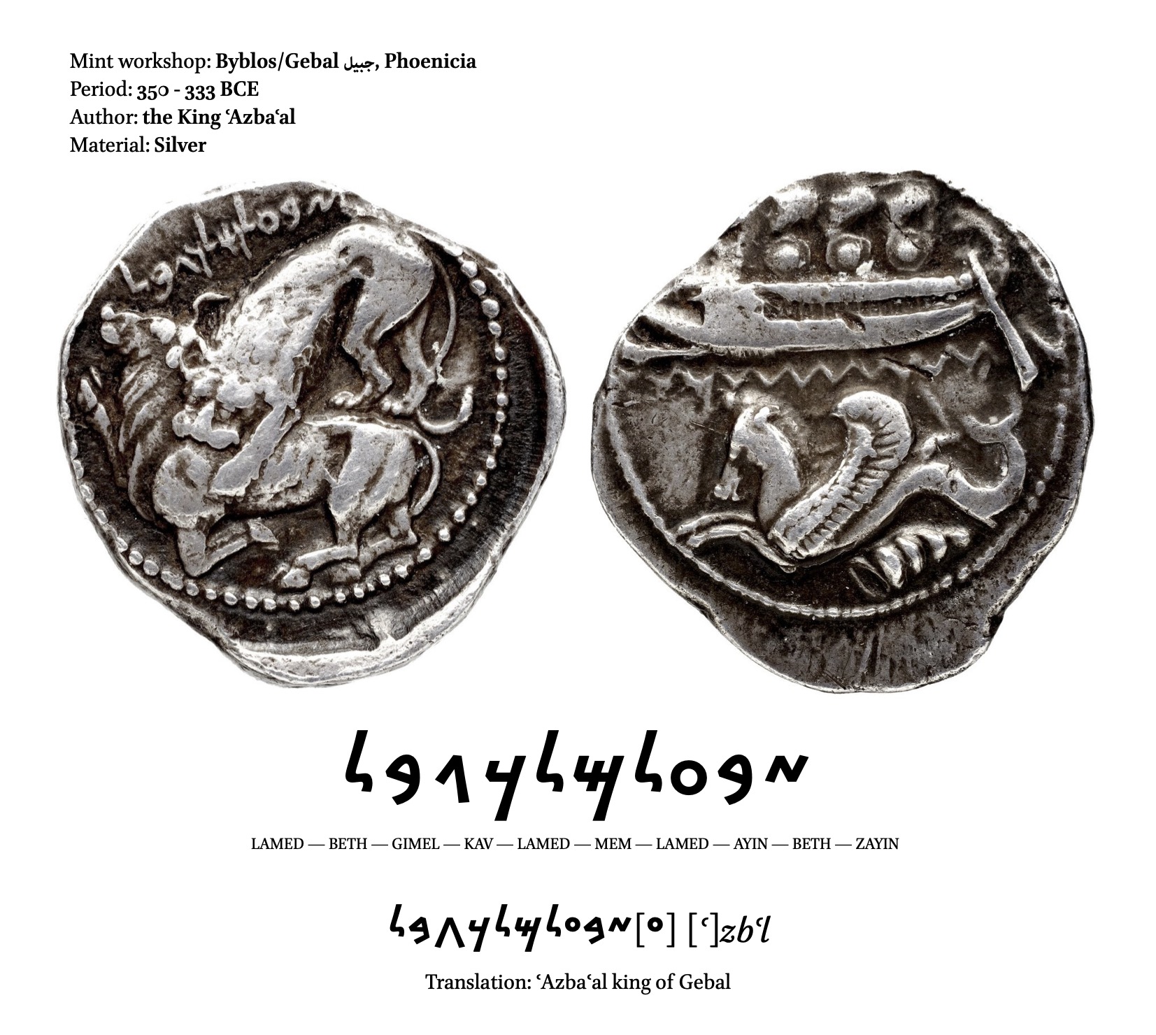
Fig.11 Silver tetradrachm, Byblos, Phoenicia, Ozbaal, 350–333 BCE (BnF, MMA, Luynes.3142)
The bronze coin shown in figure 12 was minted under Antiochos IV, a Seleucid ruler in the Hellenistic period around 175 to 164 BCE. He issued a large amount of bilingual bronze coinage, especially in Phoenicia, where the greek characters go side with Phoenician inscriptions.
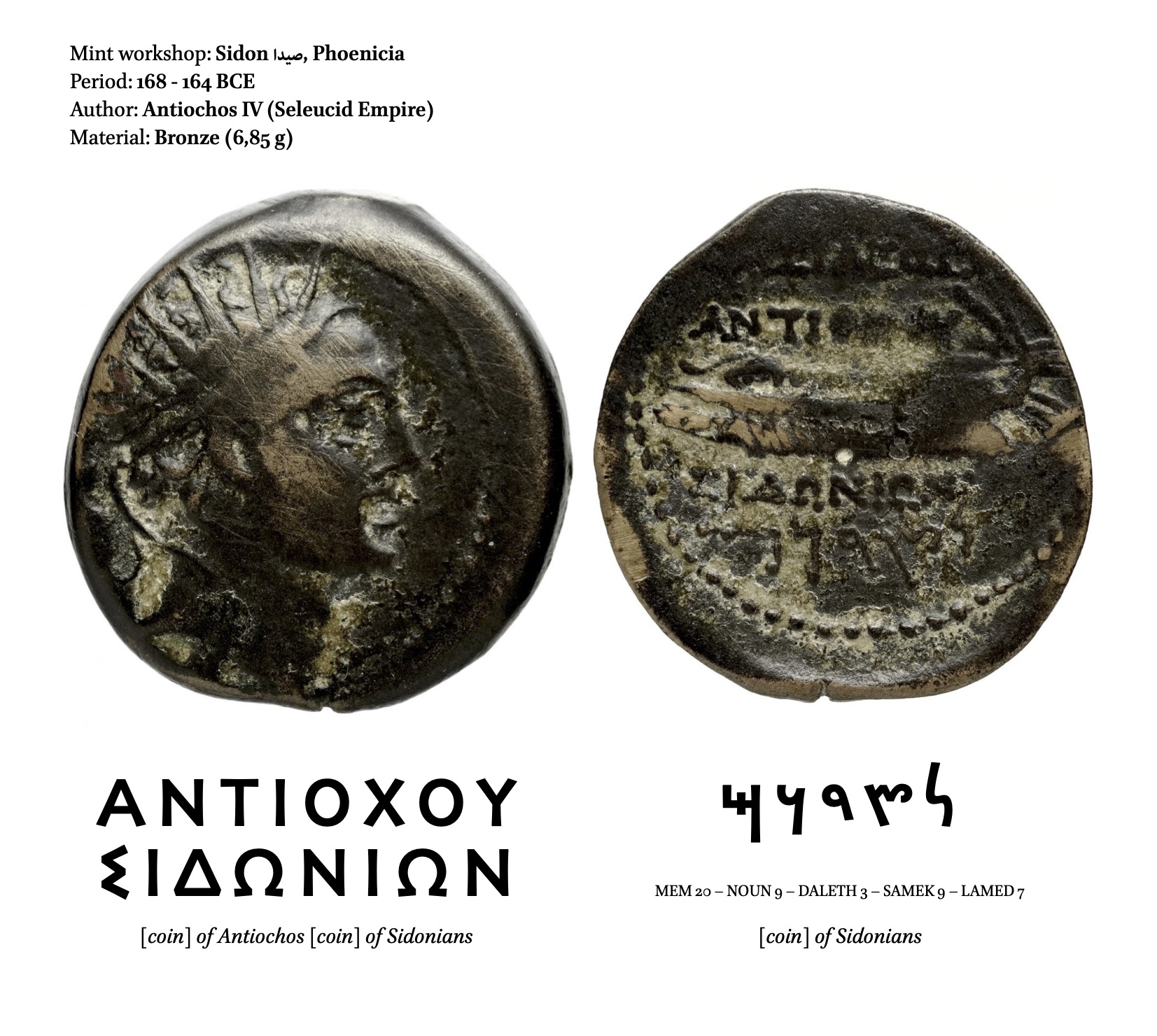
Fig.12 Sidon, Phoenicia, Antiochos IV Épiphane, 175–164 BCE (BnF, MMA, Babelon 683)
Phoenician letterforms variations are significant, and for a 22 letters alphabet, 145 variants were ascertained in the BnF collection (fig.13). Therefore, these allographs are included in the PIM typeface, next to the ontographs, more consensual and easier to identify (fig.14). Due to the heterogeneous qualities of the coins, the aim was to find a suitable representation based on the inscriptions, references, and, more importantly, the analysis and descriptions provided by the scholars (fig.15).
Fig.13 PIM Phoenician typeface

Fig.14 PIM Phoenician, ontographs preliminary drawings © M. Pierson
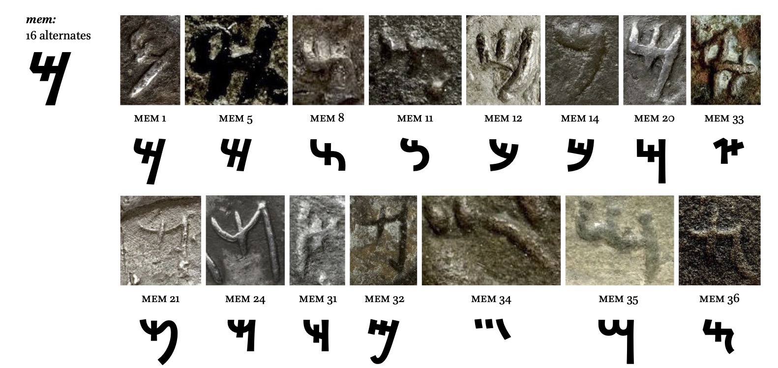
Fig.15 Phoenician letter Mem variants
Since scholars will be the primary users of such typefaces, it was essential to conceiving an accurate tool to facilitate their research. For instance, the PIM project has aided researchers in determining that the allograph ‘aleph 20’ (fig.16) was only represented on Carthaginian coins that feature an elephant. It was concluded from such observations that some allographs could be traced back to specific minting workshops. Cataloguing morphological variants also enables scholars to develop a historical and geographical reflection based on letterforms variations. This research approach, assisted by ‘material turn’ theories in which physical artefacts are considered meaningful embodiments of practices, seems to have regained momentum over the past decades in the humanities and social sciences.
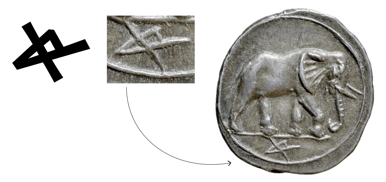
Fig.16 allograph Aleph 20, PIM Phoenician / Silver hemishekel, punic workshop of Agrigente (?). Sicily, 215-212 BCE (BnF, MMA, Fonds général 666)
The Punic language, used mainly in North Africa, is related to a branch of Phoenician called Phoenician-Punic. In the PIM corpus, 88 allographs are common with the Phoenician, totalling 181 allographs.
The punic silver coin presented in figure 17 is dated from 300 to 289 BCE and was studied in 1978 by G.K. Jenkins in “Coins of Punic Sicily”. In this article, two different reproductions of the inscription can be found: first, in the iconography section, which is a scale one replication of the coin, then in the legends index (№273), the handmade transcription proposed by the author associated with a reference number. Thanks to the new technologies, it is possible to have a high-quality image of the coin and the transcription with a digital font. It is also possible to have a high-quality photograph of the coin and the transcription with a digital font (which will facilitate research if correctly encoded). It is also possible to integrate the transcription easily into the text with its transliteration to make it more readable. Using digital fonts also facilitates the creation of a list of the collection’s inscriptions to be compared easily.
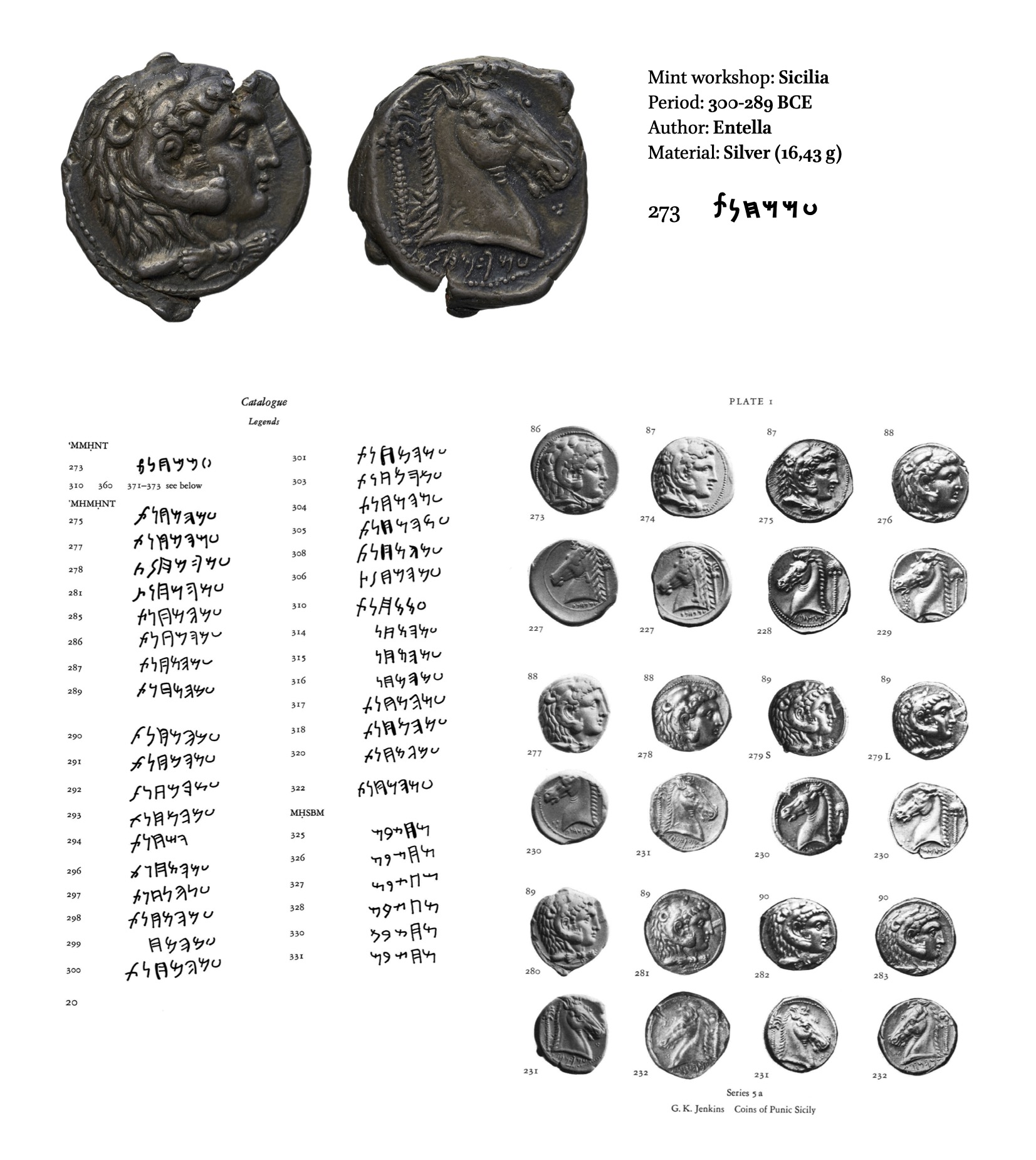
Fig.17 Silver tetradrachm, workshop of Entella, Sicily, 300–289 aBCE (BnF, MMA, Luynes 1451. / (below) Jenkins, Coins of Punic Sicily, 1978
Archaic Greek
The Archaic Greek has been the subject of many studies, and the entire variants were identified in The Local Script of Archaic Greece by Lilian Hamilton Jeffery (fig.18). Considering the abundance of sources, two standards from different periods have been designed, allowing expansion of the use of the PIM typeface in other studies than the numismatic framework. The most recent letterforms are based on the 4th century BCE and are closer to the current form of Greek capitals. For the second style, the characteristics of the letters are from the 6th century BCE (fig.19).
Fig.18 PIM Archaic Greek typeface
Fig.19 PIM Archaic Greek (left: 400 BCE — right: 600 CE)
Comparing Greek coins from different periods and minting workshops makes it possible to evaluate the morphological evolution of the letters depending on the time, and the engraver’s hand. Thus, the Zankle drachma shows archaic variants of the delta and lambda (fig.20).
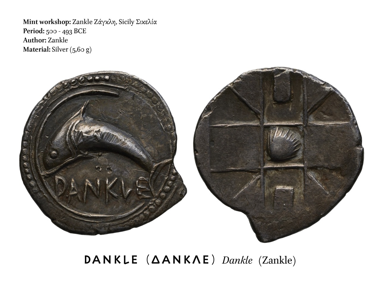
Fig.20 Silver drachm, Zankle, Sicily, 520-493 BCE (BnF, MMA, Luynes 1006)
Etruscan, Oscan, and Umbrian
‘Old Italic’ is a convention adopted for Unicode. It unifies several related historical alphabets from the Italian peninsula, used for non-Indo-European languages. However, unifying these alphabets into a single ‘Old Italic script’ requires language-specific fonts because the glyphs most commonly used may differ depending on the language being represented. The PIM project focuses mainly on the Etruscan, Oscan, and Umbrian alphabets. Therefore, scholars will have access to different font files for each of these three writing systems (fig.21).
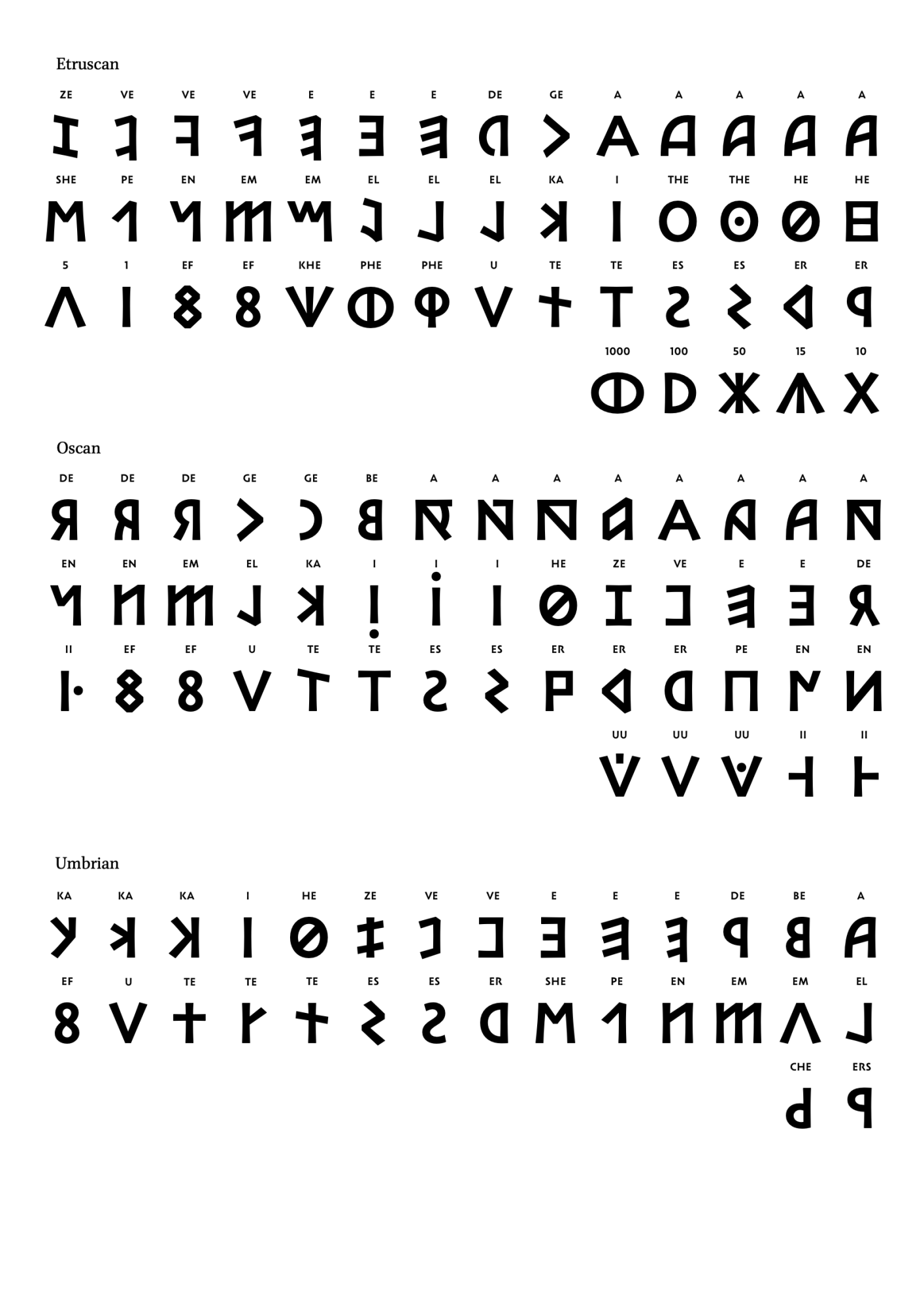
Fig.21 PIM Etruscan, Oscan & Umbrian typefaces
Because monetary inscriptions are often short, it is sometimes impossible to reconstitute the whole alphabet from these only sources (fig.22). Further research is required to find the appropriate ontograph and complete the typeface.

Fig.22 Oscan characters and their typographic transcriptions (PIM Oscan)
Hebrew and Paleo-Hebrew
The Paleo-Hebrew, also known as Proto-Hebrew, was the script used in the historical kingdoms of Israel and Judah. By comparing the letterforms of the Hebrew, the Paleo-Hebrew (including its variants) and the Phoenician, it is possible to deduce a possible ductus and traces order (fig.23). For instance, with the letter beth, we can notice the recurrence of a closed stroke on top, which is open in Hebrew, and a vertical stroke going down to finish almost horizontal. In the letter tsadi, a stroke comes from the top to join in the middle of a long vertical stroke by moving up and down (fig.24). This kind of analysis is essential in this work. Indeed, the aim is not to make a faithful revival with identical morphological details but to highlight the basic strokes that are the most relevant for each of the variants inventoried.
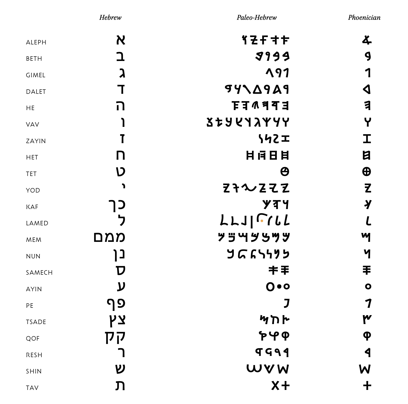
Fig.23 PIM Hebrew, Paleo-Hebrew, & Phoenician typefaces
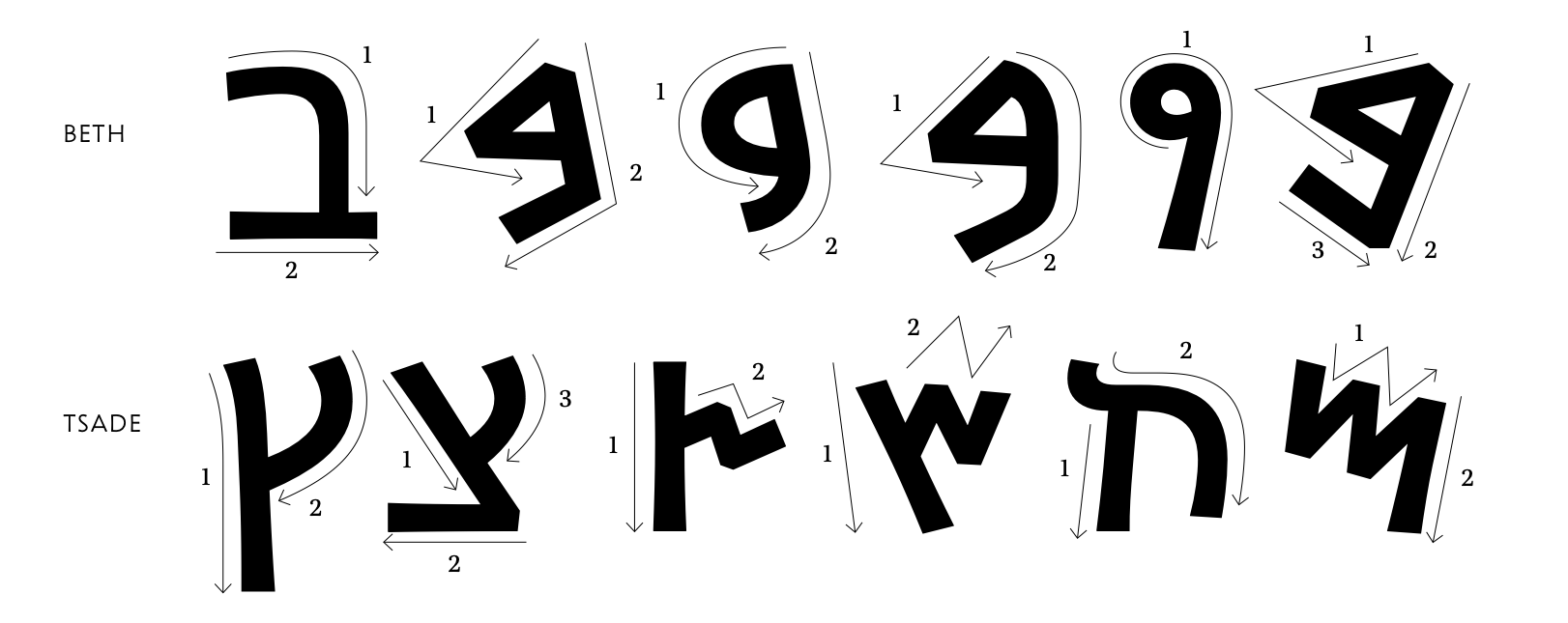
Fig.24 Possible traces orders of the Hebrew, Paleo-Hebrew and Phoenician characters
The coin in figure 25 was minted in Palestine during the Jewish revolt around 67-68 CE. The inscription above the chalice, written with Paleo-Hebrew characters, indicates that this is the “shekel of Israel”. On the reverse, in a grenetis, is written “Holy Jerusalem” around a branch carrying three pomegranates.
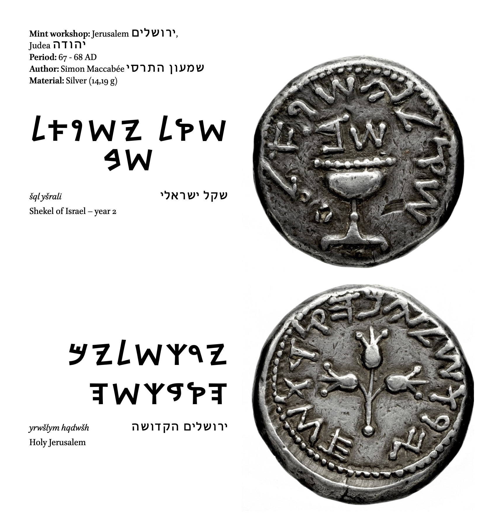
Fig.25 “Shekel of Israël”, first Jewish revolt, 68 CE (BnF, MMA, Fonds général 263)
A complementary font PIM Hebrew has been designed to translate the Paleo-Hebrew characters into modern Hebrew. That will make it possible for scholars to transcribe in the correct language and the right sounds without using transliteration.
Nabatean
Some scholars have suggested that the Syriac and Arabic writing systems are closely related to Nabatean. Following this idea, the Nabatean font has been designed in analogy with the Phoenician, Aramaic, Syriac, and Arabic letterforms (fig.26_27). As the script developed, a range of conjuncts and final forms were introduced. In the case of the PIM project, the letters found on the coins were isolated; however, if scholars require to introduce joined letters for epigraphic transcriptions, it would be possible to extend the typeface in a more cursive direction. A few variants have already been included from the sources that were attested to make it usable for other studies.

Fig.26 Fossey, Charles, ed.(1927). Notices sur les caractères étrangers anciens et modernes. Paris: Imprimerie Nationale

Fig.27 PIM Phoenician, PIM Nabatean, Noto Sans Syriac, Adobe Arabic
The bronze coin shown in figure 28 contains the inscription which reads “Aretas” [Aretas IV, King of Nabateans] and “Shaqilat”, who was the second wife and co-ruler of Aretas IV. These inscriptions are accompanied by their portraits on the obverse. At least four transcription degrees are possible for this inscription: (1.) An ‘imitative’ or ‘diplomatic’ transcription by using the variants of the typeface; (2.) A ‘semantic transcription’ by using the ontographs, which is a more conventional form of the script; (3.) The transliteration, in this case, with the use of Roman characters; (4.) The translation.

Fig.28 Bronze of the Nabatean kingdom, Aretas IV, 6-40 CE (BnF, MMA, Fonds général 34)
Lycian
Lycian was used to write an ancient Indo-European language of western Anatolia. It is an alphabetical writing system, written from left to right. Lycian is either derived from Greek or closely related to it (fig.29). Before the Persian conquest, The Lycians were politically organized in a federal system, and even after their submission to the Persians, the institutions inside the federal system continued to be effective and independent. The oldest Lycian coin seems to be from the 5th century BCE, which is contemporary to Xerxès, son of Darius I. The Lycia symbol is a solar emblem represented by the triquetra, which is seen on most of the reverse sides of the coins (fig.30).

Fig.29 PIM Lycian typeface
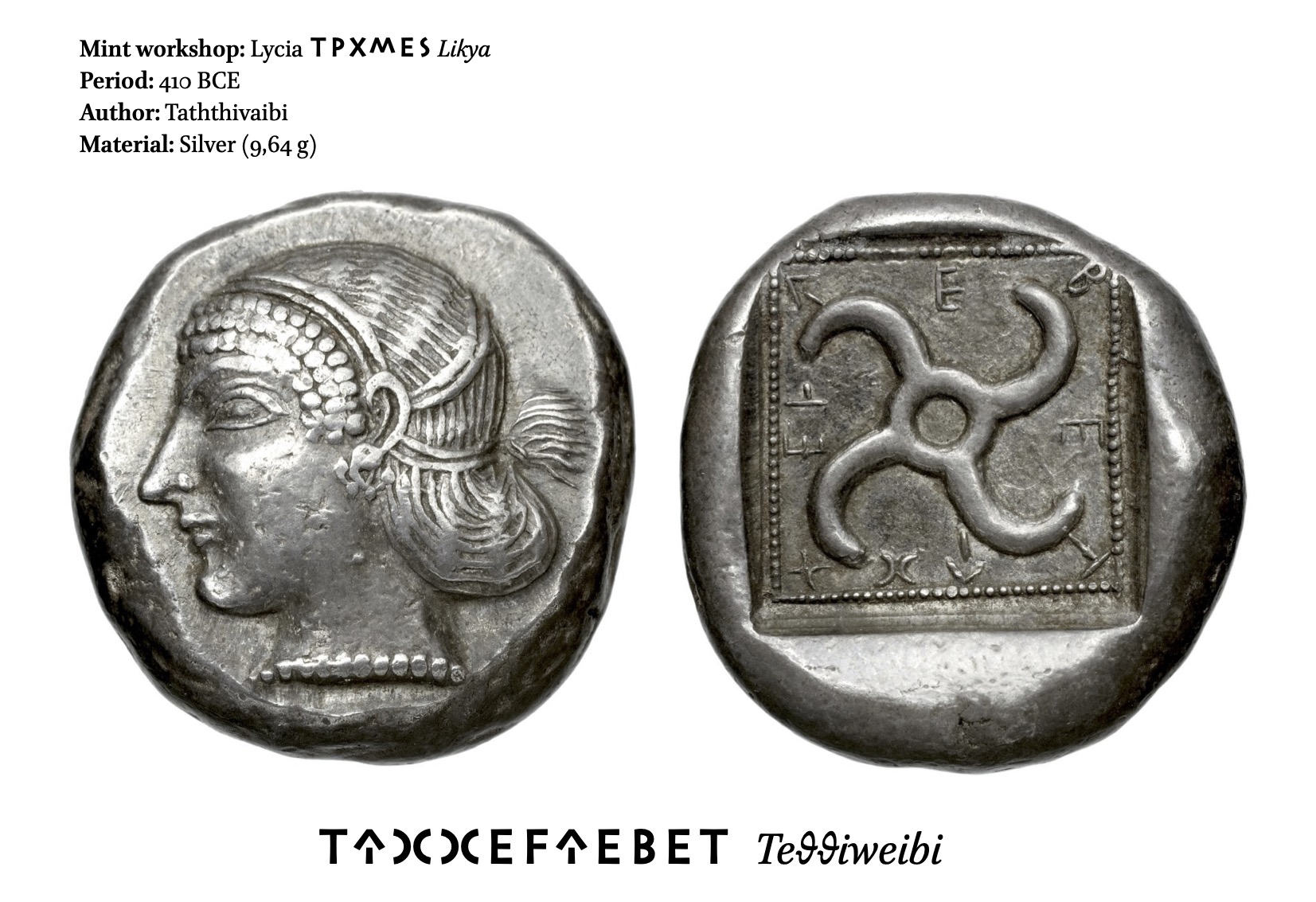
Fig.30 Silver statere, Lycia, Taththivaibi, 480-460 BCE (BnF, MMA, L 3072)
Cypriot
The Cypriot syllabary was used to write the Cypriot dialect of Greek from about 800 to 200 BCE. Structurally, the Cypriot syllabary consisted of combinations of up to twelve initial consonants and five different vowels (fig.31). In our corpus, only the coins from Amathus, Idalium, Marium, Paphos, and Salamis have legends using the Cypriot syllabary. The local and independent minting in Cyprus Island began in the 5th century BCE and stopped after the island’s conquest by Ptolemy I Soter in 312 BCE to continue under the aegis of the conquering powers, Greek Hellenistic, Roman, etc.

Fig.31 PIM Cypriot typeface
The PIM typefaces contain as well the necessary punctuation marks to indicate other information like damaged or erased letters, as we see in the coin legend in figure 32.
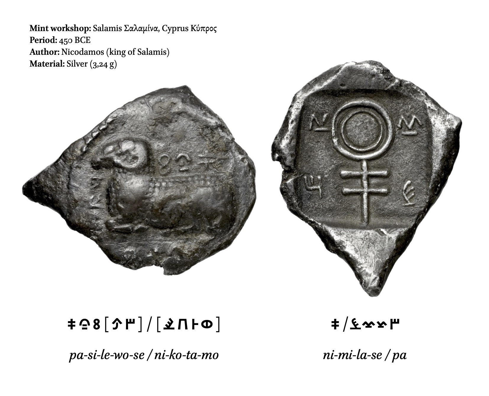
Fig.32 1/3 silver shekel, Salamine, Cyprus, Nicodamos, 450 BCE (BnF, MMA, Babelon 575C)
Publication of the PIM fonts
The licence
The Open Font License (SIL-OFL) will be used, and the fonts will be published via a public repository (GitHub). The sources’ accessibility and the specific conditions of the user license will make it possible to supplement, correct, extend and redistribute the PIM fonts easily.
The online composer
The digital humanities have profoundly changed the research methods in the human sciences, both from the view of access to sources and their distribution by various means of publishing. New digital tools assist researchers to explore, disseminate, and question the established knowledge; however, it is essential to constantly re-evaluate their efficiency and intuitiveness. For instance, office softwares generally used for writing essays or articles in humanities sciences (such as Microsoft Word or LibreOffice, are very limited from a typographic point of view. Access to other writing systems than Latin is often complicated, and several OpenType features are not implemented.
Therefore, The PIM project continues with the creation by ANRT of an Alpha version of an online text editor developed by Sylvain Julé (fig.33). It will be published with the GNU AGP3 license. This composer will make it possible to display all the PIM’s writing systems, facilitate their keyboard entries, and allow simplified visual access to the ontographs and allographs. This tool will also help to limit the risks of confusion between glyphs with similar forms (which can create textual encoding mistakes).
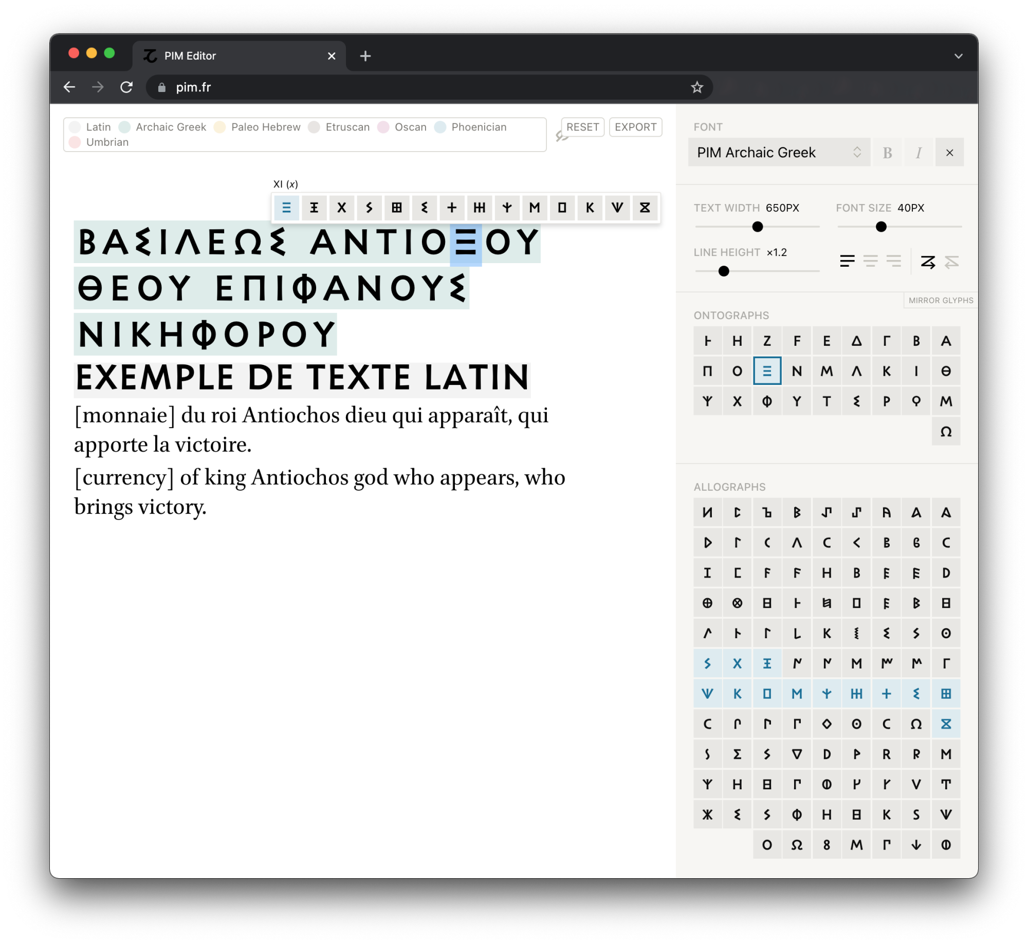
Fig.33 PIM compositor, Thomas Huot-Marchand, Sylvain Julé © ANRT
Conclusion
As a result of a close collaboration between the BnF and ANRT, the PIM project has opened many perspectives. With a particular focus on type design, it has been a productive way to study the early writing systems and understand how they have influenced each other through the large number and variety of letterforms.
The multiplicity and diversity of the letter morphologies composing the PIM fonts constitute a challenge in design and files architecture, allowing their use in scientific publications. The attention paid to Unicode encoding and the ergonomics of composition tools guarantees morphological precision, traceability of sources and possibilities of indexing and textual research.
The PIM project aims to demonstrate how creating custom typographic tools can contribute to the quality of online catalogues and scholarly publications. A fertile exchange between theory and practice makes it possible to move the research in typography and humanities sciences forward, thus improving access methods and knowledge sharing.
Fig.34 PIM alphabets with their variants
Acknowledgements
I would like to express my sincere thanks to all those who participated in this project, Thomas Huot-Marchand, Frédérique Duyrat, Gaëlle Thevenin, Caroline Carrier, Julien Olivier and Sylvain Julé. I would also like to express my gratitude to the external advisors Donald T. Ariel, Shani Avni, Dominique Briquel, Françoise Briquel-Chatonnet, Gerry Leonidas, Evi Markou, Andrew Meadows, Laïla Nehmé, and Ian Rutherford.
-
Codine-Trécourt, Florence and Sarah Guillaume (2012). “Du plomb au pixel. Transcrire les légendes des monnaies du haut Moyen Âge.” In: Revue numismatique 168, pp. 261–277. →
-
The term “transcription” is used to name the transition from a written or inscribed form to a typographical one. →
-
Thevenin, Gaëlle (2018). “Projet de Polices des Inscriptions Monétaires: le cas des monnaies ibériques et carthaginoises.” L’Antiquité à la BnF, https://antiquitebnf.hypotheses.org/2074. →
-
Volk Leonovitch, Elvire (2014 ). PIM. Police pour les Inscriptions Monétaires. Nancy: Atelier National de Recherche Typographique →
-
Jointly developed by Microsoft and Adobe in 1996, OpenType fonts can include an expanded character set and layout features, providing broader language support and finer typographic control. https://www.adobe.com/products/type/opentype.html →
-
Académie des Inscriptions et Belles-Lettres (1907). Corpus Inscriptionum Semiticarum. Pars Secunda. Inscriptiones Aramaicas Continens. Vol. II Fasciculus Primus. Paris : Republicae typogrpapheo. →
-
Jenkins, G. K. (1978). “Coins of Punic Sicily. Part 4: Carthage.” In: Swiss Numismatic Review 57. 5–6. →
-
Jeffery, Lilian H. (1963). The Local Scripts of Archaic Greece. Oxford Monographs on Classical Archaeology. Oxford. →
-
Kraay, Colin M. (1966). Greek Coins. London: Thames and Hudson. →
-
This logic has already been adopted by numismatists to establish the chronology of specific issues, for instance, for Heraia of Arcadia, from the spelling evolution of the epsilon. See Roderick T. Williams, “The Archaic Coinage of Arcadian Heraea“, American Numismatic Society Museum Notes, 1970, Vol.16 (1970), pp.1-12. →
-
Everson, Michael et al. (2000). “European Alphabetic Scripts, 7.10 Old Italic.” https://www.evertype.com/standards/iso10646/pdf/old-italic.pdf. →
-
Yardeni, Ada (2002). The Book of Hebrew Script, History, Palaeography, Script Styles, Calligraphy and Design. London, Newcastle: The British Library and Oak Knoll Press. →
-
Mansour, Kamal. “On the Origin of Arabic Scripts.” In Graphemics in the 21st Century. Brest, June 1315, 2018. Proceedings Grapholinguistics and Its Applications (ISSN: 25345192), Vol.1. Y. Haralambous (Ed.), Fluxus Editions, Brest, 2019, p. 245–255. →
-
Fossey, Charles, ed. (1927). Notices sur les caractères étrangers anciens et modernes. Paris: Imprimerie Nationale. →
-
Morgan, J. de (1926). Manuel de numismatique orientale de l’antiquité et du moyen âge. Basmadjian, K. J. Vol. 1. Paris: Librairie orientaliste Paul Geuthner. →
-
Anderson, Deborah and Michael Everson (1999). “Final proposal to encode Aegean scripts in the UCS.” https://www.unicode.org/L2/L2001/01370-n2378.pdf. →
-
Morgan, 1926 →
-
Jimenes, Rémi (2013). “Gestion informatisée des écritures anciennes.” In: Document numérique 16.3. →